Frontend Development and Browser Tech Weekly Round-Up: Exploring Modern CSS Innovations, AI-Ready Tooling, and Historical Quirks

The landscape of web development continues to evolve at a rapid pace, marked by a constant interplay between modern CSS capabilities, emerging image standards, advanced tooling integrations, and reflections on legacy browser behaviors. Recent weeks have brought forth a wealth of technical tutorials, updated developer resources, and architectural debates that highlight both the sophistication of contemporary web standards and the nostalgia of legacy workarounds. From the implementation of CSS anchor positioning for margin notes to the ongoing debate surrounding image formats like JPEG XL, frontend engineers are provided with an array of new paradigms to optimize performance, accessibility, and user experience.
Evolution of Front-End Quality Control and AI Integration
One of the most notable developments in frontend engineering infrastructure is the significant expansion of quality assurance frameworks, exemplified by the latest updates to The Front-End Checklist. Curated by David Dias, the project has grown to encompass nearly 400 distinct quality rules spanning critical pillars such as accessibility, performance, security, and search engine optimization (SEO).

What sets the latest iteration apart is its integration with modern artificial intelligence infrastructure. Developers can now connect the checklist directly to advanced AI coding assistants and models—including Claude and Cursor—utilizing the Model Context Protocol (MCP). This integration allows AI tools to automatically review codebases against established frontend standards, ensuring that automated code generation aligns with production-ready best practices. Industry analysts note that bridging the gap between automated AI coding and standardized quality guidelines addresses a major bottleneck in modern software engineering: maintaining architectural consistency and accessibility compliance in AI-assisted workflows.
Mastering Typography and Layout with Advanced CSS
Typography alignment and complex layout positioning have long presented challenges for web designers, often requiring cumbersome JavaScript workarounds or brittle positioning hacks. Recent technical deep dives by prominent web developers illuminate how modern CSS features are rendering these legacy methods obsolete.
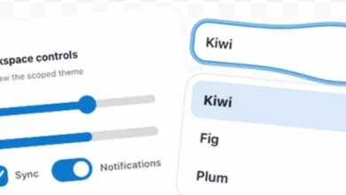
Ahmad Shadeed recently addressed a persistent visual flaw in list item design: the vertical alignment of accompanying icons next to multi-line text blocks. While standard flexbox or grid centering functions effectively for single-line text, multi-line blocks often result in icons appearing visually misaligned or awkwardly anchored. Shadeed’s exploration introduces a robust solution leveraging the CSS lh unit—a relative length unit equal to the computed line-height of the element. By utilizing lh, developers can achieve precise, scalable icon alignment regardless of text wrapping, eliminating the need for hardcoded pixel adjustments.
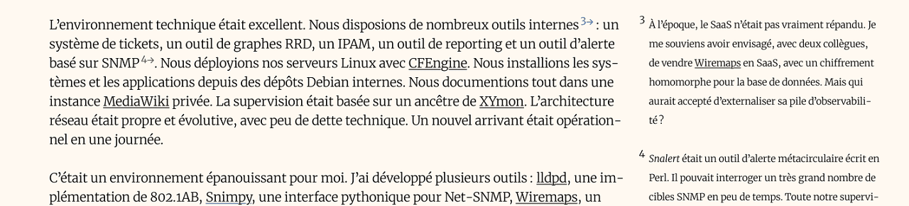
Concurrently, Vincent Bernat published a comprehensive guide on building Tufte-style sidenotes using CSS anchor positioning. Traditionally, margin notes required complex JavaScript calculations to track viewport changes and prevent overlapping. Bernat’s approach demonstrates how native CSS anchor positioning allows developers to tie margin notes directly to specific text anchors in a completely JavaScript-free implementation. The technique supports multi-block layouts and features graceful degradation strategies for narrow viewports and older browser environments, signaling a mature shift toward native browser layout capabilities.
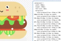
Furthermore, Preethi Sam’s exploration of animating CSS border-image properties on platforms like CSS-Tricks offers developers new avenues for creating dynamic user interface effects. By animating border gradients and image sources, designers can produce sophisticated visual indicators and interactive states without relying on heavy graphic assets or performance-draining DOM manipulations.
The Architectural Debate Over JPEG XL in Browsers
As web performance remains a paramount concern for developers, the debate surrounding modern image compression formats has intensified. Gianni Rosato, an AV1 encoder developer and former advocate for the JPEG XL format, recently published a critical analysis titled "The Case Against JPEG XL (in the Browser)."

With JPEG XL decoding support recently making its way into major browser engines such as Google Chrome and Mozilla Firefox, the web development community has closely monitored its adoption path. However, Rosato’s technical assessment argues that the format offers negligible performance or compression advantages over AVIF (AV1 Image File Format) for standard web use cases. Proponents of AVIF point to its widespread hardware acceleration and strong backing from the Alliance for Open Media, while advocates for JPEG XL emphasize its superior fidelity at very low bitrates and its preservation of legacy workflows. The ongoing discussion underscores the complex trade-offs browser vendors face when deciding which codecs to natively support, balancing legacy compatibility, decoding performance, and next-generation compression efficiency.
A Nostalgic Look Back at Internet Explorer Quirks
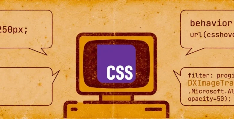
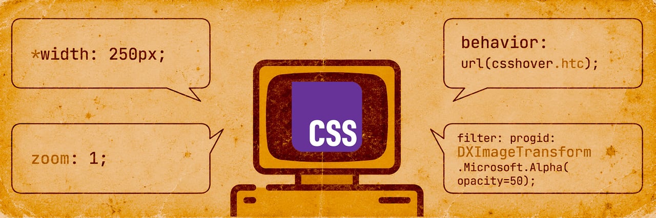
While modern developers grapple with advanced layout units and codec efficiency, a recent retrospective by Declan Chidlow titled "CSS Curiosities of the Past" offers a nostalgic journey through the non-standard quirks that defined web development in the late 1990s and 2000s.
The retrospective covers the notorious "star hack," Internet Explorer’s custom CSS expressions (which allowed arbitrary JavaScript execution within style sheets), proprietary DirectX filters, and the infamous box model hack popularized by Tantek Çelik. For senior developers, the piece serves as a reminder of the fractured browser landscape that necessitated defensive coding and complex conditional comments. For newer engineers, it highlights how far web standards have progressed toward interoperability and predictable rendering engines.
Modernization of State Management, Tools, and DOM-to-Image Generation
The developer tooling ecosystem continues to refine how applications handle build-time optimization and DOM manipulation. Flavio Copes recently provided a hands-on technical overview of StyleX, Meta’s CSS-in-JS styling library. StyleX operates by transforming JavaScript style objects into plain atomic CSS at build time, combining the developer experience of scoped component styling with the high runtime performance of traditional static stylesheets. Notably, Copes emphasizes StyleX’s suitability for AI coding agents, as its predictable, atomic output structure minimizes the risk of cascading style conflicts during automated code generation.
In the realm of client-side utilities, Zumerlab released version 3.0 of SnapDOM, a dependency-free alternative to html2canvas designed to convert DOM elements into static images. With native support for web fonts, pseudo-elements, and the Shadow DOM, SnapDOM v3.0 introduces several performance enhancements, including "incremental recapture" for faster repeat rendering, automatic web font embedding, and a fromString() method that converts raw HTML markup directly into image assets without requiring DOM insertion.
Stress Relief and Novelty in Developer Workflows
Beyond core infrastructure and technical tutorials, the developer community occasionally embraces tools designed for lighthearted stress relief. Alex Reardon introduced "Page Rage," a web-based utility and browser extension that allows developers to take out their frustrations during difficult site-building sessions by interactively destroying pre-made or live web pages. While primarily a novelty, the project has garnered attention for its creative utilization of DOM manipulation and physics engines, demonstrating the lighter side of web engineering culture.
Broader Industry Implications and Future Outlook
The convergence of these developments points toward a more standardized, AI-integrated, and performance-conscious future for web development. As native CSS capabilities—such as anchor positioning, advanced relative units, and atomic build systems—continue to mature, the reliance on external JavaScript polyfills and hacky workarounds diminishes. Simultaneously, the integration of structured development rules with artificial intelligence protocols heralds a new era of automated code validation, promising higher standards of web accessibility and performance across the digital ecosystem.