Beyond Color and Contrast: How Motion Graphics and Neurological Diversity Impact Corporate Communication

In the modern corporate environment, the drive to deliver engaging presentations has led to an over-reliance on dynamic visual aids, ranging from high-contrast color palettes to complex animations. While these design choices are intended to capture attention, emerging insights from workplace communication and cognitive science suggest they can frequently backfire, particularly when presenters fail to account for the neurodiversity of their audiences. A recent internal evaluation of corporate communication strategies has highlighted an often-overlooked hurdle in professional settings: the unintended exclusionary impact of excessive motion on slides and software demonstrations.
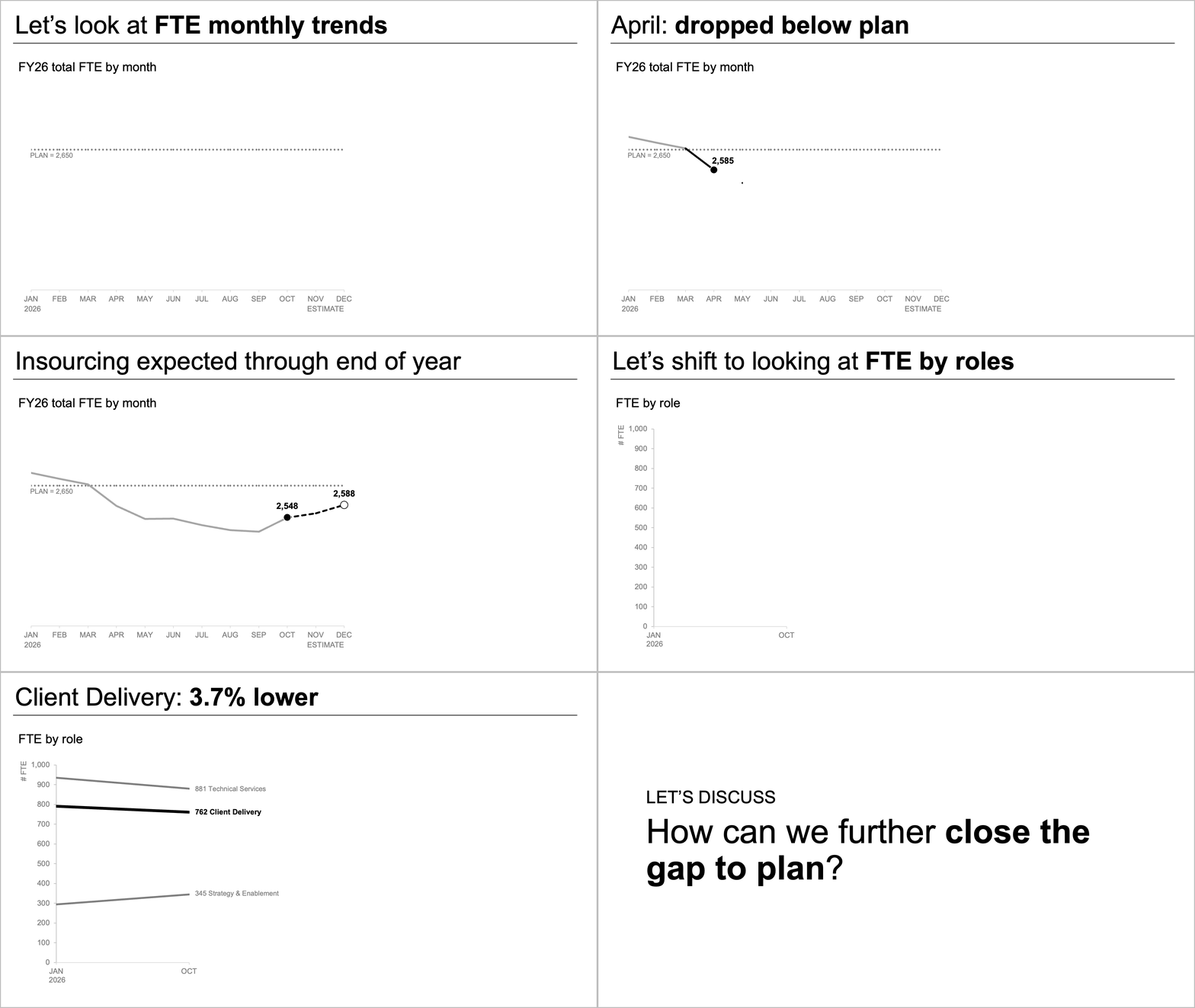
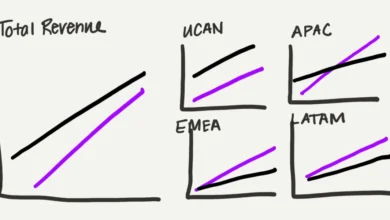
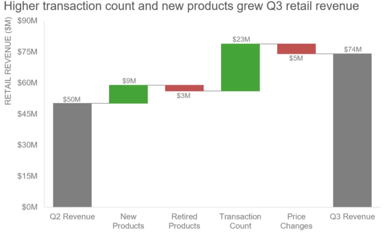
During a company-wide all-hands meeting at a mid-sized technology firm, a senior executive sought to showcase an upcoming suite of software products and analytical features. To demonstrate the versatility of the new tool, the presentation utilized animated slide transitions that caused various chart formats to rapidly fly across the projection screen. For many attendees, the visual flair was unremarkable, but for employees with specific cognitive profiles, the display proved entirely counterproductive. One staff member, who manages inattentive attention deficit/hyperactivity disorder (ADHD), reported being entirely incapacitated by the visual stimuli. Rather than absorbing the strategic value of the software or listening to the accompanying commentary, the employee’s attention was involuntarily locked onto the moving graphics, functioning similarly to how a hyper-focused observer might react to sudden motion in their peripheral vision. Consequently, the core message of the product launch was completely lost on a segment of the workforce, underscoring a fundamental disconnect between presenter intent and audience reception.
The Cognitive Science of Visual Distraction
To understand why standard corporate presentations often fail, workplace researchers and accessibility advocates emphasize the need to distinguish between mere aesthetic preferences and neurological processing realities. Human visual perception is not uniform; variations in how individuals process sensory input mean that a design element perceived as neutral or engaging by the majority can become a cognitive barrier for others.
Conditions such as ADHD, autism spectrum disorder, and sensory processing sensitivities affect how the brain filters external stimuli. While neurotypical individuals can typically suppress background motion and focus on verbal delivery, individuals with heightened sensitivity to motion may experience an involuntary attentional capture. In the context of the corporate all-hands meeting, the kinetic movement of the charts triggered an immediate orienting response, hijacking the viewer’s working memory.
This phenomenon reveals a broader vulnerability in standard presentation training. Presenters frequently treat the audience as a monolithic entity, assuming that universal engagement tools will yield universal comprehension. However, when design choices rely heavily on a single sensory attribute—such as motion or color—they amplify the risk of alienating audience members whose neural wiring processes those attributes differently. Communication experts note that this is not merely a matter of accommodation for diagnosed conditions, but a fundamental pillar of effective audience-centric design that benefits all attendees by reducing cognitive overload.
Chronology of Audience-Centric Communication Evolution
The realization that traditional presentation methods require an overhaul has developed over several decades, driven by shifts in workplace demographics, technological capabilities, and neurodiversity advocacy.
The evolution of modern presentation standards can be traced across several distinct phases:
- Early 2000s: The Rise of Digital Slides: With the widespread adoption of presentation software like Microsoft PowerPoint, corporate environments saw an explosion of clip art, word art, and basic slide transitions. Presentations prioritized technological novelty over cognitive efficiency, frequently resulting in dense, text-heavy, and visually chaotic displays.
- 2010s: The Minimalist and Data-Driven Shift: Prompted by expert critiques—such as the popularization of the "Death by PowerPoint" paradigm—organizations began encouraging minimalist design, high contrast, and simplified data visualizations. However, these guidelines often remained aesthetic-focused, failing to integrate accessibility guidelines for neurodivergent individuals.
- 2020 to Present: The Integration of Neurodiversity and Inclusive Design: As corporate diversity, equity, and inclusion (DEI) initiatives matured, organizations began expanding their definitions of inclusion to encompass cognitive diversity. Workplace researchers started analyzing how slide design, color theory, motion graphics, and typography impact employees with ADHD, dyslexia, and visual processing disorders, leading to a demand for multi-attribute, scientifically grounded communication strategies.
Quantitative Insights into Workplace Communication Barriers
Data gathered from internal communication audits and workplace accessibility studies indicate that presentation friction is a widespread issue affecting productivity and comprehension. According to recent organizational behavior surveys, approximately 15% to 20% of the global population exhibits some form of neurodivergence, including ADHD, dyslexia, and processing sensitivities. Despite this significant representation, fewer than 10% of corporate training programs incorporate specific guidelines on designing accessible visual media for internal presentations.
Furthermore, usability metrics demonstrate that excessive animation on presentation slides increases cognitive load by up to 35% for all viewers, not just neurodivergent individuals. When a slide introduces multiple moving elements simultaneously, the human brain must expend valuable metabolic energy filtering out non-essential motion to focus on the speaker’s voice. This division of attention correlates with a measurable drop in information retention, with post-meeting comprehension scores falling by nearly 50% when presentations rely heavily on kinetic distractions rather than static, structured data displays.
Industry Responses and Expert Recommendations
In light of these findings, corporate communication departments and leadership coaches are revising how presentation standards are taught and evaluated. Industry experts emphasize that mitigating these communication barriers requires a two-pronged approach: deep audience analysis and the thoughtful combination of multiple design attributes.
Organizational leaders are increasingly adopting proactive research methodologies to understand their audiences before stepping onto a stage or virtual platform. When direct access to the audience is available, presenters are encouraged to share draft materials and sample graphics with a representative cross-section of employees, soliciting direct feedback on clarity, pacing, and visual comfort. When direct consultation is impractical, communicators are advised to study established internal communication norms, historical engagement data, and industry-specific accessibility standards to anticipate potential perceptual hurdles.
Moreover, design specialists advocate for the strategic layering of visual attributes rather than relying on a single, potentially disruptive element. For instance, rather than utilizing motion to draw the eye to a new chart, presenters are urged to use a combination of subtle typography changes, strategic whitespace, and progressive verbal emphasis. This multi-layered approach ensures that if one attribute proves inaccessible or distracting to a viewer, alternative pathways for comprehension remain intact.
Broader Implications for the Future of Work
As hybrid work models and digital-first communication tools continue to dominate the professional landscape, the stakes for effective, inclusive presentations have never been higher. The shift away from monolithic audience assumptions toward neurodiversity-informed design represents a critical maturation in corporate culture.
Organizations that fail to adapt their communication strategies risk more than just miscommunicated data; they risk disenfranchising valuable talent and reducing overall organizational alignment. By treating accessibility not as a compliance checkbox, but as an essential component of data literacy and human-centric design, companies can foster environments where information is transmitted equitably. The lessons learned from a single over-animated software demonstration point toward a broader imperative: true effective communication requires respecting not only the message being delivered, but the diverse cognitive landscapes of every individual receiving it.