AI-Powered Data Storytelling Transforms Professional Workflows, Enhancing Efficiency While Preserving Human Oversight

The integration of artificial intelligence into professional workflows is rapidly reshaping how data is analyzed, visualized, and communicated, presenting a real-world experiment for professionals across various sectors. In the realm of data storytelling, AI tools are emerging as powerful assistants, capable of automating the laborious aspects of chart creation and data manipulation, thereby freeing up human experts to focus on strategic insights and nuanced design. This shift is particularly evident in the process of transforming complex datasets into compelling visual narratives, where AI is proving to be a valuable partner in accelerating execution without compromising the critical element of human judgment.
The Evolving Landscape of AI in Data Analytics

The advent of sophisticated AI models, such as Claude, CoPilot, ChatGPT, and Gemini, has marked a significant turning point in how businesses approach data analysis and presentation. These tools, increasingly integrated into popular productivity suites like Microsoft 365 and Google Workspace, offer functionalities ranging from text generation to complex data visualization. For data professionals, this represents a paradigm shift, moving away from purely manual, time-intensive processes towards a more collaborative model with intelligent machines.
Historically, data visualization has been a meticulous craft, demanding significant time and expertise to translate raw data into clear, impactful charts. The process often involves numerous iterative steps: data cleaning, selecting appropriate chart types, meticulous formatting, and ensuring visual coherence. While some of these steps, such as refining aesthetic elements like alignment and color, or sketching initial concepts, are considered enjoyable and creatively stimulating by many practitioners, others, like the manual construction of charts from scratch or the tedious manipulation of data in spreadsheets for non-standard visualizations, are often seen as necessary but unfulfilling chores. It is precisely these routine, less intellectually stimulating tasks that AI is now poised to absorb, allowing human professionals to dedicate more energy to higher-value activities such as understanding the underlying narrative, refining design principles, and ensuring the accuracy and ethical representation of information.
The market for data analytics and business intelligence software, valued at approximately $28.7 billion in 2023 and projected to grow significantly, underscores the increasing demand for efficient data processing and visualization solutions. Within this burgeoning market, AI-powered tools are expected to drive substantial productivity gains. Early adopters report saving upwards of 20-30% of their time on data preparation and initial visualization tasks, redirecting these hours towards deeper analysis and strategic communication. This efficiency gain is not merely about speed; it’s about enabling professionals to produce more sophisticated, insightful, and polished data stories within existing timelines, or to tackle a greater volume of projects.
Case Study: Streamlining Complex Data Visualization
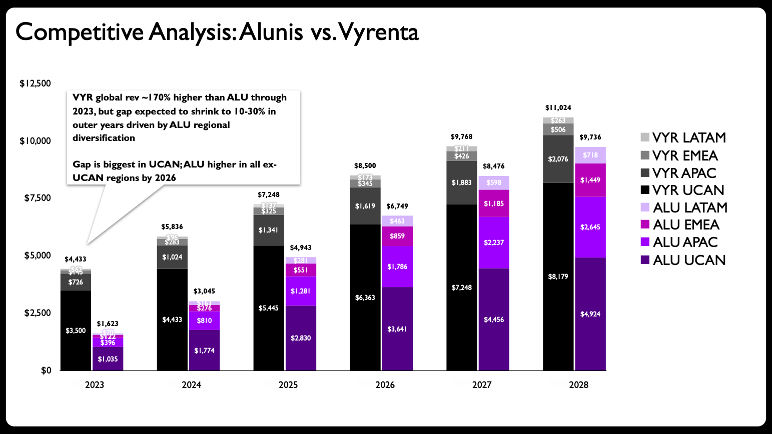
A recent client project provided an ideal testing ground for this human-AI collaborative approach, illustrating how AI can act as a crucial accelerant in the data storytelling process. The original visualization presented a common challenge: a single stacked bar chart attempting to convey too much information. The objective was to illustrate how a company, Alunis, aimed to close a revenue gap with a key competitor, Vyrenta, through regional expansion over time. The chart was tasked with communicating temporal change, comparing two entities, and breaking down each company’s regional revenue composition—a heavy lift for any single visual element.
Industry best practices, as outlined in publications like "before & after: practical makeovers for powerful data stories," frequently highlight the pitfall of over-complicating a single graph. Such charts often suffer from cognitive overload, making it difficult for an audience to extract key insights quickly. The recommended solution typically involves disaggregating complex information into multiple, simpler charts, often employing a "small multiples" approach.
In this specific scenario, the initial stacked bar chart struggled to clearly articulate the revenue trajectory of both companies, their comparative performance, and the nuanced regional contributions simultaneously. While it provided a comprehensive overview, its effectiveness in highlighting specific trends or differences was limited. The first step in the makeover process, therefore, was to break down this overloaded visual into several distinct, yet interconnected, charts.
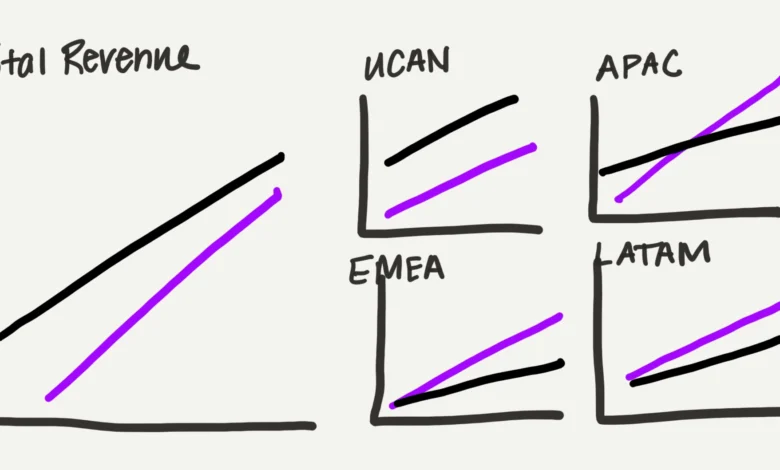
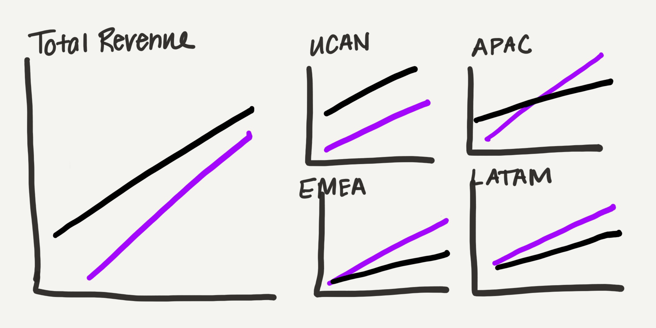
Instead of directly creating these multiple charts manually in software like PowerPoint, a process that traditionally consumes considerable time and mental energy, the practitioner opted for a collaborative approach with AI. The process began with a hand-drawn sketch outlining a proposed redesign. This sketch envisioned a shift from stacked bars to line charts, which offer a lighter visual footprint, particularly advantageous for a slide dense with data points. The design divided the information by location: a larger chart for total revenue comparison, complemented by four smaller regional charts (UCAN, APAC, EMEA, LATAM). The intentional variation in chart sizing—a larger total view and a grid of smaller regional charts occupying equivalent space—was a subtle yet effective way to visually represent the part-to-whole relationship of the data, reinforcing the overarching narrative of regional growth contributing to total revenue.
Partnering with Claude for Initial Chart Generation
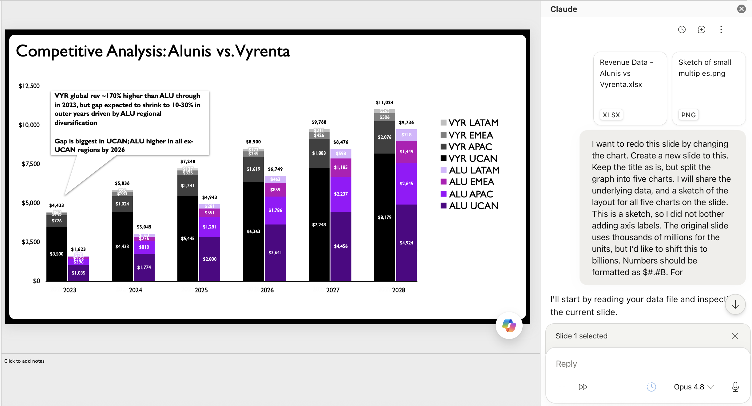
The practitioner then engaged Claude for PowerPoint, an AI add-in notable for its ability to generate editable charts directly within the PowerPoint environment. The prompt provided to Claude included the raw data and the hand-drawn layout sketch, effectively instructing the AI to translate the conceptual design into functional charts. This direct integration into PowerPoint, as opposed to generating static images, proved to be a critical factor in the success of this collaborative experiment. While other AI tools like Microsoft CoPilot, ChatGPT, and Google Gemini also offer chart generation capabilities, the ability to produce editable native PowerPoint charts was paramount for maintaining control over the final design and enabling subsequent human refinements.
The AI’s output, while not perfect, was a significant improvement over the original stacked bar chart. It successfully rendered the sketch into a series of small multiple line charts, complete with appropriate axes and labels, mirroring the desired layout. This initial AI-generated draft provided a robust starting point, effectively automating the tedious, foundational work of chart construction. It represented a solid "first draft," allowing the practitioner to bypass the laborious manual creation phase entirely.
The Indispensable Value of Human Expertise and Refinement
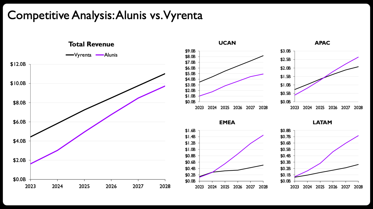
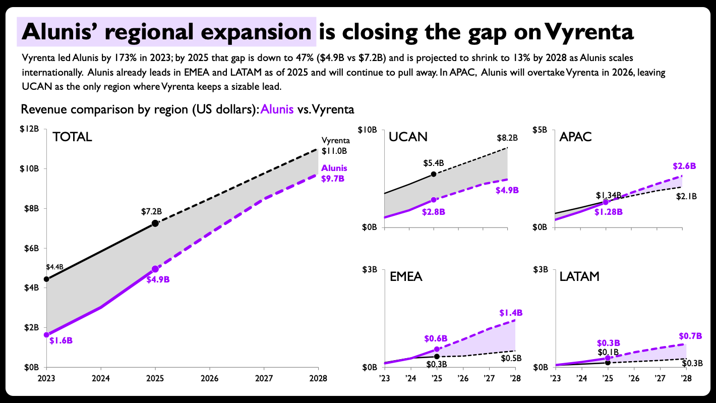
While the AI-generated charts were a substantial step forward, they highlighted the enduring and critical role of human expertise in elevating data visualizations from merely "decent" to "powerful" and "insightful." For many, the AI’s output, perhaps with a rewritten slide title and some descriptive text, might suffice. However, for a seasoned data storyteller, several crucial refinements were necessary to maximize clarity, impact, and narrative precision.
The practitioner identified and implemented key design enhancements:
- Shaded Areas and Direct Labels: To emphasize the revenue gap and its narrowing trend, shaded areas were introduced between the lines representing Alunis and Vyrenta. This visual cue immediately draws attention to the difference between the two companies. Furthermore, direct, end-of-line labels with precise values were added. This eliminated the need for a separate legend and allowed the audience to quickly grasp the exact figures at each endpoint, improving readability and reducing cognitive load.
- Per-Panel Axis Scaling: Breaking from the convention of consistent axis scales across all charts, the regional charts were given individual axis ranges scaled to their respective data magnitudes. While consistent scaling is often preferred for direct comparison, in this context, the primary goal for the smaller regional charts was to show trends within each region, and Alunis’s growth relative to Vyrenta within that region, rather than absolute comparison across regions. Scaling each panel independently allowed the subtle regional growth patterns to be more pronounced and legible, reinforcing the narrative of Alunis’s targeted expansion. This deliberate design decision required human judgment to balance the pros and cons of consistent vs. independent scaling, ultimately prioritizing regional trend visibility.
- Visual Distinction for Actuals vs. Projections: To clearly differentiate historical data from future forecasts, solid lines were used for actuals, and dashed lines for projections. This subtle visual cue provides crucial context, allowing the audience to understand the nature of the data being presented without explicit textual annotation. Additionally, compact year formatting (e.g., ’24, ’26, ’28) was applied to the smaller panels to maintain visual tidiness and optimize space.
These refinements, though seemingly minor, collectively transformed the AI-generated raw output into a polished, persuasive data story. They exemplify the unique value humans bring: the ability to apply nuanced judgment, leverage deep understanding of design principles, and strategically emphasize key insights to drive a specific message. AI can create the framework, but human intelligence crafts the narrative and ensures its resonance.
Broader Implications and the Future of Data Storytelling
This collaborative model between humans and AI carries significant implications for the future of data storytelling and the broader professional landscape:
- Democratization of Data Visualization: For individuals new to data storytelling or those lacking advanced software skills, AI tools can significantly lower the barrier to entry. They can generate a foundational chart, allowing novices to then apply basic design principles and focus on interpretation rather than intricate manual creation. This empowers a wider range of professionals to communicate data effectively.
- Enhanced Efficiency for Experts: Experienced practitioners can leverage AI to offload repetitive tasks, allowing them to dedicate more time to strategic thinking, innovative design solutions, and deep dive analysis. This accelerates the overall workflow, leading to quicker insights and more responsive decision-making.
- The Evolving Skillset: The demand for foundational data visualization and storytelling principles remains paramount. AI does not negate the need to understand why certain chart types are effective, how to construct a compelling narrative, or what design choices best serve the data’s message. Instead, it shifts the focus from manual execution to critical evaluation, refinement, and strategic direction. Professionals must learn to effectively prompt AI, critically assess its output, and skillfully apply human-centric design principles to elevate the final product.
- Competitive Landscape: The rapid development and integration of AI add-ins like Claude for PowerPoint, CoPilot, and Gemini into enterprise software suites signals a fierce competition among tech giants to capture the productivity market. The key differentiator for these tools, as highlighted by this case study, will be their ability to generate editable, flexible output that seamlessly integrates into existing professional workflows.
In conclusion, the ongoing experiment with AI in the workplace is revealing a powerful truth: AI is not merely a replacement for human tasks but a transformative partner that augments human capabilities. In data storytelling, this partnership shines brightest in the realm of chart creation. By automating the arduous initial build, AI frees up human practitioners to focus on the truly enjoyable and impactful aspects of their work—the strategic thinking, the creative tinkering, and the judicious refinement that ultimately transform raw data into powerful, actionable insights. The most successful outcomes arise when humans remain firmly in the driver’s seat, providing the judgment, direction, and nuanced artistry that AI, for all its power, cannot yet replicate. The future of data storytelling is undeniably collaborative, with AI acting as a sophisticated co-pilot, not an autonomous pilot.