The Symbiotic Evolution of Data Storytelling: How AI Augments Human Expertise in Visual Communication

The integration of artificial intelligence into professional workflows marks a pivotal shift, transforming how data is analyzed, visualized, and communicated across virtually every sector. Professionals globally are actively engaging in a real-world experiment, meticulously evaluating where AI serves as an invaluable accelerator and where its inherent limitations necessitate nuanced human intervention. Within the specialized domain of data storytelling, this ongoing exploration has led to a critical inquiry: when does AI genuinely enhance the creative process, and when does its unguided application inadvertently become an impediment to clarity and impact? The emerging consensus among practitioners points towards a sophisticated collaborative paradigm, where AI adeptly handles the laborious, repetitive tasks, thereby liberating human professionals to concentrate on the strategic, analytical, and profoundly nuanced aspects of design and narrative construction.
For data visualization specialists, the process often presents a dichotomy of tasks: those that are mechanically repetitive and those that demand intricate creative thought and strategic insight. A professional data storyteller, as highlighted in a recent practical case study, often finds genuine enjoyment in the artistic details of data presentation—meticulously refining visual alignment, selecting optimal color palettes, and ideating through preliminary sketches. These seemingly minor, iterative steps are, in fact, crucial catalysts for generating innovative insights and significantly elevating the communicative power of the final output. Conversely, the manual construction of each chart from scratch or the arduous manipulation of raw data within spreadsheet applications like Excel to conform to non-standard visualization requirements rarely contributes to deeper analytical understanding or narrative refinement. This segment of the workflow is precisely where AI offers a compelling and transformative value proposition, provided it does not compromise the human designer’s ultimate control over the aesthetic integrity, communicative effectiveness, and underlying narrative of the final product. Every minute saved from the mechanical generation of charts directly translates into invaluable time redirected towards deciphering the underlying story within the data and perfecting its visual presentation, thereby optimizing the overall data storytelling process and enhancing its strategic impact.

The Evolving Landscape of Data Visualization and AI Integration
The journey of data visualization has seen remarkable evolution, from rudimentary hand-drawn charts and static diagrams to sophisticated interactive dashboards and dynamic presentations. Historically, data professionals relied heavily on basic charting functions embedded within spreadsheet software or dedicated statistical packages. Achieving desired aesthetic and communicative effects often required extensive manual adjustments, intricate formatting, and a significant investment of time. The subsequent advent of specialized data visualization tools such as Tableau, Power BI, and D3.js provided more robust capabilities, empowering users to create complex and highly interactive visuals. However, even with these advanced tools, the initial setup, meticulous data preparation, and iterative design process remained inherently time-consuming, particularly when crafting bespoke visualizations tailored to specific, complex narratives.
The recent, rapid proliferation of artificial intelligence, especially generative AI, has introduced an entirely new frontier in this evolution. Initially, AI’s role in data analysis was primarily focused on predictive modeling, advanced pattern recognition, and automating laborious data cleaning and transformation tasks. Natural Language Processing (NLP) then began to enable users to query data using plain language, making complex datasets more accessible to non-technical stakeholders. More recently, advanced generative AI models have demonstrated an unprecedented capacity to create various forms of content, including sophisticated text, realistic images, and, crucially for this discussion, intricate data visualizations. Tools like Microsoft’s CoPilot, Google’s Gemini, and Anthropic’s Claude have integrated these potent AI capabilities directly into widely used productivity suites, promising to fundamentally streamline tasks that were once exclusively human-driven. This profound technological shift has compelled data professionals to critically reconsider and re-engineer their established workflows, actively exploring how these powerful new AI assistants can be strategically leveraged without inadvertently sacrificing the critical human element of insight, contextual understanding, and bespoke design.
Addressing the "Too Much" Problem in Data Visualization
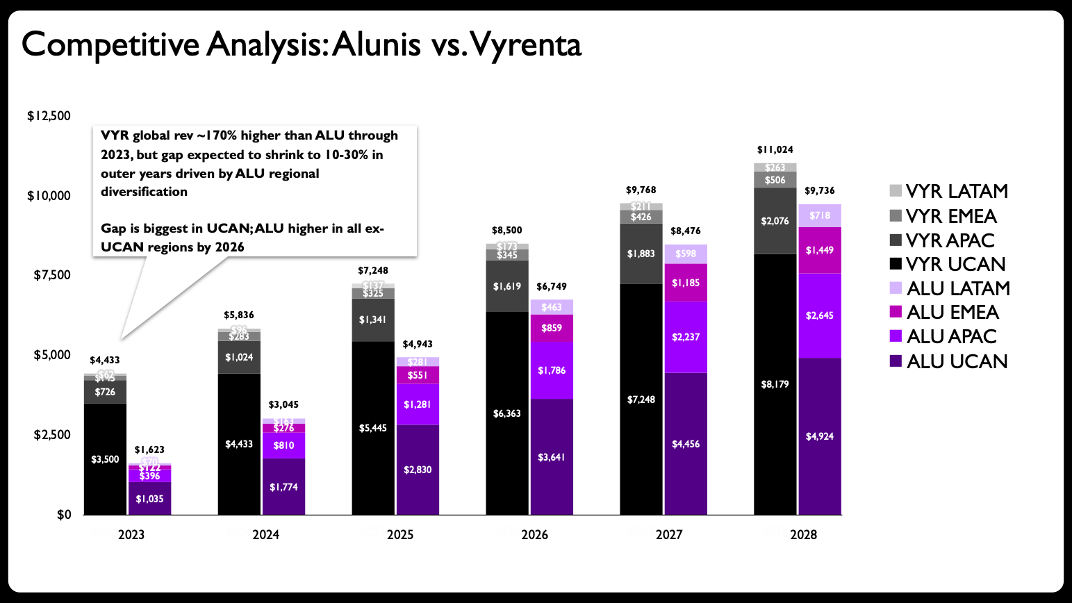
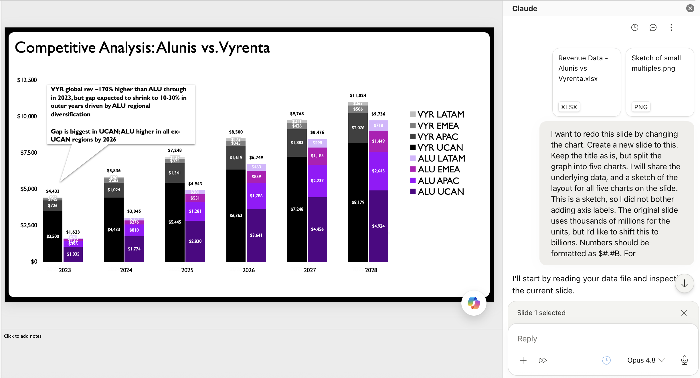
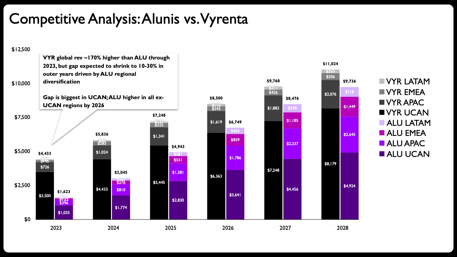
A recent client project provided an ideal and practical crucible for testing this burgeoning collaborative approach between human and AI intelligence. The initial slide presented a stacked bar chart that, upon critical review, was attempting to convey an excessive amount of information within a single, visually dense construct. The chart was designed to illustrate how the company, Alunis, strategically aimed to close a projected revenue gap with a leading competitor, Vyrenta, through targeted regional expansion over a specific timeframe. The accompanying caption, which stated, "Vyrenta’s early revenue lead narrows by 2028 as Alunis expands outside UCAN. Figures in USD bn. Sample data, not actual financials," further underscored the chart’s ambitious and multi-faceted communicative goals.
Upon critical evaluation, the primary issue with the original stacked bar chart became immediately evident: it was suffering from a common ailment in data visualization – attempting to perform too many communicative functions simultaneously. Specifically, it sought to simultaneously communicate three distinct and complex data relationships:
- Change over time: Tracking dynamic revenue trends and trajectories across multiple years.
- Company comparison: Benchmarking the performance of Alunis directly against its top competitor, Vyrenta.
- Regional composition: Detailing each company’s revenue breakdown by individual geographic area (UCAN, APAC, EMEA, and LATAM).
This multi-faceted objective imposed a significant and often unmanageable cognitive load on the audience. Stacked bar charts, while inherently useful for illustrating part-to-whole relationships at a single, static point in time, rapidly become cumbersome and cognitively demanding when the goal is to compare individual segments across multiple bars or to discern clear trends over time for specific categories. For example, accurately tracking Alunis’s revenue growth trajectory in the APAC region from one year to the next, or directly comparing it to Vyrenta’s APAC revenue, would necessitate a laborious mental deconstruction of the stacked segments, a task that fundamentally detracts from immediate understanding and swift comprehension. This scenario perfectly illustrates one of the cardinal rules of effective data visualization, as often emphasized in authoritative resources like Edward Tufte’s principles of graphical excellence, Stephen Few’s work on information design, and the "Storytelling with Data" philosophy, which consistently identifies "adding too much to one graph" as a prevalent and detrimental mistake. The fundamental principle advocating for clarity dictates that each visual should ideally convey a clear, singular message, or a closely related set of messages that can be effortlessly parsed by the audience.
The initial and arguably most crucial strategic step in the makeover process, therefore, was to disaggregate the complex, interwoven information. This meant abandoning the overloaded stacked bar chart in favor of a series of simpler, more focused, and analytically precise visuals. This strategic decision, deeply rooted in foundational data visualization principles and an understanding of human perception, was a testament to the enduring necessity of astute human judgment in guiding the visualization process, even within an increasingly AI-augmented environment. The objective was to simplify, clarify, and enhance the communicative impact by distributing the information across multiple, purpose-built charts.
A Collaborative Workflow: Sketching, Prompting, and Refining with AI
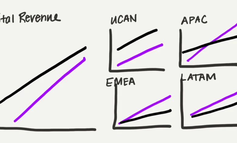
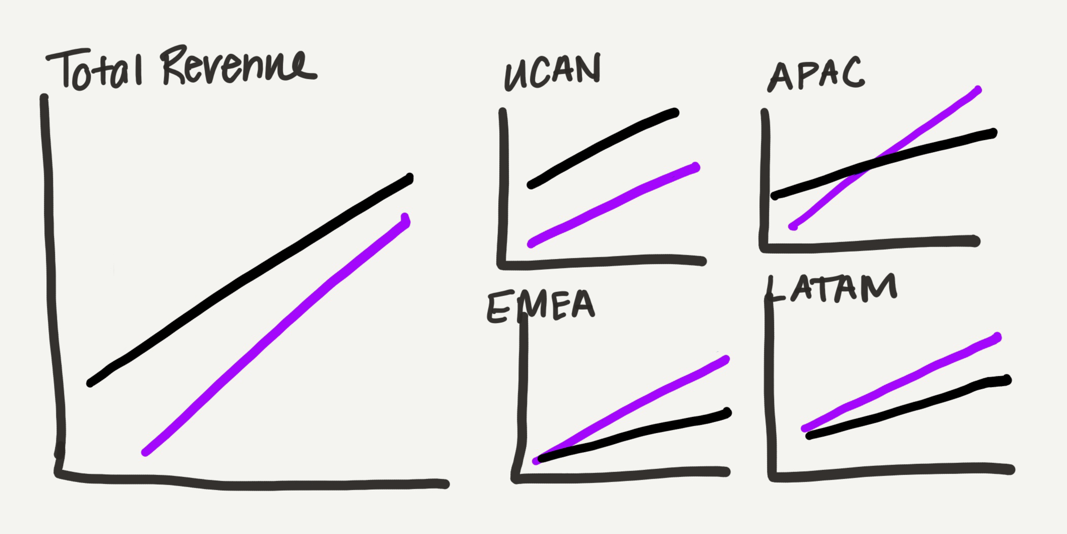
With the strategic decision firmly made to disaggregate the original chart into multiple, more digestible components, the next critical phase involved translating this conceptual overhaul into a tangible and actionable design. The author, adhering to a personal and effective preference for iterative ideation, began by creating a rough, hand-drawn sketch of the proposed multi-chart layout. This preliminary sketch envisioned a series of line graphs, which inherently offer a lighter visual footprint compared to bar charts—a distinct advantage when presenting a large volume of data within the confines of a single slide. The design strategically segmented the data by location: one larger, overarching graph dedicated to total revenue, and four smaller, equally sized graphs, each representing a specific geographic region (UCAN, APAC, EMEA, and LATAM). This deliberate arrangement, where the total view occupied the same visual space as the four regional charts combined, subtly and effectively communicated the inherent part-to-whole relationship of the data, adding a nuanced layer of depth to the overarching narrative.
In a pre-AI era, the manual creation of these five individual graphs within presentation software like Microsoft PowerPoint would have been an arduous, time-consuming, and mentally draining endeavor. It would have demanded significant patience, meticulous attention to detail, and considerable mental energy to ensure absolute accuracy, consistency across charts, and a coherent aesthetic. However, for this project, the author opted for a cutting-edge collaborative approach, strategically leveraging the burgeoning capabilities of artificial intelligence.
The chosen AI tool for this specific workflow was Claude for PowerPoint, an innovative add-in that seamlessly integrates advanced AI functionalities directly into Microsoft’s ubiquitous presentation software. This particular tool was favored due to its critical ability to generate editable charts native to PowerPoint, a feature deemed absolutely essential for maintaining full design control and enabling subsequent, detailed human refinement. While other prominent AI tools like Microsoft CoPilot and OpenAI’s ChatGPT also offer chart generation capabilities, the author noted less consistent success with their output in terms of true editability, particularly with CoPilot. For users of Google Slides, a comparable option is available through Google’s Gemini AI, indicating a clear and accelerating trend toward AI-powered chart creation across all major office productivity suites.
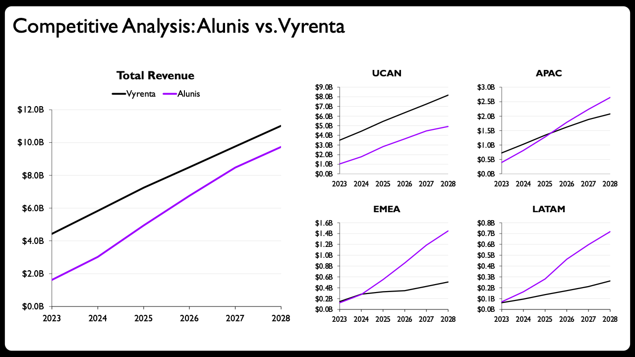
The prompt provided to Claude was designed to be concise yet comprehensively informative, combining the structured data with the explicit visual guidance from the hand-drawn sketch. The author uploaded the relevant data file alongside the visual sketch, instructing Claude to "rebuild the chart from the uploaded data and hand-drawn layout sketch." This clear, dual-input directive enabled the AI to accurately understand both the underlying data relationships and the desired visual arrangement and stylistic preferences.
Claude’s initial output was immediately recognized as a significant and marked improvement over the original, problematic stacked bar chart. It successfully generated a series of editable native PowerPoint charts, faithfully adopting the small multiples layout as sketched, complete with appropriately scaled axes and clearly legible labels. This initial AI-driven generation bypassed the most tedious and time-consuming aspect of manual chart creation, delivering a robust, functional starting point that was already a substantial leap forward in terms of clarity and communicative potential. The ability to generate these charts directly within PowerPoint, rather than as static, uneditable images, was identified as a transformative feature, fulfilling the author’s primary requirement for an effective and truly collaborative AI partnership: full and unhindered editability.
The Irreplaceable Value of Human Refinement
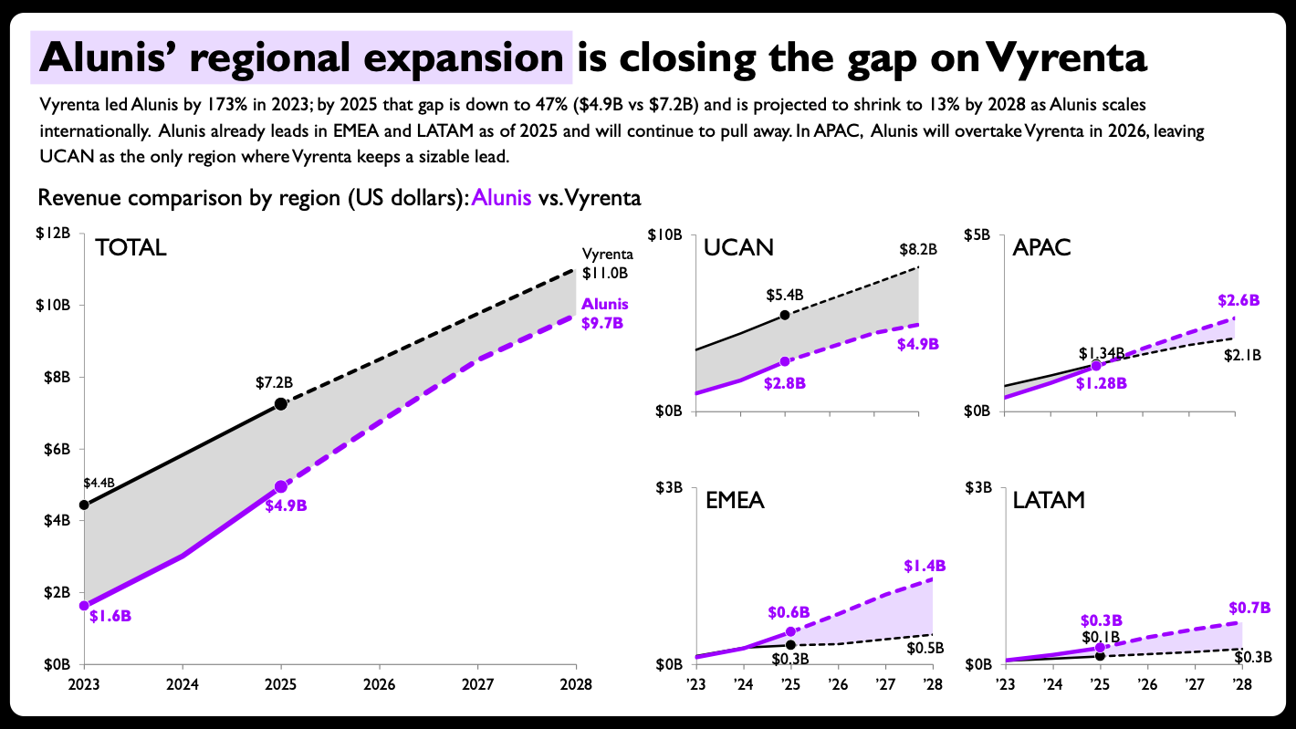
While Claude’s AI-generated output provided an undeniably strong and efficient foundation, the author emphasized that for a professional data storyteller, it was merely the initial canvas—a starting point from which to craft a masterpiece. The human element remained absolutely crucial for elevating the visualization from merely "decent" to "publication-ready," highly impactful, and strategically effective. The author identified several key, nuanced tweaks that eloquently demonstrate the irreplaceable value of human judgment, sophisticated aesthetic sensibility, and a deep, empathetic understanding of the audience’s cognitive processes. These critical refinements included:
-
Shaded Areas Between Lines: In the final, refined design, the space between the two company lines (Alunis and Vyrenta) was subtly but powerfully shaded. This deliberate design choice dramatically enhances the visual comparison, immediately highlighting the magnitude of the revenue gap and, more importantly, how it dynamically evolves over time. Without this shading, the audience might primarily focus on individual line trajectories, whereas the shaded area visually emphasizes the difference—which constitutes the core message of Alunis strategically closing the competitive gap. This is a nuanced visual cue that AI, without explicit instruction on narrative emphasis, might not automatically generate.
-
Direct End-of-Line Labels with Values: Instead of relying solely on a legend and generic axis labels, the final charts incorporated direct, prominent labels at the end of each line, displaying the final projected revenue figures. This eliminates the need for the audience to repeatedly scan back and forth between the lines, the legend, and the y-axis, significantly reducing cognitive effort and accelerating comprehension. It directly answers the crucial "what’s the current/final value?" question at a mere glance, streamlining information absorption.
-
Per-Panel Axis Ranges Scaled to Each Region: Crucially, the author made a deliberate and informed decision to strategically break the conventional rule of consistent axis scales across small multiples for the regional charts. While the overall total revenue chart maintained a broader, encompassing scale, each individual regional chart’s y-axis was scaled independently to the specific data range within that particular region. This deliberate decision allows for dramatically clearer visibility of trends and differences within each region, which would otherwise be severely obscured if a single, overarching, and potentially disparate scale were applied (especially if some regions have significantly lower revenue figures than others). The author’s explicit reinforcement of this "deliberate design decision" profoundly underscores the indispensable human judgment required to know when to intelligently bend or break conventional rules for greater clarity and impact—a level of contextual understanding and strategic foresight that current AI models inherently lack.
-
Solid-versus-Dashed Lines for Actuals vs. Projections: The critical distinction between historical data (actuals) and future forecasts (projections) was visually communicated using different line styles—solid lines for actuals and dashed lines for projections. This immediately informs the audience about the nature and veracity of the data they are viewing, adding a vital layer of transparency and analytical rigor without requiring additional explanatory