The AI-Human Partnership in Data Storytelling: Accelerating Visualization While Preserving Human Insight

Professionals across various sectors are currently engaged in a real-world experiment, integrating artificial intelligence into their daily workflows. A significant area of exploration is data storytelling, where the confluence of human creativity and AI-powered automation is redefining efficiency and output quality. This evolving partnership suggests that AI can effectively handle the tedious, time-consuming aspects of data visualization, thereby liberating human experts to concentrate on strategic thinking, design refinement, and the overarching narrative. The key to this successful collaboration, as demonstrated in recent applications, lies in the AI’s ability to produce editable outputs that allow for critical human intervention and enhancement.
The Evolving Landscape of Data Storytelling and AI Integration

In an increasingly data-driven world, the ability to not just present data, but to craft compelling narratives around it, has become a critical business competency. Data storytelling transforms raw numbers into actionable insights, guiding decision-making and fostering understanding across organizations. However, this process has traditionally been labor-intensive, often requiring professionals to spend considerable time on manual chart creation, data manipulation, and meticulous formatting.
The advent of advanced artificial intelligence, particularly generative AI models, has introduced a transformative element into this landscape. While early AI tools offered prescriptive analytics or automated basic data cleaning, the latest generation can generate complex content, including sophisticated data visualizations, almost instantaneously. This represents a paradigm shift, moving beyond mere automation to intelligent assistance in creative and analytical tasks. According to a recent Gartner survey, over 70% of organizations anticipate deriving significant business value from generative AI within the next 18 to 24 months, underscoring its rapid integration into core business functions. Similarly, reports from McKinsey indicate that AI-powered tools could automate up to 40% of data analysis tasks, potentially saving professionals hundreds of hours annually and redirecting their efforts toward higher-value activities.
The "Real-World Experiment": A Professional’s Perspective
A data storytelling professional recently articulated their ongoing experience with AI in the workplace, highlighting a clear delineation between enjoyable, creative tasks and those that are monotonous but necessary. The professional expressed a genuine affinity for the creative nuances of data visualization, such as refining alignment, experimenting with color palettes, and sketching initial ideas. These steps, often perceived as ancillary, are crucial for fostering innovative solutions and improving the final presentation’s effectiveness.
Conversely, the manual construction of each chart from scratch or the laborious manipulation of Excel data to produce non-standard visualizations were identified as tasks that rarely contribute to deeper analytical insights. These are the components of the workflow that the professional would gladly delegate to AI, provided that the final design remains under human control. The rationale is clear: every minute saved from manual chart creation is a minute gained for pondering the underlying story, optimizing design choices, and ensuring the message resonates with the audience. This perspective aligns with broader industry trends; a poll by Tableau revealed that data professionals often dedicate up to 60% of their time to data preparation and basic visualization, tasks that are prime candidates for AI augmentation.
Case Study: Redesigning a Complex Data Visualization
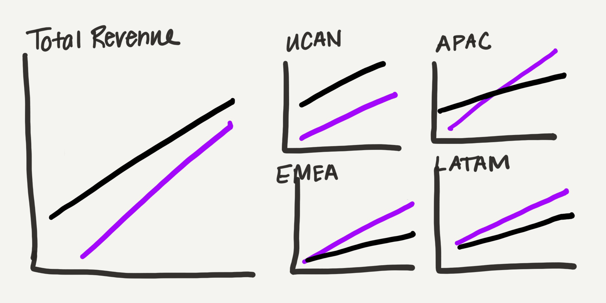
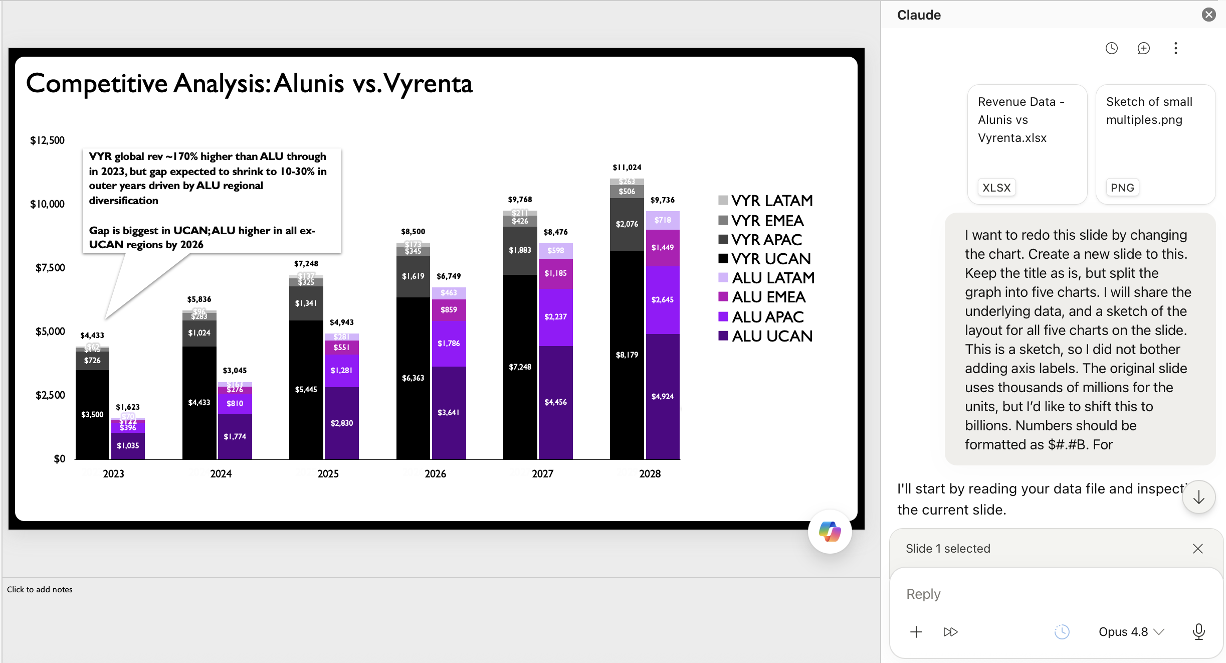
A recent client project presented an ideal opportunity to test this collaborative approach with AI. The original visualization, a stacked bar chart, was tasked with conveying too much information simultaneously. Its objective was to illustrate how a company, Alunis, aimed to close a revenue gap with a key competitor, Vyrenta, through regional expansion over time. The chart attempted to communicate temporal change, inter-company comparison, and regional revenue composition—a significant burden for a single visual. This scenario is a classic example of a common data visualization pitfall: overloading a single graph, a mistake frequently highlighted in data storytelling literature.
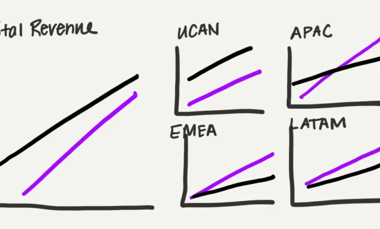
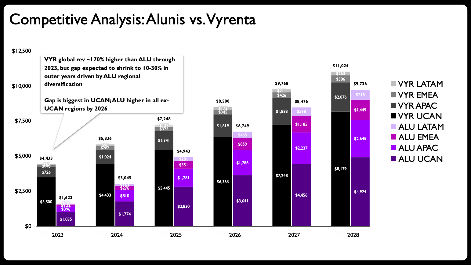
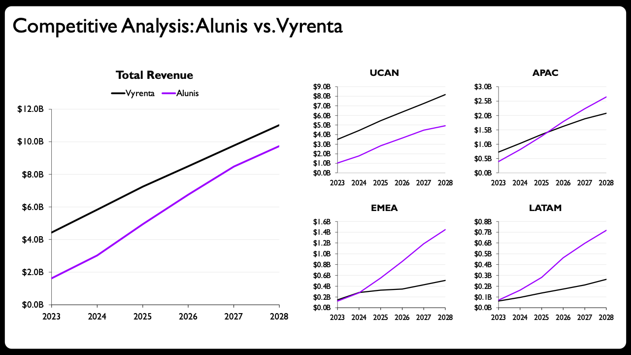
The initial human-led strategy involved dissecting the overly complex chart into multiple, more focused visualizations. The professional opted for line charts, which offer a lighter visual footprint and are more suitable for depicting trends over time. The redesign proposed a layout featuring one larger chart for total revenue and four smaller charts, each representing a specific region (UCAN, APAC, EMEA, and LATAM). This arrangement subtly communicates the part-to-whole relationship of the data, with the aggregate view prominently displayed alongside its regional components.
Before AI tools became sufficiently advanced, this multi-chart creation process would have been a protracted and mentally draining exercise in PowerPoint. However, leveraging Claude for PowerPoint, an add-in released earlier this year, streamlined the execution phase dramatically. The professional provided Claude with a hand-drawn sketch of the desired layout and the raw data. This prompt effectively guided the AI to generate the initial set of charts. The crucial factor here was Claude’s ability to produce editable charts directly within PowerPoint, which is essential for maintaining human oversight and facilitating further refinement. While other tools like Microsoft CoPilot and ChatGPT also offer chart generation, the quality and editability of their outputs can vary, making the choice of AI tool critical for a seamless workflow. Gemini also provides similar capabilities for Google Slides, indicating a broader industry trend toward integrated, editable AI visualization.
The output from Claude was a significant improvement over the original stacked bar chart. It successfully translated the hand-drawn sketch into a series of native PowerPoint line charts, complete with appropriate axes and labels, adopting the small-multiples layout. For many, this AI-generated starting point, perhaps with a revised slide title and some additional descriptive text, would be considered a complete makeover.
Beyond Automation: The Indispensable Human Element
However, for a seasoned data storytelling professional, the AI’s output serves as a robust foundation, not the final product. The true value of human expertise emerges in the subsequent refinement phase, where subtle yet impactful tweaks elevate the visualization to an exceptional standard. While the original article doesn’t list the specific "three easy tweaks," these typically involve:
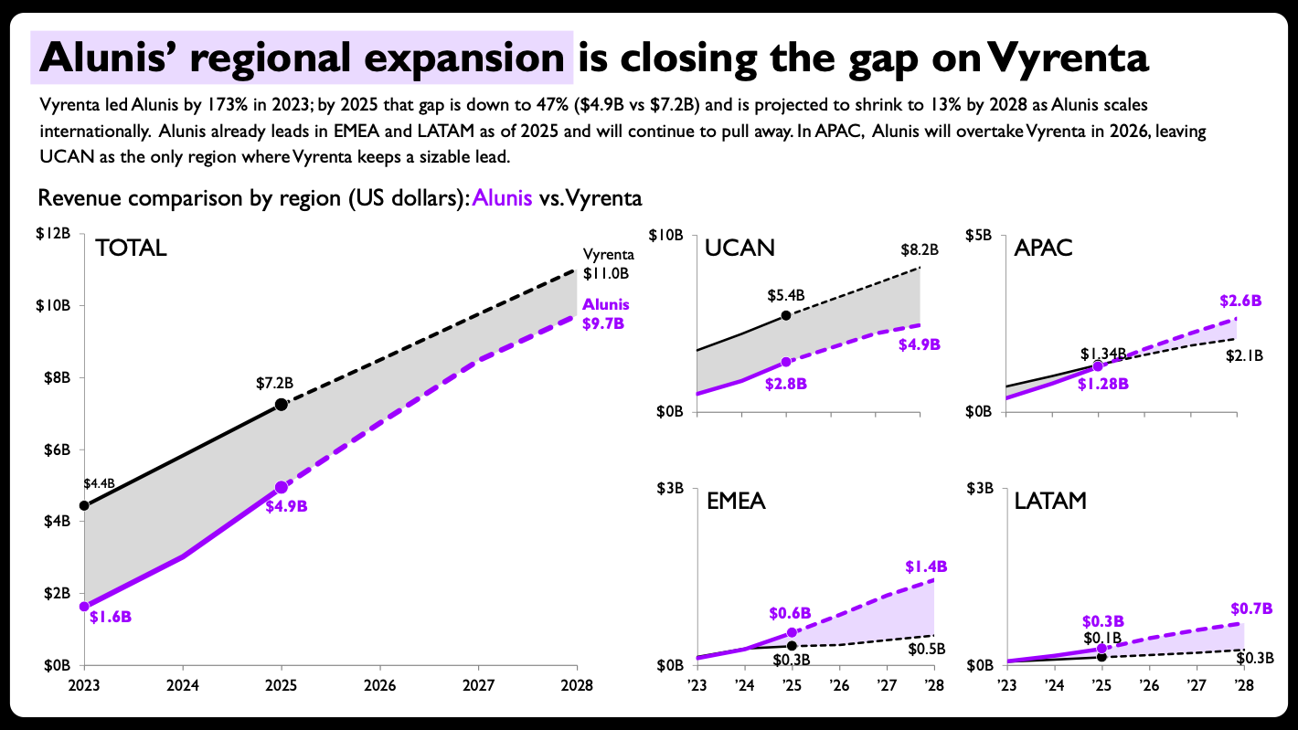
- Enhancing Clarity and Readability: This includes optimizing fonts, colors, and line weights; adding direct labels to data points rather than relying solely on legends; and ensuring consistent, intuitive formatting across all charts. For instance, the final design might introduce shaded areas between lines to highlight the gap between companies or use solid versus dashed lines to differentiate actual data from projections.
- Optimizing Visual Hierarchy and Focus: Strategically adjusting the size and placement of elements to draw the audience’s attention to the most critical insights. This might involve scaling axis ranges on smaller regional panels to maximize detail pertinent to that region, even if it breaks the convention of consistent scales across all panels, a deliberate design choice to reinforce specific regional narratives.
- Adding Contextual Annotations and Narrative Elements: Integrating textual explanations, callouts, and summary statements directly onto the charts to guide the viewer through the data story, reinforcing key takeaways that AI might not infer. This ensures the audience grasps the "why" and "so what" behind the data.
The final redesigned visualization, incorporating these human-driven enhancements, showcases a powerful synergy. The lines are clearly differentiated, end-of-line labels with precise values facilitate quick comprehension, and the thoughtful scaling of axes in regional charts allows for granular insights. The use of distinct line styles for actuals versus projections adds another layer of clarity. This level of nuanced design thinking, aimed at maximizing interpretability and impact, remains firmly within the human domain.
Broader Implications for Data Professionals and Businesses
The successful integration of AI into data storytelling workflows carries profound implications for both individual professionals and organizations.
- Boosted Productivity and Efficiency: By automating the mundane aspects of chart creation, AI allows data analysts and storytellers to process more data, explore more hypotheses, and iterate on visualizations at an unprecedented pace. This translates into faster insights and quicker decision-making cycles for businesses.
- Shifting Skill Sets: The demand for manual chart-building proficiency may decrease, but the need for critical thinking, design acumen, and "prompt engineering" skills will skyrocket. Data professionals will become curators and directors of AI, focusing on defining the problem, interpreting the output, and injecting the human elements of empathy and narrative. They must understand foundational data visualization principles to effectively evaluate and refine AI-generated content.
- Democratization of Data Visualization: AI tools can lower the barrier to entry for creating sophisticated visualizations. Non-experts or those new to data storytelling can leverage AI to produce initial charts, helping them overcome the steep learning curve associated with traditional tools. This empowers a broader range of employees to engage with data and contribute to data-driven discussions.
- Enhanced Focus on Strategic Storytelling: With the mechanical aspects handled by AI, human professionals can dedicate more time to understanding the audience, identifying the core message, and crafting a compelling narrative that resonates emotionally and intellectually. This elevates data storytelling from a technical task to a strategic art form.
However, this partnership is not without its considerations. Ethical concerns surrounding data privacy, potential biases in AI models, and the risk of "AI hallucinations" (generating factually incorrect information or visuals) necessitate robust human oversight and governance frameworks. The data professional’s role evolves to include not only design and narrative but also critical validation and ethical stewardship of AI-generated content.
Conclusion
The "real-world experiment" with AI in data storytelling emphatically demonstrates that the most effective approach is a collaborative one. AI acts as a powerful accelerator, handling the repetitive, labor-intensive tasks of chart generation with impressive speed and accuracy. However, it is the indispensable human element—the judgment, the nuanced design decisions, the understanding of context, and the ability to craft a compelling narrative—that truly transforms data into impactful stories. The critical factor making this partnership viable is the AI’s capability to produce editable output, allowing humans to remain firmly in the driver’s seat, guiding the creative process and ensuring the final product meets the highest standards of clarity, accuracy, and persuasive power. This hybrid model not only enhances productivity but also elevates the most enjoyable and strategic aspects of data storytelling, positioning AI as an invaluable augmenter, not a replacement, for human ingenuity.