Strategic Communication: The Imperative of Clarity in Corporate Presentations and Its Impact on Decision-Making

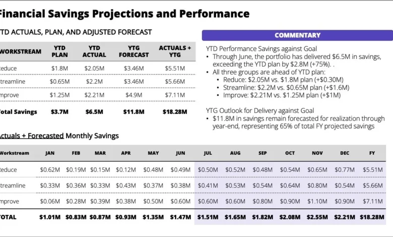
The landscape of modern corporate communication is frequently marred by a pervasive challenge: the creation and delivery of presentations that, despite containing crucial information, fail to convey their core message effectively. This often leads to a disconnect between the presenter’s intent and the audience’s comprehension, transforming what should be a focused discussion into a tedious exercise in deciphering complex data. A common scenario involves a standalone slide, laden with data and bullet points, offering context but obscuring the central takeaway. The consequence is a requirement for the reader to exert undue effort to identify what truly matters and why, undermining the very purpose of strategic communication.
In a fast-paced business environment, leaders are increasingly time-constrained. A strong pre-read document should ideally equip them with sufficient information to arrive at a meeting informed and prepared for substantive discussion, rather than forcing them to scan through dense tables and text during the session itself. The friction created by poorly designed slides is even more pronounced in a live setting. Presenting busy tables and extensive bulleted text simultaneously forces attendees to split their attention between reading the screen and actively listening to the speaker. Even if the audience has reviewed the material in advance, the sheer volume of information displayed concurrently often prompts them to hunt for specific details as the presenter speaks, diverting their focus from the overarching message and hindering genuine engagement. Research consistently shows that human attention spans are finite, with studies from Microsoft indicating that the average attention span has decreased significantly in recent years, making the guided revelation of information—presenting one idea at a time—a far more effective strategy for live delivery than overwhelming the audience with everything at once.
The Hidden Costs of Communication Friction
The ramifications of ineffective presentation design extend far beyond mere inconvenience; they represent tangible costs to organizations. According to a 2019 report by Atlassian, an average employee spends over 31 hours per month in unproductive meetings, translating into significant financial losses for businesses globally. When presentations are unclear, meetings often run over schedule, require follow-up sessions for clarification, or result in decisions based on incomplete or misinterpreted information.
- Wasted Time and Resources: Unproductive meetings are a drain on organizational resources. Each participant’s time carries a cost, and when that time is spent deciphering rather than discussing, it’s a direct loss. A typical executive meeting, involving several high-salaried individuals, can cost hundreds or even thousands of dollars per hour. If 20-30% of that time is lost due to communication friction, the financial impact quickly escalates.
- Delayed Decision-Making: Ambiguity in critical data presentations leads to hesitation and delayed strategic decisions. When the core message of a slide—such as year-to-date performance being ahead of plan but significant work remaining to achieve the forecast—is buried, leaders cannot swiftly assess risks, allocate resources, or approve actions. This delay can result in missed market opportunities, increased project costs, or a failure to address emerging challenges promptly.
- Employee Disengagement and Morale: The constant struggle to extract meaning from dense, poorly structured slides can lead to attendee frustration and disengagement. When participants feel their time is being wasted, their morale can suffer, impacting overall productivity and job satisfaction. This "meeting fatigue" can permeate the corporate culture, making employees dread mandatory sessions rather than view them as opportunities for collaboration and progress.
- Misaligned Strategic Execution: Perhaps the most critical implication is the potential for strategic misalignment. If the main action required—such as reiterating priorities, focusing on specific workstreams, and escalating blockers—is not explicitly and compellingly communicated, teams may diverge in their efforts. This lack of clarity on strategic imperatives can lead to resources being misallocated, initiatives losing momentum, and ultimately, a failure to achieve organizational goals.
Understanding the Science of Attention and Cognition
The effectiveness of a presentation is deeply rooted in principles of cognitive psychology. Human brains are not designed to process vast amounts of unstructured information simultaneously, especially under time pressure.
- Cognitive Load Theory: This theory posits that our working memory has a limited capacity. When a presentation overloads this capacity with excessive text, complex visuals, or multiple unrelated points, cognitive load becomes high, hindering the processing and retention of information. A busy slide with numerous tables and bullet points forces the audience to engage in "extraneous cognitive load"—effort spent processing irrelevant or poorly presented information—rather than "germane cognitive load," which is the effort applied to understanding the core message.
- Attention Spans and Multitasking Fallacy: While many believe they can multitask effectively, neuroscience suggests that true multitasking is largely a myth. Instead, individuals rapidly switch their attention between tasks, incurring a "switching cost" that reduces efficiency and comprehension. In a live presentation, when an audience attempts to read detailed text on a screen while simultaneously listening to the presenter, they are not doing both effectively; they are constantly switching, diminishing both reading comprehension and auditory processing.
- The Primacy of Visuals: The human brain processes visual information significantly faster than text. According to some estimates, visuals are processed 60,000 times faster than text. Yet, many corporate presentations remain text-heavy, failing to leverage the brain’s natural inclination for visual learning. When visuals are used, they are often complex charts or graphs that require extensive interpretation, rather than clear, simple representations of key data points.
- The "Curse of Knowledge": Presenters, being experts in their subject matter, often suffer from the "curse of knowledge," assuming their audience possesses the same background, context, and understanding. This leads to the omission of critical explanatory steps or the presentation of information without sufficient scaffolding, making it impenetrable for those less familiar with the topic.
The Evolution of Presentation Best Practices: A Chronology
The journey towards effective presentation design has evolved significantly over the past few decades, driven by technological advancements, psychological insights, and the increasing demand for efficiency in corporate settings.
- Early Days (1980s-1990s): The Rise of PowerPoint and Information Overload: With the advent of presentation software like Microsoft PowerPoint, there was an initial tendency to treat slides as digital documents. This led to a proliferation of text-heavy slides, often featuring small fonts, dense paragraphs, and numerous bullet points. The focus was on "getting all the information in," rather than on clear communication. Slides became a crutch for presenters, often read verbatim, contributing to audience disengagement.
- The "Death by PowerPoint" Era (Late 1990s-Early 2000s): As the pitfalls of text-heavy presentations became evident, the phrase "Death by PowerPoint" entered the corporate lexicon. This period saw a growing frustration with poorly designed slides that obscured messages and prolonged meetings. Critics, including figures like Edward Tufte, highlighted the cognitive burden and analytical poverty imposed by typical PowerPoint slides.
- The Shift to Visual Storytelling (Mid-2000s-2010s): Influenced by design principles and communication experts, a paradigm shift began. The emphasis moved from slides as "documents" to slides as "visual aids" that support a narrative. Concepts like "less is more," the use of high-quality images, and minimalist design gained traction. Presenters were encouraged to focus on one core idea per slide and use visuals to reinforce, not replace, their spoken message. The rise of TED Talks played a significant role in popularizing this approach, demonstrating the power of concise, visually engaging storytelling.
- Data Visualization and Guided Narratives (2010s-Present): The current era emphasizes sophisticated data visualization techniques, allowing complex data to be presented clearly and concisely. Furthermore, the understanding that live presentations require a guided narrative has become paramount. This involves carefully sequencing information, using animation deliberately to reveal points, and tailoring content explicitly for either a pre-read or a live delivery scenario. The goal is to maximize engagement, comprehension, and actionable outcomes.
Starting with Purpose: The Foundation of Effective Design
The core principle for improving presentation design, as highlighted by leading communication consultants and business strategists, is to "start with the purpose." Being specific about the situation at hand dramatically enhances design efficacy. Before even contemplating slide layouts or visual elements, presenters must ask fundamental questions:
- What does this slide (or presentation) need to achieve? Is it to inform, persuade, educate, or solicit a decision? For the client’s specific challenge mentioned, the objective was multifaceted: to inform leaders of current performance, highlight a looming gap to the forecast, and drive specific actions (reiterate priorities, focus on workstreams, escalate blockers).
- Who is the audience? What is their prior knowledge, their level of seniority, their vested interests, and their likely concerns? A presentation for a technical team will differ significantly from one for a board of directors. Leaders, in particular, require concise, high-level summaries that quickly convey impact and required action.
- In what setting will it be used? Is it a pre-read document, a live presentation, or a combination? The design constraints and opportunities for each setting are distinct. A pre-read needs to be self-sufficient and comprehensive, while a live presentation leverages the presenter’s voice and pacing to guide attention.
Once these foundational questions are answered, shaping the narrative and choosing the appropriate format becomes significantly easier. Articulating the goal helps determine what content stays, what is removed, and how to structure the narrative for each specific situation.
The Live Delivery Imperative: Guiding Attention, Not Dividing It
Let’s consider the live delivery scenario first, as it presents unique challenges and opportunities. When presenting in person, the presenter controls the pacing and the flow of information. Therefore, there is no need to cram every single detail onto a single view. Instead, the content should be broken down into a deliberate sequence, where each slide supports a specific point, building the narrative incrementally. This approach prevents cognitive overload and ensures the audience’s attention is always directed to the most relevant piece of information at any given moment.
For the client’s scenario, where the overall message was that "although year-to-date performance is ahead of plan, a lot of work remained to achieve the forecast, and the main action was to reiterate priorities, focus on three workstreams, and quickly escalate any blockers to achieving projected savings," a fragmented, sequential approach would be far more effective than a single, dense slide.
Here is how the same information could be strategically progressed for a live audience:
- Slide 1: The Executive Summary (The Core Message)
- Headline: "YTD Performance Strong, But Forecast Requires Urgent Action."
- Key takeaway: A concise, impactful statement immediately communicating the critical tension. This sets the stage and prepares the audience for the details that follow. Visuals might include a simple, bold indicator for YTD performance (green check) and another for forecast risk (red exclamation).
- Slide 2: The Positive Context (Year-to-Date Performance)
- Headline: "Solid Year-to-Date Performance Exceeds Plan."
- Content: A clean, easy-to-read chart or simplified table highlighting the specific metrics where YTD performance is ahead of plan. Avoid excessive detail; focus on the key numbers that validate the "ahead of plan" statement. The presenter provides the narrative explanation.
- Slide 3: The Challenge Ahead (Gap to Forecast)
- Headline: "Significant Gap Remains to Achieve Full-Year Forecast."
- Content: A visual representation (e.g., a waterfall chart or a gap analysis graph) clearly illustrating the difference between current trajectory and the required forecast. Quantify the "lot of work" remaining in tangible terms (e.g., "X% increase needed," "Y additional savings required"). This slide directly addresses the "but a lot of work remained" aspect.
- Slide 4: Strategic Imperatives (Reiterating Priorities)
- Headline: "Refocusing on Three Core Workstreams for Forecast Achievement."
- Content: Introduce the three key workstreams, each with a brief, clear descriptor. This could be presented as three distinct boxes or icons that appear sequentially as the presenter discusses each one. This addresses the need to "reiterate the priorities to ensure the team remained focused."
- Slide 5: Call to Action (Escalating Blockers)
- Headline: "Proactive Escalation: Removing Obstacles to Savings."
- Content: A direct, unambiguous call to action emphasizing the need to "quickly escalate any blockers to achieving the projected savings." This could be a simple, bold statement with an associated icon representing speed or problem-solving. This slide ensures the main action is clearly articulated and understood.
This sequential approach ensures that the audience’s attention is deliberately guided from the overarching problem to the specific details, then to the required actions. Each slide builds upon the last, allowing for a coherent narrative flow and preventing cognitive overload.
Broader Impact and Implications for Corporate Success
Adopting these principles of intentional design and sequential presentation has profound implications for organizational effectiveness:
- Enhanced Strategic Alignment: When critical information is communicated clearly and actions are explicitly defined, all stakeholders gain a unified understanding of objectives, challenges, and priorities. This fosters better cross-functional collaboration and ensures that efforts are aligned towards common strategic goals.
- Accelerated Decision-Making: With information presented in a digestible and actionable format, leaders can make informed decisions more rapidly and confidently. This agility is crucial in dynamic markets where quick responses can be a competitive advantage.
- Increased Meeting Productivity: By transforming meetings from information-dumping sessions into focused discussions, organizations can significantly boost productivity. Engaged participants contribute more effectively, leading to more robust outcomes and a reduction in the need for follow-up meetings.
- Empowered Presenters: Presenters who master these techniques become more confident and impactful communicators. They move from simply "reporting" data to "storytelling" with data, influencing their audience more effectively and solidifying their leadership presence.
- A Culture of Clarity and Accountability: When clarity in communication becomes an organizational norm, it cultivates a culture of precision and accountability. Expectations are clearer, responsibilities are better understood, and the collective effort is more directed and efficient.
In conclusion, the practice of effective presentation design is not merely an aesthetic choice; it is a strategic imperative. In an era of information overload and relentless demands on executive attention, the ability to distil complex information into clear, actionable messages is a cornerstone of organizational success. By starting with purpose, understanding cognitive principles, and meticulously guiding the audience through a narrative, businesses can transform their presentations from sources of friction into powerful tools for strategic alignment, swift decision-making, and sustained growth. The investment in clearer communication yields substantial returns in productivity, morale, and ultimately, the achievement of critical business objectives.