Optimizing Executive Engagement: Crafting Presentations for Clarity and Action in the Modern Corporate Landscape

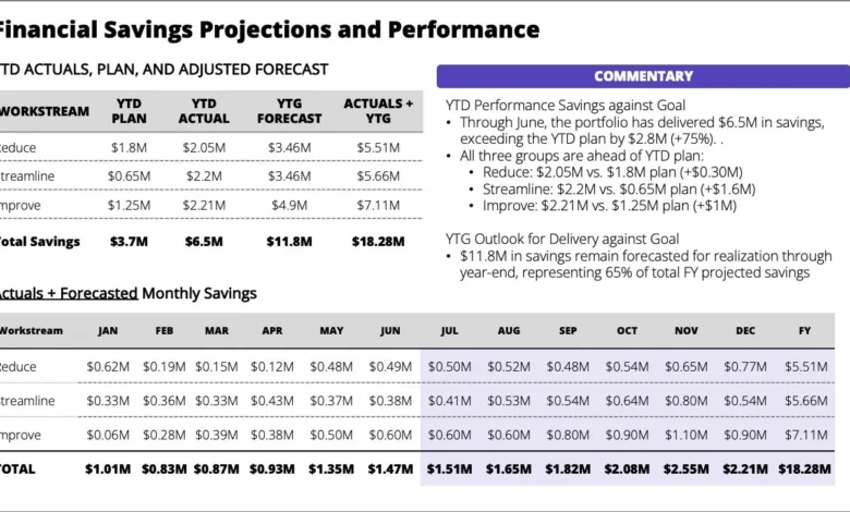
The landscape of corporate communication is undergoing a profound transformation, driven by an accelerating pace of business and an ever-increasing demand for executive attention. In this environment, the traditional approach to presenting information, often characterized by dense, multi-faceted slides, is proving increasingly ineffective. What might appear as a comprehensive standalone slide, packed with commentary and data, frequently falls short of its primary objective: to convey a clear, actionable message efficiently. Instead, it often compels the audience to expend valuable cognitive effort simply deciphering its contents, a process that detracts from engagement and impedes informed decision-making. This fundamental challenge highlights a critical need for a strategic re-evaluation of how information is prepared and delivered, particularly in high-stakes corporate settings where leaders require immediate clarity and direction.
The Cognitive Load Challenge in Corporate Presentations
Contemporary research into cognitive psychology underscores the limitations of human attention and working memory. When confronted with a dense slide containing numerous tables, bullet points, and embedded text, an audience member’s cognitive load significantly increases. This mental burden is compounded in a live setting, where individuals are forced to simultaneously process visual information on a screen and auditory information from a presenter. This dual-channel overload creates immediate friction, disrupting the flow of communication and diminishing comprehension. Studies by institutions like the Harvard Business Review frequently cite that executives spend upwards of 23 hours per week in meetings, with a significant portion of this time perceived as unproductive due to unclear communication and poorly structured presentations. The average executive attention span is often cited as being remarkably short, sometimes as little as eight seconds, emphasizing the critical need for immediate impact and crystal-clear messaging.
Even when slides are provided as pre-read materials, the issue of clarity persists. Without a strong narrative arc or explicit guidance on key takeaways, readers are left to sift through data, struggling to identify what truly matters and why. This often results in leaders arriving at meetings underinformed, compelled to scan documents in real-time rather than engaging in productive discussion. The economic implications of inefficient meetings are substantial; estimates from companies like Atlassian suggest that poorly run meetings cost U.S. businesses alone upwards of $37 billion annually. A significant portion of this inefficiency can be attributed to the failure of presentation materials to effectively prepare and guide participants.
Rethinking Presentation Design: The Primacy of Purpose
At the heart of effective presentation design lies a fundamental shift in methodology: starting with purpose. Before any content is drafted or visuals created, the crucial questions must be addressed: What is the slide intended to achieve? Who is the intended audience? And in what specific setting will it be delivered? These seemingly simple inquiries are foundational. By being unequivocally specific about the situation, communicators can dramatically improve design efficacy. The answers dictate what information is essential, what can be omitted, and how the narrative should be structured for maximum impact.
For instance, consider a common corporate scenario: a client needs to communicate that while year-to-date performance is ahead of plan, substantial work remains to achieve the annual forecast. The core message is not simply a status update, but a call to action: reiterate priorities, ensure team focus on three specific workstreams, and establish a clear escalation path for any blockers impeding projected savings. Articulating this goal explicitly clarifies the intent, transforming a mere data dump into a strategic directive. This articulation guides decisions on content inclusion and exclusion, and critically, on how the story should unfold depending on the delivery context.
Tailoring Content for Diverse Delivery Contexts
The delivery context—whether a presentation is a pre-read document or a live, in-person briefing—demands distinct strategic approaches to content structuring and visual design. Conflating these two distinct needs is a common pitfall that undermines communication effectiveness.
The Pre-Read Imperative: Clarity for Independent Consumption
For materials intended as pre-reads, the design philosophy must prioritize self-sufficiency and immediate comprehension. Executives, often reviewing these documents on various devices and under time pressure, require information that is accessible, logically structured, and devoid of ambiguity. This means:
- Executive Summary Upfront: A concise, high-level summary that captures the core message, key findings, and recommended actions should precede all detailed information. This allows leaders to grasp the essence of the document quickly, deciding if deeper engagement is necessary.
- Clear Headings and Navigation: Logical headings, subheadings, and a table of contents (for longer documents) are crucial for navigability. Readers should be able to quickly locate specific sections or data points.
- Standalone Visuals with Explanations: Charts, graphs, and diagrams must be fully labeled and accompanied by concise captions that explain their significance without requiring external commentary. Avoid relying on the presenter to explain visual data in a pre-read.
- Strategic Use of Annotations and Call-Outs: Highlight critical data points, trends, or areas of concern directly within the text or on visuals. This guides the reader’s attention to the most important information, preventing them from having to "hunt for details."
- Action-Oriented Language: Ensure that conclusions and recommendations are phrased clearly and are actionable. What specifically is being requested or proposed? What are the next steps?
- Minimalist Design, Maximum Information Density (Judiciously Applied): While avoiding clutter, pre-reads can tolerate a higher density of information than live slides, provided it is well-organized and clearly signposted. The goal is to provide sufficient detail for informed preparation, without overwhelming the reader.
- Consideration of Asynchronous Review: Recognize that pre-reads are often reviewed outside of a formal meeting setting, sometimes on mobile devices. Design choices should reflect this reality, using readable fonts, appropriate line spacing, and responsive layouts if possible.
Management consultants like McKinsey and Deloitte frequently advocate for "pyramid principle" structuring in pre-read documents, where the main conclusion is presented first, followed by supporting arguments and data. This ensures that even if a reader only skims the first few paragraphs, they still grasp the essential message.
The Live Delivery Advantage: Guiding Attention and Fostering Interaction
In a live presentation, the dynamic fundamentally shifts. The presenter becomes the primary conduit of information, controlling the pacing and the flow of ideas. This allows for a more sequential, focused delivery, where attention is deliberately guided rather than left to wander. The common mistake of cramming every detail onto a single slide, often an attempt to create a "standalone" document, becomes a significant impediment in this setting.
Instead, a live delivery benefits from:
- One Idea Per Slide: This principle is paramount. Each slide should support a single, clear point or a concise piece of data. This minimizes cognitive load and allows the audience to absorb information sequentially. For instance, instead of showing a complex table of performance metrics for an entire year, separate slides could focus on: "Q1 Performance Overview," "Key Drivers of Q2 Success," "Emerging Challenges in Q3," and "Projected Gap to Forecast."
- Visual Simplicity and Impact: Slides should be visually clean, featuring prominent headlines, strong visuals (charts, images), and minimal text. The visual elements should complement the presenter’s narrative, not duplicate it.
- Sequential Revelation: Utilize animation or progressive disclosure features to reveal content gradually. Instead of showing all bullet points at once, reveal them one by one as they are discussed. This keeps the audience focused on the current point and prevents them from reading ahead or getting distracted.
- The Presenter as the Narrative Guide: The presenter’s role is to tell the story, provide context, and connect the dots. The slides serve as visual anchors and reinforcement, not as a complete transcript. This fosters engagement, as the audience listens to the speaker rather than just reading the screen.
- Focus on Discussion and Engagement: By delivering information efficiently and sequentially, more time can be allocated for questions, discussion, and collaborative problem-solving. This shifts the meeting from a passive information download to an active strategic dialogue.
- Strategic Pauses and Transitions: Effective presenters use pauses to allow information to sink in and clear transitions to signal a shift to the next point. This pacing is impossible when a single, dense slide remains static on the screen.
A Practical Application: Reimagining the Performance Update
Let’s revisit the client’s objective: communicating strong year-to-date performance while emphasizing the remaining work to hit the forecast, focusing on three workstreams, and escalating blockers. For a live audience, this message could be broken down into a compelling sequence:
- Slide 1: Title Slide (e.g., "Achieving 2024 Forecast: Progress & Path Forward") – Sets the stage.
- Slide 2: Core Message (e.g., "Strong YTD Performance, Critical Work Ahead to Hit Annual Forecast") – Delivers the overarching takeaway immediately, in bold, clear text.
- Slide 3: YTD Performance Snapshot (e.g., "Year-to-Date Performance: Ahead of Plan") – A simple bar chart or key metric showing positive performance, with a brief, impactful caption.
- Slide 4: The Forecast Challenge (e.g., "Bridging the Gap: Remaining Work to Achieve Full-Year Forecast") – A visual representation of the gap between current trajectory and target, perhaps with a clear numerical difference. This sets up the "why" for the subsequent slides.
- Slide 5: Strategic Priority 1 (e.g., "Workstream 1: Accelerating [Specific Initiative]") – Focuses solely on the first workstream, its current status, and immediate actions.
- Slide 6: Strategic Priority 2 (e.g., "Workstream 2: Optimizing [Specific Process]") – Details the second workstream.
- Slide 7: Strategic Priority 3 (e.g., "Workstream 3: Expanding [Specific Market/Product]") – Details the third workstream.
- Slide 8: Actionable Next Steps (e.g., "Key Action: Escalating Blockers for Timely Resolution") – A clear statement about the need for immediate escalation, perhaps with a visual of a clear reporting channel.
- Slide 9: Call to Action / Discussion (e.g., "Reiterating Priorities & Opening for Discussion") – Reinforces the focus and transitions to Q&A.
This sequential approach respects cognitive limits, maintains audience engagement, and empowers the presenter to guide the narrative effectively. Each slide builds upon the last, culminating in a clear call to action and a readiness for informed discussion.
Broader Implications for Organizational Effectiveness
The implications of adopting a purpose-driven, context-sensitive approach to presentations extend far beyond individual meetings. This paradigm shift can profoundly impact organizational effectiveness across several dimensions:
- Enhanced Decision-Making: Clearer communication leads to better understanding, which in turn facilitates faster and more accurate decision-making. When leaders are well-informed and aligned on priorities, strategic initiatives can progress with greater agility.
- Improved Strategic Alignment: By explicitly stating purpose and guiding attention to key priorities, organizations can foster greater alignment across teams and departments. Everyone understands the "why" and the "what," reducing misinterpretations and duplicated efforts.
- Increased Productivity: Efficient meetings, characterized by clear objectives and focused discussions, save valuable time and reduce the frustration associated with unproductive gatherings. This reclaimed time can be redirected towards core operational and strategic activities.
- Stronger Organizational Culture: A culture that values clarity, efficiency, and respect for others’ time is a healthier, more productive culture. When leaders consistently model effective communication, it sets a positive precedent for the entire organization.
- Empowered Presenters: When presenters are equipped with a clear understanding of their goal and the tools to guide their audience, their confidence and effectiveness increase. This transforms them from information readers into compelling storytellers and facilitators of strategic dialogue.
In an era defined by information overload and constant demands on executive attention, the ability to communicate with precision, clarity, and purpose is no longer merely a desirable skill; it is a strategic imperative. By consciously designing presentations with the specific audience, setting, and desired outcome in mind, organizations can move beyond the pitfalls of information friction, transforming their meetings into powerful engines of insight, alignment, and decisive action. The transition from merely presenting data to effectively communicating a story is not just about aesthetics; it is about fundamentally improving how businesses operate and succeed.