AI Integration Transforms Data Storytelling Workflow, Empowering Human Creativity through Editable Outputs

A recent professional experiment highlights a significant shift in the data storytelling landscape, demonstrating how artificial intelligence tools, particularly those offering editable outputs, are becoming indispensable partners for professionals. The experiment focused on leveraging AI to streamline the laborious process of chart creation, ultimately freeing up human practitioners to concentrate on higher-order tasks such as narrative development, design refinement, and strategic interpretation of data. This collaborative approach suggests a future where AI handles the mechanical, time-consuming aspects of data visualization, while human expertise provides judgment, direction, and the crucial nuanced touches that transform raw data into compelling stories.
The Evolving Role of AI in Data Storytelling
The professional world is currently undergoing a real-time experiment with AI integration, as tools like OpenAI’s ChatGPT, Microsoft’s CoPilot, Google’s Gemini, and Anthropic’s Claude are adopted across various sectors. For data storytelling professionals, the central question revolves around identifying where AI truly adds value and where it might impede the creative process. The consensus emerging from early adopters points to AI excelling at automating repetitive, rule-based tasks, thereby allowing human experts to focus on complex problem-solving, creative ideation, and strategic communication.

Traditional data visualization workflows often involve tedious steps, from manually manipulating data in spreadsheets to meticulously building charts in presentation software. While certain aspects of this process, such as brainstorming design concepts or fine-tuning visual aesthetics, are integral to generating new insights and improving output, others are purely mechanical. Constructing charts from scratch, especially non-standard ones, or wrestling with data formats, rarely contributes to deeper analytical thinking. These are precisely the areas where AI proves most beneficial, provided it offers flexibility and control over the final design. Every minute saved on manual chart construction translates into more time dedicated to understanding the underlying narrative and optimizing the visual presentation for maximum impact.
The ideal scenario, as demonstrated by the recent experiment, is not for AI to autonomously design an entire slide, but rather to generate a robust starting point that can then be refined and polished by a human expert. This collaborative model is proving to be a game-changer in professional workflows.
Addressing Data Visualization Complexity: A Case Study
A recent client project provided the perfect crucible for testing this human-AI collaboration. The original slide presented a stacked bar chart attempting to convey an overly complex message: how a company, Alunis, aimed to close a revenue gap with a key competitor, Vyrenta, through regional expansion over time. This single visual was tasked with communicating change over time, comparing two entities, and detailing their respective regional compositions (UCAN, APAC, EMEA, LATAM). Such multi-faceted objectives are notoriously difficult for a single chart to achieve without overwhelming the audience, a common pitfall in data visualization highlighted in expert literature, including "before & after: practical makeovers for powerful data stories."
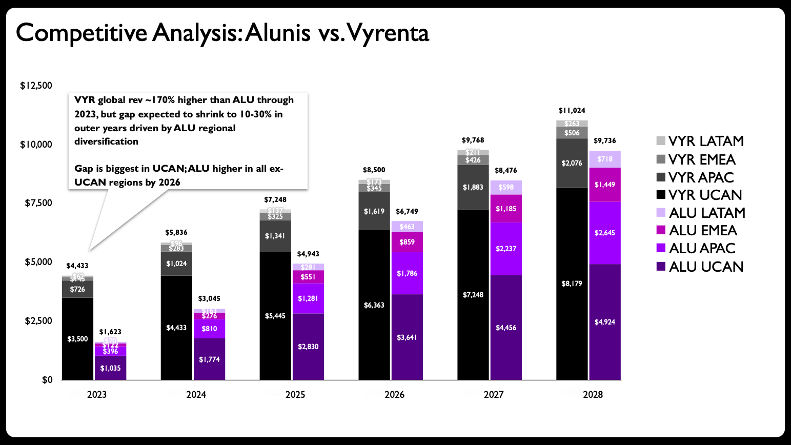
The primary issue with the original stacked bar chart was its excessive cognitive load. A viewer had to mentally deconstruct multiple stacked segments across several years for two different companies and then compare these trends across four distinct regions. This intricate interpretation process often obscures the core message, which in this case was Alunis’s strategy to narrow the revenue differential through targeted growth in specific markets.
The Strategic Redesign: Splitting Complexity with Human Insight
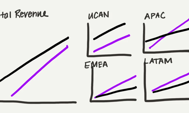
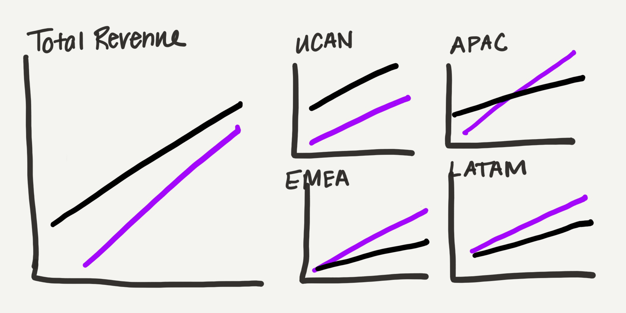
The initial step in the makeover, guided by established data visualization principles, was to decompose the single, overburdened chart into multiple, more focused visuals. This involved moving away from stacked bars to line charts, which offer a lighter visual footprint, making them more suitable for displaying trends over time across several categories. The new design strategy proposed dividing the data by location: one chart for total revenue comparison and four smaller charts, each dedicated to a specific region.
A crucial design decision, conceptualized by the human practitioner, was the intentional variation in chart sizing. The "total revenue" chart was made larger, while the four regional charts were arranged in a grid, occupying a similar visual space to the main chart. This subtle proportional arrangement served to visually reinforce the part-to-whole relationship of the regional data to the overall company performance. This type of intuitive, hierarchical visual structuring is a hallmark of human design expertise, ensuring that the audience’s attention is guided effectively.
Partnering with AI: Leveraging Claude for Efficiency
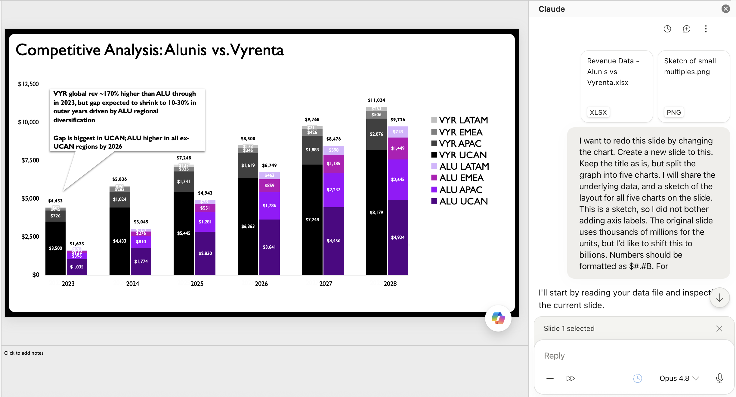
Historically, creating multiple detailed charts in presentation software like PowerPoint would consume significant time, patience, and mental energy. The experiment, however, introduced an AI accelerator: Claude for PowerPoint. This add-in, released earlier this year, distinguishes itself by generating editable charts directly within PowerPoint, which is critical for professionals who need full control over their final output. While other AI tools like CoPilot, ChatGPT, and Gemini also offer chart generation (with Gemini extending this capability to Google Slides), the editability provided by Claude was a decisive factor in its utility for this workflow.
The process began with the human practitioner sketching a rough draft of the desired multi-chart redesign. This sketch, along with the underlying data, was then provided to Claude via a prompt. The prompt directed Claude to reconstruct the charts based on the hand-drawn layout, specifying the desired chart types (line charts), the data segmentation (total revenue and individual regions), and the visual hierarchy (larger total chart, smaller regional multiples). The ability to upload both data and a visual sketch as input significantly enhanced Claude’s capacity to understand and execute the human practitioner’s vision.
Claude’s Output: A Foundation for Refinement
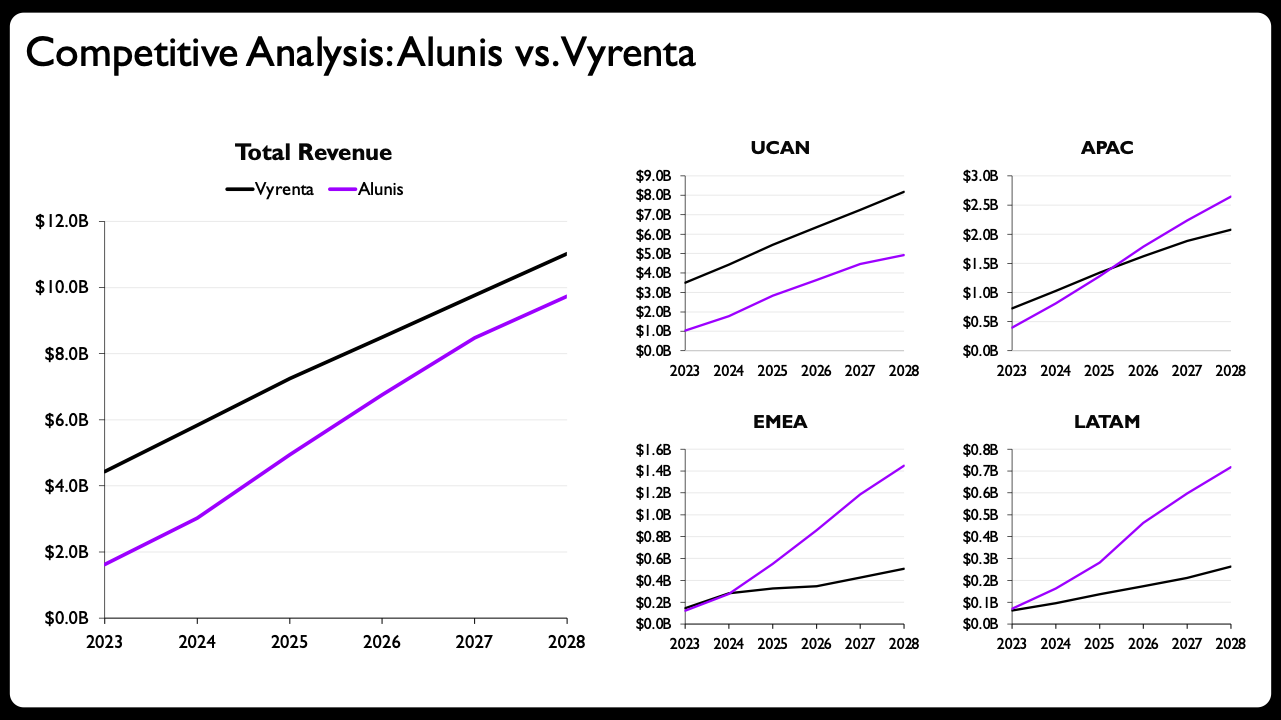
Claude’s generated output was an immediate and substantial improvement over the original stacked bar chart. It successfully translated the sketch into fully editable, native PowerPoint line charts, complete with appropriate axes and labels, adopting the small-multiples layout as requested. This initial AI-generated version provided a solid framework, effectively separating the complex narrative into digestible components. For many standard presentations, this output, perhaps with a rewritten slide title and some additional descriptive text, would be considered complete and significantly more effective than the original.
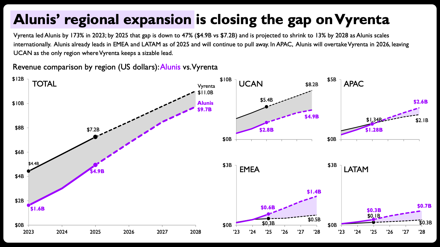
However, the value of human expertise became even more apparent in the subsequent refinement phase. The editable nature of Claude’s output allowed the practitioner to apply a series of nuanced design enhancements that elevated the charts to a higher level of clarity and storytelling power. These critical human-driven tweaks included:
- Shaded Areas for Emphasis: Introducing shaded areas between the two company lines in each chart to visually emphasize the revenue gap and its narrowing over time. This graphical element immediately draws attention to the core comparison.
- Direct End-of-Line Labels with Values: Instead of relying solely on a legend and axis labels, direct numerical labels were added to the end of each line, displaying the exact revenue figures for Vyrenta and Alunis. This provides immediate data points without requiring the audience to scan back and forth.
- Per-Panel Axis Ranges: The axis ranges for the regional charts were scaled individually to best showcase the specific trends and magnitudes within each region. While breaking the convention of consistent axis scales across small multiples, this deliberate decision was made to optimize readability for each specific regional story, prioritizing clarity over strict uniformity where appropriate.
- Solid vs. Dashed Lines for Actuals and Projections: Distinguishing between historical data and future projections using different line styles (solid for actuals, dashed for projections) provides a crucial layer of context, indicating data certainty and timeframe.
- Compact Year Formatting: Simplifying the year labels on the smaller regional panels (e.g., ’24, ’26, ’28) to conserve space and reduce visual clutter, while maintaining full year labels on the larger total revenue chart.
These refinements, impossible without editable outputs, underscore the irreplaceable value of human judgment in data visualization. They demonstrate that while AI can efficiently generate the structural components of a visualization, the human designer brings the critical eye for detail, the understanding of audience perception, and the strategic intent behind every visual choice.
Broader Implications and the Future of Human-AI Collaboration
This successful experiment carries significant implications for data professionals and the broader industry. A major hurdle in the past for many practitioners was that AI-generated charts were often static images, limiting the ability to make necessary adjustments for accuracy, brand consistency, or enhanced clarity. The advent of AI tools that produce fully editable native charts and slides removes this barrier, making AI a truly valuable addition to existing data storytelling workflows.
The impact extends beyond experienced professionals. For those new to data storytelling or less proficient in complex chart building, AI can significantly lower the entry barrier. It provides an accessible means to generate sophisticated visualizations, helping users overcome the initial learning curve and build confidence. However, this increased accessibility does not negate the need for foundational principles. The practitioner still needed to recognize the limitations of the original stacked bar chart, understand why a multi-line chart approach was superior, and grasp the nuances of visual hierarchy and emphasis. The human remains firmly in the driver’s seat, providing the critical judgment and direction.
The Enduring Value of Human Expertise
Ultimately, the experiment reinforces that AI, at its current stage, serves as a powerful accelerator for execution rather than a replacement for human intelligence. It automates the ‘how,’ allowing humans to concentrate on the ‘what’ and ‘why’ of data storytelling. This includes:
- Strategic Thinking: Identifying the core message, understanding the audience, and defining the most effective narrative arc.
- Design Judgment: Making informed decisions about visual encoding, color theory, layout, and annotation to maximize clarity and impact.
- Contextual Understanding: Interpreting data within a broader business or social context, which AI currently struggles to do with human-level nuance.
- Ethical Oversight: Ensuring data accuracy, avoiding misrepresentation, and maintaining integrity in communication.
Industry analysts predict that this human-in-the-loop model will become the standard for professional AI integration. Companies like Anthropic, developers of Claude, are actively designing their tools with this collaborative paradigm in mind, emphasizing augmentation rather than automation. This approach allows data storytellers to leverage AI’s speed and efficiency for mundane tasks, dedicating their unique cognitive abilities to the creative, analytical, and empathetic aspects of their work.
The ongoing need for education in data visualization principles remains paramount. While AI can generate charts, understanding which chart type is appropriate, how to simplify complex information, and what visual cues best convey a message are skills that AI currently cannot fully replicate. As AI tools continue to evolve, the partnership between human ingenuity and artificial intelligence promises to unlock unprecedented levels of efficiency and creativity in data storytelling, allowing professionals to craft more powerful and insightful narratives than ever before. This synergy is not just about doing things faster; it’s about doing them better, with more strategic focus and greater impact.