The long-held perception that design prowess is an innate talent, a gift bestowed upon a select few, is increasingly being challenged by experts in visual communication. Instead, a growing consensus suggests that effective design is a cultivable skill, honed through intentional practice, critical observation, and a foundational understanding of key principles. This perspective is championed by organizations like storytelling with data (SWD), which advocates for clarity and impact in visual communication, particularly through data visualization. Their own experience with team members, such as education and outreach specialist Kaitlin, serves as a compelling case study for this evolving viewpoint.
The Democratization of Design: From Art to Essential Skill

Historically, design was often shrouded in an aura of exclusivity, perceived as the domain of artists and specialized professionals. The rise of sophisticated yet user-friendly design software and digital platforms, however, has democratized access to design tools. Platforms like PowerPoint, Canva, Google Slides, and various website builders have put design capabilities into the hands of virtually everyone, from educators and marketers to data analysts and business leaders. This shift has underscored a critical need: while tools are abundant, the underlying principles of good design remain paramount. Simply having access to a palette of colors and an array of fonts does not equate to effective visual communication.
In this context, the argument that design can be taught and learned holds significant weight. It implies that individuals, irrespective of their initial "design eye," can significantly enhance their ability to create impactful visuals. The journey of Kaitlin at storytelling with data exemplifies this. Initially self-identifying as someone without a "design eye," Kaitlin’s passion for her work—especially in promoting SWD’s children’s book, Daphne Draws Data—drove her to engage with design more intentionally. Through guidance and focused effort, she demonstrated tangible progress, incorporating more deliberate color choices, cleaner fonts, and a deeper understanding of how her creations would be perceived and utilized by their target audience. This personal evolution highlights a broader truth: the gap between one’s starting point and potential in design is bridged primarily by sustained attention, consistent practice, and a clear understanding of what constitutes effective visual communication.
Foundational Principles for Cultivating Design Literacy
Experts in visual communication, including those at storytelling with data, articulate a series of foundational principles that serve as a roadmap for anyone aspiring to improve their design capabilities. These principles shift the focus from aesthetic intuition to strategic decision-making, transforming design from a mystical art into a pragmatic skill.
1. Prioritizing the Audience Over Content:
The initial step in any design endeavor, according to SWD’s philosophy, must be an audience-first approach. Before any tool is opened or layout considered, the designer must ask: "Who is the audience, and what do they need from this communication?" This seemingly obvious question is frequently overlooked. Many creators default to starting with their existing content, templates, or previous work, leading to designs that primarily serve the creator’s convenience rather than the audience’s comprehension. A truly audience-centric design considers the viewer’s context, existing knowledge, and the specific action or understanding desired. Research in user experience (UX) consistently demonstrates that designs tailored to user needs significantly enhance engagement, retention, and the achievement of communication objectives.
2. Rejecting Default Settings as Design Choices:
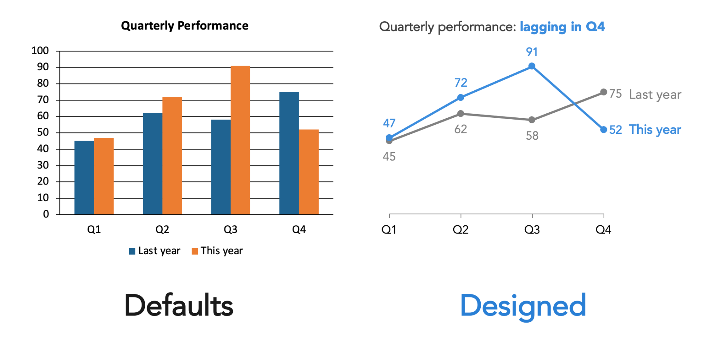
Every software application or platform comes equipped with default settings—pre-selected fonts, color schemes, and layouts. These defaults are not neutral; they represent design decisions made for a generic user base and general use case, which rarely align perfectly with specific communication goals. Accepting these defaults uncritically is not an absence of design choice, but rather an unconsidered one. The first stride towards superior design involves recognizing these inherent choices and actively questioning their suitability for the current task. For instance, a default sans-serif font might be legible, but a carefully chosen typeface can convey a specific tone, brand identity, or enhance readability for a particular demographic. This principle empowers individuals to move from passive acceptance to active, informed design decisions.
3. Embracing Strategic Constraints:
Counter-intuitively, an abundance of options can hinder effective design. When every font, color, and layout is available, the result often descends into visual chaos, where elements compete for attention, diminishing clarity. Constraints, however, foster coherence and focus. Adopting a limited color palette, committing to a single typeface or a family of fonts, or adhering to a predefined layout can significantly streamline the design process and enhance the final product’s impact. Organizational brand guidelines and existing templates are invaluable in this regard, as they pre-establish many of these constraints, ensuring consistency across materials. This consistency is crucial for building brand recognition and trust. Rather than restricting creativity, strategic constraints guide it, making genuine design decisions clearer and more impactful.
4. Establishing Clear Visual Hierarchy:
A fundamental aspect of guiding the viewer’s attention is visual hierarchy. Without deliberate direction, the eye will still navigate a design, but perhaps not in the intended sequence. Effective visual hierarchy ensures that the most critical information is the most visually prominent, followed by secondary and tertiary elements in a logical flow. This doesn’t necessitate complex techniques; simple adjustments in size, weight (boldness), position, and spacing can effectively establish this order. Studies on eye-tracking patterns (e.g., F-patterns or Z-patterns in reading web content) confirm that viewers naturally scan for dominant elements first. By consciously designing this sequence, creators can ensure their message is absorbed efficiently and effectively, preventing cognitive overload and misinterpretation.
5. Understanding That Difference Signals Meaning:
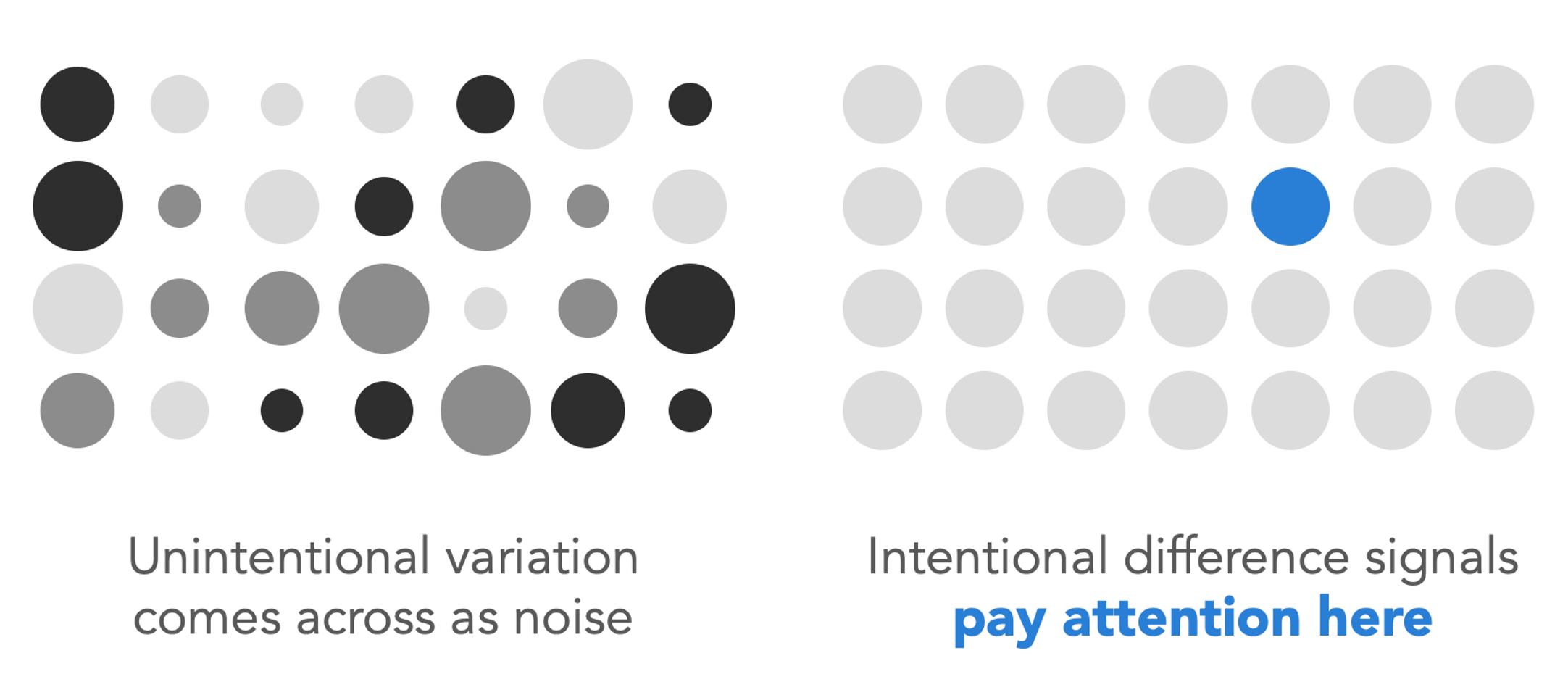
One of the most powerful and frequently violated design principles is that visual differentiation inherently signals meaning. When an element in a design—be it text, an icon, or a data point—is larger, bolder, a different color, or a unique font, viewers unconsciously interpret this distinction as significant. It signals: "Pay attention here; this matters more." The crucial corollary is that unintentional variation creates confusion. If elements that should be perceived as similar or equal are subtly different in size, color, or placement, the audience will expend mental effort trying to discern the non-existent meaning behind these discrepancies. This inconsistency introduces visual noise, undermining the clarity of the intended message. Before finalizing any design, a critical self-assessment should confirm that every visual difference serves a purpose and that elements intended to be perceived as similar indeed look identical.

6. Applying Color with Purpose:
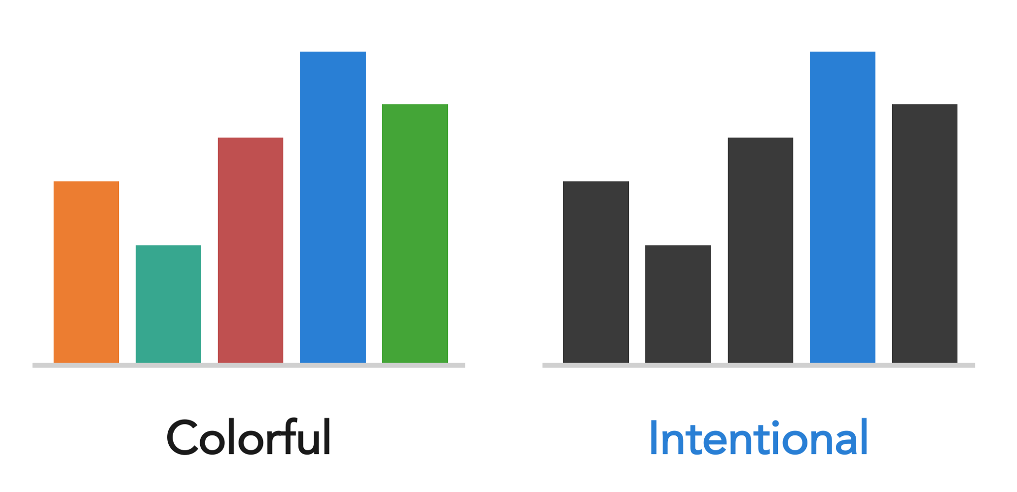
Color is a potent design tool, yet it is often misused. Its effective application is entirely dependent on the design’s objective. For expressive pieces like illustrations, posters, or book covers (such as Daphne Draws Data), a rich, playful, and abundant use of color can enhance engagement and convey emotion, particularly for young audiences. However, when the goal is to direct attention within a data visualization or a business slide, a different logic applies. Here, a predominantly neutral palette, punctuated by one or two intentional colors used sparingly to highlight key insights, is far more effective. This strategic use of color leverages pre-attentive attributes—visual properties that the eye registers before conscious thought—to immediately draw attention to the most important data points. The guiding question should not be "What colors do I like?" but rather "What is color intended to achieve in this design, and is it doing so effectively?" Considerations for color use also extend to accessibility, ensuring sufficient contrast for viewers with visual impairments.
7. Meticulous Alignment of All Elements:
The precision of alignment is a hallmark distinguishing polished, professional designs from amateurish ones. Misaligned elements—text blocks slightly off-kilter, objects almost but not quite on a grid—create a subtle yet persistent visual unease. While viewers may not consciously articulate the problem, they perceive a lack of order and professionalism. A common pitfall is the overuse of center-aligned text, especially for multiple lines. This style lacks a consistent anchor, resulting in two jagged edges that create visual tension rather than resolution. Left-aligned text, conversely, provides a clear visual anchor, enhancing readability. The solution is straightforward: leverage design tool alignment functions, activate gridlines, and be deliberate. Every element should align to something—another element, a margin, or a grid. Once the eye is trained to recognize proper alignment, inconsistencies become glaringly obvious, facilitating their correction.
8. Maximizing the Power of Whitespace:
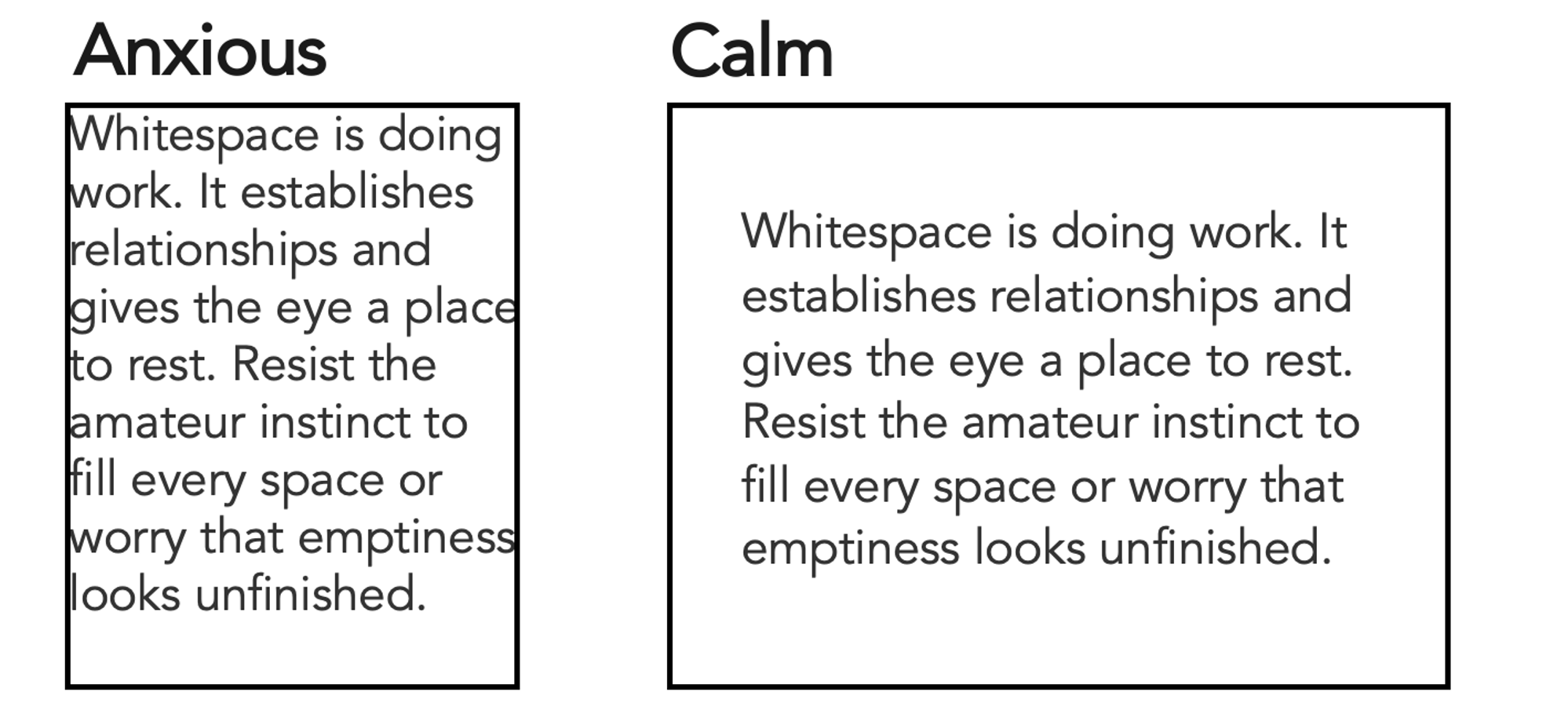
Whitespace, or negative space, refers to the empty areas within a design. Far from being wasted space, whitespace is a powerful design element that performs crucial functions: it creates separation between elements, establishes visual relationships, and provides the viewer’s eye with areas to rest. Designs that cram elements together often feel anxious, cluttered, and difficult to decipher, increasing cognitive load. Conversely, designs incorporating generous whitespace appear calm, clear, and thoughtfully composed. The initial impulse for new designers is often to fill every available space, fearing that emptiness suggests incompleteness. This instinct must be resisted. Many of the most impactful and elegant designs are defined as much by what they omit as by what they include, allowing key elements to stand out and breathe.
9. Actively Seeking Design Inspiration:
Developing design literacy is an active process of observation and analysis. When an advertisement, a book cover, a menu, a striking color combination, or a particularly clear data visualization catches the eye, it’s an opportunity for learning. The practice involves pausing and asking: "Why does this work? What specific elements contribute to its effectiveness? How can I learn from this and apply it to my own work?" This analytical approach should extend to evaluating ineffective designs as well: "What makes this design fail? How could it be improved?" This habit of critical observation compounds over time, rapidly sharpening one’s design sensibilities. Inspiration is ubiquitous, from everyday objects to professional portfolios. Platforms like the storytelling with data community’s "discover page," featuring thousands of visuals, offer an excellent resource for practicing this active engagement with design, allowing users to browse and analyze diverse examples.
10. Trusting and Training One’s Design Instincts:
Ultimately, most individuals possess more design instinct than they realize. That subtle feeling that something "feels off," even without the ability to articulate why, is valuable data. This instinct should be trusted as a starting point. However, instinct is not a fixed ceiling but a trainable foundation. The perceived chasm between a "design person" and a "non-design person" is less about inherent talent and more about accumulated practice, heightened awareness, and consistent feedback. Developing this "design eye" is akin to training any other skill: through consistent application, paying close attention to observations, and embracing an iterative process of creation and refinement. One does not need to be a professional designer to adopt a design-thinking mindset; the journey simply begins with learning to look, observe, and critically analyze the visual world.
Broader Impact and Implications: The Design-Literate Professional
The emphasis on design as a learnable skill carries significant implications for professionals across virtually all sectors. In an increasingly visually-driven world, the ability to communicate clearly and persuasively through design is no longer a niche expertise but a critical competency. For data scientists, it means transforming complex datasets into digestible, actionable insights. For marketers, it involves crafting compelling visuals that resonate with target audiences and drive engagement. Educators can enhance learning through visually engaging materials, while business leaders can articulate strategies with greater clarity and impact.
The philosophy espoused by storytelling with data and exemplified by the progress of individuals like Kaitlin underscores that investing in design literacy is an investment in more effective communication, stronger brand presence, and ultimately, greater influence. As the digital landscape continues to evolve, the demand for individuals who can not only produce content but also present it thoughtfully and strategically will only grow. Design is no longer merely aesthetic; it is strategic. By demystifying its principles and advocating for its teachability, organizations like SWD are empowering a new generation of professionals to harness the power of visual communication to make a more meaningful impact. The journey to becoming design-literate is accessible to all who are willing to observe, practice, and iterate.