UX Research Reveals Why Carets Outperform Arrows and Split Menus in Accordion Navigation

The ongoing evolution of digital interface design often struggles with balancing aesthetic minimalism and intuitive user experience. A recent comprehensive study conducted by the Nielsen Norman Group (NN/g) sheds new light on a seemingly minor yet critical element of web architecture: accordion icons. The research offers definitive guidance on how visual signifiers dictate user behavior, why split menus create friction, and why the humble caret remains the gold standard for expandable content.
For decades, digital product designers have debated the merits of various geometric indicators—including carets, chevrons, arrows, and plus-minus symbols—to signal that a section of text can be expanded or collapsed. While these visual cues appear ubiquitous across modern websites and mobile applications, user perception of them has rarely been formally measured. The latest empirical findings challenge several common design assumptions, pointing to specific patterns that either facilitate seamless navigation or frustrate users with contradictory cues.
The Anatomy of Accordion Confusion: Understanding User Expectations
When users encounter a navigation menu or a content list, their brains instantly parse visual cues to predict the outcome of an interaction. The NN/g study evaluated how different icon choices alter these expectations, particularly regarding whether a tap will initiate a page transition or merely reveal hidden subsection options.
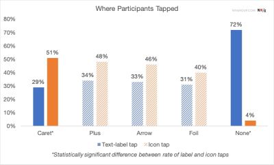
The research indicates that the absence of any icon sets a very specific expectation. When a menu item features text alone without a graphical signifier, users overwhelmingly anticipate that tapping the element will navigate them directly to a new page. Consequently, introducing custom or unconventional icons often backfires. Users struggle to decode bespoke graphical symbols, frequently resulting in hesitation, misclicks, and an overall degradation of the browsing experience.
Furthermore, testing revealed that users distribute their tap targets fairly equally between the text label and the associated icon for most standard symbols. This user behavior carries significant design implications: the choice of icon does not merely serve as a passive visual label; it directly influences the functionality and hit-area expectations of the entire interactive element.

Why Split Menus and Overcomplicated Arrows Fail Usability Tests
One of the most prominent insights to emerge from the research is the hazard associated with split menus. A split menu pattern typically features a text label that navigates to a primary category page, paired with an adjacent icon designed to toggle an accordion dropdown. Usability evaluations consistently demonstrate that this dual-action layout is counterproductive. Users frequently fail to distinguish between the boundaries of the text and the icon, leading to unintended page loads when they merely wanted to inspect subcategories, or vice versa.
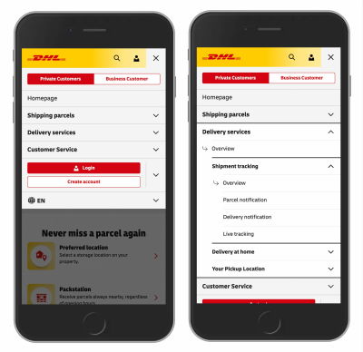
To mitigate this friction, digital architects increasingly advocate for a unified interaction model. Rather than forcing a split action, modern best practices dictate that tapping the primary category should consistently expose the sub-menu options. To provide access to the top-level category page itself, designers can embed a dedicated "Overview" link directly within the newly revealed dropdown list. Major global brands, such as logistics giant DHL, have successfully transitioned toward this streamlined approach, eliminating unnecessary directional clutter and reducing user error rates.
The study also scrutinized the use of directional arrows. Right-facing arrows do not consistently prime users to expect a direct page navigation, while downward-facing arrows fail to reliably communicate the mechanical opening of an accordion.
The Overloaded Semantics of Plus-Minus and Arrow Symbols
Beyond basic navigational arrows, interface designers frequently employ mathematical symbols—specifically the plus (+) and minus (-) signs—or vertical arrows to indicate expanded and collapsed states. While these symbols are generally understood by contemporary web users, they suffer from a fundamental design flaw: semantic overload.
The plus symbol, in particular, carries a multitude of distinct meanings across different digital environments. Depending on the context, a plus sign can signify saving an item for later, adding a product to a shopping cart, zooming into an image, or creating a new document. When deployed within multi-level navigation structures where multiple tiers remain open simultaneously, the plus-minus paradigm quickly loses its clarity.
Similarly, vertical arrows pointing up and down can imply scrolling mechanics, spatial relocation, or the retrieval of sequential search matches. While users eventually adapt to these symbols through contextual learning, their overloaded nature introduces cognitive load that simpler, purpose-built indicators completely avoid.

The Safe Choice: Why the Caret Reigns Supreme
Based on empirical observation, the NN/g research identifies the caret—a wedge-shaped triangle pointing downward—as the single most reliable and safe icon choice for accordion patterns. By default, a downward-facing caret clearly signals a collapsed state that will expand upon interaction. Upon activation, transforming the indicator into an upward-facing caret or a sideways caret cleanly communicates the toggle state without ambiguity.
For organizations seeking alternatives, the traditional plus-minus notation remains acceptable, provided it is implemented within a strictly controlled hierarchy that avoids semantic confusion. However, the overarching directive from usability specialists remains anchored in radical simplicity.
When a interface element is intended purely as a direct hyperlink rather than a collapsible container, designers should rely on standard typographic conventions rather than decorative icons. The research underscores that simply underlining text links is the most reliable method for indicating page navigation. Eschewing extraneous arrows, carets, or custom badges in favor of a clean underline ensures that users instantly recognize the element as a navigation pathway, entirely eliminating guesswork.
Broader Implications for Digital Product Design
The findings surrounding accordion icons serve as a microcosm for broader trends in user experience design. As digital platforms become increasingly complex, designers face constant pressure to innovate through novel visual treatments. However, empirical studies consistently demonstrate that adherence to established user mental models yields superior usability outcomes.
By eliminating split menus, discarding ambiguous custom graphics, and standardizing around the caret for expandable sections, product teams can significantly reduce cognitive friction. Ultimately, the research reinforces a timeless maxim in digital craftsmanship: when it comes to user interface design, clarity invariably triumphs over cleverness, and simpler solutions consistently deliver the most robust user experiences.