Human-AI Collaboration Redefines Data Storytelling Workflow in the Professional Landscape

The professional world is currently engaged in a vast, real-world experiment concerning the integration of Artificial Intelligence into daily workflows. Across industries, professionals are actively discerning where AI applications genuinely enhance productivity and where they might impede established processes. A recurring question for many, particularly in fields reliant on data interpretation and communication, revolves around the optimal timing and application of AI tools. This ongoing exploration has recently yielded significant insights within the realm of data storytelling, demonstrating a powerful synergy between human expertise and AI capabilities.
The Evolving Landscape of Data Storytelling and AI Integration
Data storytelling, the art of communicating insights from data through narrative and visualization, has become an indispensable skill in the modern, data-driven economy. With the exponential growth of data — a staggering 2.5 quintillion bytes of data are created each day, according to IBM estimates — the ability to distill complex information into clear, actionable narratives is more critical than ever. However, the process is often fraught with tedious, repetitive tasks that consume valuable time and mental energy, diverting focus from the overarching narrative and strategic design.

For many data professionals, certain aspects of the data storytelling journey remain deeply enjoyable and creatively stimulating. These include the meticulous refinement of visual elements, such as aligning components, selecting color palettes, and the crucial initial phase of sketching ideas before committing to a final output. These seemingly minor steps are often catalysts for novel insights and ultimately lead to more impactful data presentations. Conversely, the manual construction of charts from scratch or the laborious manipulation of raw Excel data to conform to non-standard visualization requirements rarely contributes to deeper analytical thinking. This mechanical execution is precisely where professionals envision AI providing substantial relief, provided it doesn’t compromise control over the final design and narrative integrity. Every minute saved from manual chart creation translates directly into more time for strategic thought, delving into the underlying data narrative, and refining the overall communication strategy.
The sentiment among many practitioners is not for AI to autonomously redesign entire presentations, but rather to serve as an intelligent assistant, generating robust starting points that can then be meticulously refined and polished by human hands. This collaborative paradigm was recently put to the test in a real-world client project, with results that are beginning to shift established workflows.
A Case Study: Decongesting a Complex Data Visualization
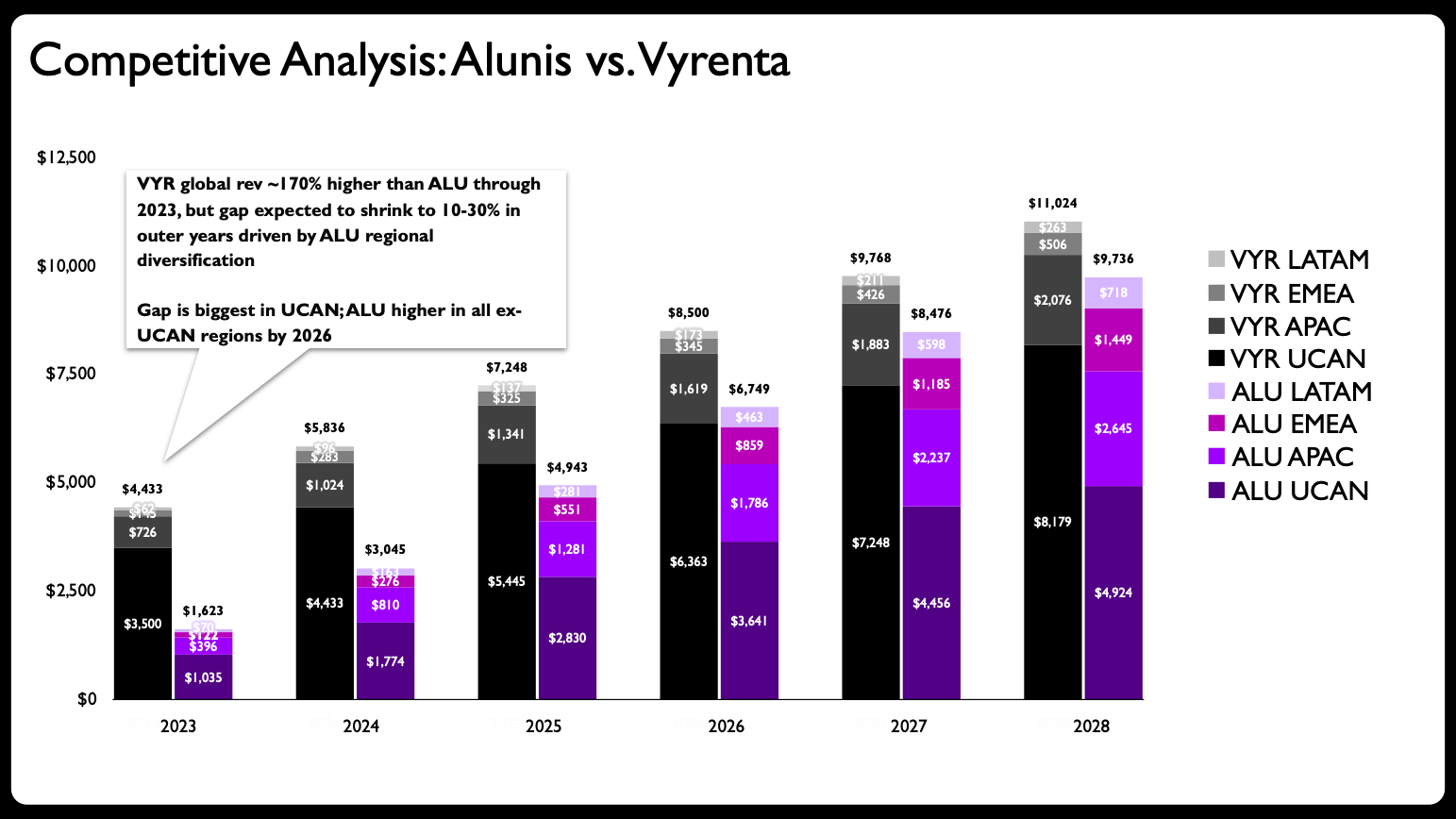
The catalyst for this collaborative experiment was a client project involving a particularly dense data slide. While the specific data and scenario have been altered to preserve confidentiality, the core challenge remains illustrative. The original slide featured a stacked bar chart designed to communicate multiple critical data points simultaneously: revenue change over time, a comparison between two companies (Alunis and a top competitor, Vyrenta), and the regional composition of each company’s revenue. This single visual was tasked with an excessive amount of "heavy lifting," attempting to convey too many variables within one graphic.
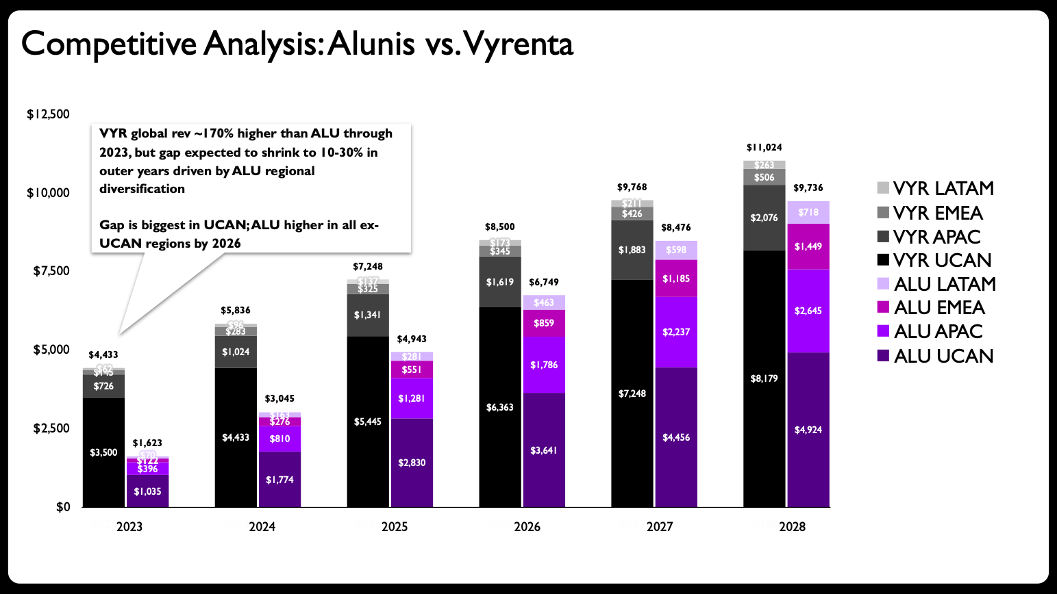
Industry best practices in data visualization, as highlighted in numerous guides including "before & after: practical makeovers for powerful data stories," consistently warn against one of the most common pitfalls: overloading a single graph with too much information. Such complexity invariably diminishes clarity, obscures key insights, and makes it challenging for the audience to grasp the intended message quickly. In this specific instance, the stacked bar chart, while visually presenting data, struggled to effectively narrate Alunis’s strategy of closing the revenue gap with Vyrenta through targeted regional expansion over several years.
The initial step in addressing this visual overload was straightforward: deconstruct the single, overstuffed graph into a series of more focused, digestible charts. This decision marked the beginning of a truly interesting collaborative process between human intuition and artificial intelligence.
The Human Touch: Sketching and Strategic Layout
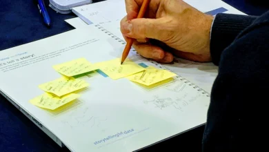
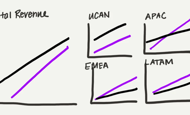
Before engaging AI, the data storyteller embarked on a traditional, human-centric design process: sketching. This iterative process allowed for the rapid exploration of various visual layouts and chart types. The decision was made to transition from stacked bars to line charts, primarily because lines offer a lighter visual footprint, a significant advantage when presenting a substantial amount of data on a single slide.
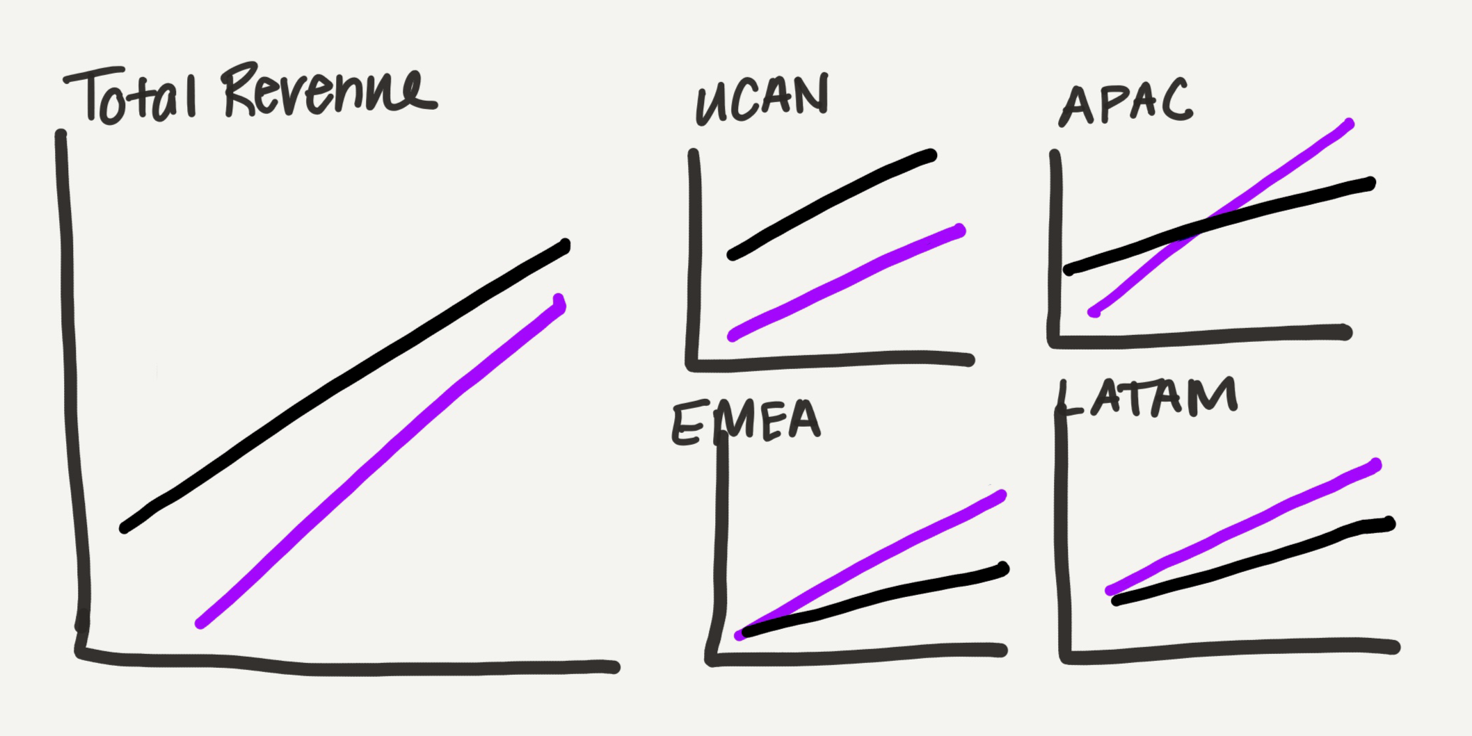
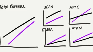
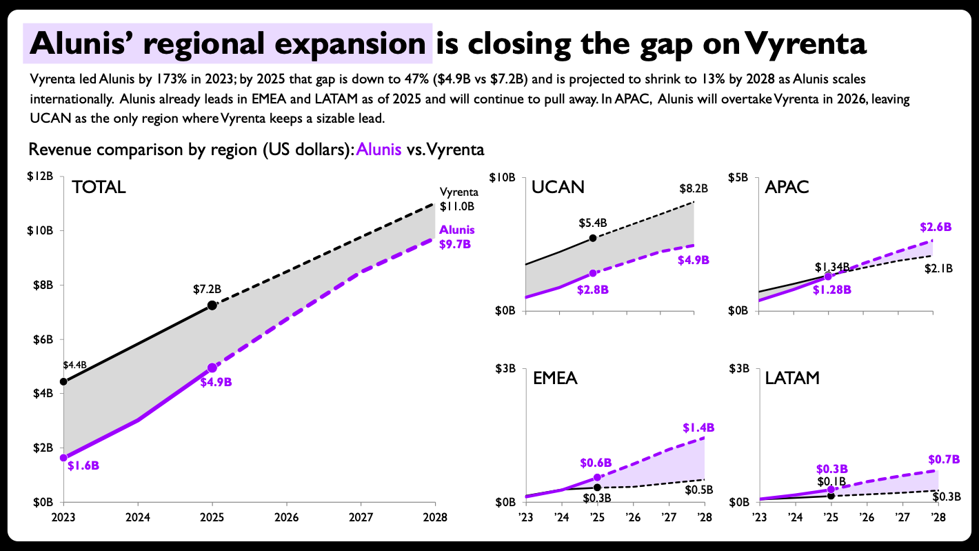
The data was then conceptually segmented by location: one chart dedicated to total revenue, and four subsequent charts, each representing a specific region (UCAN, APAC, EMEA, and LATAM). A deliberate design choice was made regarding the sizing and arrangement of these "small multiples." The total revenue view was rendered larger, visually emphasizing its overarching importance, while the four regional charts were arranged in a grid, collectively occupying the same visual space as the larger total chart. This subtle yet powerful arrangement effectively visualized the part-to-whole relationship within the data, allowing viewers to quickly grasp both the aggregate trend and the granular regional dynamics.
In a pre-AI workflow, the construction of these five individual graphs in a software like PowerPoint would have been a profoundly time-consuming and mentally taxing endeavor. Each chart would require manual data input, formatting, and precise alignment, draining valuable resources that could otherwise be allocated to higher-level analysis and narrative development.
AI as a Collaborative Partner: Engaging Claude for PowerPoint
This time, rather than undertaking the manual creation, the hand-drawn sketch and the underlying data were presented to Claude for PowerPoint, an add-in released earlier in the year. The choice of Claude was strategic, primarily due to its ability to generate editable charts directly within PowerPoint, the preferred presentation software. This editability is paramount, transforming AI from a mere image generator into a genuine collaborative partner, allowing for subsequent human refinement. Other AI tools, such as Microsoft CoPilot and ChatGPT, also offer chart generation capabilities, with varying degrees of editability and accuracy, while Gemini provides similar functionality for Google Slides, indicating a broader trend towards AI-powered productivity tools across office suites.
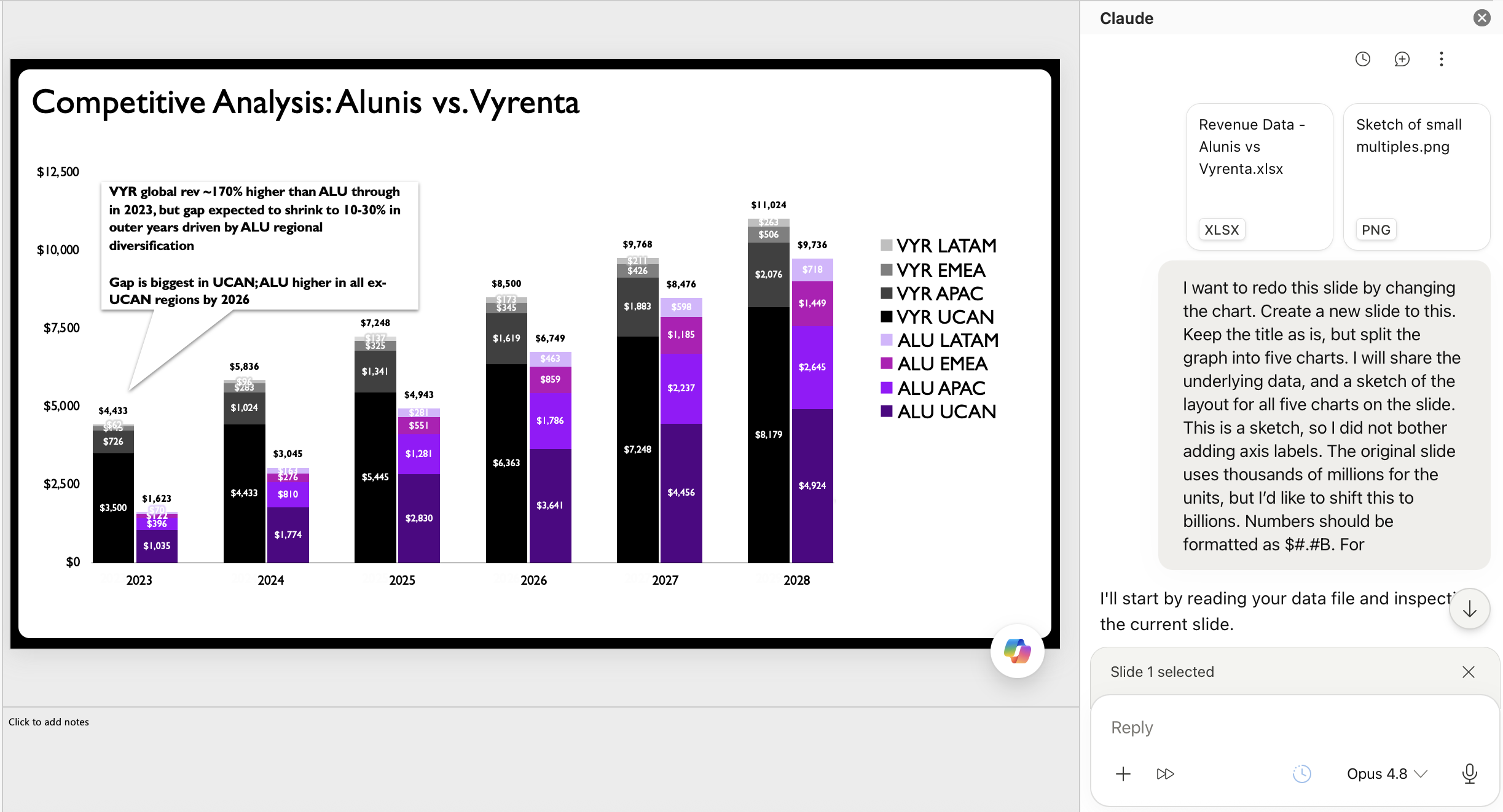
The prompt provided to Claude was concise, combining the raw data with a clear directive based on the hand-drawn layout: "Please rebuild the chart from the uploaded data and hand-drawn layout sketch." This instruction leveraged both the structured data and the visual guidance of the human designer.
The output generated by Claude was notably impressive. It successfully translated the sketch into a set of fully editable, native PowerPoint charts, adhering to the small-multiples layout envisioned by the human designer. The charts featured appropriate axes and labels, providing a solid, functional foundation. This initial AI-generated iteration represented a significant improvement over the original cluttered stacked bar chart, offering a clearer, more organized presentation of the data. For many standard professional contexts, this AI-generated output, perhaps with a rewritten slide title and some additional descriptive text, would be considered a complete and acceptable makeover.
The Indispensable Human Element: Strategic Refinement
However, for a discerning data storyteller, the AI’s output, while excellent as a starting point, was not the final destination. The true value of human expertise became evident in the subsequent refinement phase, where a few strategic tweaks elevated the charts from merely "good" to "exceptional." This highlights a critical insight: AI excels at execution and automation, but human judgment remains indispensable for nuance, strategic emphasis, and maximizing communicative impact.
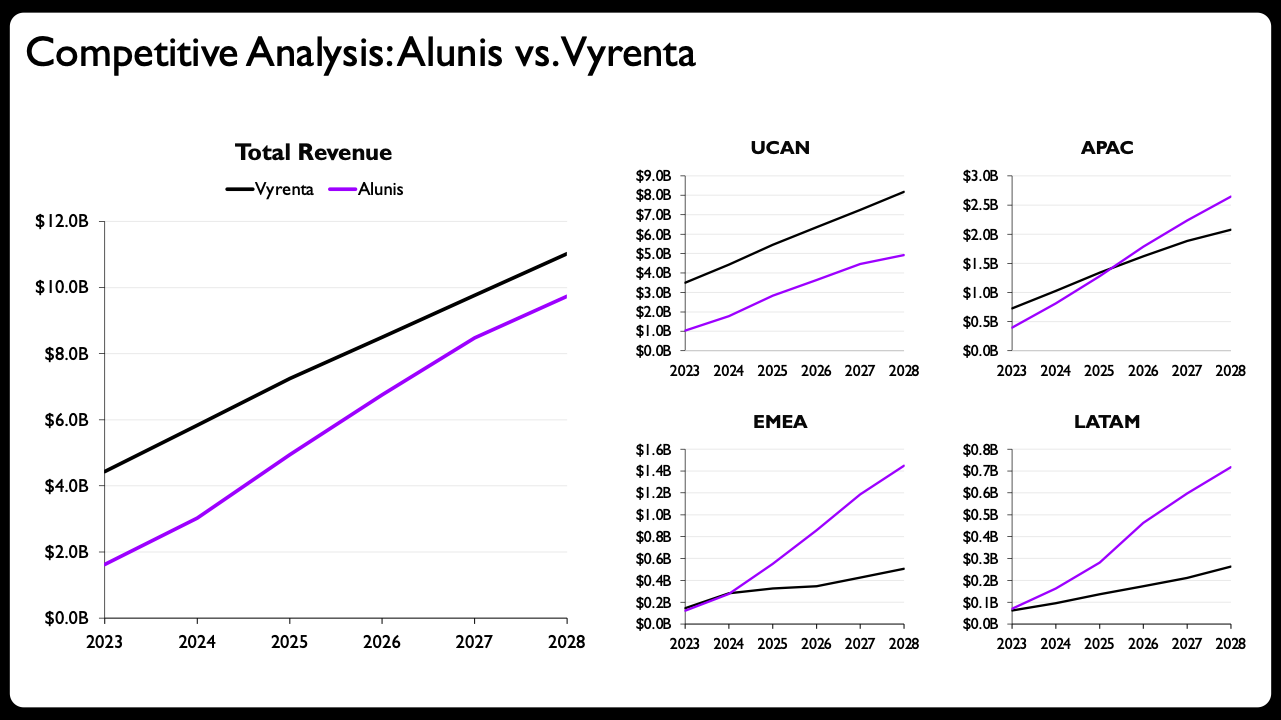
The key refinements included:
- Shaded Areas for Emphasis: To visually emphasize the difference and highlight the "gap" between Alunis and Vyrenta, shaded areas were introduced between the two lines on each chart. This subtle addition immediately drew the viewer’s eye to the core message of the closing revenue gap, enhancing readability and interpretability.
- Direct End-of-Line Labels with Values: Instead of relying solely on a separate legend or axis labels, direct end-of-line labels were added, displaying the final values for each company. This eliminated the need for viewers to visually trace lines back to an axis or legend, significantly improving data accessibility and reducing cognitive load.
- Region-Specific Axis Scaling: While consistent axis scales are generally preferred for comparability, a deliberate decision was made to scale the y-axes of the regional charts independently. This seemingly unconventional choice was, in fact, a strategic design decision. By allowing each regional chart to use a scale optimized for its specific revenue range, the relative trends and magnitudes within each region became far more apparent. This decision required human judgment to understand that emphasizing within-region trends outweighed the cross-regional comparison facilitated by a consistent scale, reinforcing the "part-to-whole" nature of the presentation.
- Differentiated Line Styles for Actuals vs. Projections: To clearly distinguish between historical data and future forecasts, solid lines were used for actual revenues, while dashed lines represented projected figures. This visual cue provided immediate context to the data points, enhancing transparency and analytical rigor.
- Compact Year Formatting for Small Multiples: On the smaller regional charts, the year labels were condensed or formatted more compactly to conserve space and maintain a clean aesthetic, without sacrificing clarity.
The final redesigned presentation, incorporating these human-led enhancements, not only became visually compelling but also communicated the complex narrative with unparalleled clarity and impact. The collaboration between human design principles and AI’s generative capabilities proved to be exceptionally fruitful, validating the model of AI as an accelerator rather than a replacement.
Broader Implications for the Professional Landscape
This experiment underscores several critical takeaways regarding the evolving role of AI in professional workflows, particularly for data visualization and storytelling.
Firstly, the ability of AI tools to generate editable charts and slides is a game-changer. Historically, a significant hurdle for data visualization practitioners was that AI-generated graphics were often static images, lacking the flexibility for precise adjustments. The advent of AI that produces native, editable elements transforms these tools into truly useful additions to an existing workflow, enabling professionals to maintain creative control and apply their nuanced understanding of design principles.
Secondly, the implications extend far beyond experienced practitioners. For individuals new to data storytelling, or those who struggle with the technical intricacies of building specific chart types in various software, AI can significantly lower the barrier to entry. It can act as a powerful educational aid and a productivity booster, allowing users to rapidly prototype visualizations and learn from the AI’s initial output before refining it. This democratization of data visualization skills could empower a broader range of professionals to communicate data more effectively.
However, this doesn’t diminish the fundamental importance of learning foundational data storytelling principles. The AI’s effectiveness in this case hinged on the human designer’s prior knowledge: understanding why a stacked bar chart was suboptimal, conceptualizing a more effective layout using small multiples, and recognizing the strategic value of design decisions like varied axis scales. AI excels at execution based on input, but it lacks the contextual understanding, critical judgment, and strategic insight that human professionals bring to the table. The human remains firmly in the driver’s seat, providing the judgment and direction, while AI efficiently handles the execution.
This collaborative model suggests a future where data professionals can reallocate their time and energy from manual, repetitive tasks to higher-value activities: deeper analysis, strategic narrative development, audience understanding, and the art of impactful communication. The "most enjoyable part of data storytelling," as articulated by practitioners, often involves this creative problem-solving and refinement, which AI now liberates professionals to pursue more fully.
The trend of AI augmenting human capabilities in data visualization is poised to grow. As tools like Claude, CoPilot, ChatGPT, and Gemini continue to evolve, offering increasingly sophisticated and integrated functionalities, the demand for human professionals who can effectively "partner" with AI will only intensify. This partnership promises not just increased efficiency, but also the potential for more insightful, compelling, and ultimately, more impactful data stories across all sectors. The focus shifts from merely presenting data to truly empowering decision-makers with clear, actionable intelligence, forged in the crucible of human ingenuity and artificial intelligence.