AI Elevates Data Storytelling: A Collaborative Blueprint for Enhanced Visualization in the Workplace

The integration of artificial intelligence into professional workflows is rapidly redefining productivity, with a particular emphasis on creative and analytical fields such as data storytelling. A recent real-world experiment highlights how AI, when leveraged strategically, can become an invaluable partner, automating tedious tasks and empowering human professionals to concentrate on higher-order thinking, strategic design, and narrative refinement. This shift promises not only increased efficiency but also a new paradigm for producing more impactful and insightful data visualizations in the modern business landscape.
The Evolving Landscape of Professional Workflows and AI Integration
The advent of sophisticated AI models, particularly generative AI, has ushered in an era of profound transformation across various industries. Professionals across sectors are now navigating an unprecedented "real-world experiment" with AI in the workplace, continually discerning its optimal applications and inherent limitations. For many, the central question revolves around identifying tasks where AI truly adds value without compromising quality or human control. This ongoing evaluation is critical for harnessing AI’s potential to augment human capabilities rather than merely replace them. Recent reports indicate a surging adoption rate of AI tools in enterprises, with a 2023 IBM study showing that 42% of companies surveyed have already deployed AI, and another 40% are exploring it. This underscores a widespread organizational imperative to integrate AI for competitive advantage and operational efficiency.

Data storytelling, a critical discipline for communicating complex information effectively, is one such area experiencing significant disruption and innovation. In a business environment increasingly driven by data, the ability to translate raw numbers into compelling narratives is paramount. The global data visualization market, valued at over $4 billion in 2023, is projected to grow significantly, reflecting the escalating demand for clear, actionable insights. However, the process of data visualization—from initial data manipulation to final chart design—has traditionally been labor-intensive, often demanding considerable time, precision, and specialized software skills. This can lead to bottlenecks, delayed insights, and, at worst, poorly designed visuals that obscure rather than clarify information, thereby hindering effective decision-making.
Addressing a Common Data Visualization Pitfall
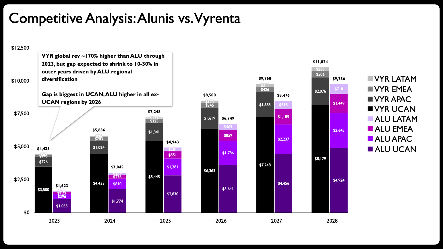
The genesis of this collaborative AI experiment stemmed from a common challenge encountered in data visualization: a single chart attempting to convey too much information simultaneously. In a recent client project, the initial presentation featured a stacked bar chart designed to illustrate how a company, Alunis, intended to close a revenue gap with a top competitor, Vyrenta, through regional expansion over time. The chart aimed to communicate three distinct narratives: change over time, a comparison between two companies, and the regional composition of each company’s revenue across various geographical segments.
This approach, while well-intentioned, inadvertently created a visual overload. Stacked bar charts, while useful for showing part-to-whole relationships at a single point in time, quickly become cumbersome when tracking multiple categories across several time points and comparing different entities. As noted in leading data visualization literature, including the popular book before & after: practical makeovers for powerful data stories, "adding too much to one graph" stands out as one of the five most prevalent data visualization mistakes. Such charts often force the audience to exert excessive cognitive effort to extract key insights, undermining the very purpose of data storytelling. The original chart, depicting Vyrenta’s early revenue lead narrowing by 2028 as Alunis expands outside UCAN (with figures in USD billion), suffered from this exact issue, presenting a dense array of data points that obscured the core strategic message: Alunis’s aggressive expansion into APAC, EMEA, and LATAM markets was projected to significantly erode Vyrenta’s initial market dominance, despite Vyrenta’s continued strength in the UCAN region.
A Human-Led Redesign Strategy and the AI Intervention
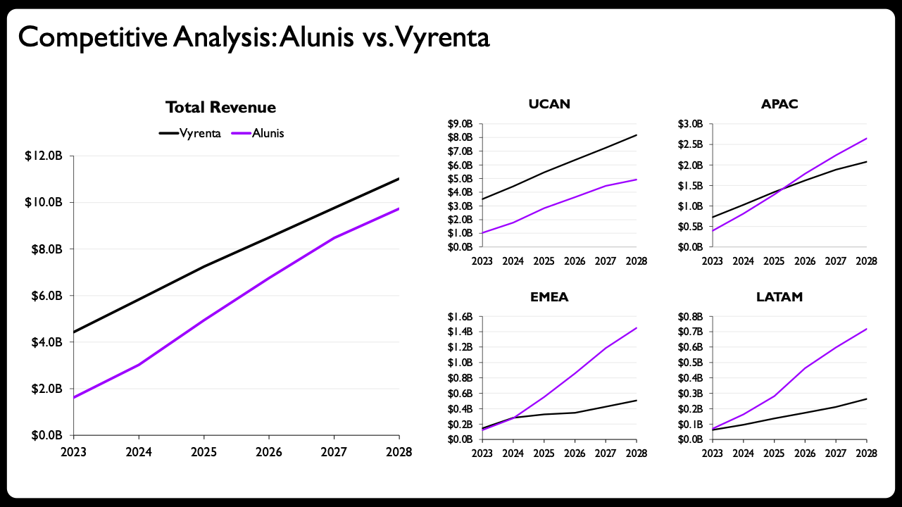
Recognizing the limitations of the original visualization, the professional embarked on a redesign grounded in established data visualization principles. The first critical step was to disaggregate the overloaded chart into multiple, more focused visuals. This involved shifting from stacked bars to line charts, which offer a lighter visual footprint and are inherently more effective for illustrating trends over time and facilitating direct comparisons between two entities.
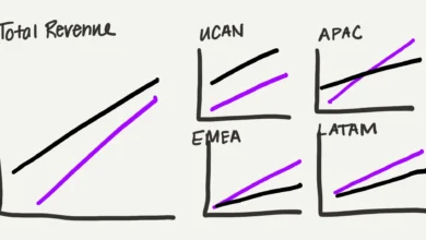
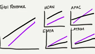
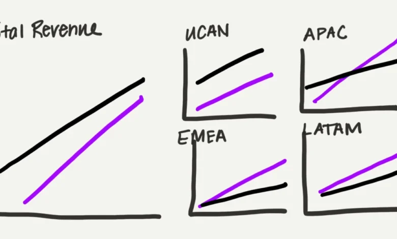
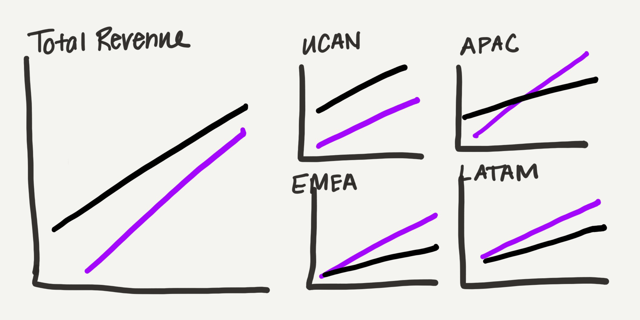
The conceptual redesign was first articulated through a hand-drawn sketch, a crucial phase for iterative thinking and refining ideas before committing to digital execution. This sketch outlined a "small multiples" approach, dedicating one larger graph to total revenue comparison and four smaller, individual graphs for each region (UCAN, APAC, EMEA, and LATAM). This layout not only addressed the visual clutter but also subtly emphasized the part-to-whole relationship of regional contributions to total revenue by scaling the "total" view larger. This human-centric design phase—tinkering with alignment, considering color palettes, and sketching ideas—is precisely where human creativity and domain expertise are indispensable, often leading to emergent ideas and superior analytical output that AI alone might miss. Historically, this entire creation step, involving meticulous data manipulation in Excel to produce non-standard charts and then painstakingly building each graph in presentation software, would consume a significant portion of a professional’s time and mental energy.
AI as an Accelerator: Partnering with Claude for PowerPoint
Traditionally, converting such a conceptual sketch into polished, editable charts in presentation software like PowerPoint would consume significant time and mental energy. Each line, axis, and label would require meticulous manual creation and adjustment. This is where artificial intelligence, specifically the Claude for PowerPoint add-in, proved transformative.
Claude for PowerPoint, an application released earlier this year as part of the broader integration of AI into productivity suites like Microsoft 365, integrates directly into the software, allowing users to leverage AI capabilities within their preferred slide environment. The crucial advantage of this tool, and similar offerings from Microsoft’s CoPilot, OpenAI’s ChatGPT (which also creates editable charts), and Google’s Gemini (which offers similar capabilities for Google Slides), is its ability to generate editable charts. Unlike earlier AI tools that might output static images, editable charts empower the user to retain full control over the final design, facilitating a collaborative workflow rather than a purely generative one. This feature is paramount for data visualization professionals who require precision and customization.
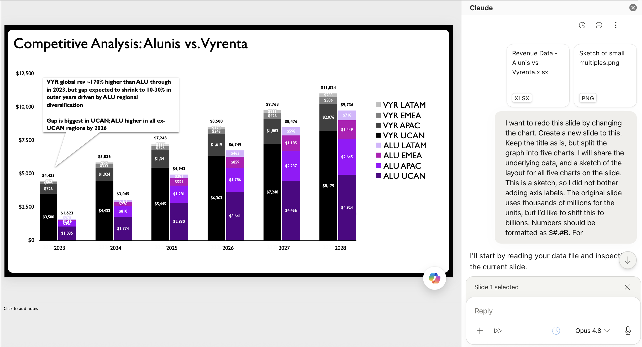
The professional provided Claude with the underlying data (which was altered from a confidential client project) and a clear prompt, incorporating the hand-drawn sketch as a visual guide. The prompt directed the AI to rebuild the chart based on the uploaded data and the specified small-multiples layout, emphasizing line charts for trend comparison. The process highlighted the growing importance of "prompt engineering"—the art of crafting effective instructions for AI—to achieve desired outcomes.
The AI’s initial output was notably robust. It successfully translated the sketch into a series of native PowerPoint line charts, complete with appropriate axes and labels, adhering to the small-multiples layout. This instantaneous generation of foundational charts represented a significant leap in efficiency. What would have taken hours of painstaking manual effort was accomplished in minutes, freeing the professional from the mechanical aspects of chart creation. This efficiency gain underscores a major benefit of AI in the workplace: offloading repetitive, rule-based tasks to allow humans to engage in more complex, creative, and strategic thinking. The ability to quickly iterate through different chart types or layouts, without the manual overhead, significantly accelerates the entire data storytelling process.
The Indispensable Value of Human Refinement
While Claude’s output was a substantial improvement over the original stacked bar chart, it was not the final product. This stage underscored the critical role of human judgment and expertise in elevating data visualizations from merely "decent" to truly "powerful." For many, the AI-generated output, perhaps with minor title adjustments, might suffice. However, a data visualization specialist understands that nuanced design choices significantly impact clarity, interpretability, and persuasive power. This is where the "value that humans bring" becomes evident.
The professional identified several key refinements to be applied to the AI-generated charts, transforming them into a truly publication-ready asset:
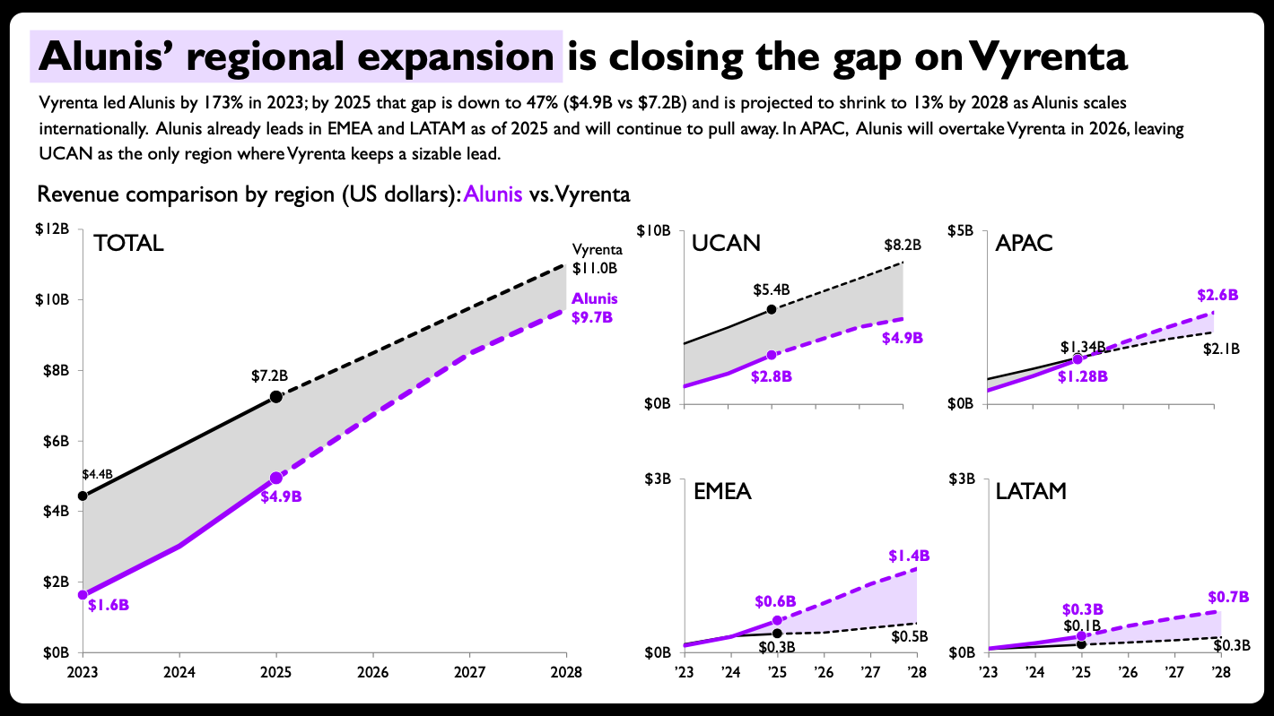
- Shaded Areas Between Lines: To visually emphasize the narrowing revenue gap between Alunis and Vyrenta, particularly as Alunis catches up, shaded areas were introduced between the two lines on each graph. This design choice instantly draws the eye to the key narrative of diminishing differences, making the comparison more salient than just two intersecting lines.
- Direct End-of-Line Labels with Values: Instead of relying solely on a legend and axis labels, direct labeling at the end of each line with its corresponding final value (e.g., 2028 revenue) significantly enhances readability. This eliminates the need for the audience to repeatedly scan between the legend, lines, and axis, streamlining comprehension and making the conclusion of each trend immediately apparent.
- Per-Panel Axis Ranges Scaled to Each Region: While consistent axis scales are generally a good practice for direct comparisons across multiple charts, the small multiples approach allowed for a strategic deviation. Scaling each regional chart’s y-axis to its specific data range (rather than a global maximum) maximized the visual real estate for that region’s data, making subtle trends and differences within each region more pronounced without distorting the overall narrative. This deliberate design decision required human judgment to balance standard practice with the specific communicative goal of highlighting regional dynamics.
- Solid vs. Dashed Lines for Actuals vs. Projections: To clearly distinguish between historical data and future forecasts, solid lines were used for actual figures (e.g., up to 2024), and dashed lines for projections (e.g., 2025-2028). This subtle yet powerful visual cue provides crucial context, allowing the audience to differentiate between confirmed performance and estimated future trends at a glance, thereby increasing the trustworthiness and analytical depth of the presentation.
- Compact Year Formatting on Smaller Panels: On the smaller regional charts, the year labels were formatted more compactly (e.g., ’20, ’22, ’24) to reduce visual clutter, maintaining legibility while optimizing space. The larger "total" chart could retain full year labels for broader context.
These seemingly minor adjustments collectively transformed the AI’s output into a highly effective and aesthetically refined data story. This process exemplifies the ideal collaborative model: AI handles the heavy lifting of initial chart generation, while human expertise provides the critical layers of insight, design acumen, and narrative clarity that ultimately resonate with an audience. The final design, ready for client presentation, effectively communicates Alunis’s strategic growth and narrowing gap against Vyrenta by 2028, with clear regional breakdowns, achieving far greater clarity than the original, overloaded chart.
Broader Implications and the Future of Data Storytelling
The successful integration of AI in this data visualization makeover carries significant implications for professionals and organizations alike.
Efficiency and Strategic Focus: The most immediate benefit is the dramatic increase in efficiency. By automating the arduous process of manual chart creation and data manipulation, AI frees up valuable time and cognitive energy. This allows data storytellers to dedicate more resources to higher-value activities: understanding the underlying data, identifying compelling narratives, refining messaging, and meticulously crafting the overall presentation design. The focus shifts from mechanical execution to strategic impact, allowing professionals to delve deeper into the "why" and "so what" of the data.
Accessibility and Skill Development: For individuals new to data storytelling or those who lack advanced software proficiency, AI tools can significantly lower the barrier to entry. They can generate a starting point for complex charts, effectively serving as an interactive tutor that helps users understand chart types and basic construction. This democratization of data visualization capabilities empowers a broader range of professionals to engage with and communicate data more effectively, fostering a more data-literate workforce.
The Evolving Role of the Data Professional: This collaboration model signals an evolution in the role of data visualization specialists. Rather than being solely chart builders, they are becoming "AI orchestrators" or "design strategists." Their value increasingly lies in their ability to provide judgment, strategic direction, and a nuanced understanding of human perception and cognition in relation to data. The demand for foundational principles in data storytelling, such as knowing when a stacked bar chart is suboptimal or how to effectively use small multiples, remains paramount. AI executes; humans still guide and refine. This shift aligns with analyst predictions that AI will augment, not entirely replace, human roles in creative and analytical domains.
The Importance of Editable Output: A key takeaway from this experiment is the critical importance of AI tools generating editable output. Early AI-generated charts were often static images, which severely limited a designer’s ability to make the necessary tweaks for optimal clarity and impact. The emergence of tools like Claude for PowerPoint, CoPilot, and others that produce native, editable charts in common software platforms marks a crucial turning point, making AI a truly practical addition to existing workflows. This feature ensures that human control over the final product is maintained, allowing for adherence to brand guidelines, specific aesthetic preferences, and the precise communicative needs of a given audience.
Industry Trends and Future Outlook: This collaborative approach aligns with broader industry trends focusing on "human-in-the-loop" AI systems. Companies developing these tools are increasingly prioritizing integration and user control, recognizing that the most powerful AI applications enhance human expertise rather than supersede it. This iterative refinement process—AI generates, human refines—is likely to become a standard operating procedure across many professional domains, from marketing analytics to financial reporting.
The journey of integrating AI into data storytelling is still unfolding, but experiments like this demonstrate a clear path forward. It’s a partnership where AI handles the heavy lifting of execution, while human insight and creativity continue to drive the strategic vision and ensure the ultimate clarity and impact of the data story. This synergy, where technology accelerates and human judgment elevates, promises to unlock unprecedented potential in how we understand and communicate with data. Professionals interested in exploring this synergy further are encouraged to engage with ongoing discussions and resources, such as live events and workshops that bring together AI developers and data storytelling experts to share best practices and future outlooks. The conversation around human-AI partnership in data visualization is vibrant, emphasizing that the most enjoyable and impactful part of data storytelling—the thinking, the designing, the refining—remains firmly in human hands, now powerfully augmented by intelligent machines.