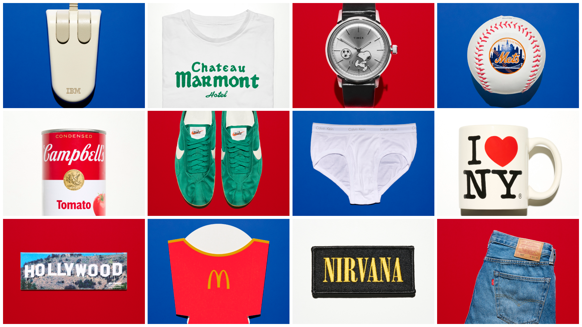
This analysis explores 14 seminal logos that have transcended their commercial origins to become cultural artifacts. These designs have stood the test of time, proving that successful branding is more than just volume marketing; it is the intersection of high art, civic pride, and mass consumption.
The Civic Symbols: Identity Beyond the Boardroom
The power of a logo is perhaps most evident when it transitions from a corporate tool to a symbol of collective identity. Two of the most prominent examples in American history are the "I Love NY" campaign and the New York Mets emblem.
I Love NY
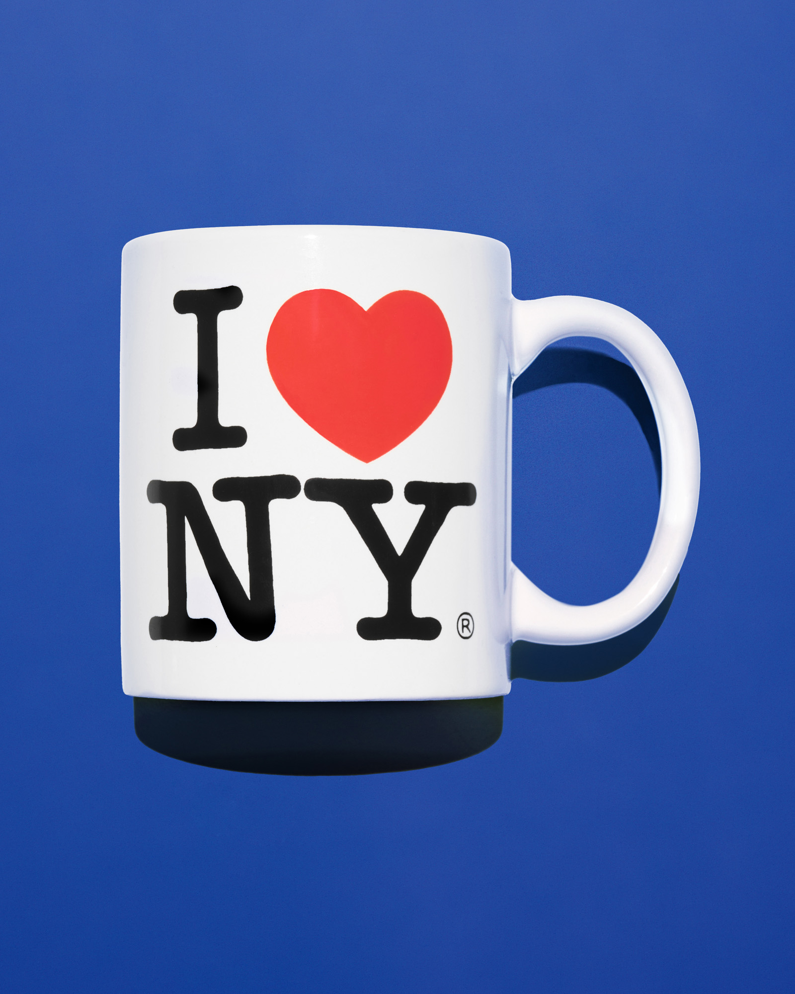
Introduced in 1976, the "I Love NY" logo is widely considered the most appropriated graphic mark in history. Designed by Milton Glaser during a period of severe fiscal crisis, the logo was the centerpiece of a marketing campaign intended to rescue New York City from the brink of bankruptcy. While riding in a taxi, Glaser doodled the rebus—a red heart paired with the slab-serif "American Typewriter" font—on a torn envelope.
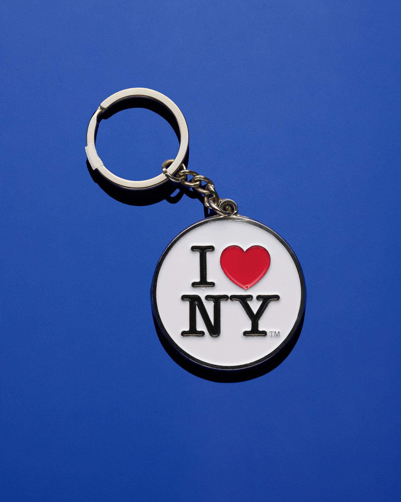
The campaign’s success was immediate. Tourism revenue in New York State increased by $140 million within the first year of the logo’s launch. In 2001, following the September 11 terrorist attacks, Glaser updated the design with a "burn mark" on the heart and the phrase "More Than Ever," demonstrating the logo’s resilience as a vehicle for civic mourning and recovery. When city officials attempted a rebrand in 2023 with the "We Love NYC" initiative, the public outcry was so fierce that it reinforced the original’s status as an untouchable icon of urban identity.
The New York Mets
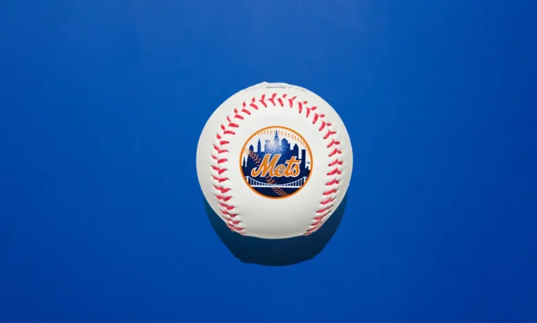
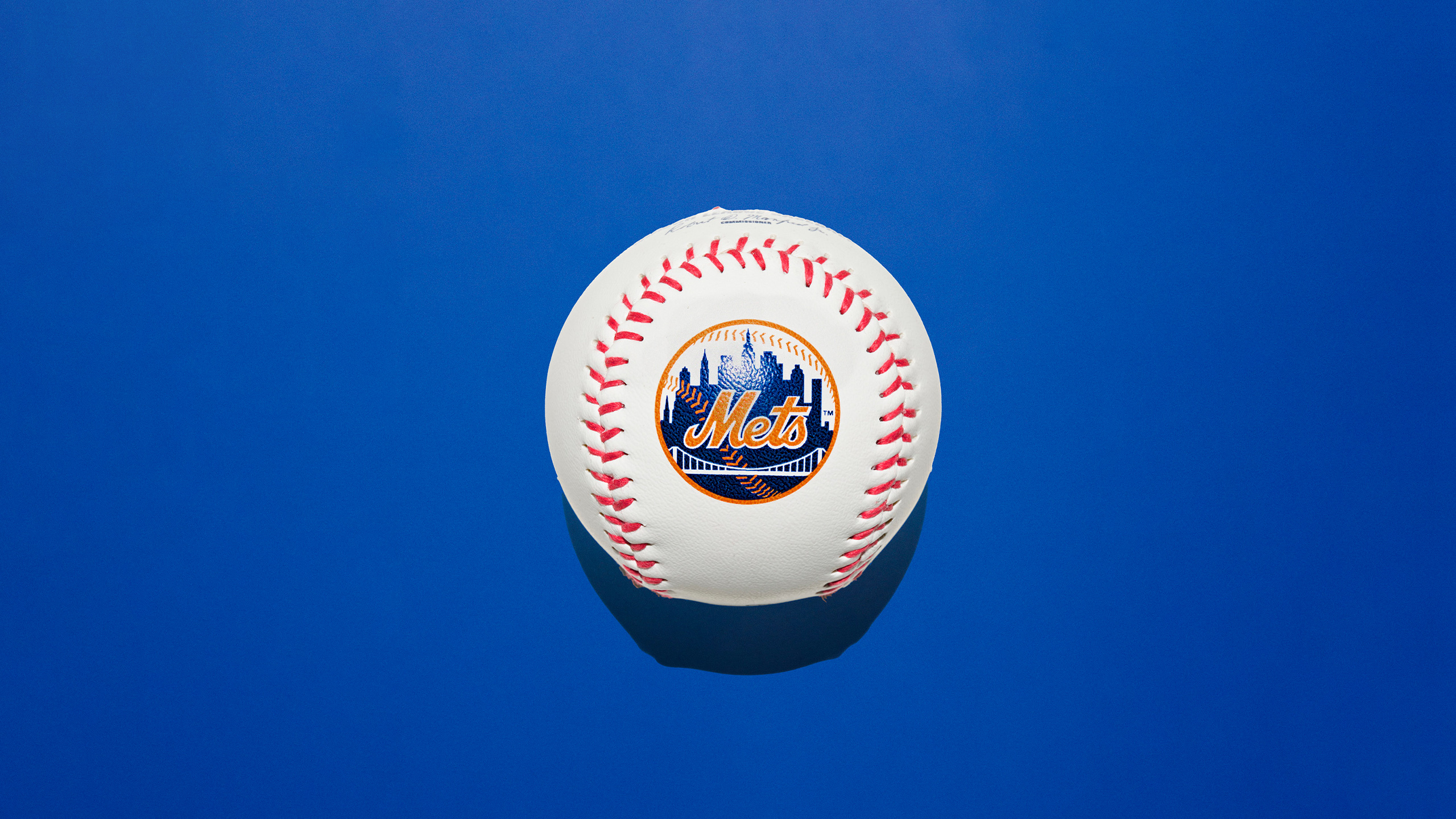
Similarly, the New York Mets logo, unveiled in 1961, serves as a geographic unifier. Created by illustrator Ray Gotto through a public competition, the design features a skyline that blends landmarks from various boroughs, including the Empire State Building and the United Nations headquarters. By using a palette of blue and orange—colors borrowed from the New York City flag and the former New York Giants and Brooklyn Dodgers—the logo bridged the gap between the city’s storied baseball past and its expansionist future.
The Industrial Monoliths: Defining Corporate Modernism
During the mid-20th century, American corporations sought to project an image of efficiency, stability, and technological prowess. This era gave rise to "Corporate Modernism," a movement led by designers like Paul Rand and Stanley Clark Meston.
IBM
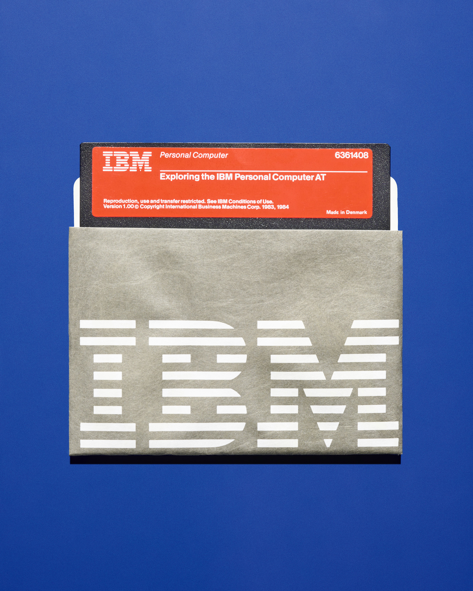
Paul Rand’s 1956 redesign of the IBM logo transformed an industrial giant into a modern powerhouse. Rand understood that for a company dealing in complex vacuum-tube computers, the visual identity needed to be simple and adaptable. He refined the letters and later, in 1972, introduced the horizontal stripes. These stripes were not merely decorative; they suggested speed and the scanning lines of a computer screen. IBM’s commitment to design extended beyond its logo, as the company collaborated with luminaries like Charles and Ray Eames and Eero Saarinen to ensure its physical offices and products matched its graphical sophistication.
McDonald’s
The "Golden Arches" represent the pinnacle of commercial architecture becoming a graphical trademark. Originally conceived by Richard McDonald and realized as structural parabolas by architect Stanley Clark Meston in 1953, the arches were intended to make the roadside restaurants visible from a distance. In 1962, Jim Schindler flattened these physical structures into the "M" logo. Today, while the "Googie" architecture of the 1950s has largely been replaced by standardized buildings, the logo remains a universal shorthand for fast food, served to billions across the globe.
Luxury, Fashion, and the Marketing of Aspiration
In the realms of fashion and luxury, a logo must communicate craft, heritage, and exclusivity. The following examples demonstrate how typography and color can create a "halo effect" around a brand.
Tiffany & Co.
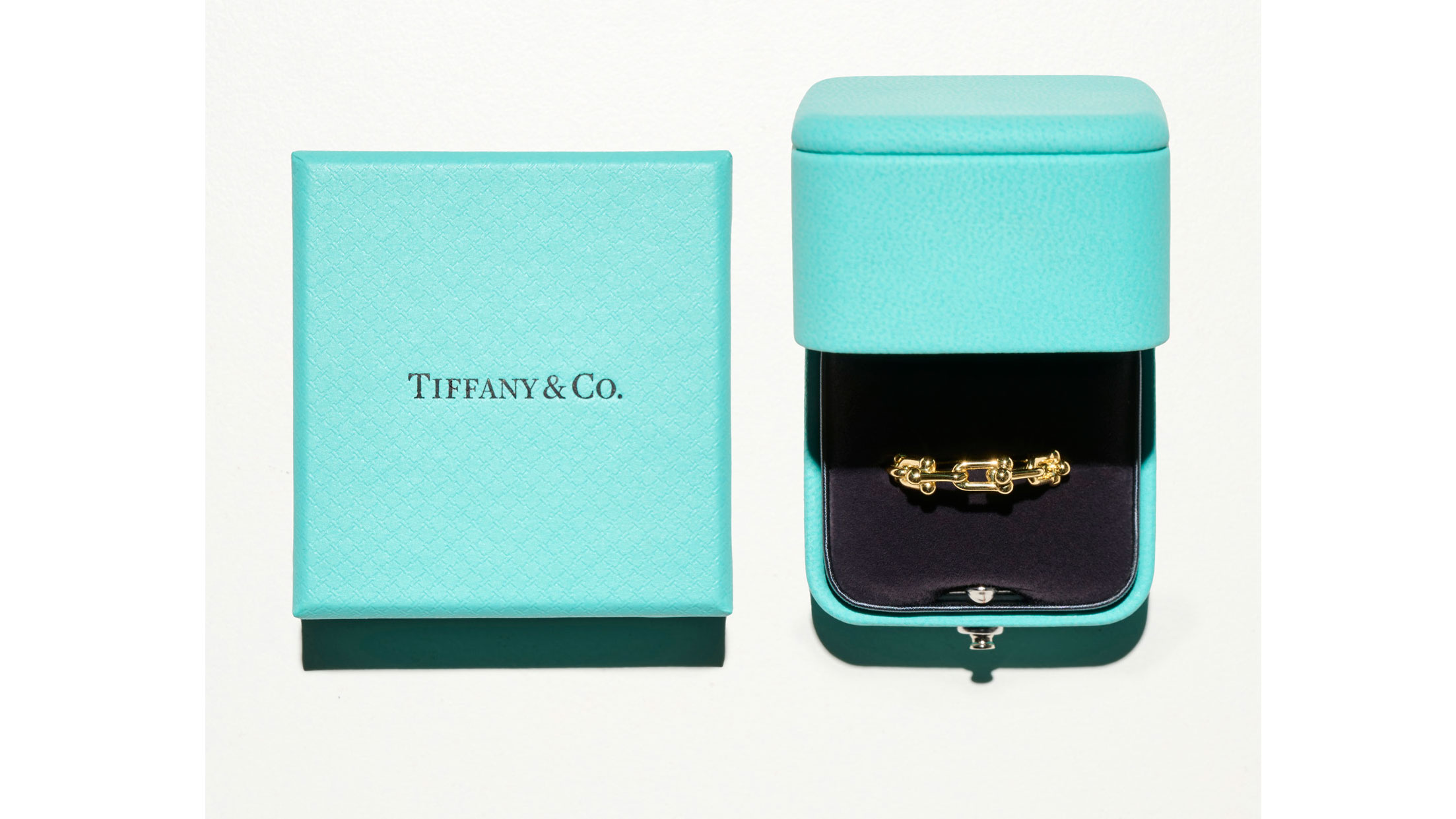
The "Tiffany Blue" box is an object of desire that cannot be purchased separately from the jewelry it contains. Trademarked since 1998 and standardized as Pantone 1837 (referencing the company’s founding year), the turquoise hue is the primary driver of the brand’s identity. In 2005, Paula Scher of Pentagram provided a discreet refresh, introducing a hand-drawn logo that suggests the elegance of letterpress printing. This combination of a proprietary color and refined typography has allowed Tiffany & Co. to maintain its status as the definitive American luxury house, even after its acquisition by the French conglomerate LVMH.
Nike and the "Swoosh"
Perhaps no logo better illustrates the value of design than the Nike Swoosh. Created in 1971 by Carolyn Davidson, a student at Portland State University, the mark was intended to convey motion and speed. Co-founder Phil Knight famously remarked, "I don’t love it, but it will grow on me." Davidson was paid just $35 for the design. However, as Nike grew to dominate the global athletic market, Knight eventually rewarded Davidson with a diamond ring and shares in the company, which are now valued in the millions. The Swoosh is a rare example of a logo that is so effective it no longer requires the company name to be present for brand recognition.
Levi’s and Calvin Klein
Levi Strauss & Co. introduced its "two-horse patch" in 1873 to demonstrate the strength of its riveted denim. The pictorial nature of the logo was a pragmatic response to high illiteracy rates in the American West; customers could simply ask for the "pants with the two horses." In contrast, Calvin Klein’s 1968 sans-serif logo represents the minimalist shift of the late 20th century. By placing the logo prominently on the elastic waistbands of underwear, Klein turned a utilitarian garment into a status symbol, leveraging celebrity endorsements and provocative photography to create a brand lifestyle.
Pop Art and the Counter-Culture
The final category of American logos involves marks that were born from or adopted by cultural movements, blurring the lines between commerce and fine art.
Campbell’s Soup and Andy Warhol
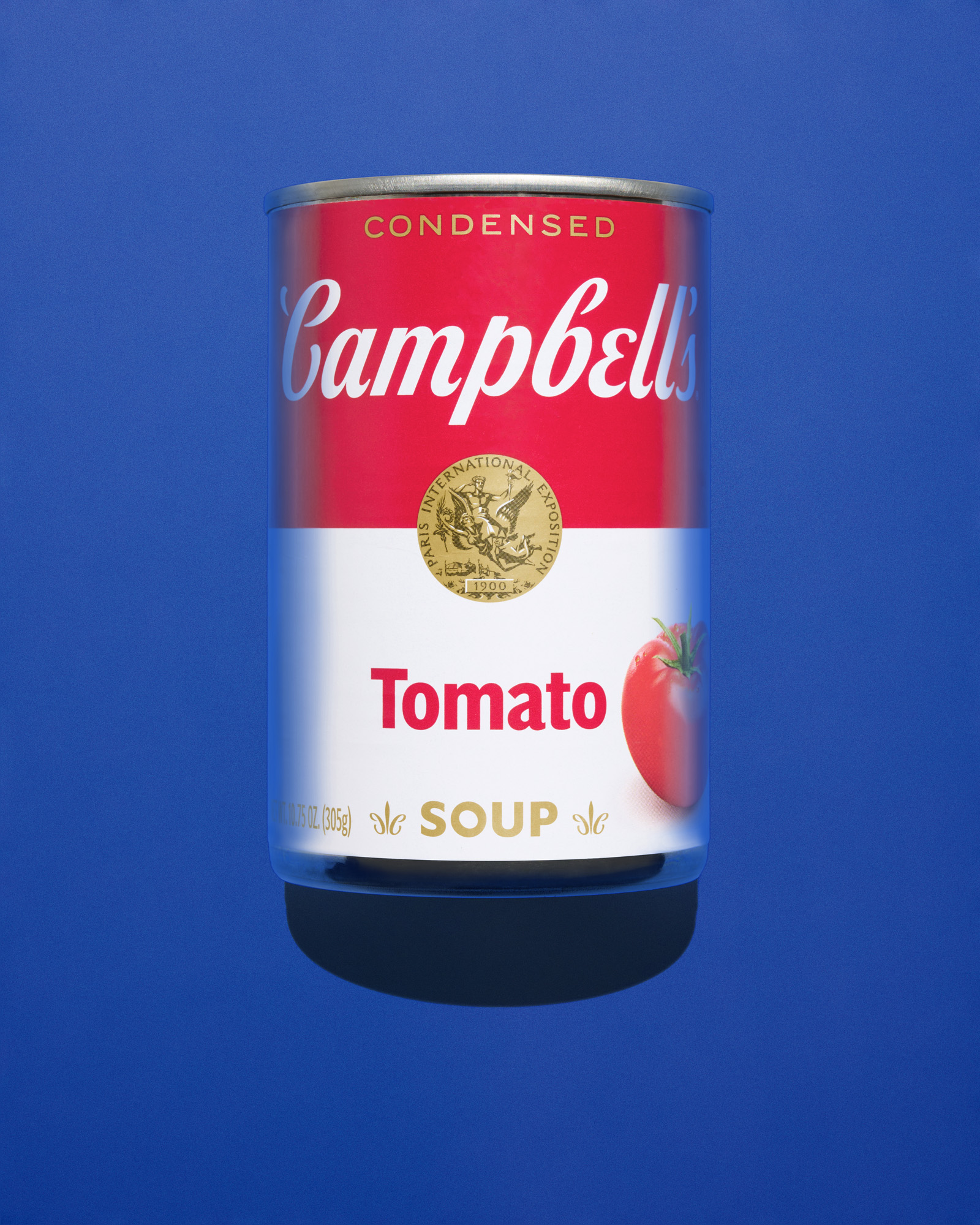
The Campbell’s Soup can was already a staple of American pantries by the 1960s, but Andy Warhol’s 32 canvases elevated the packaging to the status of high art. By reproducing the commercial design without commentary, Warhol forced the public to acknowledge the aesthetic power of mass-produced objects. This symbiotic relationship benefited both parties: Warhol became the face of Pop Art, and Campbell’s secured its place as a permanent icon of American culture.
Snoopy and Peanuts
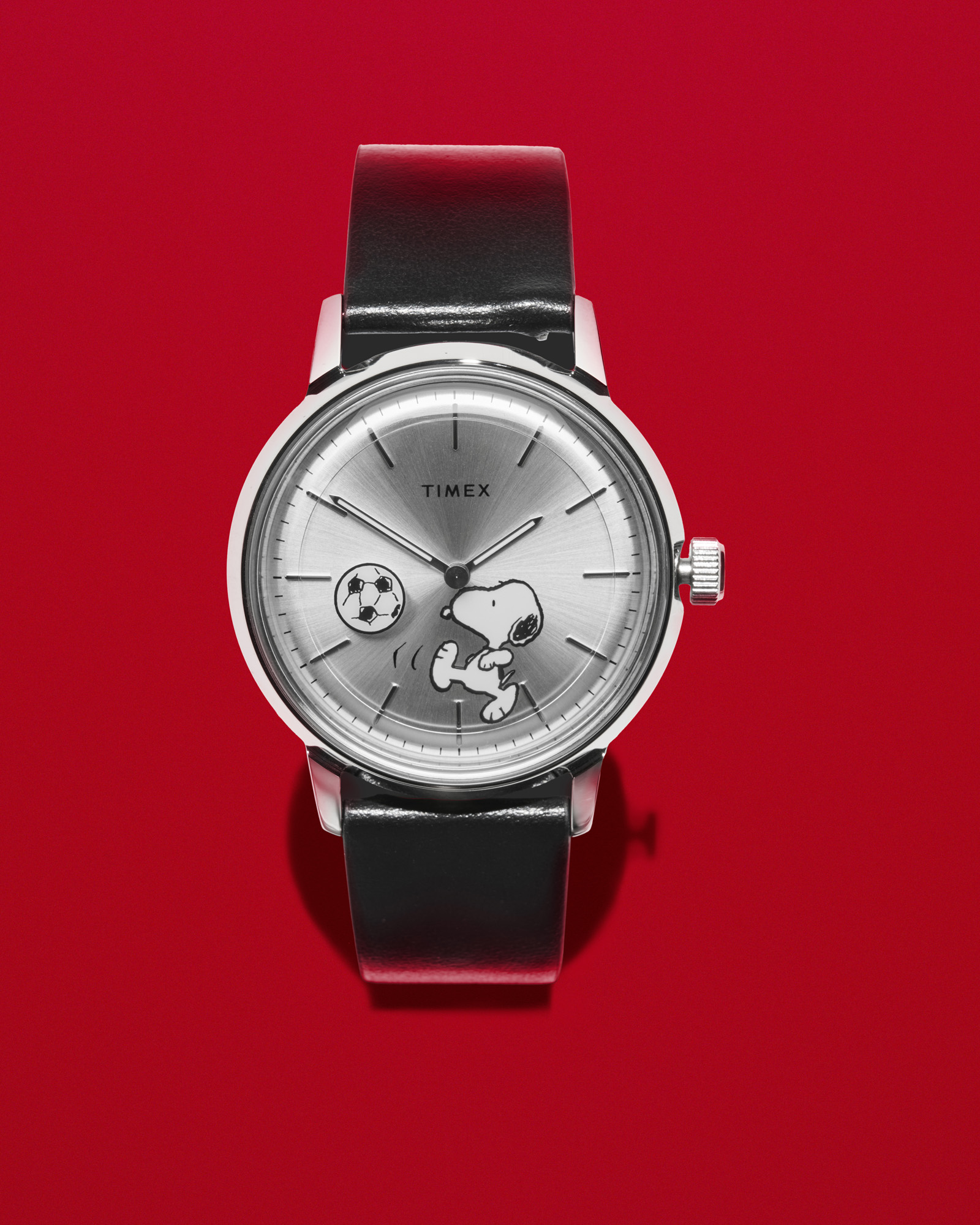
Charles M. Schulz’s Snoopy evolved from a simple beagle in the Peanuts comic strip into a global licensing powerhouse. Schulz’s decision to simplify Snoopy’s features—long ears and expressive dots for eyes—made the character highly adaptable for merchandise. In 1965, Timex became one of the first brands to license the character, beginning a trend that would see Snoopy appear in collections for Chanel, Gucci, and Lacoste.
The Hollywood Sign and Nirvana
Some logos were never intended to be logos at all. The Hollywood sign was created in 1923 as a temporary real estate advertisement for "Hollywoodland." It survived decay and potential demolition to become the universal symbol of the entertainment industry. Similarly, the Nirvana logo—utilizing the Onyx font—was a product of the 1980s Seattle grunge scene. Designer Lisa Orth and typesetter Grant Alden chose the font based on what was available on their machine at the time. Its blocky, unrefined look perfectly captured the raw energy of the band, eventually becoming a staple of fashion and music subcultures.
Broader Impact and Implications
The 14 logos discussed here represent more than successful graphic design; they are pillars of the American economy. Branding is a significant component of intangible capital, which accounts for an estimated 30% to 40% of the value of the S&P 500 companies.
The longevity of these marks—most of which have existed for over 50 years—suggests that while technology and consumer habits change, the fundamental principles of visual communication remain constant. A successful logo must be simple, memorable, and capable of evoking an emotional response. Whether it is the comfort of the Golden Arches or the rebellious spirit of the Nirvana "smiley," these designs continue to shape how the world perceives the American identity.
As the digital age introduces new challenges for brand visibility, the creative stories behind these icons provide a blueprint for future designers. They remind us that a doodle in a taxi or a $35 student commission can, under the right circumstances, change the course of graphic design history.