Xcode 27.1 Beta Introduces iPhone Duo Simulator Amid a Surge of Modern Web Development Standards and Browser Capabilities

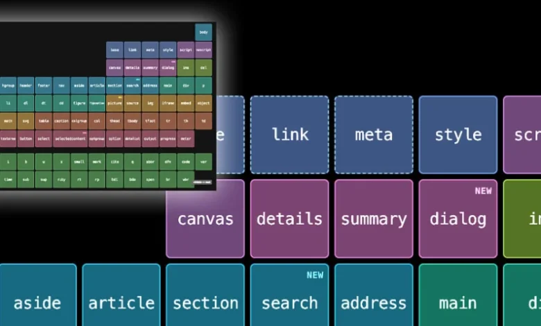
The landscape of software development and modern web engineering is undergoing a period of rapid evolution, marked by significant advancements in mobile hardware prototyping, browser layout engines, and the continuous deprecation of legacy toolchain dependencies. In a notable development for mobile and application engineers, Apple has released the Xcode 27.1 Beta, which prominently features an "iPhone Duo" simulator designed to give developers an early look at how digital interfaces render on the company’s rumored upcoming foldable device. This hardware-focused update arrives concurrently with a broad wave of web platform enhancements, including major updates to Safari’s WebKit foundation, Chrome’s handling of responsive frames, and deep technical discussions surrounding modern Cascading Style Sheets (CSS) capabilities that promise to streamline developer workflows.
The inclusion of the iPhone Duo simulator within the Xcode 27.1 environment is perhaps the most heavily discussed hardware-adjacent feature for software creators this season. As industry speculation regarding foldable smartphones intensifies, software ecosystems must adapt well in advance of commercial product rollouts to ensure a seamless user experience. By supplying developers with a dedicated dual-screen or foldable viewport emulator, Apple is proactively addressing the layout challenges inherent in devices that dynamically alter their screen real estate. Applications must now gracefully handle state transitions—such as expanding from a compact outer display to an expansive inner canvas—without suffering from layout thrashing or broken component hierarchies. While Apple has yet to officially confirm the commercial specifications or exact release timeline of a foldable iPhone, the presence of the simulator in a public beta underscores the company’s traditional strategy of providing developers with multi-year and multi-month runways to optimize their software ecosystems.

Parallel to these mobile hardware preparations, the web development community is experiencing a paradigm shift driven by the maturation of CSS and native browser features. For years, front-end developers relied heavily on preprocessors like Sass and complex JavaScript-based build steps to achieve native nesting, encapsulation, and advanced component querying. However, recent technical insights highlighted by developer Flavio Copes emphasize a growing movement toward zero-build-step modern CSS. Features such as native CSS nesting allow developers to write cleaner, more maintainable style sheets without requiring transpilation pipelines. Similarly, the widespread adoption of the :has() pseudo-class has effectively retired a multitude of fragile wrapper-class hacks, enabling developers to style parent elements based on the presence or state of their descendants directly within the browser. These native capabilities not only simplify the architectural complexity of modern web applications but also significantly improve build performance and reduce maintenance overhead for engineering teams.
In the realm of layout management and scrolling architecture, technical documentation published by Polypane creator Kilian Valkhof has brought renewed attention to the critical role of the "root scroller." The root scroller serves as the viewport’s primary scroll container, governing essential browser behaviors such as scroll restoration, overscroll effects, and the dynamic collapsing of mobile browser address bars. As web applications have grown more sophisticated, common CSS patterns—such as locking overflow properties on the body or introducing deeply nested scrollable containers—have frequently resulted in developers inadvertently handing scrolling responsibilities over to secondary elements. When this occurs, applications often lose native browser optimizations and mobile viewport behaviors. Valkhof’s recent explainers, backed by comprehensive interactive demonstrations, serve as a timely reminder for engineers to carefully audit their layout hierarchies to preserve core browser usability.
Simultaneously, the debate surrounding code quality and the influx of automated generation tools continues to polarize the development community. Prominent web engineer Zach Leatherman recently published a critical commentary titled "AI, Make the Website Good," addressing the broader implications of automated tools in digital creation. Leatherman argues that regardless of the sophistication of the underlying tooling—whether AI-driven code generators or traditional frameworks—the ultimate responsibility for output quality rests squarely on intentional design and rigorous engineering standards. By humorously analyzing the front-of-house digital outputs produced by prominent artificial intelligence firms, Leatherman highlighted a persistent industry blind spot: automation frequently replicates mediocre design patterns at scale unless guided by disciplined human oversight. This sentiment resonates deeply with veteran engineers who caution against trading foundational craft for rapid, unvetted code generation.
Browser vendors are also continuing to push the boundaries of document embedding and layout flexibility. In recent releases, engineers Sebastian Benz and Bramus van Damme announced the arrival of natively responsive iframes in Chrome 154, with preview availability extending to Microsoft Edge. Historically, embedding external content via an iframe required cumbersome JavaScript libraries or fixed aspect-ratio hacks to handle dynamic content resizing gracefully. The introduction of natively responsive iframes allows developers to set an iframe to automatically match the exact dimensions of its internal content, dictate which dimension drives that sizing, and apply dynamic adjustments on the fly. The singular caveat to this powerful new feature is that the embedded document must explicitly opt in, ensuring security and cross-origin compliance while modernizing one of the web’s oldest and most rigid elements.
The convergence of these diverse technological updates—ranging from Apple’s exploratory hardware simulators to zero-build-step CSS standards, root scroller optimizations, and native iframe responsiveness—paints a clear picture of an industry striving for greater efficiency, native capability, and structural purity. As developers digest the tools provided in Xcode 27.1 Beta and adapt to the latest specifications rolled out across major browser engines, the overarching mandate remains clear: modern engineering requires a delicate balance between embracing cutting-edge platform capabilities and maintaining a rigorous commitment to fundamental code quality. Whether building for the next generation of foldable mobile hardware or crafting resilient, zero-dependency web applications, the software engineering sector continues to move toward a more streamlined, standards-compliant future.