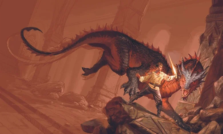
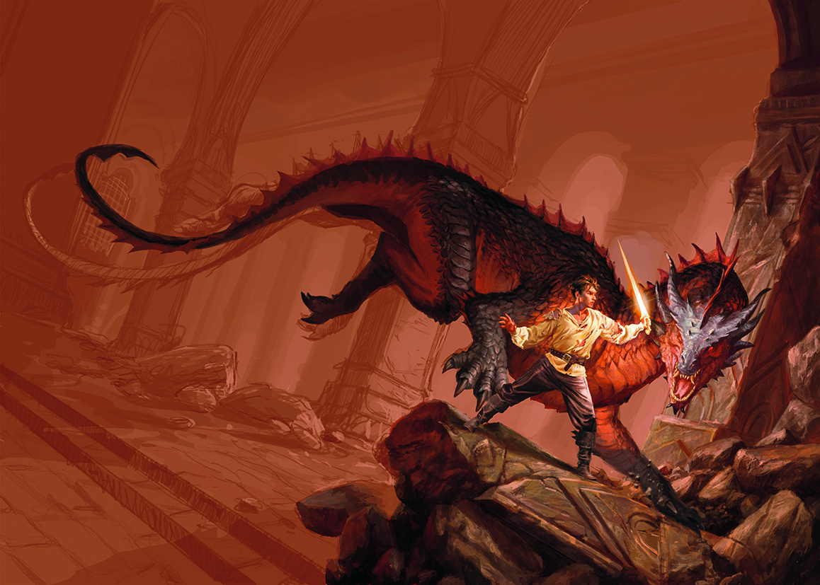
The publishing industry continues to rely heavily on visual storytelling to capture the attention of readers in an increasingly crowded market. Recently, Armenia Edizioni commissioned a bespoke illustration for the debut fantasy novel by author RF Obsydios, tasking the artist with creating a cover that captures the high-stakes, atmospheric essence of the genre. The project required a blend of technical digital artistry and a deep understanding of epic fantasy tropes, culminating in a piece that depicts a battle-scarred warrior confronting a wingless, red-and-black scaled dragon within the confines of an ancient, ruined fortress.
Project Scope and Conceptual Framework
The collaboration between Armenia Edizioni and the commissioned illustrator highlights the precise nature of modern commercial art. The directive from the publishing house was specific: the cover needed to evoke a sense of "classic epic fantasy." This requested aesthetic is deeply rooted in the traditions of late 20th-century fantasy art, a style characterized by high contrast, dramatic lighting, and a focus on scale and tension.
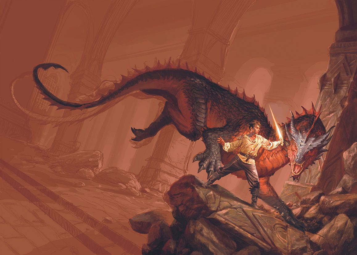
To guide the artistic process, the publisher referenced Joe Abercrombie’s The Devils, a benchmark for current dark fantasy trends. The color palette was strictly defined by the need for warm, aggressive tones, with red and orange dominating the composition to signal both the dragon’s presence and the volatile energy of the battlefield. This choice of color is backed by color theory in marketing, which suggests that warm, high-saturation colors are more effective at triggering physiological responses—such as increased heart rate—that mimic the tension of an impending conflict.
The Technical Execution of Fantasy Illustration
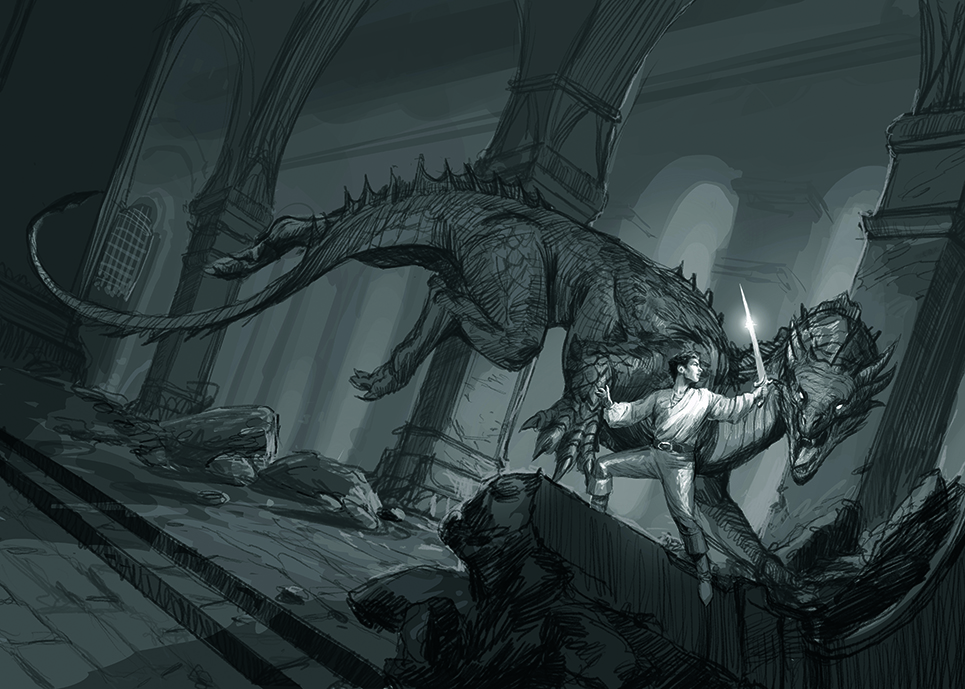
The production of this cover serves as a case study for contemporary digital illustration workflows. The process began with a minimalist approach: black-and-white sketches. By prioritizing composition, volume, and light before introducing color, the artist was able to establish a clear structural foundation that the client could approve without the distraction of final rendering details.
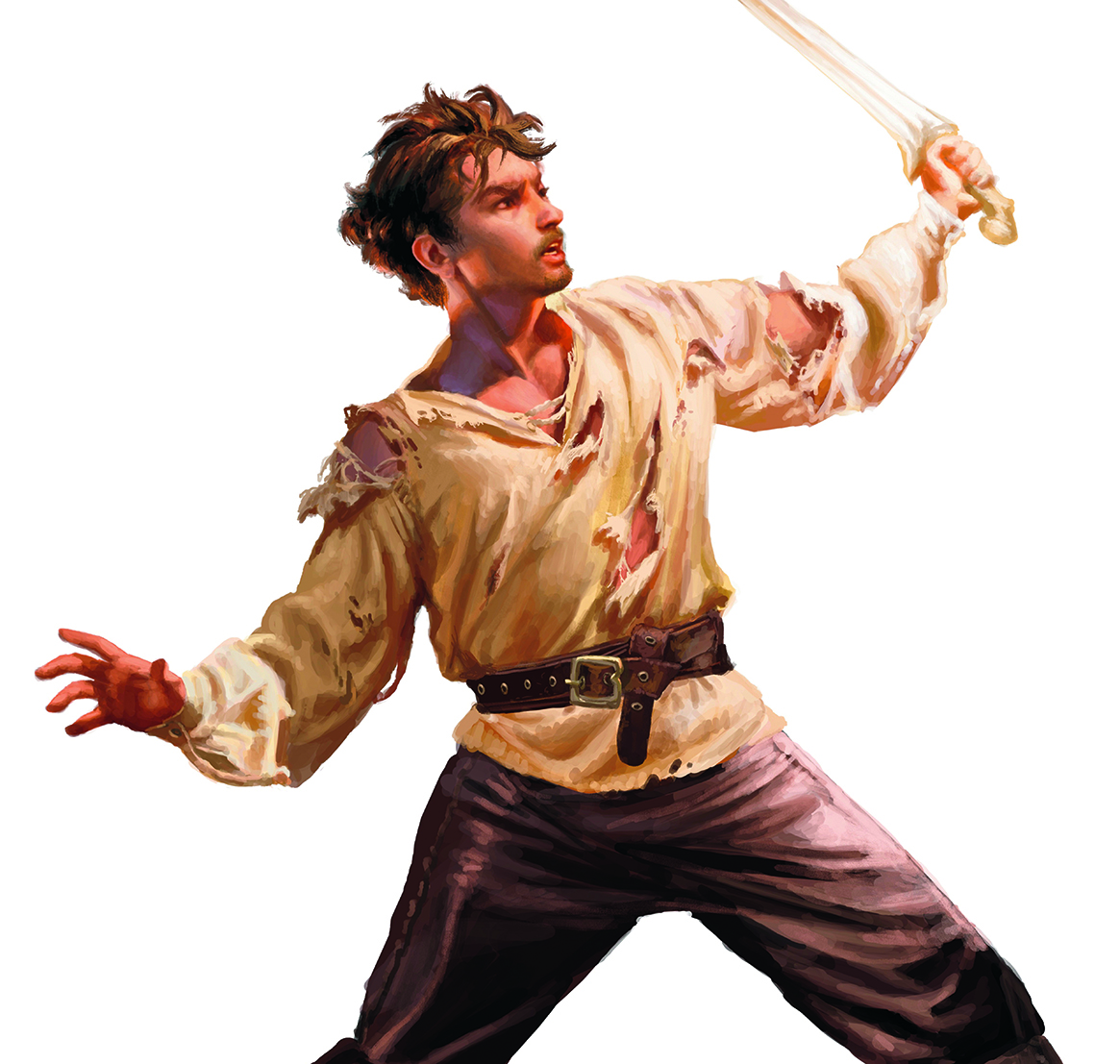
One of the more complex technical decisions involved the isolation of the primary subject. The warrior was painted in a high-resolution, independent format before being integrated into the broader environment. This methodology, common among industry professionals, allows for greater flexibility during the final compositing stage, ensuring that the figure remains sharp and properly lit against the backdrop of the fortress.
Architectural Inspiration and Compositional Strategy
The setting of the illustration, an imposing fortress featuring massive vaulted columns, draws heavy inspiration from the architectural tropes of high fantasy, specifically referencing the ruinous aesthetic of sites like the fictional Moria. The composition utilizes a "tilted shot"—a Dutch angle—which is a well-documented technique in both film and visual arts to convey instability, psychological tension, and danger.
The design of the dragon presented a significant anatomical challenge. The artist prioritized a dynamic, curvilinear shape for the creature’s hind legs, which serves a functional role in the composition: it forces the viewer’s eye to travel in a specific arc, effectively framing the warrior and creating a direct line of sight between the two combatants. This is a deliberate application of the Rule of Thirds and leading lines, designed to keep the viewer’s focus locked on the primary point of conflict.
Historical Research and Reference Material
A notable aspect of the artist’s methodology is the use of practical, real-world references. The creator has cultivated a personal archive of historical-style clothing and fabric scraps, which are used to construct makeshift costumes. By photographing these under specific lighting conditions, the artist is able to capture realistic folds, material textures, and shadow behavior that would be difficult to synthesize from memory or imagination alone. This practice bridges the gap between digital fabrication and historical accuracy, a trend that has gained traction as digital tools become more sophisticated at rendering complex textures.
The Evolution of Book Cover Design
The publishing industry has undergone a radical transformation in the last two decades. Where once cover art was relegated to traditional media like oil or acrylic on canvas, the market is now dominated by digital suites such as Adobe Photoshop, Corel Painter, and Clip Studio Paint. These software tools allow for non-destructive editing and infinite iteration, which is essential when working with publishers who require rapid turnaround times.
Furthermore, the rise of the "best drawing tablet" market—with high-end displays from manufacturers like Wacom, Huion, and Xencelabs—has allowed artists to work with precision levels that rival traditional media. For professional illustrators, the investment in this hardware is not merely a preference but a necessity for meeting the production standards required by international publishing houses.
Broader Implications for the Publishing Market
The commissioning of high-quality, bespoke cover art remains a primary strategy for publishers to differentiate their titles. With the advent of AI-generated imagery, the human element in cover art has become a point of contention and discussion. However, the depth of technical planning, historical research, and anatomical understanding displayed in the RF Obsydios commission underscores the value of the human artist. Unlike algorithmic generation, which often struggles with complex compositional logic and specific client-led narratives, a professional illustrator provides the nuanced decision-making required to translate a manuscript’s thematic weight into a single, cohesive visual image.
In the context of the fantasy genre, where visual cues are essential for signaling the tone of the narrative, the cover is the first point of contact for the reader. Statistics from the Book Industry Study Group (BISG) suggest that cover design remains a top-three factor in consumer purchasing decisions for new fiction. By investing in professional illustration, publishers like Armenia Edizioni are betting on the ability of visual art to cultivate brand identity and reader loyalty in an increasingly digital-first marketplace.
Conclusion
The creation of the cover for the debut fantasy novel by RF Obsydios is a reflection of the rigorous, methodical nature of modern commercial art. By combining traditional compositional techniques, such as the tilted angle for dramatic effect, with advanced digital workflows, the illustrator has created a piece that satisfies both the creative requirements of the publisher and the aesthetic expectations of the fantasy readership. As the industry continues to evolve, the integration of physical reference gathering and high-end digital tools will likely remain the standard for producing covers that not only capture the spirit of a story but also serve as effective tools for market competition.
For aspiring artists looking to enter the field of professional book illustration, the lessons from this project are clear: master the fundamental principles of composition and lighting, develop a robust reference library, and maintain a workflow that allows for clear communication and iteration with the client. The enduring appeal of epic fantasy depends as much on the visual promise made by the cover as it does on the text within the pages.