Mastering Slide Architecture: How Strategic Layout and Vertical Logic Transform Data Communication

When modern organizations endeavor to communicate complex insights through data, the vast majority of strategic energy is disproportionately funneled into the design of the graphs themselves. Analysts and presenters spend hours debating whether a bar chart, a line graph, or a scatter plot best captures a trend, meticulously refining color palettes, agonizing over axis labels, and highlighting specific data points to capture attention. However, communication experts note that an equally critical determinant of whether a message successfully lands is routinely overlooked: the architectural layout of the slide itself.
The spatial organization of a presentation slide—dictating precisely where a graph is positioned, the allocated volume of accompanying text, and the deliberate pathway through which the human eye navigates the visual landscape—is far more than a superficial aesthetic choice. It is a fundamental communication mechanism. When executed correctly, an optimized layout ensures that an audience effortlessly absorbs and follows the presenter’s underlying logic. Conversely, when poorly structured, even the most meticulously designed and statistically sound data visualization can leave viewers disoriented, fatigued, and ultimately confused.
Understanding the Mechanics of Visual Processing and Spatial Layout
To appreciate the weight of slide architecture, one must examine how human cognition interacts with visual media. Modern cognitive science emphasizes the picture superiority effect, a well-documented phenomenon establishing that human beings process, comprehend, and retain visual imagery significantly faster and more effectively than text alone. When a slide forces viewers to divide their attention equally between dense blocks of text and competing graphical elements, cognitive load spikes.
Corporate presentations frequently suffer from what data visualization specialists term "visual clutter." In these scenarios, graphs and text fight for dominance, leaving the viewer unsure of where to look first or how the various data points relate to the overarching narrative. By treating slide layout as a deliberate communication tool rather than a blank canvas to be filled, presenters can choreograph the viewer’s journey. Leading with a prominent visual element allows the human brain to instantly grasp the core concept, while strategically placed supporting text provides context without causing cognitive overload.
The Core Principle: Vertical Logic
A foundational concept in bridging the gap between raw data and audience comprehension is vertical logic. Coined within the broader methodology of effective data storytelling—and extensively detailed in foundational texts such as Storytelling with Data: Let’s Practice!—vertical logic dictates that every discrete piece of information presented on a single slide must be mutually reinforcing.
Under a regime of strict vertical logic, the content of the slide reinforces the overarching title, and the title conversely contextualizes the content. The textual annotations reinforce the visual graphic, and the visual graphic validates the accompanying words. There is no room for extraneous bullet points, unrelated decorative icons, or tangential statistics. Instead, the slide achieves a seamless informational flow where the reader or viewer deepens their comprehension with every individual element they encounter, moving effortlessly from top to bottom or from anchor visual to supporting text.
This vertical alignment acts as a safeguard against misinterpretation. When a presenter stands before stakeholders, executives, or clients, the slide should function as an externalized train of thought. If the title makes a claim that the chart below it fails to substantiate immediately, or if the text introduces variables not visible in the graphic, the vertical logic collapses. Maintaining this internal consistency requires editors and designers to ruthlessly edit out non-essential data, ensuring that every square millimeter of the slide serves a direct, cohesive purpose.
Evolution of Presentation Design and Industry Standards
The discourse surrounding slide architecture and vertical logic is part of a broader, ongoing evolution in corporate communications. Over the past two decades, the global business community has transitioned away from the text-heavy, bullet-point-laden slide decks popularized by early enterprise software in the late 1980s and 1990s. Research from organizational psychology suggests that traditional bulleted lists severely hamper audience retention, often inducing a state colloquially known as "Death by PowerPoint."
As corporations recognized the financial and operational costs of miscommunication—estimated by various management consultancies to cost billions annually in lost productivity and delayed decision-making—demand surged for evidence-based design frameworks. Organizations began replacing decorative templates with purposeful, narrative-driven layouts. The publication of specialized literature on data visualization marked a turning point, shifting corporate training programs away from mere software proficiency toward cognitive science and visual perception theory.
Applying the Framework: The One-Sided Layout
Translating abstract concepts like vertical logic into daily corporate practice requires concrete structural templates. Building upon foundational communication theories, recent methodologies introduced in professional texts such as Storytelling with Data: Before & After offer standardized layouts designed to maximize cognitive engagement. One of the most effective configurations for executive-level communication is the one-sided layout.
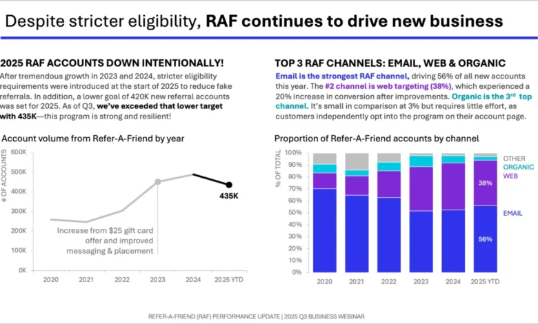
In a one-sided layout, a single, high-impact graph is granted a large, prominent position—typically occupying the majority of the slide’s surface area. Surrounding this visual anchor is dedicated, uncluttered space for text positioned strategically across the top and down the right-hand margin. This structural approach directly exploits the aforementioned picture superiority effect. By anchoring the slide with a dominant visual, the presenter commands immediate attention, allowing the graphic to perform the heavy lifting of communicating the primary trend or anomaly.
Once the visual has grounded the audience’s attention, the surrounding text is deployed not to reiterate what is already obvious in the chart, but to frame, contextualize, and drive home the ultimate recommendation. For instance, in real-world marketing and business strategy presentations featured in before-and-after case studies, this specific layout structure has been utilized to distill complex market research into succinct, actionable recommendations. Rather than forcing executives to cross-reference a small chart with a lengthy paragraph buried at the bottom of the slide, the one-sided layout presents the insight as an undeniable, unified conclusion.
Data and Industry Impact
The economic and operational implications of adopting structured slide architecture are substantial. According to a landmark 2023 workplace communication survey conducted by global human resources and analytics firms, approximately 68% of corporate decision-makers report making strategic errors or experiencing significant delays due to poorly designed or ambiguous data presentations. Furthermore, mid-to-large-scale enterprises that implemented standardized data storytelling and layout guidelines experienced an estimated 35% reduction in meeting duration and a marked increase in executive alignment during quarterly strategic reviews.
Data analysts and corporate communication officers note that the integration of vertical logic and deliberate spatial layouts transforms presentations from static reporting mechanisms into dynamic decision-making tools. When data is presented with rigorous structural clarity, discussions shift away from debating what the chart actually shows and move directly into evaluating strategic responses and resource allocation.
Expert Perspectives and Reactions
Industry leaders and organizational development experts have increasingly endorsed the shift toward disciplined slide architecture. Dr. Elena Vance, a senior corporate communication strategist at a multinational management consultancy, emphasizes that the primary failure of modern data presentation is rarely a lack of analytical rigor, but rather a failure of spatial translation.
"Organizations invest millions in gathering pristine data and building sophisticated predictive models, yet they routinely undermine their own efforts by dumping uncurated information onto poorly structured slides," Dr. Vance observes. "When you apply concepts like vertical logic and the one-sided layout, you are respecting the cognitive limits of your audience. You are removing friction from the communication channel, allowing the insight to drive action immediately."
Similarly, corporate training directors have noted a surge in demand for workshops focused on visual hierarchy and slide layout. As remote and hybrid work environments place a premium on asynchronous communication and high-impact virtual presentations, the ability to design self-explanatory slides has transitioned from a niche skill to an essential core competency for business professionals across all sectors.
Broader Implications and Future Outlook
Looking forward, the principles governing slide layout and vertical logic are poised to influence not only human-led presentations but also the automated generation of business intelligence dashboards. As artificial intelligence tools increasingly assist analysts in synthesizing data and generating initial reporting decks, embedding cognitive science principles into algorithmic layout design will become paramount.
Ensuring that AI-generated dashboards and slides adhere to strict vertical logic and leverage optimal spatial arrangements—such as prominent visual anchoring and contextual text placement—will prevent the proliferation of automated clutter. As businesses navigate an ever-expanding ocean of data, the mastery of slide architecture remains a vital human-led discipline, ensuring that information is not merely displayed, but truly understood and acted upon.