
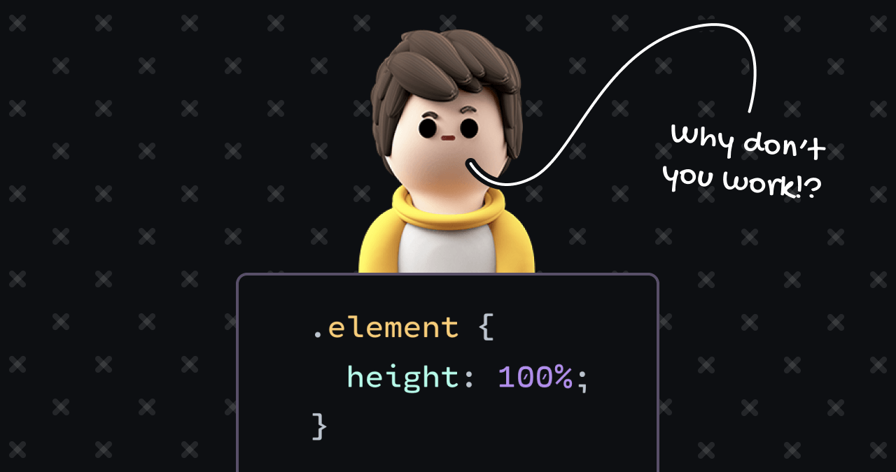
The mystery of why CSS height properties frequently fail to render as intended is a long-standing challenge for web developers. While properties like width behave predictably by inheriting dimensions from parent containers, the height property operates under a different set of constraints that often leads to frustration for those transitioning from other programming disciplines. Understanding these mechanics requires an analysis of the browser’s layout algorithms, specifically the difference between block-level flow layout and modern alternatives like Flexbox and CSS Grid.
The Mechanism of Height Calculation
In the early days of web development, the Document Object Model (DOM) and the subsequent Cascading Style Sheets (CSS) specifications were designed primarily for document-based structures rather than complex application layouts. This legacy manifests in the "Flow Layout" algorithm, which remains the default behavior for most HTML elements.
Under the rules of Flow layout, a block-level element, such as a div, is programmed to expand horizontally to fill its parent’s available width. Conversely, its vertical dimensions are determined by the sum of its internal content. This "shrink-wrap" behavior creates a fundamental disconnect: the width of an element is determined by looking "up" the document tree to the parent, while the height is determined by looking "down" at the children.
This divergence creates a circular dependency paradox. When a developer applies height: 50% to a child element, the browser attempts to calculate 50% of the parent’s height. However, if the parent’s height is itself determined by its children, the browser cannot finalize the calculation. Because the parent needs to know the child’s size to set its own height, and the child needs to know the parent’s size to set its own height, the browser effectively aborts the instruction, rendering the percentage value inert.
Historical Context and Browser Evolution
The complexity of these layout rules has been a documented hurdle since the inception of CSS2. Throughout the early 2000s, developers relied on complex hacks—such as "clearfixes" or fixed pixel dimensions—to force elements into specific heights. These methods were largely brittle and ignored the principles of responsive design, which began to take center stage around 2010 with the rise of mobile browsing.
For over a decade, the standard solution for creating full-screen layouts involved a "cascade of percentages." Developers would explicitly set heights on the html and body elements to 100%, effectively creating a "knowable" height chain that started from the browser’s viewport. This method ensured that any child element could safely reference a parent’s height. However, this approach was often problematic, as it locked elements into rigid structures that struggled to accommodate varying text sizes, browser zoom levels, and accessibility requirements.
Data and Accessibility Implications
Recent industry analysis by web accessibility advocates indicates that the reliance on fixed-pixel units for height—often used as a workaround for the percentage calculation failure—poses significant risks for users with visual impairments. When developers force a container to a fixed height (e.g., 300px), they often fail to account for users who increase their browser’s default font size. As text scales upward, it inevitably overflows the container, leading to obscured content and broken user interfaces.
Modern web standards now emphasize "knowable" heights—values derived from explicit constraints rather than dynamic content. The transition from pixels to relative units like rem has been a primary shift in the industry, allowing for layouts that remain proportional regardless of user settings. Furthermore, the introduction of Viewport units—specifically vh (viewport height) and the newer svh (small viewport height)—has provided a more robust way to define heights relative to the browser window, addressing the erratic behavior previously observed on mobile devices where URL bars and toolbars would dynamically resize the viewport.
The Paradigm Shift: Flexbox and Grid
The most significant development in resolving these layout issues has been the widespread adoption of Flexbox and CSS Grid. These layout modules, which reached broad browser support around 2015, fundamentally change how elements interact with their parents.
In a Flexbox or Grid context, the parent element is no longer forced to shrink-wrap its children. Instead, these layout algorithms enable "stretching" behavior. When a container is set to display: grid or display: flex, the default behavior for children is to expand to fill the entire cross-axis of the container. This eliminates the need for the circular calculation paradox entirely.
Research into layout efficiency suggests that moving away from Flow layout toward Grid and Flexbox reduces the amount of "boilerplate" CSS code required for complex applications by approximately 30-40%. By offloading the calculation of heights to the browser’s optimized rendering engine, developers can achieve consistent results without the need for the rigid, nested percentage chains that characterized the previous decade of web development.
Industry Perspectives on Layout Algorithms
Industry experts, including those involved in the CSS Working Group, have noted that the "height problem" is not a bug, but a reflection of the browser’s attempt to reconcile document flow with modern UI requirements. The consensus among senior engineers is that the shift in mindset is the most critical hurdle. Instead of asking "how do I make this child 50% height," developers are now encouraged to ask "which layout algorithm is best suited for this component?"
For instance, in a navigation dashboard, CSS Grid is often preferred because it allows for explicit definitions of rows and columns, effectively bypassing the uncertainty of dynamic content height. In contrast, Flexbox is frequently favored for singular, horizontal, or vertical alignment tasks where content might vary in length but must maintain a specific relationship to its siblings.
Future Outlook and Best Practices
As the web continues to evolve, the distinction between "document-oriented" CSS and "application-oriented" CSS will likely become even more pronounced. The move toward Container Queries, a feature recently added to major browsers, represents the next frontier in layout management. Container Queries allow elements to respond to the size of their parent container rather than the viewport, providing a degree of control that was previously only possible with JavaScript.
The conclusion for developers remains clear: when encountering a failure in CSS height application, one should first evaluate whether the parent element has an explicit, non-dynamic height. If it does not, the solution is not to force the parent into a fixed size, but to implement a more robust layout context, such as Flexbox or Grid. By leveraging these modern engines, developers can ensure that their interfaces remain stable, accessible, and responsive across the vast ecosystem of modern browsers and hardware. The era of "rolling the dice" with layout properties is effectively ending, replaced by a more deterministic and programmatic approach to web design.