Latest Web Development Standards Emphasize Modern CSS, Responsive Iframes, and Hardware Readiness for Emerging Formats

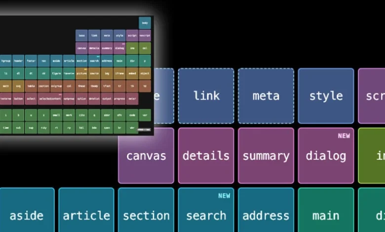
The digital design and software engineering landscape continues to experience rapid evolution, driven by shifting browser capabilities, the integration of generative artificial intelligence in web design, and the impending arrival of novel hardware form factors. Recent developments from major technology platforms, browser vendors, and independent developers highlight a concentrated industry-wide push toward native browser features, streamlined toolchains, and enhanced layout responsiveness. As web standards mature, developers are increasingly empowered to shed legacy dependencies in favor of powerful, built-in browser APIs that promise better performance, cleaner codebases, and more resilient user experiences across an ever-expanding array of devices.
Apple Previewing Foldable Hardware Support via Xcode
Amidst these software standard updates, hardware anticipation has reached a fever pitch following recent disclosures from Apple. Developer documentation and beta releases, specifically Xcode 27.1 Beta, have introduced an explicit iPhone Duo simulator, offering software engineers and UI/UX designers an early look at how web pages and native applications render on Apple’s forthcoming foldable device category.
While Apple has remained characteristically tight-lipped regarding an official public release date or finalized hardware specifications for a foldable smartphone, the inclusion of the iPhone Duo simulator in developer tooling signals that internal testing and third-party ecosystem preparation are well underway. Industry analysts suggest that the introduction of foldable iOS hardware will fundamentally alter mobile web design requirements. Developers will no longer be able to rely on standard single-screen responsive breakpoints. Instead, applications and websites must seamlessly transition between a compact external display layout and an expanded, tablet-sized internal canvas.
The appearance of foldable testing environments in Xcode underscores a broader historical trend in mobile computing: hardware and software co-evolution. Similar to the introduction of the original iPhone, the iPad, and various notch and Dynamic Island display configurations, Apple is providing developers with the necessary diagnostic tools well in advance of commercial availability. This proactive approach aims to prevent the fragmented user experiences that historically plagued early iterations of foldable Android devices, ensuring that the web ecosystem is fully optimized for dual-screen and flexible-display computing from day one.
The Rise of Zero-Build CSS and Native Browser Capabilities
On the web standards front, the movement toward reducing JavaScript and build-step dependencies continues to gain momentum. Prominent front-end developer Flavio Copes recently highlighted a suite of twelve modern CSS features that can be deployed immediately in production environments without the need for complex preprocessors or build pipelines.
For over a decade, web developers relied heavily on preprocessors like Sass and Less to achieve code maintainability through features such as nested selectors. However, with native CSS nesting now supported universally across all major modern browser engines, the need for third-party build tools to compile stylesheets has diminished significantly. Furthermore, the widespread adoption of advanced selectors, such as the :has() relational pseudo-class, has effectively eliminated the need for complex wrapper-class hacks and JavaScript-based DOM traversing to style parent elements based on their children.

This shift toward native capabilities yields measurable performance benefits. Eliminating build steps reduces continuous integration and continuous deployment (CI/CD) build times, simplifies debugging by ensuring that browser-inspected code matches source code directly, and decreases the overall payload overhead associated with legacy polyfills and compiler scripts. As browser vendors accelerate their implementation cycles for the CSS Working Group specifications, the gap between developer convenience and native execution continues to narrow.
Preserving the Root Scroller in Modern Web Architecture
As web layouts grow more complex, maintaining fundamental browser behaviors—such as scroll restoration, pull-to-refresh mechanics, and the dynamic collapsing of mobile browser address bars—has become a critical engineering challenge. In a recent technical deep dive, web developer and educator Kilian Valkhof examined the intricacies of the "root scroller"—the designated viewport scroll container that governs global scrolling behaviors.
Historically, web browsers automatically assigned viewport scrolling duties to the document root element. However, modern CSS patterns, including full-page application layouts utilizing fixed positioning, flexbox, and CSS grid frameworks, frequently inadvertently transfer scroll containers to nested child elements. When this occurs, the browser loses track of the primary scroll context, resulting in broken scroll restoration upon page navigation and erratic behavior from mobile browser chrome as users scroll.
Valkhof’s analysis emphasizes the importance of explicitly defining and preserving root scroller behavior through proper architectural patterns. For enterprise web applications and content publishers alike, losing root scroller functionality degrades the perceived performance and polish of a site, often making web-based applications feel sluggish compared to their native counterparts. By adhering to best practices that keep the viewport as the primary scroll container, developers can ensure that native browser optimizations function as intended without requiring resource-intensive JavaScript workarounds.
AI Integration and the Unyielding Demand for Quality Output
Beyond low-level layout mechanics, the web development community is grappling with the philosophical and practical implications of artificial intelligence in design and content generation. In a widely discussed commentary titled "AI, Make the Website Good," software engineer and developer advocate Zach Leatherman addressed the growing prevalence of generative AI tools in the web creation process.
Leatherman argues that while AI tooling has drastically lowered the barrier to entry for generating website code, copy, and visual assets, the availability of these tools has simultaneously amplified the importance of human discernment and quality control. To illustrate his point, Leatherman humorously critiqued the front-of-house digital properties and promotional landing pages launched by prominent AI startup entities, demonstrating that automated generation frequently results in generic design tropes, accessibility oversights, and suboptimal performance metrics.
The core argument put forward by industry veterans is that AI functions effectively as a force multiplier for competent developers, but it cannot replace foundational knowledge of typography, accessibility, performance budgeting, and semantic HTML. As automated tools flood the internet with homogenous, AI-generated web pages, organizations that invest in bespoke craftsmanship, rigorous accessibility compliance, and performance optimization are expected to stand out more sharply in an increasingly crowded digital landscape.
Responsive Iframes Land in Chrome and Edge
In browser vendor news, engineers Sebastian Benz and Bramus van Damme announced the official rollout of responsively-sized iframes starting in Chrome 154, with preview availability in Microsoft Edge. Historically, embedding external content via an iframe has been a notorious source of layout shift, horizontal scrolling, and frustrating fixed-dimension constraints. Developers frequently had to implement brittle JavaScript wrappers to dynamically resize iframe heights based on internal document dimensions.
The newly introduced responsive iframe standard allows developers to configure an iframe to automatically adapt its dimensions to match the size of its embedded content. Furthermore, developers can explicitly define whether the sizing is derived from the width, the height, or both dimensions simultaneously, while retaining the ability to apply dynamic tweaks via CSS and attributes.
There is, however, a crucial security and privacy caveat: the embedded document must explicitly opt in to allow the parent document to query its dimensions. This requirement prevents malicious or poorly configured third-party embeds from breaking layout integrity or exploiting cross-origin sizing vectors. The standardization of responsive iframes represents a major win for modular web design, simplifying the integration of third-party widgets, advertisements, and embedded applications without compromising responsive design principles.
Broader Industry Impact and Future Outlook
The convergence of these diverse developments—hardware preparations for foldable devices like Apple’s rumored iPhone Duo, the obsolescence of CSS preprocessors, heightened scrutiny of AI-generated web quality, and advanced layout controls like responsive iframes—paints a clear picture of an industry in transition.
As the web platform absorbs capabilities that once required heavy external libraries, developers are encouraged to reevaluate their technology stacks. The overarching trend favors minimalism, native execution, and strict adherence to web standards over complex, abstracted tooling. Whether navigating the complexities of multi-screen hardware layouts, optimizing scroll containers for mobile devices, or leveraging AI as a supportive rather than authoritative design partner, the modern web engineering discipline demands a balanced mastery of both native browser internals and timeless design principles.
Moving forward, as browser vendors continue to align their release schedules and hardware manufacturers introduce disruptive form factors, the agility of the web ecosystem will remain its greatest asset. Developers who embrace native platform features and prioritize rigorous quality control will be best positioned to build resilient, high-performing digital experiences for the next generation of computing hardware.