Rebuilding FIFA’s Standings Layout with CSS Subgrid: A Deep Dive into Modern Web Layout Techniques

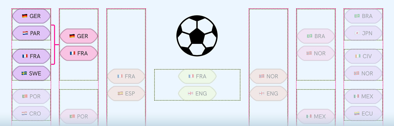
The recent conclusion of the FIFA World Cup, a global spectacle captivating billions, has also presented the web development community with intricate design challenges. One such challenge, detailed in a recent article by Ahmad Shadeed, involves the complex standings layout, a prime example of how modern CSS techniques can be employed to create responsive and sophisticated user interfaces. This deep dive explores Shadeed’s approach, utilizing CSS Grid and Subgrid, offering a comprehensive understanding of how to tackle demanding web layouts, a skill increasingly vital in the dynamic landscape of digital design.
The FIFA Standings Challenge: Beyond Simple Tables
Ahmad Shadeed’s analysis, titled "Rebuilding FIFA’s Standings Layout with CSS Subgrid," unpacks the architectural considerations behind presenting vast amounts of data in an organized, accessible, and visually appealing manner. The FIFA standings, a multi-faceted display of team performance, statistics, and rankings, inherently require a robust layout system. Traditionally, such complex grids might have been tackled with a combination of tables, floats, and JavaScript, often leading to brittle code that struggled with responsiveness and maintainability. Shadeed’s investigation, however, pivots to the power of CSS Grid and, crucially, CSS Subgrid, demonstrating a path toward cleaner, more semantic, and inherently flexible solutions.
The article highlights a common pain point in web development: the difficulty of aligning content across different levels of nested structures. This is precisely where Subgrid shines. While CSS Grid excels at defining a two-dimensional layout for a container, Subgrid extends this capability to child elements, allowing them to inherit and align to the grid lines of their parent. This capability is transformative for layouts like the FIFA standings, where different sections might have varying internal structures but need to maintain a consistent overall alignment.
Shadeed’s approach is not merely theoretical; it is grounded in practical application with clear code examples. The visual explainer accompanying the article breaks down the process, showcasing how to leverage these CSS features to achieve a responsive design that adapts seamlessly across various screen sizes. The outcome, as described, is a "clean result, no messy code," a testament to the power of using the right tools for the job. The reference to "no messi" is a subtle, yet effective, nod to the football theme, underscoring the article’s engagement with the subject matter.

The Evolution of CSS Layout: From Floats to Grid and Subgrid
The journey to modern CSS layout has been a long one. For years, developers relied on float properties to achieve multi-column layouts, a method that was notoriously cumbersome and prone to errors. The introduction of CSS Flexbox marked a significant improvement, offering one-dimensional layout control that simplified many common arrangements. However, for complex two-dimensional grids, CSS Grid emerged as the true game-changer.
CSS Grid provides a robust system for defining rows and columns, allowing developers to place items with pixel-perfect precision. It offers powerful features like named grid areas, implicit grid creation, and responsive adjustments through media queries. Yet, even Grid has its limitations, particularly when dealing with deeply nested components where internal grid structures need to align with an external parent grid. This is where CSS Subgrid, a relatively newer addition to the CSS Grid specification, steps in to fill the gap.
Subgrid allows a grid item to define its own grid, but instead of creating a new, independent grid, it inherits the track sizing (rows and columns) from its parent grid. This means that elements within a subgrid can align perfectly with the tracks of their ancestor grid, regardless of how many levels of nesting are involved. This is particularly useful for component-based architectures where individual components might have their own internal layout needs, but must still integrate seamlessly with the overall page structure.
The implications of this are far-reaching. For complex data visualizations, dashboard interfaces, and intricate forms, Subgrid offers a declarative and powerful way to manage alignment and spacing. It reduces the need for JavaScript-based layout calculations and promotes a more semantic and maintainable codebase. As web applications become increasingly complex, tools like Subgrid are essential for developers to keep pace with design demands while maintaining code quality.
Sentry’s Live Workshop: Elevating Logging Practices
Beyond layout challenges, the digital landscape necessitates robust error monitoring and logging. Sentry, a leading application monitoring platform, is sponsoring a live workshop titled "How to Write Logs That Actually Help." This initiative addresses a critical aspect of software development: the quality and utility of logs generated by applications.
In the high-pressure environment of application maintenance, especially during critical incidents, logs serve as the primary source of information for diagnosing and resolving issues. However, poorly structured or insufficient logs can transform a solvable problem into a protracted debugging nightmare. Sentry’s workshop aims to equip developers with the knowledge to create logs that are not just records of events, but actionable intelligence.
The workshop promises to cover essential topics such as what data to capture, how to structure log entries for maximum clarity, and best practices for log management. The core objective is to shift the perception of logs from mere debugging aids to vital components of an effective incident response strategy. When an application falters, the difference between a quick fix and a prolonged outage can hinge on the quality of the logs available.
The timing of this workshop is particularly relevant as the complexity of modern web applications continues to grow. Microservices architectures, asynchronous operations, and distributed systems generate vast amounts of log data. Without a systematic approach to logging, this data can become overwhelming and ultimately useless. Sentry’s focus on actionable logging empowers development teams to gain deeper insights into their application’s behavior, leading to faster resolution times and improved user experience. The workshop’s promise to turn "something broke" into "here’s exactly what happened" underscores its practical value.
Optimizing for Real-World Mobile Experiences
In the rapidly evolving mobile device market, understanding which devices truly represent the majority of users is crucial for effective web development and testing. Harry Roberts’ article, "Low and Mid-Tier Mobile for the Real World," revisits and updates a vital guide for selecting representative test devices in 2026. This piece challenges the common misconception that the latest flagship devices are always the most relevant for testing.
Roberts emphasizes that while high-end devices offer cutting-edge features, the vast majority of global users interact with the web on more affordable, mid-tier, and low-tier smartphones. His updated recommendations for 2026 include devices like the Samsung Galaxy A17 5G, identified as the fifth best-selling device globally in Q1, and the Samsung Galaxy A56 5G, the top-selling device in Europe for 2025. These selections highlight a pragmatic approach to mobile web development, advocating for testing on devices that reflect actual user behavior and hardware capabilities.

This focus on "real-world" mobile experiences has significant implications. Websites and applications designed and tested exclusively on high-end devices may perform poorly or exhibit visual glitches on the devices most commonly used by a substantial portion of the global population. This can lead to user frustration, reduced engagement, and missed business opportunities. By prioritizing testing on devices like the Galaxy A17 and A56, developers can ensure a more equitable and robust user experience for a broader audience.
The article also serves as a reminder that device evolution is not solely about raw processing power or screen resolution. Factors like network speed, battery life, and the capabilities of the device’s hardware play a critical role in how users experience web content. By grounding testing strategies in actual market data and user demographics, developers can build more inclusive and performant web experiences.
Articles, Opinions, and Tutorials: A Spectrum of Web Development Insights
The current landscape of web development is rich with diverse perspectives and practical guidance. A collection of recent articles and tutorials offers a broad spectrum of insights, from the nuanced return of CSS outlines to the innovative application of CSS for animated masonry layouts.
The Enduring Importance of CSS Outline: Morgan Murrah’s piece, "Return of CSS Outline," makes a compelling case for the continued relevance of focus outlines, a fundamental aspect of web accessibility. Despite the advent of :focus-visible, which intelligently applies focus styles only when necessary, many websites still employ outline: 0 as a remnant of outdated CSS resets. This practice often strips keyboard users of the visual cues needed to navigate the interface, creating significant accessibility barriers. Murrah highlights how :focus-visible provides a modern solution, allowing developers to maintain visual focus indicators without compromising design aesthetics. The implication here is clear: prioritizing accessibility is not an optional add-on but a core requirement for inclusive web design.
Animated Masonry Layouts with CSS: Chris Coyier, in "Masonry (with Animation) in CSS," delves into the creation of fluidly animated masonry-style layouts. This type of layout, characterized by items of varying heights arranged in a staggered fashion, is visually engaging but can be complex to implement with smooth animations. Coyier explores the use of CSS Grid and the emerging Anchor Positioning module, which promises to simplify the creation of such dynamic arrangements. The inclusion of grid-lanes further suggests advancements in CSS Grid’s capabilities for handling complex spatial arrangements. This exploration is crucial for developers seeking to create visually rich and interactive web experiences.

Time-Based Color Transitions with CSS Color Mix: A tutorial on "Time-Based Background Colour Transitions with Temporal and CSS Color Mix" by localghost.dev showcases an innovative use of modern CSS features. By combining the temporal CSS module with color-mix(), developers can create dynamic background color transitions that are driven by time. This technique opens up possibilities for creating ambient interfaces, dynamic visualizations, or simply adding subtle yet captivating visual effects to web pages. The article demonstrates how these advanced CSS functions can be used to achieve sophisticated design outcomes with relatively concise code.
Tools, Code, and Resources: Empowering the Developer Toolkit
The continuous evolution of web development is fueled by the creation and dissemination of powerful tools and libraries. Several recent resources offer developers new ways to enhance their projects and streamline their workflows.
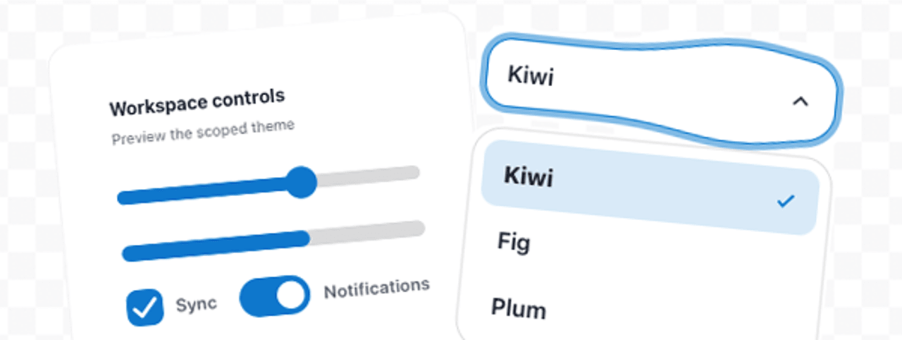
Jelly UI: Soft Web Components for Enhanced Interactivity: The Jelly UI library, developed by bmson, introduces a "dependency-free web components library that brings ‘soft’ physics effects to native HTML controls." This library aims to inject a more organic and responsive feel into user interfaces by applying subtle physics-based animations to standard HTML elements. With 40 pre-built elements and a showcase for experimentation, Jelly UI provides developers with a straightforward way to enhance the user experience without introducing complex JavaScript dependencies. The "soft" physics effects can add a layer of polish and delight to user interactions, making web applications feel more dynamic and engaging.
Framework Benchmarks: A Data-Driven Comparison: Alicia Sykes’ "Framework Benchmarks: Compare Frontend Frameworks" offers a valuable resource for developers making decisions about which frontend framework to adopt. The project involves an experienced developer building the same weather application in numerous popular frameworks, including Angular and React. This is coupled with an automated benchmarking system to provide objective performance metrics. The results cover crucial aspects such as bundle size, build time, and user experience metrics. In an ecosystem where framework choices can have significant long-term impacts on development speed, application performance, and maintainability, these benchmarks provide essential data for informed decision-making.
Decoy Font: A Novel Approach to AI Evasion: An intriguing experiment from Mixfont, "Decoy Font: A TTF Font That Hides What You Type," presents a unique solution for privacy-conscious users. This TTF (TrueType Font) is designed to obfuscate typed content from AI by introducing a "decoy" layer. The font achieves this by utilizing "separate spatial frequencies to communicate two different letters in the same space." While the concept might require a slight visual adjustment for human readers, it represents an innovative approach to the growing concern of AI interpretation of user input. This experiment highlights the creative applications of font technology in addressing contemporary digital challenges.
The Broader Impact: A More Accessible, Performant, and Engaging Web
The collection of articles and resources presented here collectively points towards a future of web development that is increasingly focused on accessibility, performance, and engaging user experiences. The sophisticated layout techniques showcased by Ahmad Shadeed, coupled with the emphasis on real-world mobile testing by Harry Roberts, ensure that the web is becoming more inclusive and performant for a wider audience.
Furthermore, the practical advice on logging from Sentry and the innovative CSS techniques explored in various tutorials empower developers to build more robust and visually compelling applications. The availability of tools like Jelly UI and comprehensive framework benchmarks democratizes advanced development practices, allowing even smaller teams to create sophisticated and high-performing digital products.
The "Decoy Font" experiment, while niche, also signals a growing awareness of the interplay between human interaction and artificial intelligence, pushing the boundaries of what is possible with typography and digital security. As the web continues to evolve, these ongoing explorations in layout, performance, accessibility, and novel applications of technology will undoubtedly shape the digital experiences of tomorrow. The commitment to mastering these areas ensures a web that is not only functional but also delightful, equitable, and secure for all users.