How Mother Design Transformed the Brand Identity of Psychic Services Platform Purple Garden Through Spiritual Experimentation

The challenge of branding a business within the esoteric services sector is inherently paradoxical: designers must create a tangible, coherent visual identity for a service rooted in the intangible. Recently, the creative agency Mother Design undertook this complex task for Purple Garden, a leading psychic services platform. By eschewing traditional market research in favor of immersion-based methodologies, the agency has delivered a brand identity that aims to bridge the gap between spiritual tradition and contemporary digital utility.
A Departure from Conventional Design Frameworks
In the contemporary branding landscape, most agencies rely on data-driven metrics, focus groups, and competitive analysis to build a new visual identity. Mother Design, however, opted for a more radical approach known as their "Wild Card" initiative. This framework encourages designers to engage directly with the subject matter of their client, regardless of how unconventional that subject may be.
For the Purple Garden project, the objective was to define a visual language that resonated with "seasoned seekers"—the core demographic of the platform—without resorting to the tired tropes of the occult industry. The agency collaborated with a holistic practitioner from the Purple Garden platform to facilitate a series of workshops. These sessions included chakra readings and guided automatic writing and drawing exercises. By facilitating these sessions, the designers sought to bypass conscious, analytical thought, allowing them to tap into the same intuitive processes that characterize the psychic services offered by the platform itself.
Historical Context and Philosophical Influence
The methodology employed by the Mother Design team draws a clear line back to the early 20th-century pioneers of abstract art. The team explicitly cited the influence of Hilma af Klint and her group, "The Five." Af Klint, a Swedish artist whose work predates the recognized founders of Western abstract art like Wassily Kandinsky, utilized trance states to create her iconic, symbolic compositions. She believed she was a conduit for a higher consciousness, a concept that provided the intellectual framework for the Purple Garden design workshops.
By adopting this "seance" style of creative development, Mother Design aimed to capture the essence of the "living practice" that defines the platform. The resulting visual elements are not merely aesthetic choices but are intended to represent the actual energy exchanges that occur between practitioners and clients. This historical alignment provides a layer of depth to the brand, moving it away from the superficial "fortune teller" aesthetic and toward a more profound, art-historical resonance.
The Anatomy of the New Visual Identity
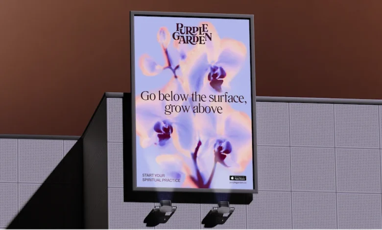
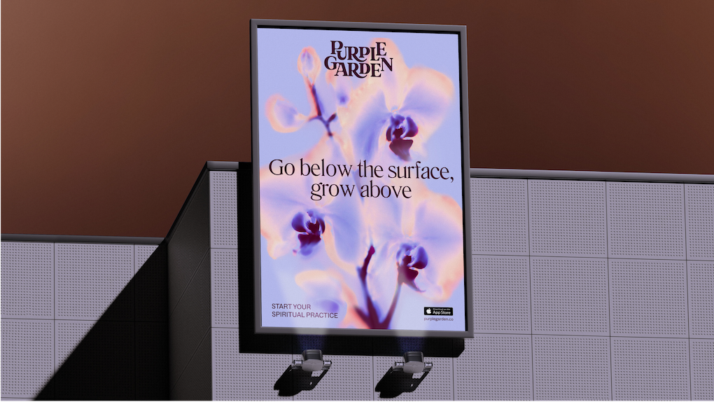
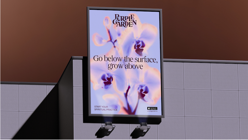
The completed rebrand is defined by a departure from the high-contrast, often aggressive marketing styles common in the psychic industry. Instead, Mother Design focused on creating an atmosphere of "grounded guidance."
The wordmark serves as the cornerstone of the new identity, featuring elegant serif typography with curved junctures. These letters are designed to mimic the appearance of organic growth, visually reinforcing the idea of a "living practice." Complementing the typography is a digital-first, crystal-like glyph that functions as a touchpoint for the brand, providing a sense of stability and structure.
The color palette represents a strategic pivot. While the brand retains the traditional association with purple—a color long linked to intuition and higher consciousness—it has been expanded to include seven distinct hues. These tones are described as "earthier" and "richer" than the standard, flat colors used by competitors. This choice is intended to create a sense of depth and physical presence in a digital space.
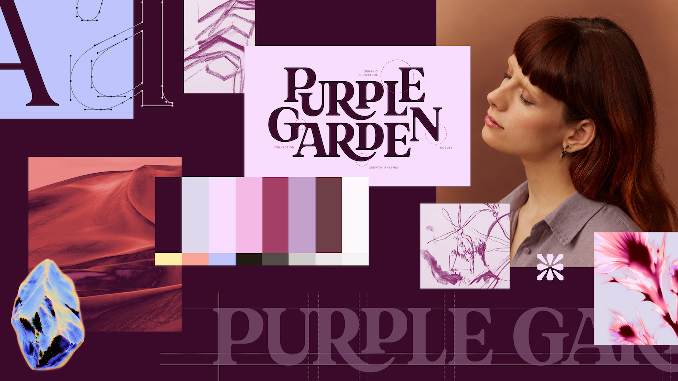
Furthermore, the photographic imagery has been treated with "solarised glows" and flame-like ripples. These effects are not just stylistic; they are intended to visually manifest the energetic exchange inherent in spiritual readings. By applying these filters to natural imagery, the brand creates a bridge between the physical world and the spiritual realm, effectively signaling to the user that the platform is a space for both reflection and action.
Strategic Market Positioning and Business Objectives
From a business perspective, the rebrand serves to solidify Purple Garden’s standing as a market leader. In the crowded psychic services industry, where many platforms compete on urgency and pressure-based marketing tactics—such as "book now" or "instant answers"—Purple Garden has opted for a voice characterized by "Active Contemplation."
Jo Tulej, Creative Director at Mother Design, noted that the messaging strategy was designed to meet the user where they are. By avoiding the common tropes of artificial urgency, the brand positions itself as a partner in a journey rather than a transactional vendor. This reflects a broader trend in digital services where consumers are increasingly gravitating toward brands that offer a sense of mindfulness and calm.
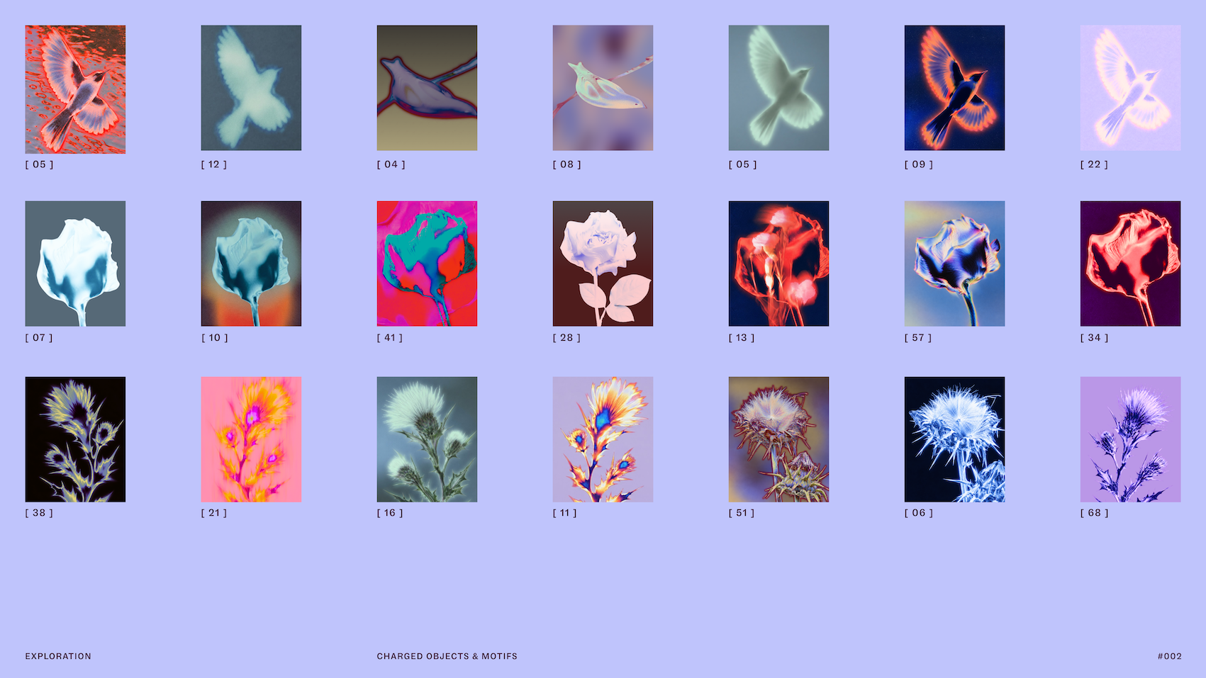
The implementation of the brand has been executed across all digital touchpoints, ensuring that the visual consistency of the "charged objects" and the "living type" works in harmony. This cohesion is critical for maintaining user trust, particularly in a category where the barrier to entry for new users is often a lack of perceived authenticity.
Broader Implications for the Branding Industry
The collaboration between Mother Design and Purple Garden highlights a growing trend in the creative industry: the prioritization of the "process" as a means of enhancing the "output." In an era dominated by rapid, AI-generated design and hyper-efficient workflows, the decision to spend time on slow, non-linear, and abstract workshops stands out as a significant strategic investment.
While some critics might argue that such methodologies are difficult to justify to corporate stakeholders who prioritize KPIs and quarterly growth, the result in this case suggests that deep-immersion branding can lead to a more robust, defensible, and long-lasting identity. By removing the immediate pressure of a "KPI-driven" output, the agency was able to produce a brand identity that feels more "human" and, consequently, more authentic to its target audience.

This project also serves as a case study for how agencies can handle the "intangible" challenge. Whether it is a psychic platform, a financial institution, or a technology firm, the ability to translate abstract values into concrete visual expressions is the primary function of modern branding. Mother Design’s success with Purple Garden proves that the most effective way to communicate a service—no matter how abstract—is to fully inhabit the experience of the end-user.
Conclusion
The transformation of Purple Garden is a testament to the power of unconventional creative strategies. By blending historical artistic influence with a modern, digital-first aesthetic, Mother Design has managed to elevate the platform from a generic service provider to a curated, thoughtful space for spiritual engagement. As the digital economy continues to mature, the lessons learned from this rebrand—specifically regarding the importance of authenticity and the value of "slow" design processes—are likely to influence future branding projects across a variety of sectors, proving that even the most intangible concepts can be given a permanent, powerful visual home.