Coca-Cola Brand Refresh Sparks Unintended Comparisons to Marlboro Cigarette Typography as Design Experts Weigh In on Visual Identity Shift

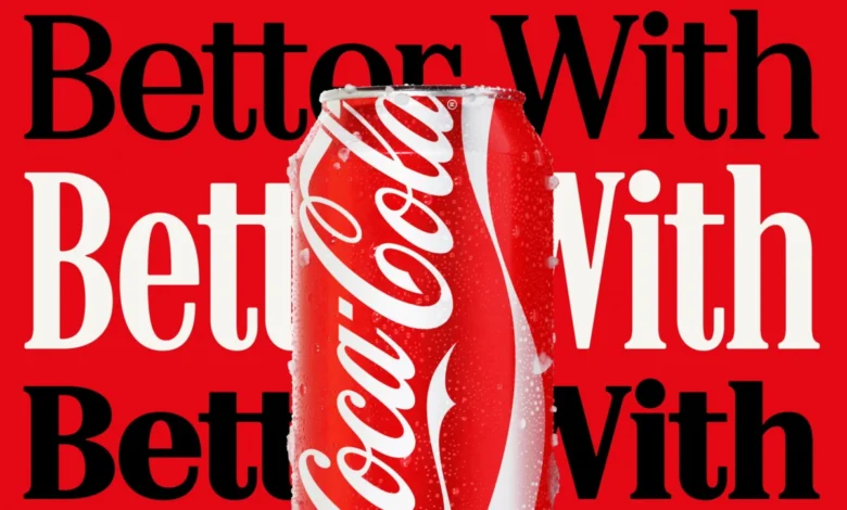
In an era where global heritage brands are increasingly leaning into "retro-modernism" to maintain consumer trust, Coca-Cola’s latest visual overhaul has inadvertently sparked a significant debate regarding the psychological associations of design. The beverage giant recently launched a comprehensive new brand identity, a design overhaul led by the renowned agency Jones Knowles Ritchie (JKR) with a specific emphasis on a "typography-first" approach. Central to this new identity is the "Better With" typeface, a custom serif font family originally developed for the brand by Brody Associates in 2023. While the intention was to celebrate Coca-Cola’s rich history and "unique personality," the public reaction has centered on an unexpected visual parallel: the striking resemblance between the new font and the iconic typography of Marlboro cigarettes.
The "Better With" font, which first appeared during a 2023 holiday campaign, has now been elevated to the core of Coca-Cola’s global marketing and packaging strategy. According to Brody Associates, the typeface was inspired by the company’s extensive archives, aiming to blend "rich serif font heritage with modern-day requirements." However, as images of the new packaging and promotional materials began to circulate on social media platforms, particularly X (formerly Twitter) and TikTok, users were quick to point out the irony of a sugary beverage brand adopting a visual language reminiscent of one of the world’s most famously addictive products. This comparison has raised questions about the subconscious signals sent by branding and the cultural evolution of soft drinks in a health-conscious society.
The Evolution of the "Better With" Typeface
The journey of the "Better With" font reflects a broader shift in Coca-Cola’s communication strategy. For decades, the brand’s visual identity was almost exclusively defined by its Spencerian script—the flowing, cursive logo that has remained largely unchanged since 1886. In recent years, however, Coca-Cola has sought to expand its typographic palette to better suit digital platforms and diverse marketing campaigns.
Brody Associates, the design firm behind the typeface, stated that they were tasked with crafting a serif font family that could express "movement and playfulness." The goal was to add a layer of storytelling to the brand, moving beyond the logo to create a cohesive typographic ecosystem. By pulling from the archives, the designers hoped to evoke a sense of nostalgia and authenticity. Serif fonts, characterized by the small decorative strokes at the ends of letters, are traditionally associated with established institutions, newspapers, and heritage brands. In Coca-Cola’s case, the heavy, slightly blocky serifs of the "Better With" font were meant to feel "classic yet fresh."
The rollout of this font as a primary brand element marks a departure from the "One Brand" strategy Coca-Cola adopted in 2016, which sought to unify Coca-Cola, Diet Coke, and Coca-Cola Zero Sugar under a single visual umbrella. The new JKR-led identity appears to allow for more typographic flexibility, though this flexibility has now brought the brand into a peculiar cultural crossfire.
The Marlboro Comparison: A Study in Visual Semiotics
The comparison to Marlboro is not merely a product of the font itself, but of the entire visual "lockup" of the branding. Marlboro’s identity, particularly the "Marlboro Red" packaging, is one of the most recognizable examples of minimalist, high-contrast design in history. It relies on a bold serif typeface—specifically a variation of Neo-Contact—set against a stark red-and-white background.
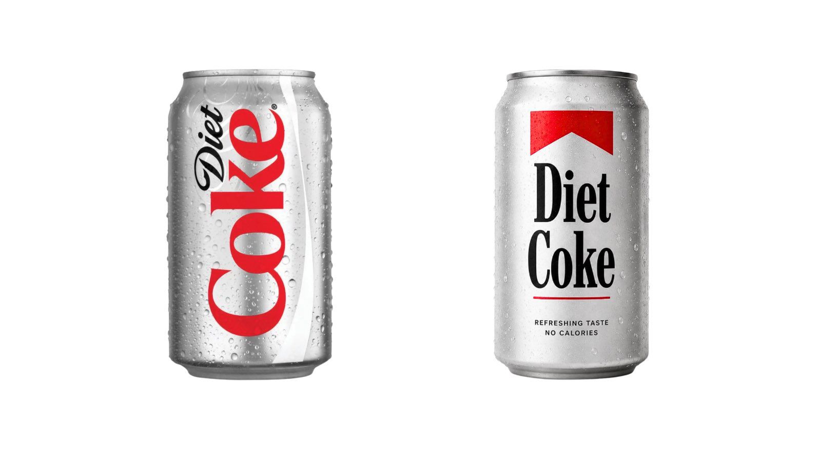
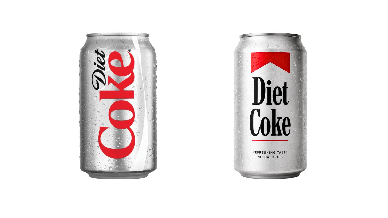
When Coca-Cola utilizes the "Better With" font in white against its signature "Coke Red," the typographic weight and the sharp angles of the serifs mimic the authoritative, rugged aesthetic of the tobacco giant. Social media users were quick to produce mock-ups, placing the "Better With" font on Diet Coke cans in a style that mirrored Marlboro’s "roof" design. One viral post on X noted, "Coca-Cola switching to a Marlboro font lookalike is the most self-aware thing a sugar company has ever done," while another user joked that the brand had simply "leaned into the fact that soda is the new cigarettes."
From a design perspective, the resemblance highlights the narrow path heritage brands must walk when attempting to look "classic." Both Coca-Cola and Marlboro occupy the same "Americana" design space—a space defined by bold primary colors, heavy typography, and a sense of mid-20th-century industrial permanence. By reaching into its archives for a serif font, Coca-Cola landed in the same stylistic territory that Marlboro has dominated for decades.
The Chronology of Coca-Cola’s Branding Shifts
To understand the significance of this change, one must look at the timeline of Coca-Cola’s visual identity over the last decade:
- 2011–2015: The brand focused on "Share a Coke," replacing its logo with popular names. This period emphasized personalization over typography.
- 2016: The "One Brand" strategy was launched, unifying all Coke variants under the "Red Disc" identity to simplify the brand’s global presence.
- 2021: Coca-Cola introduced the "Real Magic" platform, which included a "Hug" logo (a curved version of the script) intended to represent the way the logo wraps around a bottle.
- 2023: Brody Associates developed the "Better With" serif font for the "Food Marks" and holiday campaigns, focusing on the idea that meals are better with a Coke.
- 2024: JKR integrated "Better With" into a full-scale brand identity overhaul, making the serif font a central pillar of the brand’s global packaging and advertising.
This latest shift represents a move away from the "minimalist" trend that dominated the 2010s (often called "blanding") and a return to a more expressive, character-driven design. However, the timing of this return to "heritage" typography coincides with a period of intense scrutiny for the soft drink industry.
The "Fridge Cigarette" and the Cultural Context of Sugar
The unintended association with Marlboro is particularly poignant given the current cultural discourse surrounding sugar and health. In recent years, public health advocates and regulators have increasingly compared the soft drink industry to Big Tobacco, citing the addictive nature of sugar and the long-term health impacts of high-fructose corn syrup.
In the United Kingdom, the 2018 Soft Drinks Industry Levy (the "sugar tax") forced manufacturers to reformulate recipes or face higher taxes. Similar regulations have been enacted in various U.S. cities and countries globally. Against this backdrop, the visual comparison to a cigarette brand is more than just a design quirk; it is a commentary on the perceived "vice" status of soda.
Interestingly, the "Marlboro-fication" of Coca-Cola aligns with a pre-existing internet meme. On TikTok and Instagram, "Diet Coke" has frequently been referred to by Gen Z and Millennial users as a "fridge cigarette"—a small, guilt-inducing ritual or "vice" that provides a hit of caffeine and nostalgia. By adopting a font that looks like a tobacco brand, Coca-Cola has, perhaps accidentally, validated a meme that characterizes its product as a modern-day alternative to smoking.
Expert Analysis: The Risks of Retro-Modernism
Design critics argue that while the "Better With" font is technically well-executed, its application may suffer from a lack of "visual distance" from other iconic brands. "In the quest for authenticity, brands often look to the same historical periods for inspiration," says design consultant Marcus Thorne. "The mid-century serif is a powerful tool for conveying trust, but it is also the aesthetic language of the tobacco and spirits industries of that era. When you combine that specific typography with a red-and-white color palette, the brain almost automatically fills in the Marlboro connection."
Furthermore, the shift highlights a challenge in global branding: how to remain "playful" (as Brody Associates intended) without losing the specific "premium" feel that a global leader requires. If the font feels too much like a "generic" heritage serif, it loses its proprietary value. The Spencerian script is uniquely Coca-Cola; the "Better With" font, while beautiful, shares DNA with a much broader—and more controversial—visual history.
Official Responses and Strategic Goals
While Coca-Cola has not officially commented on the Marlboro comparisons, the company’s marketing leadership has consistently emphasized that the new identity is about "celebrating the ritual of consumption." The JKR overhaul is intended to make the brand feel more integrated into everyday life, particularly in digital spaces where the classic script can sometimes be difficult to read at small scales.
The "Better With" typeface is designed to be highly legible and versatile, appearing on everything from billboards to social media stickers. By creating a custom font, Coca-Cola also saves significantly on licensing fees for third-party typefaces across its global operations, a common move for Fortune 500 companies looking to streamline their assets.
Broader Implications for the Design Industry
The reaction to Coca-Cola’s new look serves as a case study for the "unintended consequences" of brand refreshes. In a hyper-connected world, every design choice is subject to immediate, collective analysis. The "Better With" font demonstrates that a brand’s identity is not just what the company says it is, but how the public perceives it through the lens of existing cultural icons.
As Coca-Cola continues to roll out the new identity across international markets, it remains to be seen whether the Marlboro comparison will fade or become a permanent part of the brand’s lore. For now, the "Better With" font stands as a reminder that in the world of branding, heritage is a double-edged sword. While it can evoke feelings of warmth and tradition, it can also link a brand to the ghosts of industries past—industries that modern soft drink companies are working hard to distance themselves from.
The transition also signals the end of the "minimalist" era in corporate design. By embracing complex serifs and archival inspiration, Coca-Cola is leading the way toward a "maximalist" future where storytelling and history are prioritized over simplicity. Whether that story is one of "Real Magic" or "Fridge Cigarettes," however, is a narrative that the consumers, not the designers, may ultimately control.