The Intersection of Artificial Intelligence and Data Visualization: A Case Study in Collaborative Design

The integration of artificial intelligence into the corporate workflow has transitioned from a theoretical concept into a daily operational reality for professionals across multiple industries. As knowledge workers navigate this ongoing technological experiment, a central question persists: precisely where and when does leveraging artificial intelligence provide genuine utility versus unnecessary friction? This operational tension is particularly acute in specialized fields such as data storytelling, where creative nuance, precision, and human intuition traditionally dictate success.
While certain components of the data storytelling process—such as aesthetic color alignment, structural layout exploration, and initial conceptual sketching—frequently yield deeper insights and refined outputs, other mechanical tasks remain entirely tedious. Manually constructing complex charts from scratch or manipulating massive, unstructured datasets in spreadsheet applications rarely enhances critical thinking. Consequently, professionals are increasingly eager to delegate the mechanical execution of data visualization, provided they retain strict editorial control over the final design. Every minute saved on manual chart construction represents additional time dedicated to refining the underlying narrative and strategic impact.

The Anatomy of a Design Challenge
A recent corporate client engagement provided a compelling testing ground for this human-AI collaborative paradigm. The project centered on a competitive market analysis between two fictionalized industry entities: Alunis and Vyrenta. The core strategic objective for Alunis was to demonstrate a clear trajectory for closing a persistent revenue gap against its primary market leader, Vyrenta, by strategically emphasizing regional expansion over a multi-year forecast.
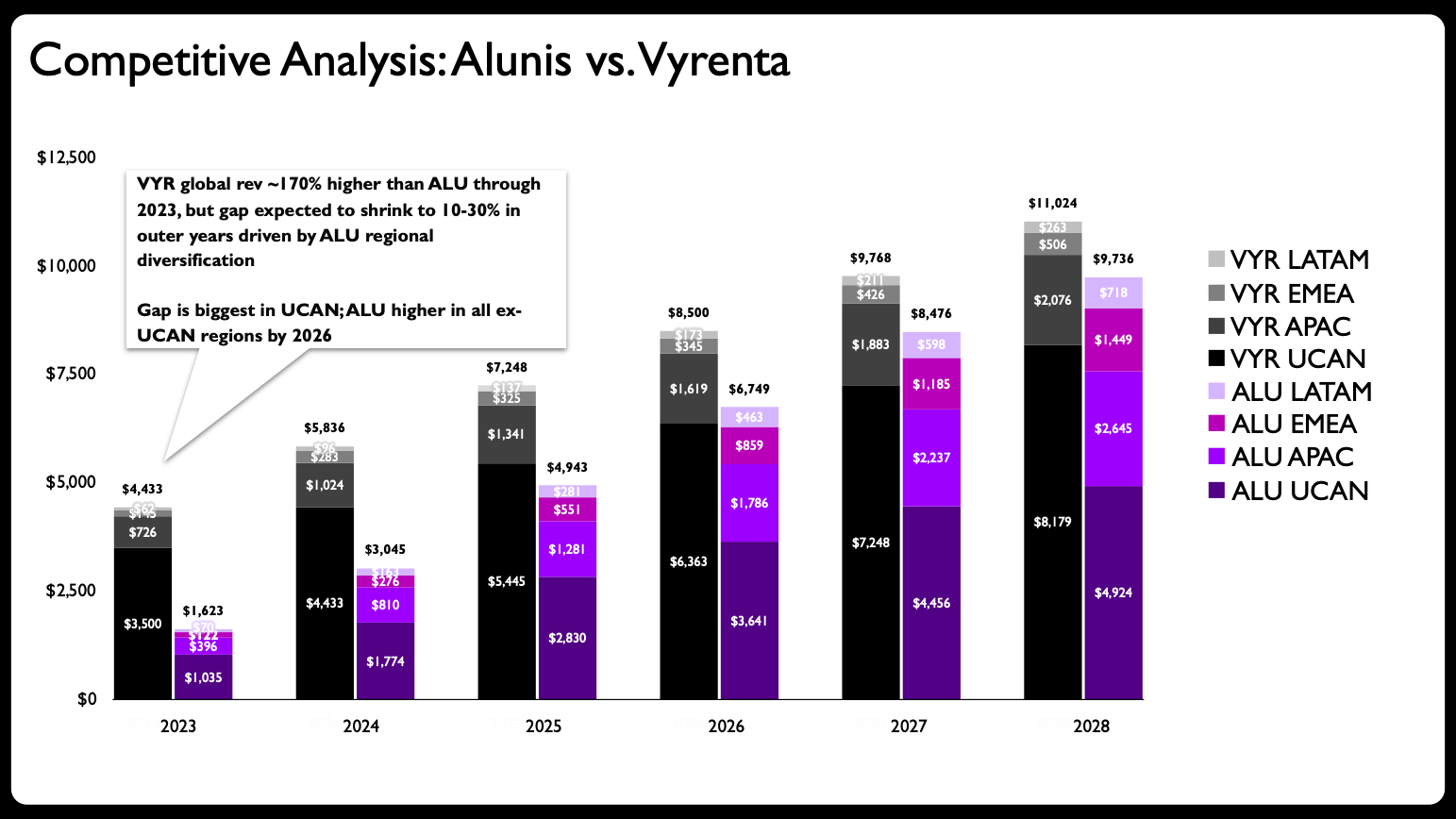
The initial briefing material presented a classic pitfall in corporate communication: a single, overly complex stacked bar chart attempting to execute multiple distinct visual tasks simultaneously. The visualization was tasked with illustrating revenue changes over time, facilitating a direct comparative analysis between two separate corporate entities, and simultaneously breaking down the regional composition of each company’s revenue streams. According to foundational principles outlined in contemporary data visualization literature, this represents the single most common error in graphic design—overloading a single graph with excessive information.
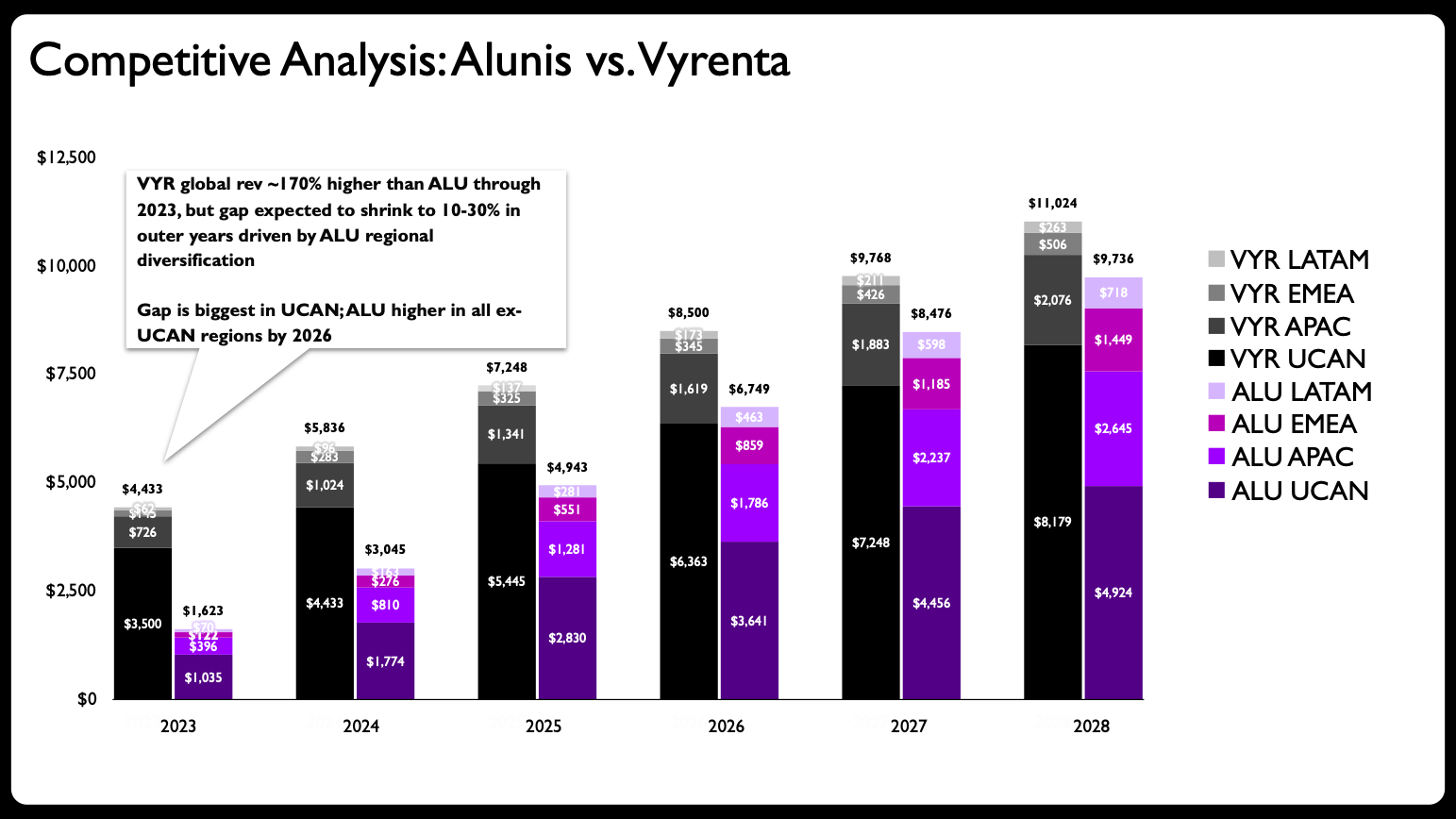
To adhere to established data communication standards, the primary design directive required decomposing the overcrowded graph into a series of cleaner, more digestible small-multiple charts. Rather than forcing a single visual element to carry an unsustainable analytical burden, the design needed to separate total figures from regional breakouts to ensure cognitive clarity for executive stakeholders.
The Chronology of the AI-Assisted Redesign
The workflow to overhaul the visualization followed a deliberate, multi-step chronological sequence designed to harness both machine execution speed and human design judgment.
Initial Concept and Sketching Phase
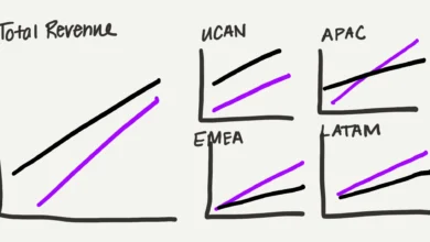
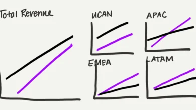
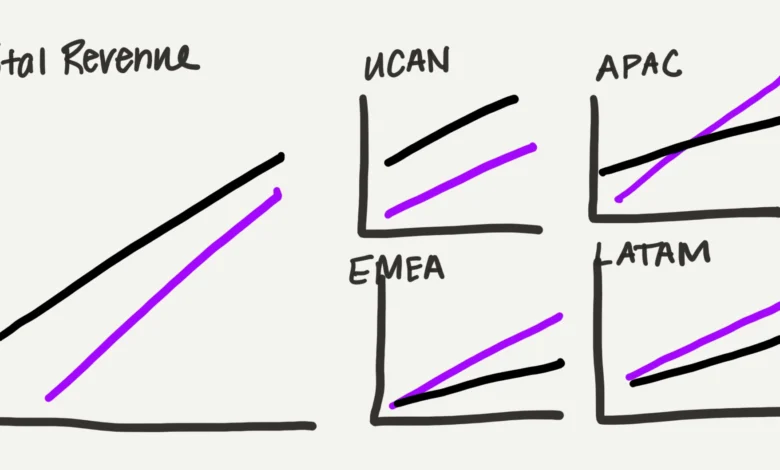
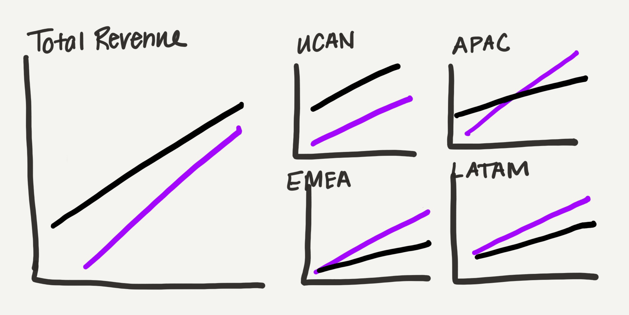
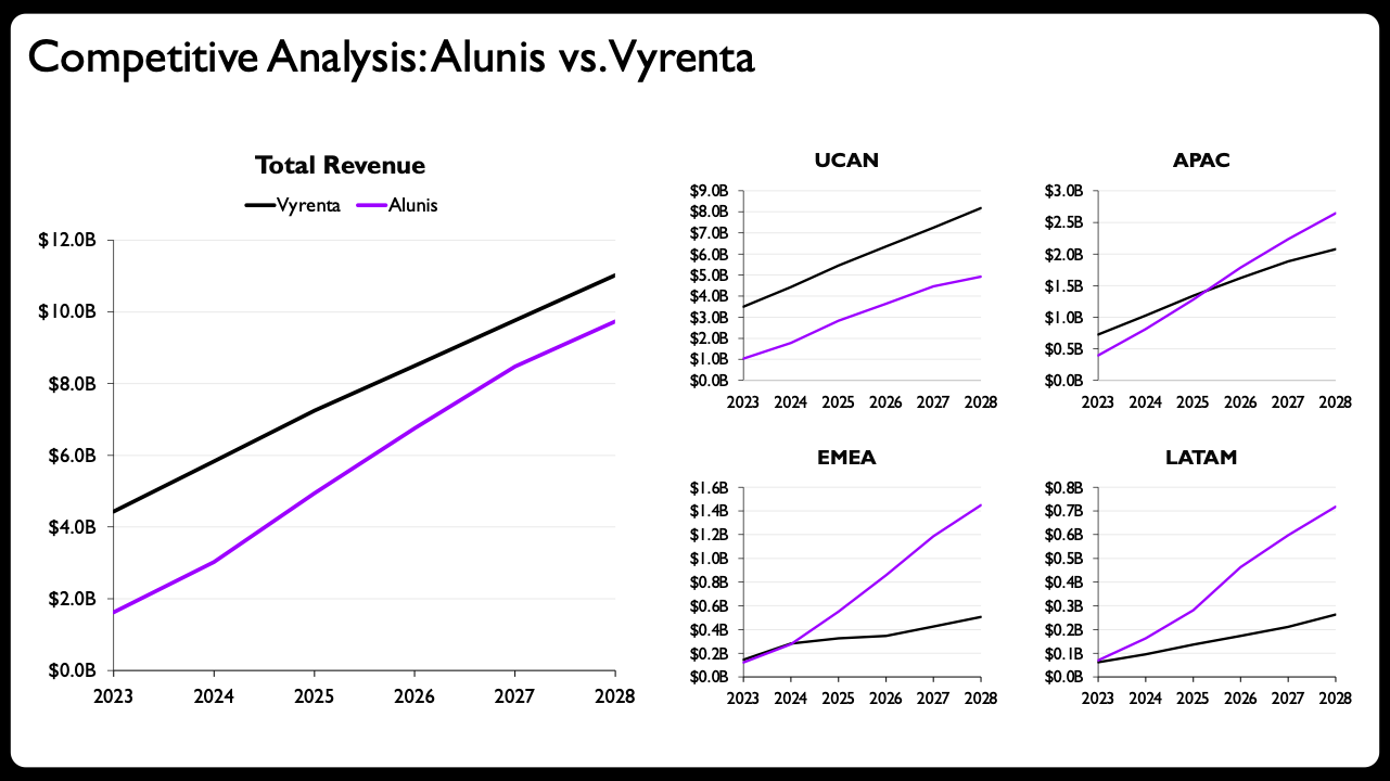
The design process commenced with human-led ideation. Rather than jumping directly into presentation software, the designer produced a rough hand-drawn sketch outlining a small-multiple layout. Recognizing that traditional bar charts consume excessive visual space, the concept transitioned toward line charts, which offer a significantly lighter visual footprint—an essential advantage for information-dense executive slides.
The layout strategy was intentionally asymmetrical. The total revenue view was granted a prominent visual position, while four individual regional charts were arranged in a compact grid occupying an equivalent amount of physical slide space. This spatial arrangement served as a subtle, intuitive visualization of the data’s part-to-whole relationship, signaling that regional performance directly aggregates into total enterprise standing.
Prompting and AI Execution Phase
Historically, translating a conceptual sketch into functional presentation graphics required hours of painstaking manual labor within software like Microsoft PowerPoint. For this experiment, the designer leveraged Claude for PowerPoint, an integrated add-in designed to generate editable native charts directly within the presentation environment.
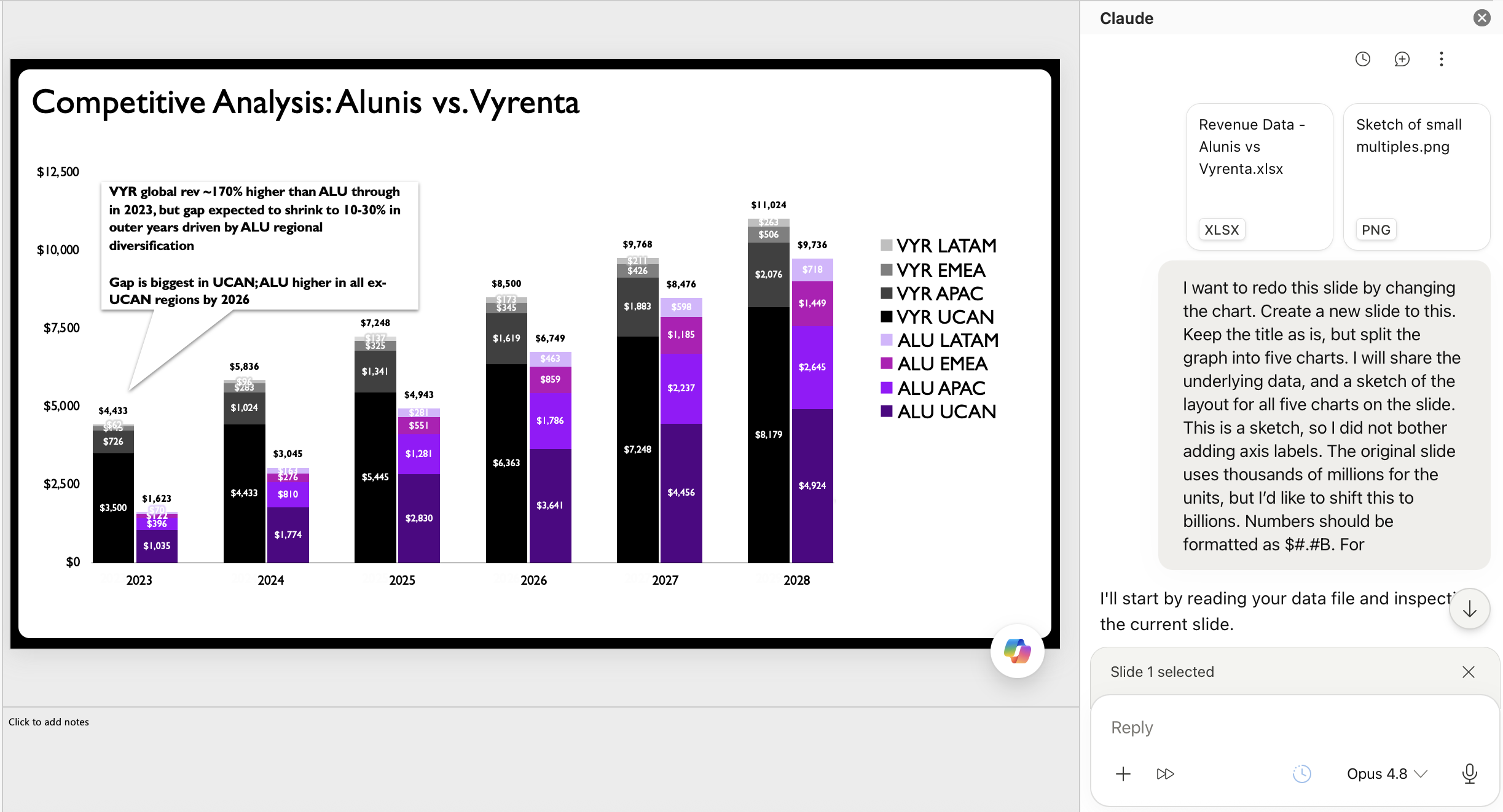
The designer uploaded the structured dataset alongside the hand-drawn structural sketch, supplying a direct text prompt outlining the structural layout requirements. Despite minor typographical imperfections in the natural language prompt, the AI processing engine successfully interpreted the parameters. The resulting output delivered a series of native, fully editable charts structured in the requested small-multiples layout, complete with realistic axes and standardized labels. This represented a substantial departure from earlier iterations of generative AI tools, which historically produced flat, non-editable image files that frequently contained rendering errors.
Human Refinement and Polish Phase
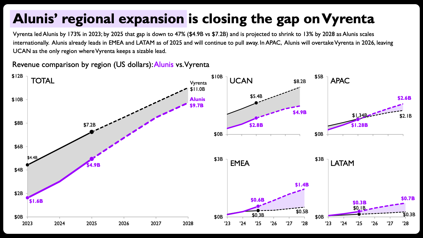
While the AI-generated output provided a robust structural foundation, professional data storytelling requires a level of contextual polish that automated systems cannot independently achieve. The designer implemented three critical enhancements to elevate the visual artifact to publication standards. First, shaded visual areas were introduced between comparative lines to emphasize the narrowing performance gap. Second, direct end-of-line data labels were implemented to eliminate the cognitive friction of cross-referencing a distant legend. Third, per-panel axis ranges were intentionally unlinked and scaled dynamically to reflect the unique baselines of each specific geographic region, ensuring that localized trends remained clearly visible.
Finally, solid lines were deployed to represent historical actual financial data, while dashed lines were utilized to delineate future projections, establishing a clear visual distinction between empirical history and forecasted estimates.
Broader Industry Implications and Technological Landscape
The successful execution of this workflow highlights a broader shift in how technical tools intersect with human expertise. While Claude for PowerPoint facilitated editable output in this instance, competing technological ecosystems offer parallel capabilities. Microsoft Copilot and OpenAI’s ChatGPT provide varying degrees of native chart generation within presentation software, while Google’s Gemini offers corresponding functionalities tailored for Google Slides.
However, industry analysts emphasize that these generative advancements do not eliminate the necessity for foundational domain knowledge. The human practitioner remained entirely in the analytical driver’s seat throughout the process. Recognizing that a stacked bar chart was fundamentally inappropriate for the dataset required human critical judgment. Similarly, determining the optimal spatial layout for five distinct charts on a single slide, and consciously deciding to break traditional consistent axis-scaling conventions to better highlight regional variances, demanded advanced design expertise.
Expert Analysis and Future Outlook
Industry observers note that the primary hurdle historically preventing the widespread adoption of AI in data visualization was the limitation of static image generation. Because early models produced uneditable graphics marred by minor visual inaccuracies, designers spent excessive time correcting machine errors rather than refining narratives. The evolution toward native, editable slide components marks a vital maturation point, transforming generative models from novelty items into functional productivity assets.
Furthermore, this collaborative model democratizes advanced visualization techniques. For junior professionals or practitioners unfamiliar with constructing specialized multi-panel layouts, AI tools significantly lower the initial technical learning curve. By handling the tedious mechanics of data plotting, the technology allows users to focus immediately on structural composition and audience reception.
Ultimately, the optimal future of workplace productivity appears rooted in a symbiotic division of labor: artificial intelligence accelerates physical execution and mechanical formatting, while human professionals provide strategic direction, ethical oversight, and aesthetic judgment. In the specialized realm of data storytelling, this collaborative balance ensures that technology serves to amplify, rather than replace, human ingenuity.