Welsh National Opera Unveils Modernized Brand Identity in Defiant Response to Industry Skepticism and Changing Cultural Landscape

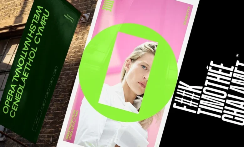
The Welsh National Opera (WNO) has officially launched a comprehensive brand transformation designed to challenge contemporary skepticism toward high art and reassert the medium’s relevance in a rapidly evolving digital age. This strategic shift, arriving as the company approaches its 80th anniversary, serves as a direct counter-narrative to a growing sentiment that classical art forms are losing their cultural foothold. The catalyst for this aesthetic and philosophical overhaul was partly fueled by a widely publicized remark from Hollywood actor Timothée Chalamet, who earlier this year suggested that "no one cares about opera and ballet any more." Rather than ignoring the critique, the WNO has utilized the controversy as a springboard to redefine its public persona, moving away from traditionalist tropes toward an identity that promises the "energy of an electric night out."
The rebranding project was entrusted to Bwtic, a specialized Welsh design studio tasked with bridging the gap between the opera’s prestigious history and its future aspirations. The result is a visual language that emphasizes flexibility, modernism, and cultural authority. By moving away from the static imagery often associated with the genre, the WNO aims to capture a younger, more diverse audience while maintaining the loyalty of its existing patrons. This move comes at a critical juncture for the performing arts in the United Kingdom, where organizations are increasingly pressured to demonstrate social value and accessibility amidst fluctuating public funding and shifting consumer habits.
The Design Philosophy: The O Frame and Intentional Dissonance
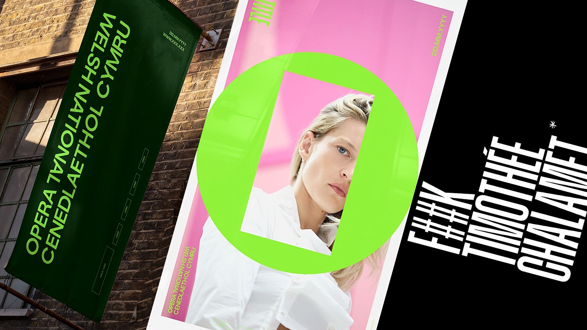
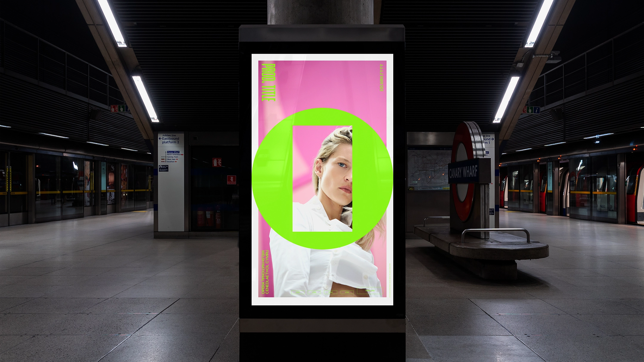
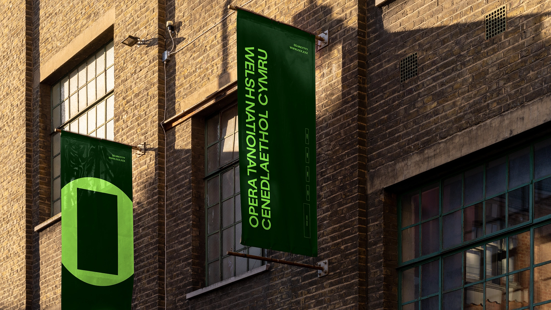
At the center of the new identity is a minimalist logo referred to as the "O Frame." This device consists of a bold outer circle—representing the "O" of Opera—containing an open, slightly offset rectangle within its center. According to Bwtic, the design was born from a specific frustration: the perception that opera is a monolithic art form that tells "one particular story in one particular way." The O Frame seeks to dismantle this stereotype by acting as a literal and metaphorical window. The outer circle represents the medium of opera itself—a permanent, foundational structure—while the inner rectangular frame represents the specific production, subject matter, or message of a given performance.
The studio has described this relationship as one of "intentional dissonance." By placing a square-edged frame inside a circular boundary, the design utilizes the concept of "square pegs in round holes" to reflect the complexity and occasional friction inherent in dramatic storytelling. This versatility allows the branding to adapt to various productions, from the dark tragedies of Verdi to the avant-garde works of contemporary composers. The O Frame functions as a vessel for changing stories, ensuring that the brand remains dynamic rather than tethered to a single visual style. This adaptability is particularly crucial for digital marketing, where the frame can be used to crop photography, contain video content, or overlay bold typography across social media platforms.
A Legacy Reimagined: Typography and the 1946 Connection
While the rebrand is forward-looking, it is deeply rooted in the history of the company. During the research phase, Bwtic delved into the WNO archives, uncovering a poster from 1946—the year the company staged its first-ever production. The poster featured a distinctive, condensed sans-serif typeface that conveyed a sense of authority and directness appropriate for the post-war era. Inspired by this discovery, the designers collaborated with the Grilli Type foundry to adapt the GT Standard typeface into a modern typographic system for the opera.
The new typeface maintains the authoritative, uppercase weight of the original 1946 design but has been refined for 21st-century utility. It provides the WNO with a voice that is both "bold and modern," capable of delivering serious artistic manifestos or engaging in "cheeky jibes" at Hollywood critics. This typographic continuity serves as a bridge between the company’s founding mission to bring opera to the people of Wales and its current goal of remaining a global leader in the performing arts. By referencing its origins, the WNO asserts that its current modernization is not a rejection of the past, but a continuation of a long-standing tradition of innovation.
Navigating Bilingualism: The Eye of the Reader
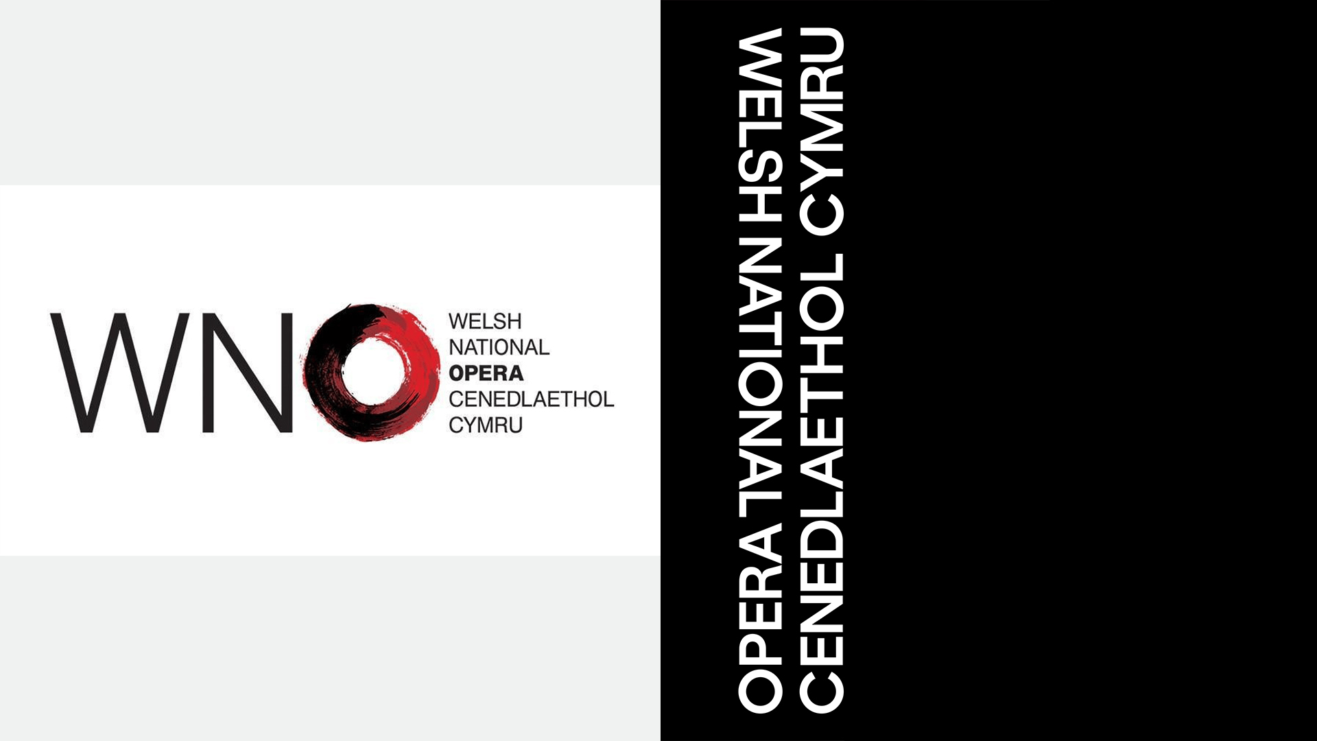
As a national institution of Wales, the WNO faces the unique challenge of representing a bilingual nation. Historically, Welsh organizations have struggled to balance English and Welsh text in their logos, often resulting in cluttered designs or a perceived hierarchy where one language dominates the other. Bwtic’s solution for the WNO rebrand is a bilingual wordmark that prioritizes visual parity and psychological "first-sight" recognition.
The new logotype is structured so that the Welsh and English names of the company share equal weight and presence. The studio’s philosophy is that "it is the eye of the reader that finds their own language first." This approach acknowledges that opera has always been a multilingual medium—often performed in Italian, German, or French with surtitles—and therefore the company should be naturally comfortable with linguistic fluidity. By creating a layout where neither language is relegated to a secondary position, the WNO reinforces its identity as a truly national company that serves all citizens of Wales, regardless of their primary language.
Chronology of a Cultural Counter-Attack
The WNO’s rebranding does not exist in a vacuum; it is part of a broader, global response to the "Chalamet controversy." The timeline of this artistic pushback highlights a sector that is increasingly willing to defend its territory with wit and strategic marketing:
- Early 2024: During a high-profile media appearance, Timothée Chalamet remarks that opera and ballet are no longer relevant to the modern public.
- Spring 2024: Seattle Opera gains international attention with a "classy" response, using social media to showcase the vibrancy of its community and the demographic diversity of its audience.
- Mid-2024: The Welsh National Opera, already in the process of reviewing its brand for its 80th anniversary, pivots its creative brief to more aggressively address the "irrelevance" narrative.
- Late 2024: The WNO officially unveils the "O Frame" and its new typographic system, positioning itself as a contemporary cultural powerhouse.
This sequence of events suggests that the opera industry is moving away from a defensive posture and toward one of proactive engagement. By using modern design principles and digital-first branding, these institutions are attempting to strip away the "stuffy" reputation that has long acted as a barrier to entry for younger demographics.
Sector Analysis: The Financial and Social Stakes of Branding
The decision to rebrand is rarely just an aesthetic one; it is a calculated business move. For the Welsh National Opera, the stakes are high. In recent years, the UK arts sector has faced significant funding challenges. Arts Council England and the Arts Council of Wales have both had to make difficult decisions regarding the distribution of limited resources, often prioritizing organizations that can prove they are reaching "underserved" communities and modernizing their operations.
A progressive, contemporary identity allows the WNO to argue its case more effectively to stakeholders and donors. It signals that the company is not a stagnant museum of 19th-century culture, but a living, breathing laboratory for storytelling. Data from the performing arts sector suggests that branding which emphasizes "experience" and "energy"—the "electric night out" mentioned by the WNO—performs significantly better with Gen Z and Millennial audiences than branding focused on "prestige" or "tradition."
Furthermore, the "O Frame" provides a practical tool for marketing. In an era where visual content is consumed primarily on smartphones, having a logo that doubles as a framing device for video and photography is a significant technical advantage. It allows the WNO to maintain brand consistency across TikTok, Instagram, and YouTube while showcasing the high-production value of its sets and costumes.
Broader Impact and Implications for the Arts
The WNO’s rebranding may serve as a blueprint for other legacy arts organizations facing similar existential questions. The success of this transition will be measured not just by the acclaim of the design community, but by ticket sales and audience demographics over the coming seasons. If the "O Frame" successfully communicates the "energy" of the opera to a new generation, it will prove that high art is not dying; it simply needs a new way of being seen.
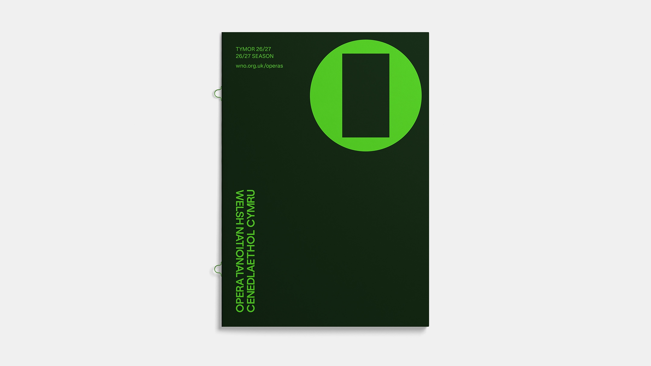
The implications of this shift extend beyond Wales. Across Europe and North America, opera houses are grappling with how to reconcile their historical repertoire with contemporary social values. By creating a brand identity that is "born from frustration" with limited storytelling, the WNO is signaling a commitment to diversity in its programming. The frame is empty, waiting to be filled with new voices, new composers, and new perspectives.
In the final analysis, the Welsh National Opera’s new look is a testament to the resilience of the art form. By taking a casual comment from a Hollywood star and turning it into a catalyst for an 80th-anniversary reinvention, the WNO has demonstrated that it possesses the very thing Chalamet suggested it lacked: a pulse. The "O Frame" is more than just a logo; it is a declaration that opera is ready for its next act, prepared to occupy the center of the cultural conversation with more energy and authority than ever before.