UX Research Highlights Why Carets Outperform Split Menus and Complex Icons in Accordion Design

The ongoing evolution of digital user interface design has long grappled with micro-interactions, particularly regarding how websites communicate collapsible content to users. Recent empirical findings from the Nielsen Norman Group (NN/g) have shed light on a common friction point in web architecture: the selection of icons for accordion menus. The comprehensive usability research evaluates how different visual indicators—ranging from carets and chevrons to plus-minus signs and entirely blank spaces—influence user behavior, click accuracy, and navigation expectations. The data offers clear, evidence-based recommendations for UI and UX designers aiming to optimize site usability and eliminate user confusion.
Background Context and Evolution of Accordion Navigation
Accordions have served as a staple of responsive web design and complex information architecture for over a decade. By allowing content to expand and collapse dynamically, they help manage visual clutter on both desktop displays and constrained mobile screens. However, as web applications have grown more feature-rich, designers have frequently introduced custom icons, animations, and multi-layered states that deviate from established user mental models.
Historically, interface designers relied on intuition rather than empirical data when selecting directional symbols for expandable menus. This lack of standardization led to a fragmented digital landscape where users encounter a wide array of visual signifiers—such as standard arrows, carets, plus symbols, and custom geometric shapes—often within the same browsing session. Recognizing the cognitive load this places on consumers, UX research institutions initiated targeted usability studies to measure exact user expectations when interacting with these navigational elements.
Key Findings from Usability Research

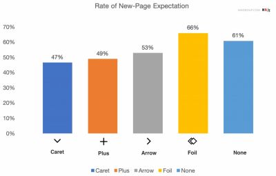
The NN/g study evaluated user interactions across multiple icon variations to determine whether participants anticipated a page navigation or an accordion expansion upon clicking a menu item. The findings revealed distinct patterns in how users interpret visual cues.
When menus featured no icon at all, participants consistently expected clicking the item to load an entirely new page rather than reveal hidden content beneath it. Furthermore, the absence of an icon frequently led to user hesitation. Conversely, when custom or non-standard icons were utilized, users struggled to accurately predict the interaction outcome, resulting in erratic clicking behavior distributed evenly across both the text label and the icon itself.
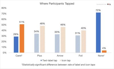
The research also scrutinized the problematic nature of split menus—designs where the text label routes the user to a separate category page, while the adjacent icon handles the accordion expansion. Usability testing demonstrated that split menus routinely fail. Users rarely distinguish between the hit targets of the text label and the icon, leading to unintended page loads when they merely wanted to view sub-categories, or frustrating dead-ends when they sought a comprehensive overview page.
Comparative Analysis of Icon Types
To understand why specific symbols succeed while others falter, researchers analyzed the semantic load and cognitive friction associated with each icon category:
-
Plus and Minus Symbols (+/-): While universally recognized for toggle states, plus and minus signs carry heavy semantic baggage. In digital commerce and software, a plus sign frequently signifies adding an item to a shopping cart, zooming in, or saving data for later use. When deployed in multi-level navigational trees where several accordions remain open simultaneously, the plus-minus paradigm quickly becomes ambiguous.

-
Directional Arrows: Horizontal and vertical arrows suffer from similar over-complication. A right-facing arrow typically implies forward progression or page navigation, while a downward arrow does not reliably communicate accordion expansion. Furthermore, users frequently associate arrows with scrolling actions, page anchoring, or pagination sequences. Because these symbols are overloaded with multiple contextual meanings, they introduce unnecessary cognitive friction.
-
The Caret (Triangle): Emerging as the clear frontrunner in usability metrics, the caret—specifically a downward-pointing triangle by default, rotating upward or sideways upon interaction—proved to be the safest and most intuitive choice. Unlike arrows, carets carry virtually no secondary meanings in standard web interfaces. They exclusively signal a disclosure widget or a dropdown mechanism. Additionally, the study noted that users demonstrated a distinct behavioral anomaly with carets: they were significantly more likely to click directly on the caret icon compared to other symbols, effectively widening the reliable interactive hit target.
Industry Implications and Best Practices
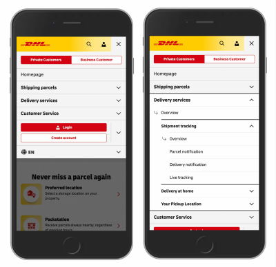
The implications of these research findings extend across e-commerce platforms, corporate websites, and scholarly search engines. Major global entities—such as logistics leader DHL and research databases like Lens.org—have increasingly aligned their interface designs with these streamlined principles. By removing extraneous directional arrows and eliminating confusing split menus, these organizations have observed measurable improvements in user task completion rates.
Experts recommend a set of core principles for modern interface design based on the data:
- Prioritize Simplicity: Avoid over-engineering menu items with excessive directional indicators that shift unpredictably based on state changes.
- Eliminate Split Menus: Abandon patterns that separate the hyperlink action from the expansion action within a single list item. Instead, make the primary category header responsible for opening the dropdown menu, and include a dedicated "Overview" or category link within the expanded sub-menu.
- Rely on Underlining for Direct Links: If a text label is intended to navigate the user to a new page, the most effective and universally understood signifier is a simple text underline, devoid of accompanying carets or arrows.
- Standardize on Carets: Utilize standard carets for all collapsible content containers to leverage established user mental models and minimize cognitive load.
Broader Impact on Digital Accessibility and User Experience
As digital platforms continue to handle increasingly complex data sets, reducing user friction remains a paramount objective for web developers and designers. The shift toward standardized accordion iconography is not merely an aesthetic preference; it directly impacts digital accessibility. Predictable interfaces reduce cognitive fatigue for all users, including those relying on assistive technologies or navigating under time constraints.
By aligning design systems with empirical research rather than subjective trends, organizations can create more intuitive, efficient, and user-friendly digital environments. The data underscores a fundamental rule of contemporary web design: when it comes to navigation, clarity consistently outperforms complexity.