Latest Web Development Standards Emphasize Zero-Build CSS, Root Scrollers, and Advanced Responsive Iframes

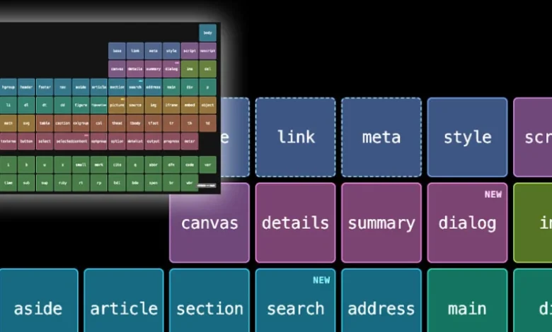
The landscape of modern web development is undergoing a quiet yet profound transformation, driven by a renewed industry-wide focus on native browser capabilities, reduced toolchain complexity, and the anticipation of entirely new form factors. Recent updates from major browser vendors, developer tools ecosystems, and thought leaders in the front-end community point toward a future where developers can write cleaner, more performant code with fewer external dependencies. At the same time, hardware manufacturers continue to push the boundaries of device design, forcing developers to prepare for multi-screen and foldable interfaces well in advance of their commercial release.
The Shift Toward Zero-Build CSS and Native Tooling
For over a decade, front-end developers have relied heavily on complex build steps, preprocessors like Sass and Less, and wrapper-class hacks to achieve maintainable stylesheets. However, a significant paradigm shift is currently underway, championed by educators and developers who advocate for leveraging native CSS features that are now universally supported across modern evergreen browsers.
A primary driver of this movement is the widespread adoption of native CSS nesting. Historically, developers needed tools like Sass to nest CSS selectors logically within one another, requiring a compilation step to convert the syntax into standard CSS that browsers could interpret. Today, native nesting is fully supported in all major browsers, allowing developers to organize their stylesheets hierarchically without adding build-tool overhead.
Similarly, the advent of the :has() relational pseudo-class has effectively eliminated the need for complex JavaScript or wrapper-class hacks. Previously, applying a style to a parent container based on the presence of a specific child element required cumbersome DOM manipulation or utility classes. With :has(), developers can query the parent-child relationship directly within the stylesheet, drastically reducing boilerplate code and improving rendering performance.
According to web standards advocates, adopting these twelve core CSS features—which also include container queries, subgrid, and modern color spaces—allows teams to retire legacy toolchain dependencies entirely. This "zero-build" approach not only speeds up local development servers and continuous integration pipelines but also aligns with broader industry goals of sustainability and web performance optimization by serving leaner, standards-compliant assets directly to the end user.
Mastering the Root Scroller in Modern Viewports
As web applications grow increasingly complex, managing scrolling behavior across diverse viewports remains a critical challenge for developers. A recent deep dive by web developer Kilian Valkhof has brought renewed attention to the concept of the "root scroller"—the viewport’s primary scroll container responsible for handling essential browser behaviors such as scroll restoration, visual viewport resizing, and the dynamic collapsing and expanding of mobile browser address bars.

In traditional web design, the document body or the HTML root element naturally acted as the root scroller. However, modern CSS patterns—such as full-screen application layouts, fixed positioning, and flexbox or grid wrappers—frequently inadvertent transfer scrolling responsibilities to inner container elements. When this happens, the browser loses track of the root scroller, leading to broken scroll restoration, jittery mobile interfaces, and unresponsive address bar behavior during touch interactions.
Valkhof’s analysis provides developers with actionable strategies to maintain control over the root scroller, utilizing modern layout techniques that ensure scrolling remains tied to the viewport level where appropriate. As mobile web traffic continues to outpace desktop usage globally, maintaining native browser scroll behaviors is paramount for delivering app-like experiences that feel fluid, predictable, and accessible to all users.
The AI Quality Debate: Substance Over Style in Digital Creation
Beyond core web mechanics, the broader tech community is actively debating the societal and professional implications of generative artificial intelligence in digital production. In a recent commentary titled "AI, Make the Website Good," front-end engineer and developer advocate Zach Leatherman challenged the prevailing industry narrative that simply deploying generative AI tools is sufficient to produce high-quality digital experiences.
Leatherman argues that regardless of the sophistication of the underlying algorithms or prompt engineering techniques, a deep, foundational concern for the ultimate quality of the output matters now more than ever. To illustrate his point, he highlighted the public-facing digital properties of prominent artificial intelligence firms, pointing out ironic discrepancies between the advanced capabilities they market and the baseline front-end execution of their own web platforms.
The commentary strikes a chord within the web development community, where concerns have grown regarding an influx of automated, boilerplate-heavy web designs that prioritize speed of generation over accessibility, performance, and semantic HTML structure. Industry analysts suggest that while AI will undoubtedly remain a permanent fixture in the developer’s toolkit for scaffolding and boilerplate generation, the ultimate differentiator for successful digital products will continue to be human oversight, rigorous quality assurance, and an uncompromising commitment to user experience standards.
Chrome 154 Introduces Native Responsive Iframes
In the realm of browser vendor updates, Google’s Chrome team—alongside preview implementations in Microsoft Edge—has officially introduced native responsive <iframe> capabilities in Chrome 154. Spearheaded by engineers Sebastian Benz and Bramus van Damme, this update addresses one of the most notoriously stubborn layout challenges in web development: embedding external content whose dimensions are unknown prior to load time.
Historically, making an iframe responsive required complex CSS hacks, wrapper divs with specific aspect-ratio paddings, or bidirectional postMessage communication scripts between the parent page and the embedded document to dynamically adjust height and width. Chrome 154 streamlines this process entirely by allowing developers to set an iframe to automatically adopt the exact size of its internal content.
Furthermore, the new specification empowers developers to dictate precisely which dimension—width, height, or both—drives the scaling behavior, while allowing for dynamic post-load tweaks. The sole technical caveat is that the embedded document must explicitly opt in to the responsive behavior, ensuring security and preventing unintended layout shifts. This native capability is expected to significantly reduce maintenance overhead for content publishers, advertisers, and third-party widget providers who rely heavily on iframe integrations.
Preparing for Foldables: Xcode 27.1 Beta and the iPhone Duo
Looking ahead to upcoming hardware trends, recent releases from the Apple developer ecosystem indicate active preparation for novel device form factors. The rollout of the Xcode 27.1 Beta includes a specialized simulator for an unannounced device category provisionally referred to as the "iPhone Duo."
While Apple has not yet made official commercial announcements regarding a foldable iPhone or dual-screen device, the inclusion of dedicated simulation environments in developer kits provides a clear window into the company’s hardware roadmap. Software engineers and UI/UX designers are already leveraging the simulator to test how responsive web layouts, dynamic type scales, and adaptive design systems behave when a viewport undergoes sudden geometrical shifts—such as transitioning from a compact single-screen layout to an expanded multi-panel canvas.
The emergence of foldable simulators underscores a broader hardware trend across the smartphone industry, where manufacturers are striving to bridge the gap between pocket-sized portability and tablet-sized productivity. For web developers, this means that responsive design can no longer be treated as a static desktop-to-mobile breakpoint exercise. Instead, applications must be engineered to fluidly adapt to continuous variations in aspect ratio, folding creases, and multi-window multitasking environments.
Industry Implications and Future Outlook
The convergence of zero-build CSS standards, enhanced viewport control, automated iframe scaling, and preparation for foldable hardware paints a clear picture of where web development is heading in the near term. The overarching philosophy of the current technological cycle is simplification at the toolchain level paired with increased expressiveness at the native browser level.
By shedding heavy preprocessing dependencies in favor of native features like nesting and relational queries, development teams can reduce technical debt, improve build speeds, and ensure greater longevity for their codebases. Simultaneously, as browser engines take on heavier responsibilities—such as automated iframe sizing and advanced scroller management—developers are freed to focus on higher-level architectural and experiential concerns.
However, these advancements also raise the bar for professional craftsmanship. As Zach Leatherman and other industry veterans have noted, the proliferation of automated tools and AI-generated code makes intentional design, performance monitoring, and adherence to web standards more critical than ever. Whether navigating the complexities of multi-screen foldable devices simulated in tools like Xcode or optimizing core web vitals for mobile-first audiences, the modern web developer must balance the power of native browser automation with a rigorous dedication to quality output.