The landscape of Cascading Style Sheets (CSS) is constantly evolving, offering developers more powerful and intuitive tools to create visually rich web experiences. Recent advancements have introduced significant capabilities for shaping elements beyond the traditional rectangular box model. Notably, the shape() function, now considered Baseline, and the corner-shape property represent major leaps forward. However, the true potential for intricate and decorative CSS shapes may lie in the emerging border-shape property, poised to revolutionize how borders and other decorative elements interact with custom shapes.
A Deeper Dive into CSS Shaping Technologies
For developers who actively engage with CSS shape manipulation, the arrival of shape() and corner-shape may have been a welcomed, albeit potentially subtle, progression. For those less immersed in the intricacies of CSS geometry, these features might have passed under the radar. It is therefore pertinent to provide a concise overview of these foundational advancements before exploring the groundbreaking implications of border-shape.

shape() and corner-shape: Laying the Groundwork
The shape() function, now widely supported, serves as a flexible value for properties like clip-path and offset-path. It leverages Scalable Vector Graphics (SVG) syntax, offering a more accessible and streamlined approach to defining CSS shapes compared to the often complex path() function. The power of shape() lies in its ability to translate any SVG shape into a CSS-compatible format. This capability has been extensively explored in dedicated article series, demonstrating how to construct everything from simple lines and arcs to highly complex, custom shapes.
The flexibility of shape() extends to its direct conversion of SVG elements into CSS shapes. To facilitate this process, tools have been developed, such as an SVG-to-CSS converter, allowing designers to seamlessly integrate their vector graphics into web designs as dynamic CSS shapes.
Complementing shape(), the corner-shape property works in tandem with the established border-radius property. As its name suggests, corner-shape allows for the precise styling of an element’s corners using a predefined set of keywords. These keywords include options like round, scoop, bevel, notch, and squircle, offering a range of aesthetic choices that go beyond simple rounded corners.

The corner-shape property also opens avenues for creating a variety of common CSS shapes. While some of these shapes could previously be achieved using clip-path or mask, corner-shape offers a distinct advantage: the seamless integration of borders and other decorations that naturally follow the defined corner contours. This is a significant improvement, as traditionally, applying borders to custom shapes presented a considerable challenge. Although browser support for corner-shape is still maturing, with initial implementation primarily in Chromium-based browsers, its potential for simplifying complex decorative styling is undeniable.
The Emergence of border-shape: Redefining Decorative Elements
While corner-shape excels at styling individual corners, the need for more comprehensive element shaping has led to the development of the border-shape property. This new property aims to define the shape of an entire element, rather than just its corners, and accepts the same rich set of values as clip-path, including the powerful shape() function.
The core innovation of border-shape lies in its interaction with decorative CSS properties. Unlike clip-path or mask, which inherently clip or mask the entire element including its borders and shadows, border-shape influences the rendering of these decorative layers. This means that properties such as border, box-shadow, and outline will now follow the defined shape of the element, rather than adhering to its default rectangular boundary.

This distinction is crucial. Previously, applying borders to non-rectangular shapes was a cumbersome process, often requiring complex workarounds or SVG overlays. border-shape promises to make this significantly more manageable, potentially transforming the creation of visually engaging CSS shapes.
For developers already familiar with clip-path, adopting border-shape is remarkably straightforward. The transition involves a simple substitution of the clip-path property with border-shape, retaining the same shape definition syntax. This low barrier to entry further amplifies the property’s potential impact.
The synergy between the shape() function and border-shape is particularly noteworthy. Mastering shape() unlocks the full expressive power of border-shape, enabling the creation of highly sophisticated and dynamic visual elements. While browser support for border-shape is currently limited, primarily to Chrome, the early exploration of its capabilities reveals a transformative potential for web design.

Border-Only Shapes: Eliminating Workarounds
One of the most immediate and impactful applications of border-shape is the creation of border-only shapes. By applying a standard border property and then defining a shape using border-shape, developers can achieve outlines that precisely follow custom contours without the need for any fill. This eliminates the need for complex hacks and significantly streamlines the design process.
The syntax is elegantly simple:
.shape
  border: 8px solid red;
  border-shape: /* your shape code */;
This approach allows for the direct rendering of borders along the defined shape’s path. The width of the border is determined by the element’s computed border width, providing a predictable and consistent visual outcome. This opens up a world of possibilities for creating intricate outlines, such as stylized hearts, starbursts, flowers, or any custom shape imaginable, rendered purely as a border. Many existing CSS shape collections and generators are already being updated to incorporate border-shape compatibility, offering ready-made solutions for developers.

Cutout Shapes: Precision Through Dual Path Definitions
The border-shape property’s versatility is further enhanced by its ability to accept two shape definitions. This dual-path syntax enables the creation of cutout shapes, where the border is rendered within the area defined by an outer and an inner boundary. The specification outlines this as "Fill mode," where the first shape defines the outer perimeter and the second defines the inner.
For instance, to create a cutout effect, one might use inset(0) as the outer shape (representing a rectangle) and then define a secondary shape within it.
.shape
  border: 8px solid red;
  border-shape: inset(0) /* your inner shape code */;
This allows for sophisticated effects, such as a heart shape cut out from a larger rectangular background, or a starburst appearing within a circular frame. The ability to define precise inner and outer boundaries provides granular control over the geometry of the border region.

A common misconception might arise regarding the interaction with border-radius. When border-shape is applied, border-radius is effectively ignored. This is logical, as the element no longer possesses traditional corners to round; it is now defined by a custom shape. However, this does not limit design possibilities. By leveraging the shape() function and other basic shape definitions within border-shape, any desired curvature or contour can be achieved, negating the need for border-radius altogether.
For example, transitioning from a rectangular cutout to a circular one is as simple as changing the outer shape definition from inset(0) to circle(). This demonstrates the adaptability of the property for creating a wide array of visually appealing designs.
Breakout Decorations: Extending Visual Elements Beyond Boundaries
The border-shape property also introduces the compelling concept of "breakout decorations." This refers to the ability of decorative elements, such as borders or backgrounds simulated by borders, to extend beyond the element’s defined content box. This is a significant advancement, particularly in the context of layout systems like CSS Grid, where creating elements that break out of their containers can be notoriously challenging.

When border-shape is used with a single shape definition, it shapes the entire element, including its decorations. However, the content within the element remains bound by the original rectangular shape. This behavior is similar to traditional border-radius. To achieve breakout effects, the key lies in manipulating the shape definitions to extend beyond the element’s boundaries.
By carefully defining the outer and inner shapes in the two-value syntax, or by using shape values that inherently extend beyond the element’s box in the single-value syntax, developers can create visual elements that appear to spill out of their containers. For instance, defining a background shape that extends to the viewport edges while the content remains centered can create a striking full-width background effect.
.box
  border-shape: inset(0 -100vw) circle(0);
  border-color: pink;
In this example, the inset(0 -100vw) likely defines an outer shape that spans the full viewport width, while circle(0) may define a minimal inner shape, effectively creating a full-width pink background for the element. This technique allows for the creation of visually impactful layouts that defy traditional constraints.

Partial Decorations: Unbounded Creative Freedom
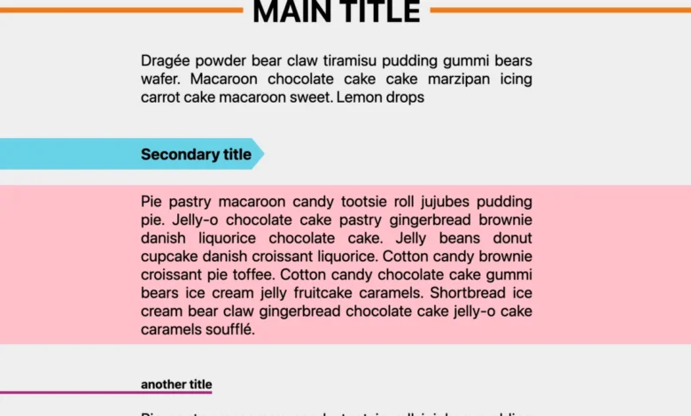
Building upon the concept of breakout decorations, border-shape also facilitates the creation of partial decorations. This means that decorative elements are no longer confined to the element’s boundaries. Developers can use the shape() function, in conjunction with border-shape, to create highly specific and intricate decorations that appear in precisely defined areas.
This opens up possibilities for:
- Targeted Underlines: Creating stylized underlines for headings or text that are not simply straight lines but follow custom paths.
- Thematic Backgrounds: Applying background shapes that only appear in specific sections of an element, such as a diagonal accent or a corner flourish.
- Custom Borders: Designing borders that are not uniform but manifest as specific graphic elements, like a series of dots or a dashed line that follows a complex curve.
The lack of inherent boundaries for these decorations means that the only limit is the developer’s imagination and their mastery of the shape() function. The ability to craft such nuanced visual details without resorting to complex image manipulation or JavaScript libraries represents a significant step forward in declarative styling.

The Future of CSS Shapes: Animation and Beyond
The capabilities of border-shape extend into the realm of animation, offering dynamic and engaging visual effects.
Shape Animation: Bringing Designs to Life
border-shape is fully animatable, allowing for a wide spectrum of dynamic effects.
- Reveal Effects: Using the two-value syntax, animating the
border-widthcan create compelling reveal animations, where shapes or borders gracefully emerge or recede. This can be applied to text, images, or any other HTML element. - Morphing Shapes: By animating the shape values themselves, complex transformations can be achieved. This allows for elements to morph between different custom shapes, creating fluid and eye-catching transitions. For example, blob shapes can be animated to bounce or pulsate, adding a sense of life and interactivity.
- Dynamic Decorations: Animations can also be applied to the partial decorations discussed earlier. Hover effects can trigger subtle animations on underlines, background accents, or custom borders, enhancing user engagement and providing visual feedback.
The integration of animation with border-shape unlocks sophisticated interactive designs that were previously difficult or impossible to achieve with pure CSS.

Advanced Applications and Future Potential
The ongoing development and adoption of border-shape are paving the way for increasingly complex and innovative web designs. Early demonstrations showcase its potential for:
- Animated Underlines: Replacing static underlines with dynamic, hand-drawn effects that slide and animate on hover, adding a unique stylistic touch to navigation menus.
- Electric Frames: Creating visually striking frames around content that appear to be alive with energy, moving and shifting in a dynamic fashion.
- Custom Loaders: Designing animated loaders that are not confined to simple geometric shapes but can take on complex, fluid forms, offering a more engaging user experience during loading times.
- Interactive Connectors: Developing elements that visually connect and adapt, such as lines that bend and stretch between moving objects, demonstrating a dynamic relationship between UI components.
These examples highlight the transformative power of border-shape when combined with the expressive capabilities of the shape() function. As browser support continues to expand, it is anticipated that border-shape will become an indispensable tool for designers and developers seeking to push the boundaries of visual design on the web.
Conclusion: A Powerful New Era for CSS Styling
The introduction of shape(), corner-shape, and most significantly, border-shape, marks a pivotal moment in the evolution of CSS. These properties collectively empower developers with unprecedented control over the visual presentation of web elements. border-shape, in particular, stands out for its ability to seamlessly integrate decorative elements like borders and shadows with custom shapes, eliminating previous technical hurdles and opening up a vast canvas for creativity.

The ability to craft border-only shapes, create intricate cutout designs, implement breakout decorations, and animate these elements signifies a new era of design possibilities. As browser support matures, border-shape is poised to become a fundamental tool for building visually rich, interactive, and engaging web experiences. Designers and developers are encouraged to explore the capabilities of shape() and border-shape to unlock their full potential in creating cutting-edge web designs. Resources such as CSS shape collections and online generators are continuously being updated to reflect these advancements, providing developers with the tools and inspiration needed to harness the full power of modern CSS shaping.
Related posts: