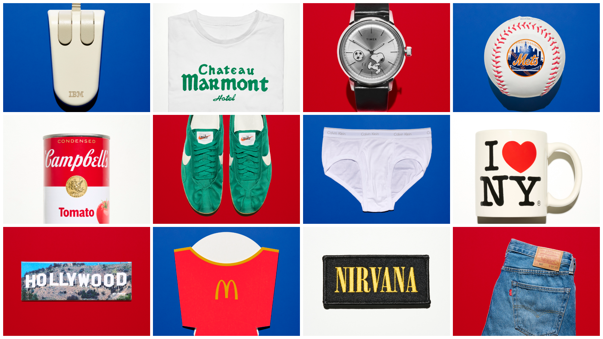
The visual landscape of the United States has long been defined by a unique synthesis of commerce, culture, and bold graphical articulation. In the "land of opportunity," success has often relied on the ability to distill complex brand identities into instantly recognizable symbols that can withstand the pressures of time and shifting consumer tastes. These 14 iconic American logos represent more than just corporate identifiers; they are historical markers that illustrate the evolution of graphic design from the industrial age to the digital era. By examining the creative stories behind these showstoppers—spanning fashion, fast food, architecture, and technology—we gain insight into how American branding became a global language of mass consumption and high art.
The Civic Symbols of New York: I Love NY and the Mets
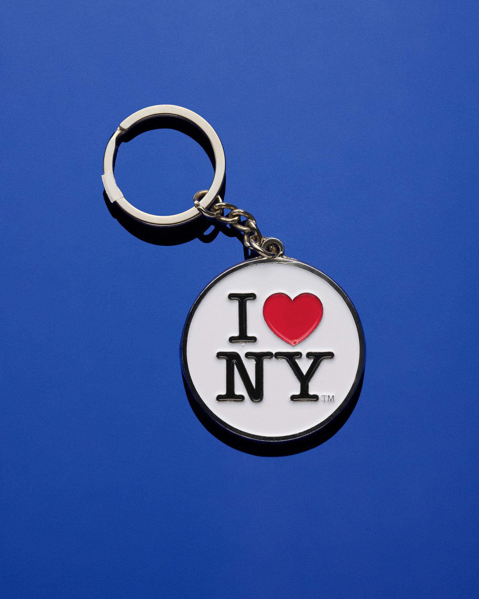
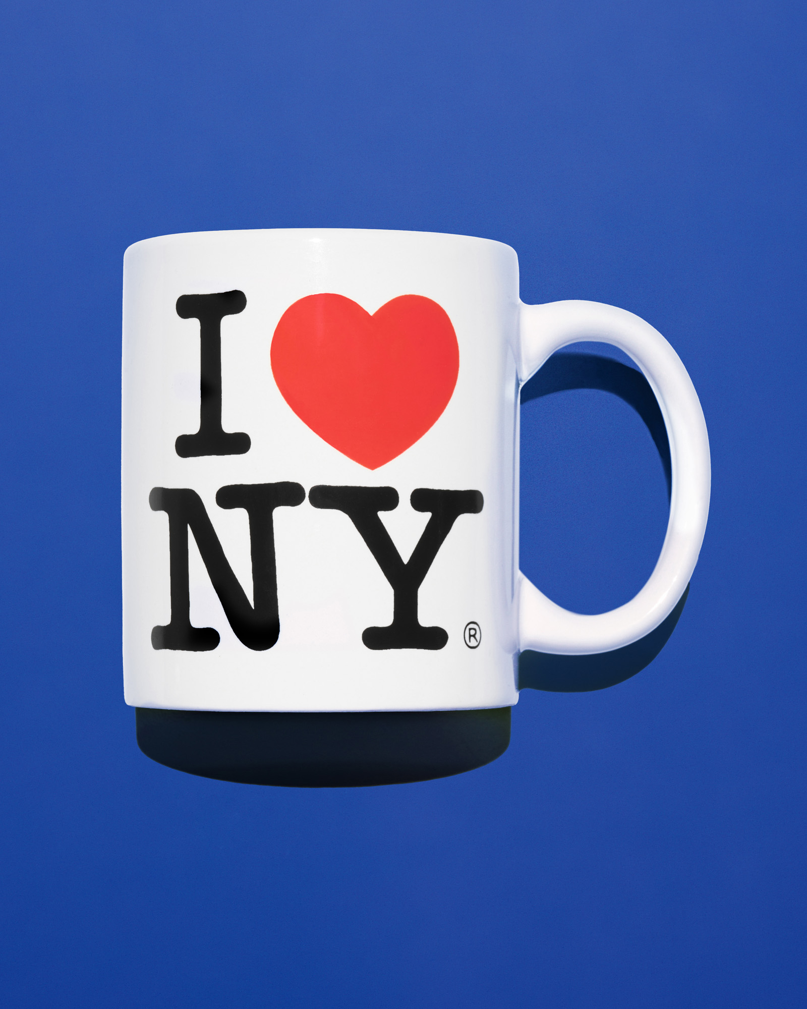
The power of a logo to rescue a city’s reputation is perhaps best exemplified by Milton Glaser’s 1976 creation, "I Love NY." At the time of its inception, New York City was grappling with a ballooning fiscal deficit and a reputation for crime that deterred tourism. The state’s Department of Commerce commissioned the Wells Rich Greene advertising agency to develop a campaign, and Glaser was brought in to provide the visual punchline.
Doodling in the back of a taxi, Glaser sketched a red heart paired with the letters "I" and "NY" in American Typewriter, a slab serif font that captured the 1970s aesthetic. Despite early concerns that the rebus-like construction would confuse the public, the design became a global phenomenon. Following the September 11 attacks, Glaser updated the logo with a "More Than Ever" tagline and a small burn mark on the heart, transforming the commercial symbol into a banner of resilience. Today, the logo generates tens of thousands of dollars in annual licensing fees for the state, though Glaser himself famously performed the initial work pro bono for the sake of his city.
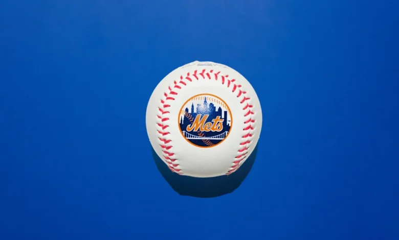
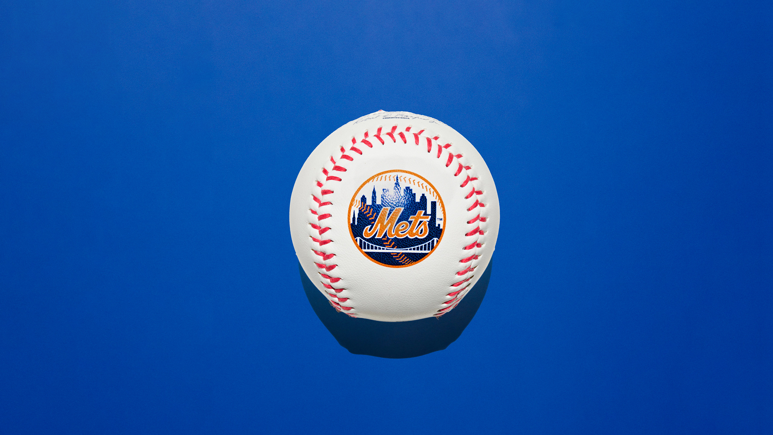
Similarly rooted in New York’s civic identity is the logo for the New York Mets. Unveiled in 1961 and designed by illustrator Ray Gotto, the emblem was the result of a public competition. Gotto sought to create a symbol that transcended borough rivalries, despite the team being based in Queens. The resulting circular logo features a skyline that is a composite of landmarks: the Woolworth Building, the Empire State Building, the United Nations headquarters, and a suspension bridge representing the city’s connectivity. While the palette was originally black and pink, it evolved into blue, orange, and white—colors that mirror the New York City flag. For over six decades, even as the team moved stadiums and changed ownership, Gotto’s skyline has remained an untouchable piece of sports iconography.
The Architecture of Identity: IBM and the Hollywood Sign
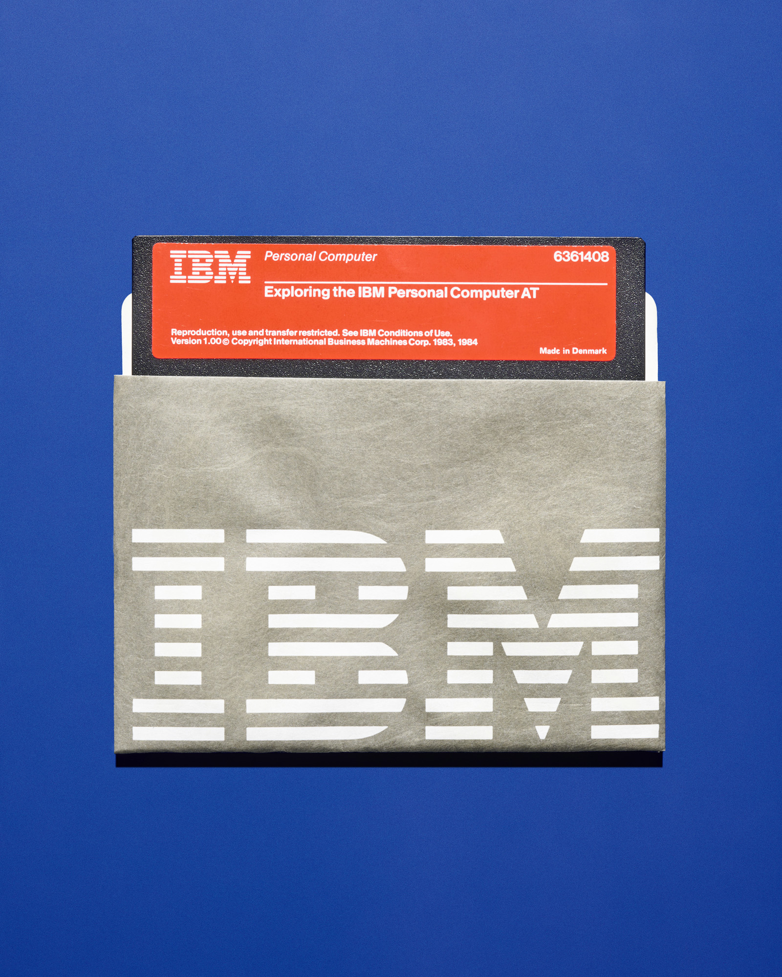
In the corporate world, few designers have had an impact as profound as Paul Rand. In 1956, Rand was tasked with rebranding International Business Machines (IBM) as it transitioned from vacuum-tube technology to modern computing. Rand’s initial design brought a sense of coherence to a company that produced everything from business cards to massive industrial mainframes.
By 1972, Rand refined the logo into the "8-bar" striped version recognized today. The stripes were intended to suggest speed and dynamism while making the heavy letterforms appear lighter. This move toward a "corporate identity system" was revolutionary, influencing how every modern tech giant approaches branding. IBM’s commitment to design was further cemented by its collaborations with legendary figures such as Charles and Ray Eames and Eero Saarinen, proving that a logo is merely the tip of a much larger architectural spear.
On the West Coast, the Hollywood sign represents a different kind of architectural branding—one that began as a temporary advertisement. Erected in 1923 by real estate developers SH Woodruff and Tracy E Shoults, the original "Hollywoodland" sign was intended to last only 18 months to promote a new housing tract. Designed by Thomas Fisk Goff, the 50-foot-high block letters were illuminated by thousands of lightbulbs. By 1949, the sign had fallen into disrepair, famously missing its "H." The Hollywood Chamber of Commerce intervened, removing the "land" suffix to reflect the district rather than the housing development. What began as a billboard for real estate is now the definitive global symbol of the film industry, protected by the Hollywood Sign Trust and standing as a landmark of American aspiration.
Luxury and Modernism: Tiffany & Co and MoMA
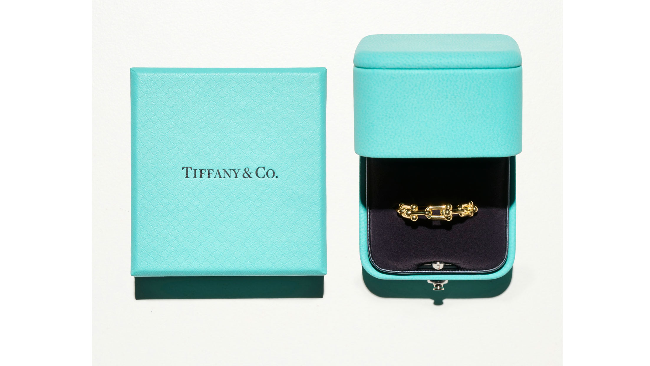
Branding in the luxury sector requires a delicate balance between tradition and modernization. Tiffany & Co.’s "Blue Box" is a masterclass in this discipline. The distinctive robin’s-egg blue has been associated with the jeweler since its founding in 1837, but it was trademarked in 1998 and officially standardized as Pantone 1837 in 2001. In 2005, Pentagram partner Paula Scher provided a discreet refresh, emphasizing the box as the brand’s central identity. The hand-drawn logo, designed to mimic hot-stamped letterpress, signals a marriage of industrial luxury and artisan craft. This "unbuyable" box has become so iconic that it is often more recognizable than the jewelry it contains.
In the realm of high culture, the Museum of Modern Art (MoMA) in New York established a benchmark for institutional branding. In 1964, Ivan Chermayeff designed a logotype using Franklin Gothic No. 2, a choice that reflected the museum’s commitment to the avant-garde and the functional. In 2004, the identity was expanded with "MoMA Gothic," a custom typeface by Matthew Carter. The brilliance of Chermayeff’s original solution lies in its adaptability; the logo can be cropped, scaled, and abstracted without losing its identity. This typographic approach allows the museum’s branding to sit comfortably alongside the diverse artworks it houses, serving as a neutral yet authoritative frame for modern art.
Fast Food and Pop Art: McDonald’s and Campbell’s
The "Golden Arches" of McDonald’s are perhaps the most ubiquitous commercial symbol in human history. The arches did not start as a graphic on a page, but as a structural element of a 1953 restaurant in Phoenix, Arizona. Architect Stanley Clark Meston, working with Richard McDonald, designed the arches as neon-lit parabolas to draw in motorists. It was Jim Schindler, the company’s head of engineering, who later overlapped the two arches to form the letter "M." While the restaurants themselves have moved away from the "Googie" architectural style of the 1950s toward more functional, flat-packed structures, the Golden Arches remain the primary visual lure for billions of customers worldwide.
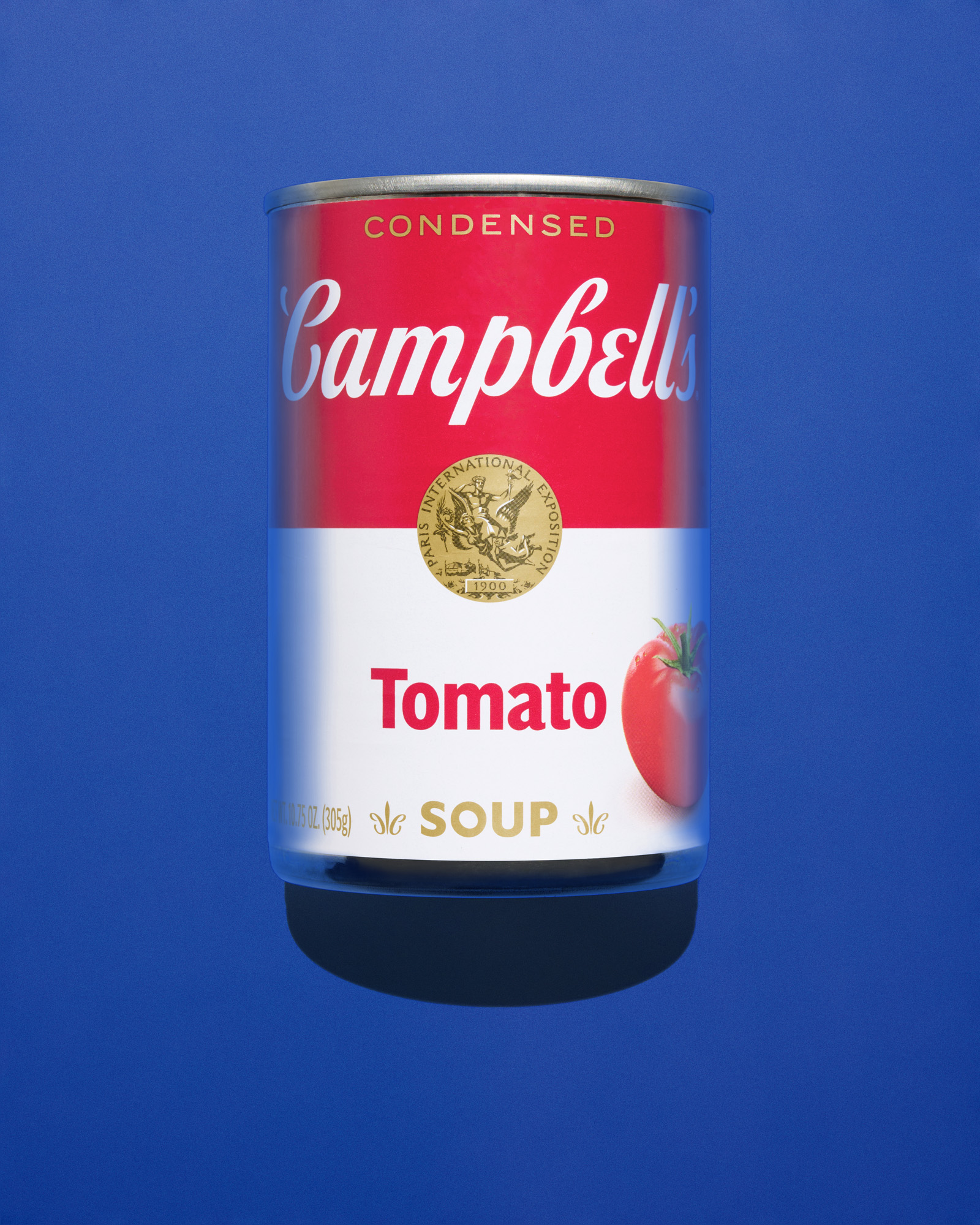
The intersection of mass marketing and fine art reached its zenith with the Campbell’s soup can. While the label design—with its red and white halves and gold seal—was already an American staple, it was Andy Warhol’s 1962 exhibition that transformed it into a cultural icon. Warhol recognized that the effectiveness of the package design was a form of art in itself. By replicating the can exactly, Warhol challenged the art world to find beauty in the mundane. The Campbell’s logo is a rare example of a brand that achieved "fine art" status not through a redesign, but through the sheer persistence of its original 19th-century aesthetic.
Fashioning the American Image: Nike, Levi’s, and Calvin Klein
The Nike "Swoosh" is a testament to the fact that even the most successful logos can have humble beginnings. In 1971, Phil Knight, the co-founder of what was then Blue Ribbon Sports, commissioned design student Carolyn Davidson to create a logo that conveyed motion. Davidson was paid just $35 for the design. Knight’s initial reaction—"I don’t love it, but it will grow on me"—is now legendary. The Swoosh was designed to look like a wing, a nod to the Greek goddess of victory, and its clean, sweeping lines became synonymous with athletic excellence. Davidson was eventually rewarded with shares in the company, which today has a brand valuation exceeding $30 billion.
Levi’s "Two-Horse Patch" represents the oldest logo in this selection, dating back to 1886. Levi Strauss and Jacob Davis understood that many of their customers—miners and laborers during the Gold Rush—were illiterate or spoke little English. The pictorial logo, showing two horses attempting to pull apart a pair of jeans, was a brilliant piece of visual communication. It told the story of the product’s durability without requiring a single word. While the brand has introduced various wordmarks over the years, the leather patch remains a constant on every pair of 501s, anchoring the brand in its rugged, 19th-century origins.
In contrast, Calvin Klein’s logo, introduced in 1968, represents the minimalist shift of the late 20th century. The sans-serif font is an exercise in directness. However, the logo’s true impact came from its placement. By printing the name on the elastic waistband of underwear and featuring it in provocative ad campaigns by Bruce Weber and Herb Ritts, the brand turned a functional garment into a status symbol. The logo became a badge of allegiance, visible above the waistline of jeans, forever linking the name Calvin Klein with the concept of effortless American "cool."
Subculture and Myth: Snoopy, Nirvana, and Chateau Marmont
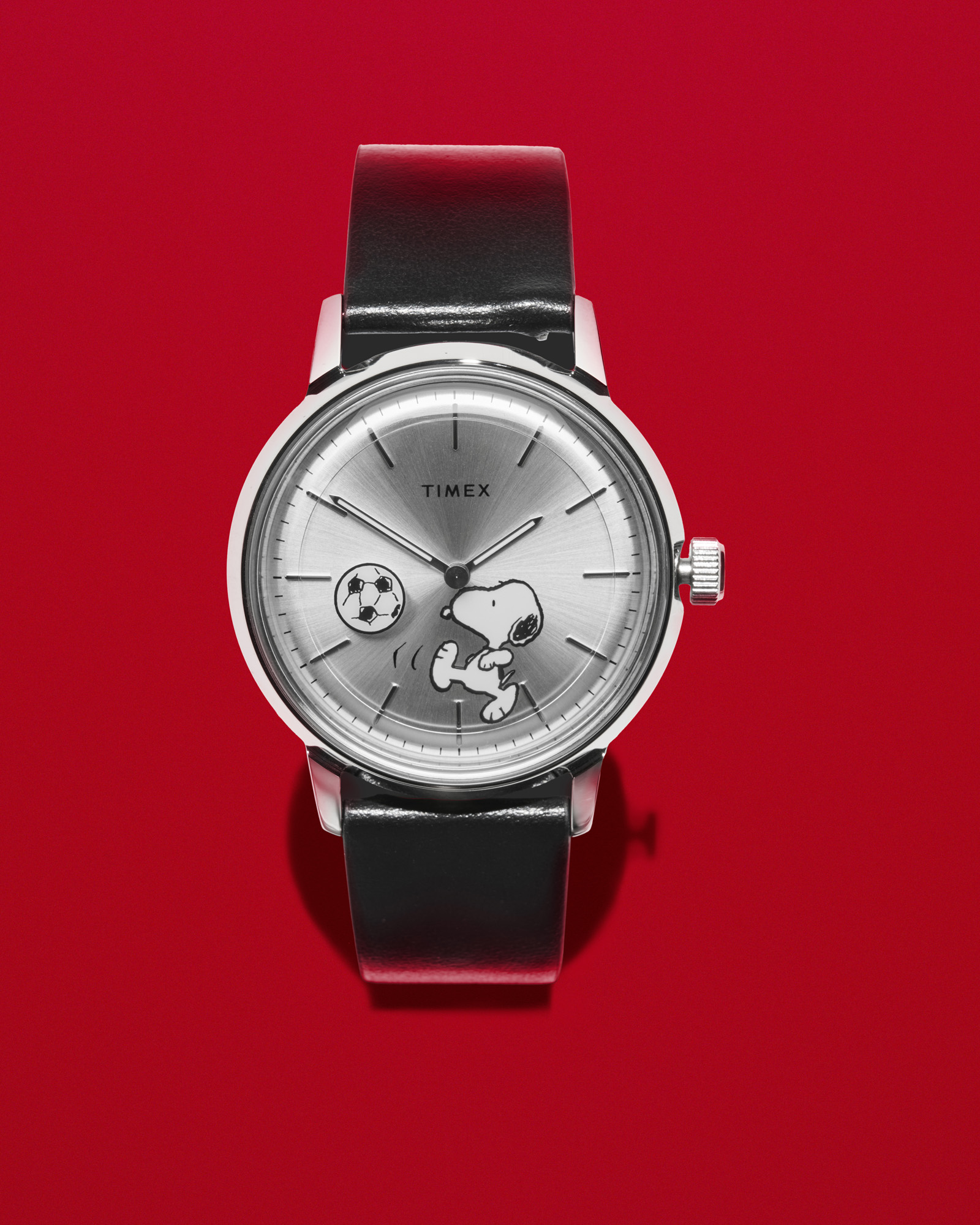
Not all icons are born in corporate boardrooms. The character of Snoopy, created by Charles M. Schulz for the Peanuts comic strip, evolved from a realistic beagle into a minimalist icon. Schulz’s streamlined design made Snoopy incredibly adaptable, allowing the character to transition from newsprint to luxury fashion collaborations with Gucci and Chanel. In 1965, Timex became one of the first brands to license the character, beginning a tradition of Snoopy-themed watches that continues to this day. Snoopy’s silhouette is now a global shorthand for a specific kind of American whimsy and resilience.
In the world of music, the Nirvana logo illustrates how serendipity can create a lasting brand. In 1989, designer Lisa Orth was tasked with creating the cover for the band’s debut album, Bleach. She asked a colleague to use whatever font was already loaded into the typesetting machine; it happened to be Onyx. The blocky, serif font perfectly captured the raw, unpolished energy of the Seattle grunge scene. Despite its accidental origins, the Onyx font became the definitive visual marker for the band, appearing on millions of T-shirts and patches worldwide.
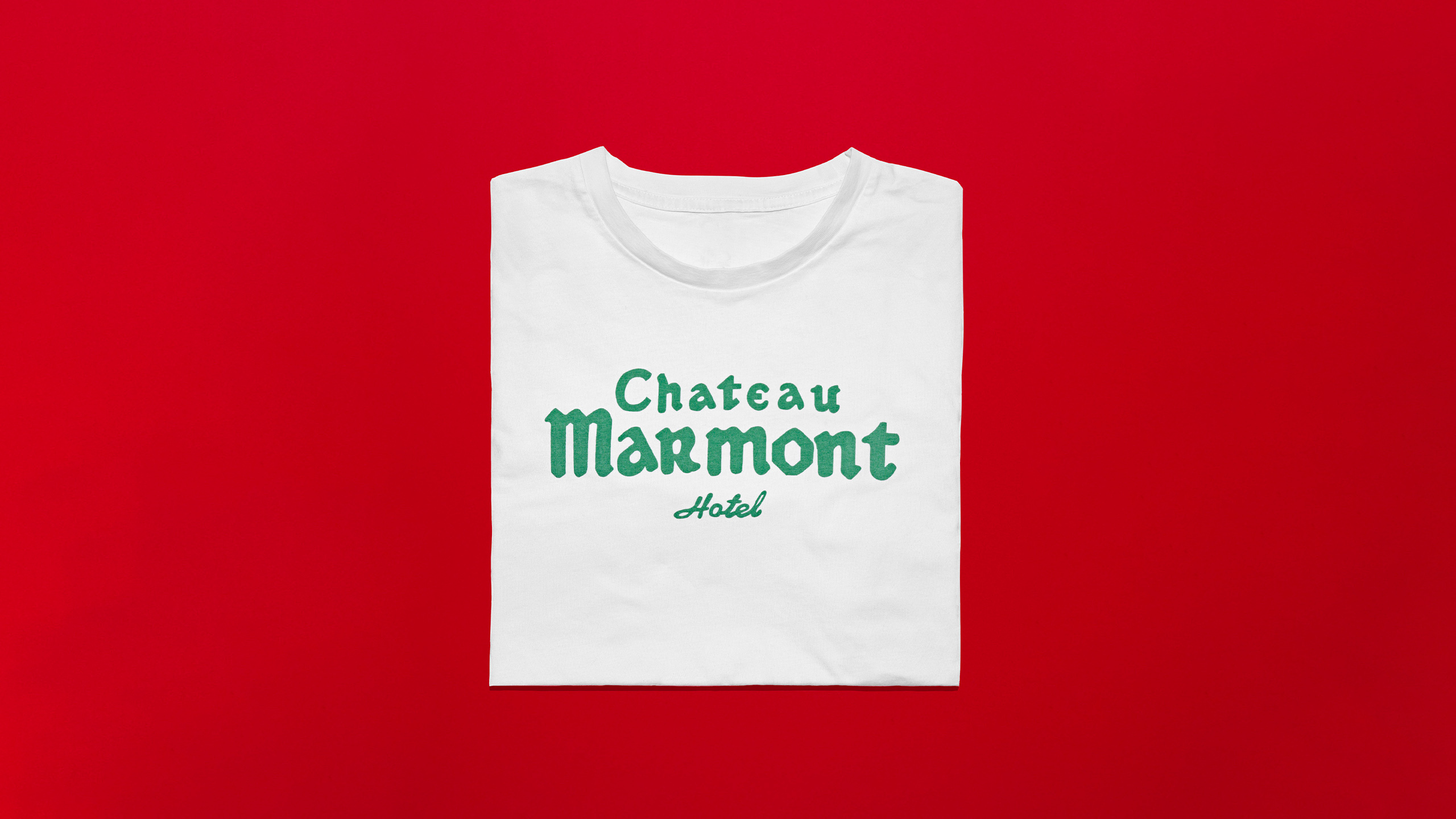
Finally, the Chateau Marmont logo serves as a bridge between Old Hollywood and the modern era. The hotel, modeled after a French chateau, opened in 1929. When André Balazs took over the property in 1990, he sought to preserve its "intentionally shabby" gothic aesthetic. The logo uses the Libra font, created in 1938 by Sjoerd Hendrik de Roos. Its medieval, hand-drawn appearance reflects the hotel’s status as a sanctuary for artists and movie stars, a place where the history of Hollywood is still being written behind closed doors.
Broader Impact and Design Legacy
The 14 logos discussed here are more than mere marketing tools; they are the visual DNA of the American experience. They demonstrate that successful graphic design is rarely about complexity. Instead, it is about the ability to distill a brand’s essence into a form that is simple enough to be remembered yet bold enough to be recognized across different cultures and eras.
From Milton Glaser’s taxi-cab doodle to the structural parabolas of the Golden Arches, these designs have shaped how we navigate our cities, our wardrobes, and our cultural institutions. They prove that in the intersection of commerce and culture, a well-designed logo does not just sell a product—it defines a lifestyle. As we move further into a digital-first world, these analog-born icons continue to provide a sense of stability and identity, standing as a testament to the enduring power of American graphic design history.