
Washington Commanders Alternate Logo Sparks Intense Debate Among Fans Regarding Physical Feasibility and Branding Logic
The introduction of a new visual identity for a professional sports franchise is rarely a seamless process, as legacy fanbases often possess a deep-seated emotional attachment to established design languages. The Washington Commanders, a franchise that has undergone significant identity shifts over the last four years, recently found itself at the center of a viral design controversy following the unveiling of a new suite of "alternate" branding assets. Central to this debate is a specific logo featuring a stylized spear or arrow intersecting the team’s folded "W" emblem. While the team intended for the design to symbolize a bridge between its storied past and a forward-looking future, the internet has instead fixated on a peculiar question of spatial geometry: is the logo’s design physically possible?
The controversy began when the NFL team revealed a collection of secondary logos on social media, intended to supplement the primary "W" logo introduced during the 2022 rebranding. The specific mark in question depicts a burgundy-and-gold spear—reminiscent of the imagery used during the franchise’s "Redskins" era—passing through the negative space and folds of the modern, stencil-style "W." In an official Instagram post accompanying the reveal, the Commanders described the interweaving spear and "W" as a "powerful joining of past and present," asserting that the design "captures the forward-focused spirit of the Commander, a leader of warriors." However, the design’s attempt at three-dimensional depth has been met with skepticism from graphic designers and fans alike, who argue that the spear’s path through the letterform defies the laws of physics.
The Geometry of a Logo: Fans Challenge the Design
The crux of the online debate involves the way the spear weaves in and out of the "W." On platforms like X (formerly Twitter) and Reddit, users quickly pointed out that if the "W" were a physical object with tangible folds, the spear would have to bend or break to follow the path depicted in the logo. Critics argue that the spear appears to enter one fold and emerge from another in a way that creates an "impossible object" similar to a Penrose triangle or an M.C. Escher lithograph.
The backlash prompted a wave of fan-generated corrections. One popular "alternate alternate" logo circulated on social media, featuring a modified version where the spear passes behind the entire "W" or weaves through the folds in a more logically consistent manner. These fan edits highlight a common tension in modern sports branding: the desire for complex, layered symbolism versus the need for clean, intuitive visual communication.
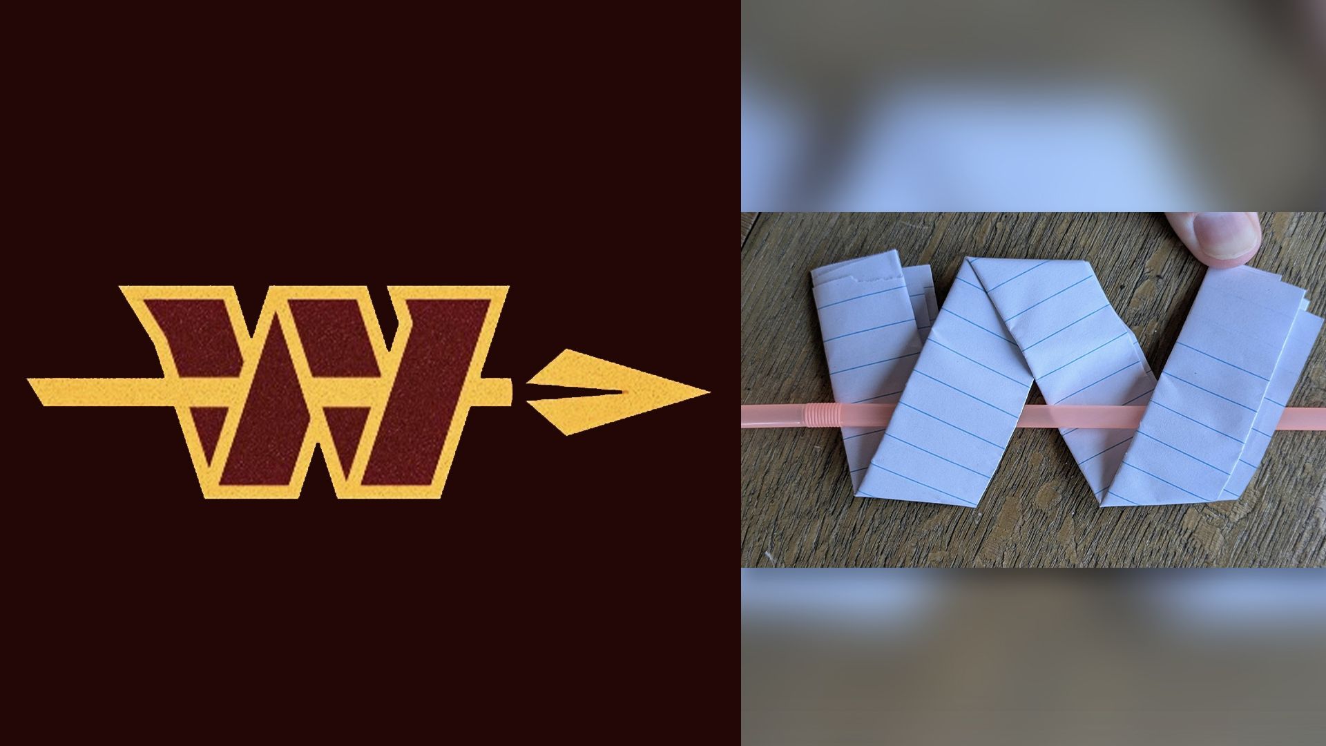
In a surprising turn of events, the debate moved from digital theorizing to physical experimentation. One dedicated fan and Redditor, posting under the handle Key_Raisin_5091, sought to prove that the Commanders’ design was indeed feasible in the real world. Using strips of paper folded into the "W" shape and a common drinking straw to represent the spear, the fan recreated the logo’s exact weaving pattern. The resulting physical model demonstrated that with specific angles and spatial positioning, a straight object could indeed pass through the folds of a "W" exactly as rendered in the official graphic. While the experiment provided a technical vindication for the team’s designers, it also fueled further discussion about whether a logo that requires a paper-and-straw tutorial to explain is effective as a brand identity.
A Chronology of the Washington Franchise Rebrand
To understand the intensity of the reaction to this alternate logo, one must look at the turbulent history of the Washington Commanders’ visual identity. The franchise has been in a state of flux since 2020, following decades of pressure to retire its former name and logo due to their offensive nature toward Indigenous peoples.
- July 2020: Under then-owner Daniel Snyder, the franchise officially retired the "Redskins" name and logo. The team adopted the temporary moniker "Washington Football Team" (WFT) for the 2020 and 2021 seasons. The WFT era was characterized by a minimalist approach, featuring numbers on helmets and a simple, classic color palette of burgundy and gold.
- February 2022: After an extensive two-year search and rebranding process, the team officially announced the "Washington Commanders" name. The reveal included a new primary "W" logo, a military-inspired crest, and updated uniforms. The reception was mixed, with many fans feeling the "Commanders" name was too generic and the "W" logo lacked the character of the franchise’s history.
- July 2023: The franchise was sold to a new ownership group led by Josh Harris, which included NBA legend Magic Johnson. The change in leadership sparked hope among fans for another potential rebrand or at least a refinement of the existing identity.
- July 2024: The team released the new suite of alternate assets, including the controversial spear-and-W logo. This move was widely interpreted as an attempt by the new ownership to acknowledge the franchise’s pre-2020 history while maintaining the Commanders’ brand.
The Symbolism of the Spear: Balancing Heritage and Sensitivity
The inclusion of the spear is perhaps the most significant aspect of the new alternate logo. For many longtime fans, the spear is a direct nod to the helmet designs used by the team in the 1960s and again in the early 2000s as a "throwback" aesthetic. By reintroducing this element, the Commanders are attempting to reclaim a piece of their heritage without returning to the controversial imagery of the past.
However, this strategy is fraught with challenges. The use of Indigenous-themed imagery remains a sensitive topic in professional sports. While a spear is a more generalized tool of "warriors" or "commanders," its association with the team’s previous identity makes it a lightning rod for criticism. Branding experts suggest that the team is walking a fine line, trying to appease a segment of the fanbase that feels alienated by the "Commanders" rebrand while avoiding a relapse into imagery that could be deemed culturally insensitive.
The team’s marketing language—referring to the "spirit of the Commander, a leader of warriors"—is a clear attempt to recontextualize these symbols within a military or historical leadership framework. By framing the "W" as a modern shield and the spear as a tool of leadership, the team hopes to create a cohesive narrative that spans the entirety of the franchise’s existence.

Supporting Data: The Business of NFL Rebranding
The financial implications of a successful (or unsuccessful) logo reveal are substantial. The NFL operates on a revenue-sharing model, but individual teams retain a significant portion of their local merchandise sales. According to industry data, a major rebrand typically results in a 20% to 35% surge in merchandise sales during the first year as fans rush to buy jerseys, hats, and apparel with the new marks.
For the Washington Commanders, the stakes are even higher. Following the 2022 rebrand, the team saw an initial spike in sales, but interest leveled off as the team struggled on the field and the "Commanders" identity failed to resonate deeply with the local community. The introduction of alternate logos is a common tactic used by sports franchises to refresh their merchandise lines and provide fans with more variety. In the NFL, "third logos" or alternate marks often become favorites for lifestyle apparel and streetwear, which can be a lucrative market outside of traditional game-day gear.
The debate over the spear logo, while seemingly pedantic, serves a vital marketing function: engagement. In the digital age, a controversial logo that generates thousands of comments, memes, and Reddit threads is often more valuable than a "safe" logo that goes unnoticed. The "impossible" nature of the spear-and-W design has ensured that the Commanders’ branding remains a topic of conversation during the NFL offseason, keeping the team relevant in the eyes of consumers.
Comparative Analysis: Other NFL Branding Controversies
The Washington Commanders are not the first NFL team to face scrutiny over logo physics or aesthetics. In recent years, several franchises have dealt with similar backlashes:
- The Los Angeles Rams (2020): When the Rams moved into SoFi Stadium, they unveiled a new "LA" logo where the horn of the ram appeared to grow out of the letters. Fans criticized the design for looking like a "news station logo" or a "Crescent Moon," and many questioned the anatomical correctness of the horn’s curve.
- The Jacksonville Jaguars (2013): The team’s "realistic" jaguar logo was mocked for its teal tongue and what some called a "cartoonish" appearance. The team eventually leaned into the design, but it took years for it to gain widespread acceptance.
- The Cleveland Browns (2015): The Browns famously "updated" their logo by making the orange of their helmet a slightly brighter shade and changing the face mask color from gray to brown. The move was widely ridiculed for being an imperceptible change that was marketed as a major evolution.
These examples illustrate that fans are hyper-attuned to the visual details of their teams. In the case of the Commanders, the scrutiny is intensified by the fact that the fanbase is still mourning the loss of a 90-year-old identity and is looking for any reason to critique the new regime’s creative direction.
Broader Impact and Design Implications
The "logic" of the Commanders’ spear logo raises interesting questions about the nature of graphic design in the 21st century. In a world dominated by flat design and digital interfaces, the attempt to create a logo with complex, realistic depth can sometimes backfire. Modern logos are often designed to be "responsive," meaning they must look good as a tiny icon on a smartphone screen, a giant decal on a stadium wall, or a stitched patch on a jersey.
The spear-and-W logo, with its intricate weaving and reliance on 3D perspective, may struggle with scalability. When reduced to a small size, the "impossible" overlaps that fans are debating could become a muddled mess of burgundy and gold. Conversely, the "paper and straw" experiment suggests that the logo was designed with a specific physical logic in mind, perhaps intended for 3D animation in stadium broadcasts or augmented reality (AR) fan experiences.
As the Commanders move forward under the leadership of Josh Harris and General Manager Adam Peters, the visual identity of the team will likely continue to evolve. Whether this controversial alternate logo becomes a permanent fixture of the team’s branding or is eventually relegated to the "experimental" pile remains to be seen. For now, it stands as a testament to the passionate, often obsessive nature of sports fandom, where even the path of a spear through a letter can become a matter of intense public debate.
In the final analysis, the Washington Commanders have succeeded in one primary goal: they have made people look. Whether the logo makes physical sense or not, it has forced fans to engage with the brand’s new visual language and confront the intersection of the team’s past and its future. In the high-stakes world of NFL marketing, that engagement is often the most valuable currency of all.


