Can Design Be Taught? Ten Essential Principles for Non-Designers and Data Professionals


The admission is a familiar one across corporate offices, academic institutions, and creative agencies alike: "I don’t have a design eye." For Kaitlin, the education and outreach specialist at the data visualization consultancy storytelling with data (SWD), this phrase was stated as an immutable personal trait, much like height or hometown. As a professional deeply dedicated to her work—particularly in championing the organization’s children’s book, Daphne Draws Data—she nonetheless harbored a self-perceived deficiency in visual aesthetics. Yet, through ongoing mentorship and hands-on practice, her work has begun to reflect a deliberate evolution: more intentional color choices, cleaner typography, and a growing anticipation of how her materials will be consumed by audiences.
This observable progression reopens a fundamental question that has long divided educators, artists, and communication professionals: Can design truly be taught?
For decades, cultural mythology has framed design as an innate, mysterious gift—something bestowed upon a select few at birth. However, contemporary pedagogy and industry practice increasingly suggest otherwise. Everyone approaches visual communication from different starting points, often driven by varying degrees of natural sensitivity to spatial and visual harmony. Nevertheless, empirical observation within professional training environments demonstrates that functional design is fundamentally a learned skill rather than an immutable talent. The gulf between an amateur layout and an effective visual communication piece is bridged not by genetic predisposition, but by sustained attention, structured practice, and an understanding of visual literacy.

This dynamic mirrors the evolution of data visualization. Creating an effective graph or dashboard is rarely an innate capability; rather, it is a cultivated competency rooted in cognitive science and human perception. To demystify this process for individuals who claim they lack a creative background, communication experts have established ten core principles of visual design that bridge the gap between intent and execution.
1. Prioritize the Audience Over the Content
The foundational mistake in any visual communication endeavor is beginning with the raw materials—the text, the dataset, the legacy slide template—rather than the end user. Before launching a design application or sketching a layout, creators must answer two fundamental questions: Who will view this material, and what specific action or understanding do they require from it?
Failing to anchor a design in audience needs frequently results in egocentric artifacts. When creators design around their own convenience or historical habits, the output serves the creator rather than the consumer, introducing unnecessary cognitive friction into the communication process.
2. Reject Uncritical Reliance on Software Defaults
Modern productivity tools—including presentation software, document processors, web platforms, and spreadsheet applications—arrive pre-loaded with automated design choices. Default fonts, standardized color palettes, and rigid templates are embedded directly into the software architecture.
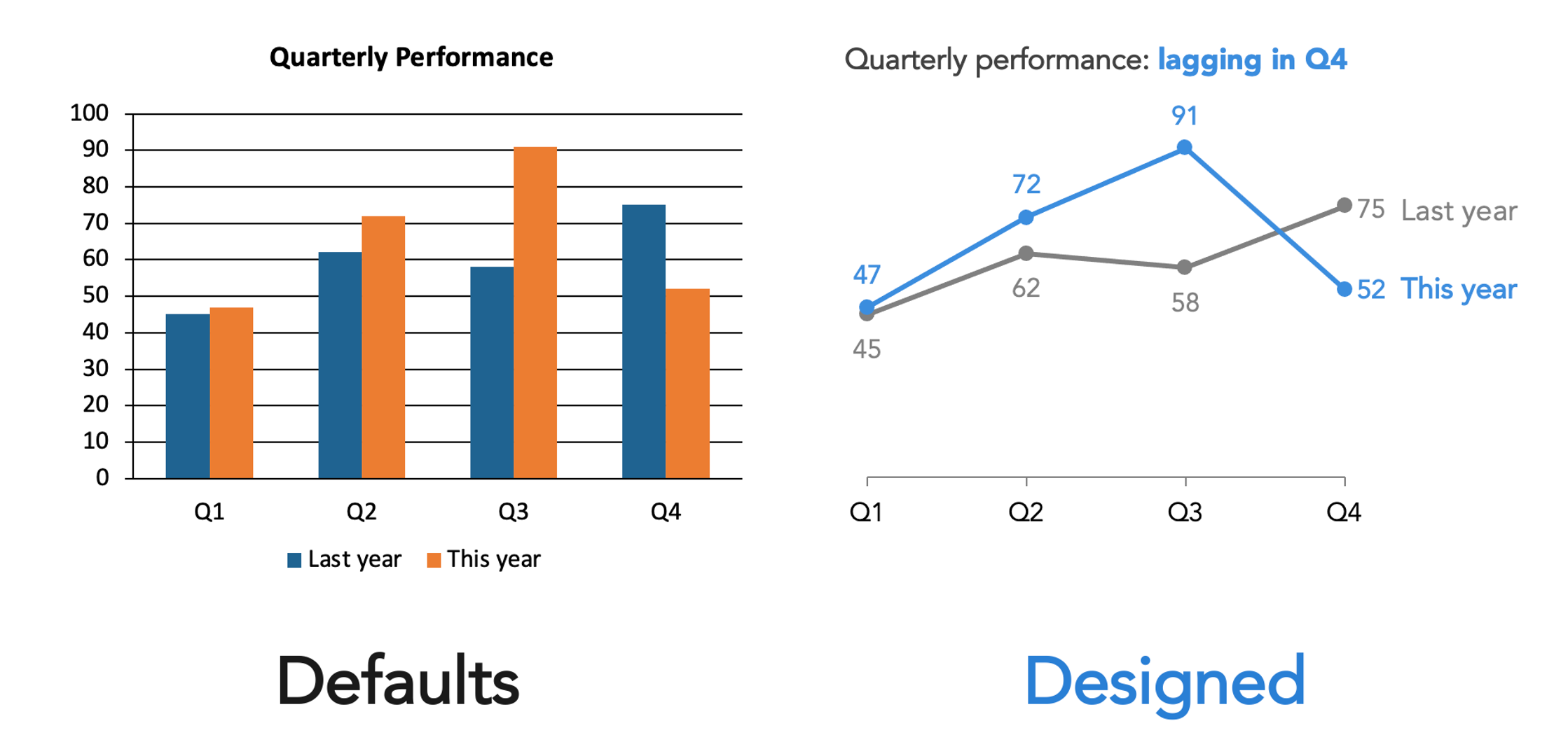
These defaults are rarely neutral; they represent generalized assumptions made by software developers for broad, anonymous use cases. Accepting these defaults without critical evaluation is an active design decision, albeit an unconsidered one. Breaking free from generic outputs requires acknowledging that these pre-set configurations exist and deliberately evaluating whether they serve the specific communication goal at hand.
3. Implement Strict Visual Constraints
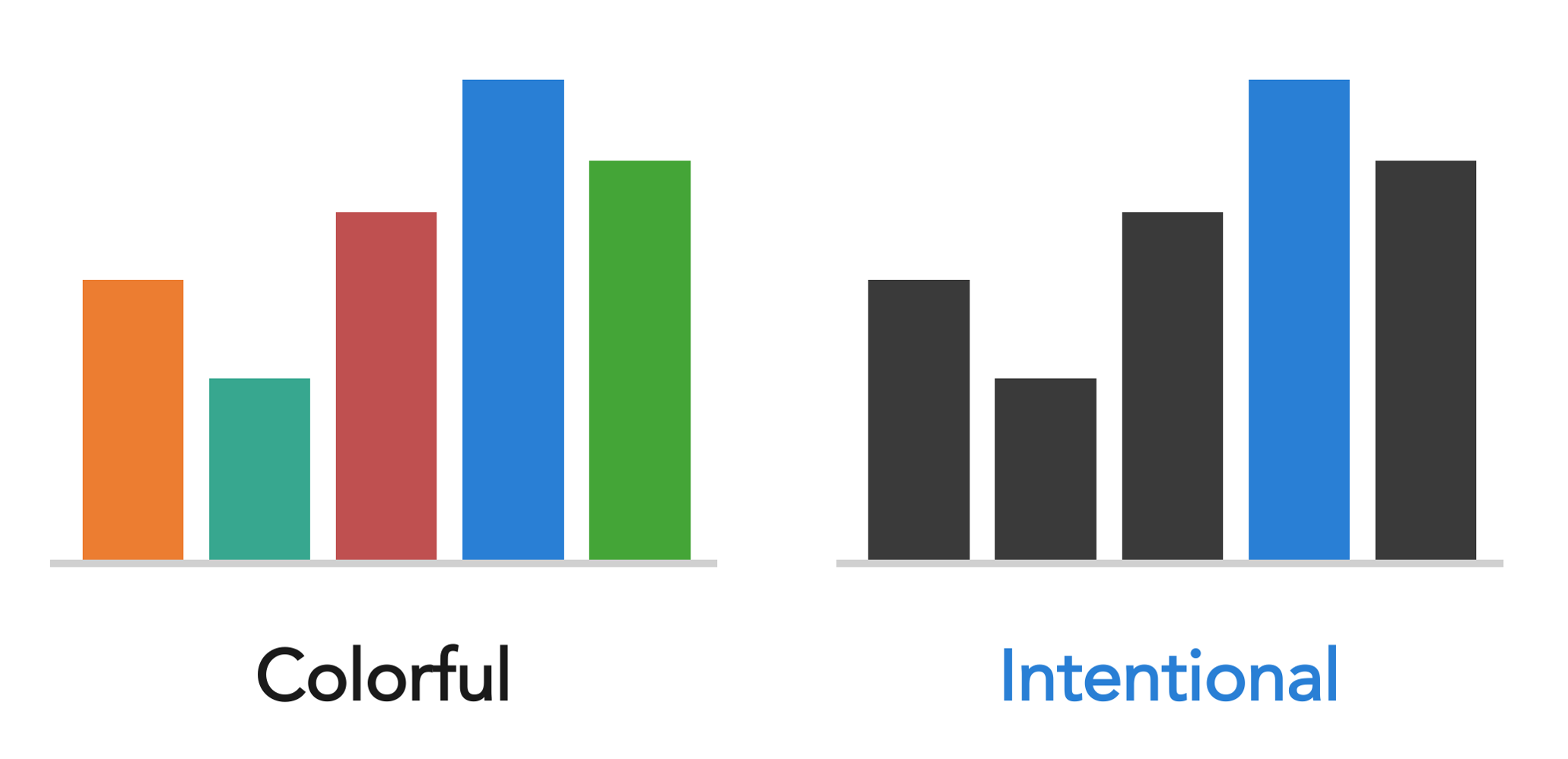
A common misconception in visual communication is that boundless choices equate to creative freedom. In practice, an abundance of unconstrained options—every available typeface, an infinite spectrum of colors, and endless layout permutations—creates visual noise. When every element fights for attention, the core message is obscured.
Establishing strict constraints introduces coherence. Utilizing a singular typeface, limiting a color palette to two or three intentional tones, and adhering to established brand guidelines or standardized organizational templates eliminates unnecessary decision fatigue. True design creativity flourishes within structured boundaries, allowing the essential components of a message to emerge clearly.
4. Establish a Deliberate Visual Hierarchy
A viewer’s eye navigates a visual field systematically, influenced by contrast, scale, and positioning. The critical question for a designer is not whether the eye will move, but whether it will move according to a predetermined, logical sequence.
Visual hierarchy addresses this by designating clear tiers of importance. The primary takeaway must dominate the visual field through prominent scale, weight, or strategic placement. Secondary and tertiary information should follow in a structured cascade. Establishing this sequence prior to assembling visual elements ensures that the audience processes information in the precise order intended by the creator.
5. Recognize That Variance Signals Meaning
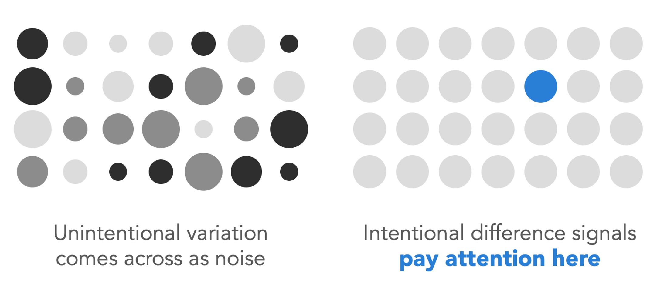
One of the most consequential principles of visual design involves the semiotics of difference. Human cognition naturally interprets visual variation—such as a sudden shift in scale, font weight, color saturation, or spatial orientation—as a signal that a specific data point or text fragment warrants heightened attention.
Conversely, unintentional variation introduces severe ambiguity. If multiple elements vary slightly in size or alignment without analytical justification, the viewer will expend cognitive energy attempting to decipher a non-existent pattern. Consistency signals uniformity; deliberate variation signals significance. Creators must rigorously audit their work to ensure that every visual discrepancy carries authentic informational weight.
6. Deploy Color with Purpose and Restraint
Color is among the most potent instruments in visual communication, yet it is frequently misapplied. The appropriate application of color depends entirely on the functional context of the medium.

In expressive contexts—such as book illustration, artistic posters, or narrative covers like Daphne Draws Data—rich, exuberant, and multi-hued color palettes serve the imaginative spirit of the work. However, in analytical environments such as data dashboards or corporate presentations, a radically different logic applies. A predominantly neutral color palette augmented by a single, high-contrast accent color used with surgical precision is exponentially more effective than a kaleidoscopic array of competing hues. The guiding question must always shift from aesthetic preference ("What colors do I like?") to functional utility ("What work is this color performing, and is it succeeding?").
7. Master Precision in Element Alignment
Few visual characteristics distinguish polished professional work from amateurish drafts as definitively as alignment. Misaligned typography, objects positioned near a structural grid rather than locked to it, and haphazard spacing generate subconscious visual unease. Audiences frequently register this discomfort instinctively long before they can articulate its technical source.
Center-aligned text represents a frequent pitfall in informal design. By lacking a fixed vertical anchor, multi-line center-aligned text creates dual ragged margins that generate visual tension rather than structural resolution. Left-aligning body text provides a firm visual anchor that guides the eye naturally. Utilizing software gridlines, alignment functions, and rigorous spatial discipline ensures that every element relates logically to a margin, a grid, or an adjacent object.
8. Utilize Whitespace as an Active Component
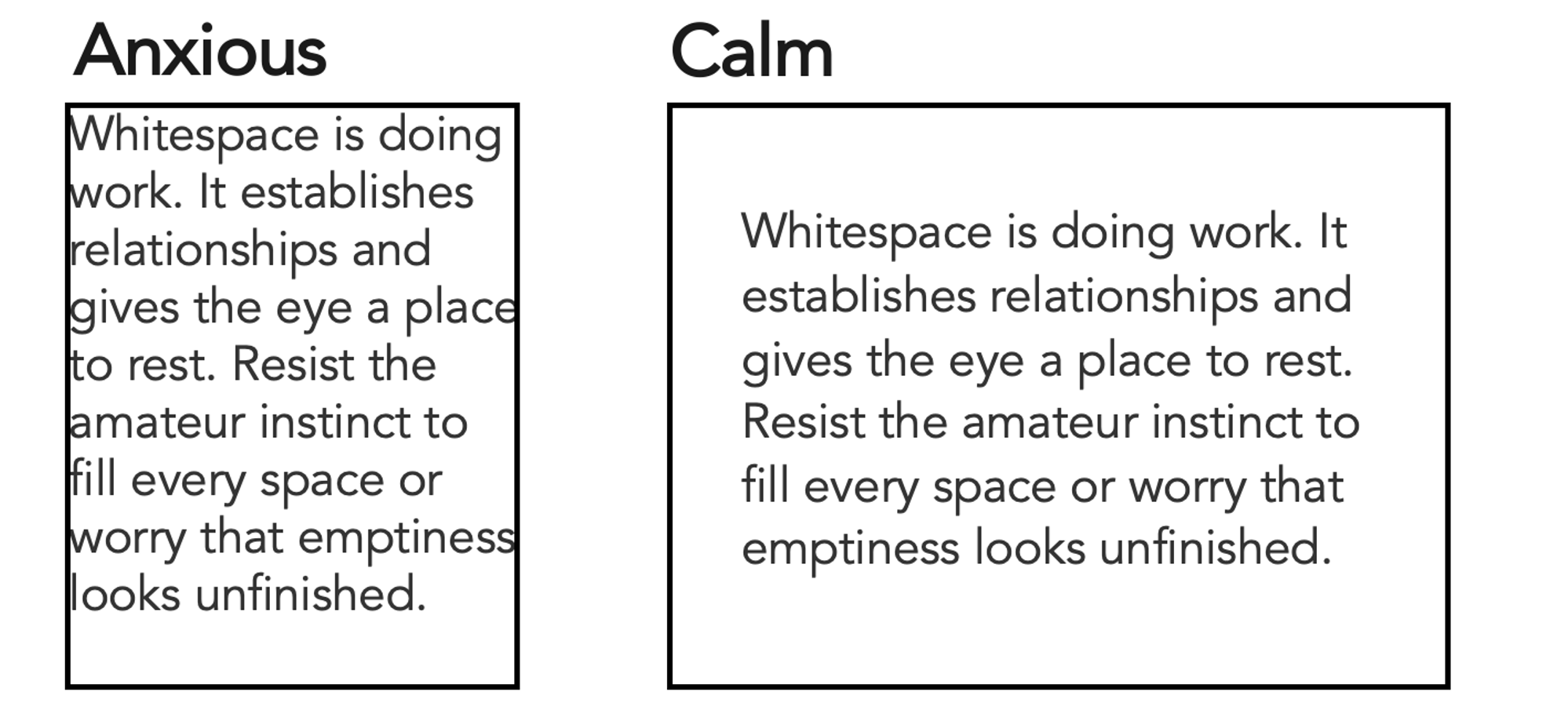
Whitespace—the intentional absence of text, graphics, or color within a layout—is frequently misunderstood as wasted real estate. In professional design, whitespace is an active structural element that delineates boundaries, establishes logical relationships, and provides essential resting points for the human eye.
Amateur designs often exhibit a compulsion to fill every available pixel, driven by the anxiety that empty space implies incompleteness. Effective visual communication embraces negative space, recognizing that the clarity and impact of a composition are defined as much by what is omitted as by what is included.
9. Cultivate Analytical Inspiration
Visual literacy is an acquired habit developed through active observation. When individuals encounter compelling design—whether an intuitive data visualization, a sophisticated publication layout, or an effective architectural sign—pausing to deconstruct its mechanics accelerates learning.
Analyzing unsuccessful designs yields equal value: identifying precisely why a graphic fails to communicate its message reinforces the avoidance of those same pitfalls. Organizations and professional networks increasingly curate repositories of visual work, such as the global data visualization discovery platforms maintained by industry communities, providing continuous access to peer examples for benchmarking and inspiration.
10. Trust and Train Intuition
Ultimately, human visual intuition is far more robust than most non-designers assume. The immediate somatic reaction of sensing that a layout "looks wrong," even when the technical vocabulary to explain the flaw is absent, constitutes valid qualitative data.
While intuition provides a vital baseline, it functions as a starting point rather than a ceiling. The divergence between a self-described non-designer and a proficient communicator is not innate talent, but rather accumulated practice, environmental awareness, and iterative feedback. By systematically observing visual cues, embracing structural constraints, and refining layouts through continuous iteration, individuals across any technical discipline can master the fundamentals of design. Becoming an effective visual communicator does not require an innate artistic identity; it requires the willingness to look closely and think deliberately.
Related posts: