Xcode 27.1 Beta Introduces iPhone Duo Simulator Amid a Surge of Modern Web Development Standards and Browser Capabilities

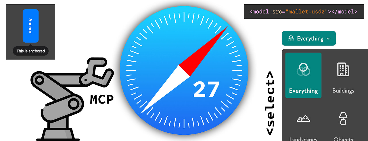
Apple has released Xcode 27.1 Beta, introducing a notable new addition to its developer tooling ecosystem: an iPhone Duo simulator. This specialized environment allows software engineers, web developers, and interface designers to preview applications and web experiences on Apple’s anticipated foldable device configuration. The timing of this release coincides with a broader industry shift toward adaptive layout design, advanced CSS capabilities, and evolving web standards that increasingly require developers to account for dual-screen and flexible form factors. As mobile hardware diversifies beyond traditional slab smartphones, the web development community is simultaneously adopting native browser features designed to reduce toolchain complexity, enhance performance, and improve cross-platform consistency.
The Evolution of Mobile Form Factors and Developer Tooling
The introduction of the iPhone Duo simulator within Xcode 27.1 Beta marks a significant milestone for Apple’s developer ecosystem. While foldable devices have occupied a distinct niche in the Android ecosystem for several years, Apple’s methodical approach to hardware transitions typically begins with software simulation environments. By providing developers with the tools to test layouts across folding and dual-screen viewports well ahead of commercial hardware availability, Apple aims to ensure a robust ecosystem of optimized applications and responsive websites upon the device’s eventual launch.
Historically, hardware transitions of this magnitude require substantial adaptations in both native application architecture and web rendering engines. Webkit and Safari, Apple’s core browsing technologies, must handle dynamic viewport resizing, hinge postures, and multi-pane multitasking seamlessly. The inclusion of the iPhone Duo simulator signals to the development community that adaptive design principles—traditionally handled via complex JavaScript wrappers or media queries—will become increasingly critical for delivering cohesive user experiences across Apple’s expanding hardware lineup.
Modern CSS Features Redefining Front-End Engineering
While hardware developers prepare for foldable form factors, front-end web developers are experiencing a parallel evolution in styling capabilities. Recent updates across major browser engines have mainstreamed several long-awaited CSS features, allowing engineers to retire legacy toolchain dependencies such as Sass preprocessors and complex wrapper-class hacks.
Among the most impactful developments is the widespread adoption of native CSS nesting. Previously, developers relied on preprocessors like Sass or Less to nest style rules logically within components, requiring an additional build step to compile stylesheets into vanilla CSS. With native nesting supported natively in modern browsers, developers can write cleaner, more maintainable code directly without build tooling overhead.
Furthermore, the introduction and stabilization of the :has() relational pseudo-class have fundamentally altered how developers approach component styling. Often referred to by engineers as a "parent selector," :has() enables developers to style an element based on whether it contains specific children or descendants. This capability eliminates the need for JavaScript-based state management or clumsy wrapper-class hacks to style container elements conditionally based on their internal contents.

Industry advocates, including prominent web developer and educator Flavio Copes, have emphasized that utilizing these modern CSS features today can drastically reduce build times and simplify project dependencies. By shifting computational burdens back to the browser’s native rendering engine, developers can achieve better performance while maintaining leaner codebase architectures.
Mastering the Root Scroller and Mobile Viewports
As web layouts become more complex, managing browser viewports and scroll containers remains a critical challenge for front-end engineers. In a comprehensive exploration of viewport mechanics, developer Kilian Valkhof recently highlighted the intricacies of the "root scroller"—the primary scroll container of the web page viewport responsible for native behaviors such as scroll restoration, pull-to-refresh mechanics, and the dynamic collapsing of mobile browser address bars.
A persistent issue in modern web development involves unintentional delegation of scrolling behavior. Common CSS layout patterns, such as applying specific overflow properties to wrapper divs or setting fixed heights on body and html elements, can inadvertently hand scrolling duties away from the document root to interior elements. When this occurs, pages often lose native mobile browser behaviors, resulting in jerky scrolling, broken scroll restoration upon navigation, and failure of address bars to hide automatically on mobile devices.
Understanding how to preserve the root scroller is increasingly vital as mobile traffic dominates global web consumption. Developers are now utilizing modern debugging tools and strict layout containment strategies to ensure that core viewport scroll mechanics remain intact, providing users with the smooth, native-feeling interactions they expect from modern web applications.
Responsive Iframes and Cross-Browser Alignment
Another significant leap forward for web layout design is the arrival of natively responsive iframes. Historically, embedding external content via an iframe required cumbersome JavaScript libraries or proportional padding hacks (such as the classic padding-bottom trick) to maintain aspect ratios across varying screen sizes.
With the rollout of responsive iframes in Chrome 154 and preview availability in Microsoft Edge, spearheaded by engineers Sebastian Benz and Bramus van Damme, developers can now set an iframe to scale dynamically based on the dimensions of its internal content. Browsers now allow developers to define which dimension—width, height, or both—drives the scaling behavior, enabling seamless integration of embedded content without layout shifts.
The primary requirement for this new capability is that the embedded document must explicitly opt in, ensuring security and cross-origin compatibility while giving developers granular control over embedded widgets, advertisements, and third-party tools. This standardization across Chromium-based browsers represents a major step toward reducing layout instability—a core metric tracked by search engines and user experience analysts alike.
The Debate Over AI-Generated Web Development
Amidst these technical advancements in CSS, viewport management, and hardware simulation, the broader tech industry has engaged in intense discourse regarding the role of artificial intelligence in web design and development. In a widely discussed critique titled "AI, Make the Website Good," web developer and standards advocate Zach Leatherman examined the growing trend of utilizing generative AI tools to build and design websites.
Leatherman argued that while AI code-generation tools can rapidly scaffold markup and basic stylesheets, they frequently fall short in areas requiring nuanced human judgment, such as accessibility (a11y), semantic HTML structure, performance optimization, and typographic hierarchy. By critically evaluating the front-of-house output produced by prominent AI-driven technology companies, Leatherman illustrated that the raw capability to generate code does not automatically translate to high-quality user experiences.
The core argument centers on the premise that caring about craftsmanship, semantic integrity, and long-term maintainability matters more than ever in an era of automated tooling. As AI tools lower the barrier to entry for generating basic web pages, the distinction between hastily assembled automated output and meticulously engineered web applications becomes increasingly pronounced. Industry experts suggest that while AI serves as an efficient assistant for repetitive tasks, human oversight remains indispensable for ensuring compliance with web standards and delivering accessible, high-performing digital products.
Broader Industry Implications and Future Outlook
The convergence of hardware innovations like Apple’s upcoming foldable ecosystem—previewed via the Xcode 27.1 Beta iPhone Duo simulator—and advanced browser capabilities points toward a more adaptive, standards-driven future for digital design. Developers are no longer forced to rely on heavy third-party polyfills or complex build pipelines to achieve modern layouts. Instead, native platform features such as CSS nesting, relational pseudo-classes, responsive iframes, and strict viewport management tools are empowering engineers to build faster, more resilient applications.
At the same time, the discourse surrounding AI-generated code serves as a timely reminder that technological efficiency must be balanced with rigorous quality control. As browsers continue to evolve and hardware form factors expand into dual-screen and foldable paradigms, the mandate for front-end engineers remains clear: prioritize standards-compliant code, master native browser mechanics, and maintain an unwavering commitment to digital craftsmanship.