The Goldilocks Customizable Select Height, Introducing the UserMedia HTML Element, and Webflow for Developers

The digital landscape for web developers is in constant flux, with new tools, evolving standards, and innovative solutions emerging regularly. This report delves into several significant recent developments, offering insights into advancements in HTML elements, CSS techniques, and platform capabilities that are shaping the future of web development. From optimizing the user experience of select elements to enhancing privacy controls and empowering developers with new platform integrations, these updates represent key milestones in the ongoing evolution of the internet.
Mastering Select Element Sizing: The Goldilocks Approach
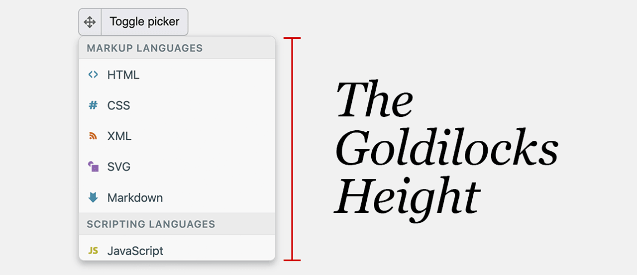
Jake Archibald’s recent exploration into optimizing the sizing of customizable <select> elements, titled "The Goldilocks Customizable Select Height," presents a meticulous solution for achieving the perfect balance between intrinsic sizing and dimensional constraints. This technical deep-dive addresses a persistent challenge in web design: ensuring that dropdown menus not only display their content clearly but also adhere to aesthetic and functional design specifications without appearing awkward or broken.
The core of Archibald’s methodology lies in his innovative calc-size() function. This approach meticulously calculates the necessary height for a <select> element, taking into account the intrinsic dimensions of its content while simultaneously enforcing predefined maximum and minimum heights. This ensures that the element scales appropriately with its content, preventing it from becoming either too cramped or excessively large, thereby maintaining a consistent and pleasing user interface across various devices and screen sizes. The article provides comprehensive demos, clear CSS code examples, and essential fallback strategies, making it an invaluable resource for developers seeking to implement this sophisticated sizing technique.

The implications of such a solution are far-reaching. Inconsistent sizing of form elements can lead to usability issues, particularly for users with visual impairments or those using assistive technologies. By providing a robust and adaptable method for sizing <select> elements, developers can significantly improve the accessibility and overall user experience of their web applications. This level of granular control over UI components is crucial for building modern, responsive, and user-friendly interfaces. The demand for such precise control has been growing as web applications become more complex and the expectations for seamless user interaction rise. This article directly addresses that demand by offering a practical and well-reasoned solution.
The Evolution of Media Permissions: Introducing the <usermedia> Element
A significant advancement in user privacy and control on the web comes with the introduction of the <usermedia> HTML element, now shipping in Chrome 151. This novel element serves as a modern replacement for the often intrusive getUserMedia() prompt, which has long been the standard for requesting user permission to access their camera and microphone. The <usermedia> element streamlines this process, offering a more integrated and user-friendly experience.
Beyond simplifying the initial permission request, the <usermedia> element introduces a critical new feature: the ability for users to change their minds about blocked permissions without needing to navigate the labyrinthine settings of their browser. This user-centric design empowers individuals to manage their privacy more effectively and with greater ease. Previously, revoking or re-granting camera and microphone access often involved a cumbersome process of delving into browser configurations, which could be a deterrent for many users. The <usermedia> element aims to rectify this by providing an in-context and accessible method for managing these permissions.
This development is a testament to the ongoing efforts by browser vendors and the web standards community to prioritize user privacy and agency. The increasing prevalence of web-based applications that utilize camera and microphone functionalities, from video conferencing tools to augmented reality experiences, necessitates robust and intuitive permission management. The <usermedia> element represents a forward-thinking approach that balances the functionality required by modern web applications with the fundamental right of users to control their personal data and device access. The potential impact on user trust and adoption of media-rich web experiences is substantial.
Webflow Empowers Developers with Expanded APIs and SDKs
Webflow, a popular visual web development platform, is significantly broadening its appeal to professional developers with the introduction of a comprehensive suite of tools, including new APIs, SDKs, and Code Components. This strategic move aims to bridge the gap between visual design and custom coding, allowing developers to leverage Webflow’s user-friendly interface while retaining the flexibility and power of bespoke code.
The new offerings enable developers to integrate their own code directly into Webflow projects, deploy custom applications on Webflow Cloud, build intricate custom integrations, and even publish their creations to the Webflow app marketplace. Furthermore, the platform is introducing capabilities for building with agents via an MCP (Master Control Program) server, hinting at more advanced automation and AI-driven features. This expansion signifies Webflow’s commitment to becoming a more robust platform for enterprise-level development and complex web applications, moving beyond its initial positioning as a primarily no-code or low-code solution.
This initiative is particularly relevant in a market where developers often face trade-offs between rapid development facilitated by visual builders and the extensive customization offered by traditional coding. By providing powerful APIs and SDKs, Webflow is empowering developers to build highly customized experiences without sacrificing the efficiency of the platform. This could lead to a surge in sophisticated Webflow-powered websites and applications that were previously not feasible. The ability to deploy apps on Webflow Cloud also suggests a move towards a more integrated ecosystem, where design and application logic can coexist seamlessly. The implications for agencies and development teams looking for scalable and efficient web development solutions are significant.
Modern UI Patterns and the Future of CSS
The recent CSS Day conference featured a compelling talk by Una Kravets on "Modern UI Patterns." Kravets’ presentation offered a deep dive into the latest advancements in CSS and the broader web UI landscape. She not only showcased emerging trends but also introduced a practical UX framework comprising five core principles designed to guide design decisions through a modern UI lens.

Kravets’ discussion underscores the dynamic nature of CSS, a technology that continues to evolve with powerful new features. The framework she presented likely emphasizes aspects such as responsiveness, accessibility, performance, and user engagement – key considerations for any contemporary web interface. By providing a structured approach to modern UI design, Kravets’ talk equips designers and developers with the tools to create interfaces that are not only visually appealing but also highly functional and user-centric. The continuous innovation in CSS, such as the introduction of new color spaces, layout modules, and animation capabilities, enables developers to create richer and more interactive user experiences than ever before.
Achieving Dark Mode with Web Standards
Ollie Williams’ article, "Dark Mode with Web Standards," provides a comprehensive technical guide on implementing a robust dark mode for websites. The approach outlined by Williams emphasizes adherence to web standards, ensuring that the dark mode implementation is not only effective but also maintainable and accessible.
A key aspect of Williams’ methodology is the respect for OS-level preferences. This means that a user’s system-wide dark mode setting will be automatically honored by the website, providing a seamless experience. However, the implementation also includes a crucial feature: a manual override. This allows users to choose their preferred mode, irrespective of their system settings, offering a level of personalization and control that enhances user satisfaction. The technical details likely involve leveraging CSS variables, media queries (specifically prefers-color-scheme), and potentially JavaScript for dynamic theme switching. The importance of this approach lies in its universality and its ability to cater to a diverse user base with varying preferences and needs. As dark mode becomes increasingly popular, well-executed implementations are becoming a standard expectation for modern websites.
Supercharging Web UX with View Transitions
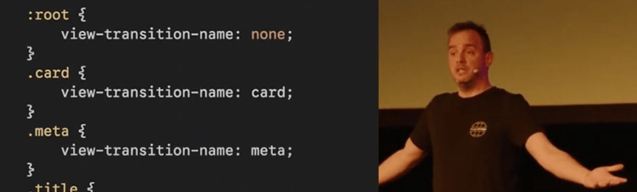
Bramus Van Damme’s 50-minute talk, "Supercharge Web UX with View Transitions," delves into a powerful new API that promises to revolutionize web navigation and user experience. Van Damme begins with a clear, introductory overview of how View Transitions work, demystifying the concept for developers. He then proceeds to "turn it up to 11," exploring the intricate details and the vast potential of this API.

The View Transitions API allows for smooth, animated transitions between different states or views of a web application. This can transform the user experience from a jarring page reload to a fluid, app-like transition. The implications for user engagement are profound. By reducing perceived load times and creating a more cohesive browsing experience, View Transitions can significantly enhance user satisfaction and retention. Van Damme’s detailed exploration likely covers practical implementation strategies, performance considerations, and advanced use cases, making it an essential resource for front-end developers looking to leverage this cutting-edge technology. The API’s ability to animate DOM changes seamlessly offers a powerful tool for creating visually engaging and interactive web applications.
Exploring WebGL Without a Dedicated GPU
Kiko Beats’ article, "WebGL Without a GPU," tackles a fascinating technical challenge: rendering WebGL content on systems lacking dedicated graphics processing units, such as fleets of Linux servers. The piece investigates the available CPU-emulation chains and highlights a Chrome flag that demonstrably accelerated screenshotting by an impressive 4x.
This exploration is particularly relevant for scenarios involving server-side rendering, automated testing, or environments where GPU resources are limited or unavailable. WebGL, a JavaScript API for rendering interactive 2D and 3D graphics, traditionally relies heavily on GPU acceleration. Beats’ research into CPU emulation and browser optimizations provides valuable insights into how to overcome these limitations. The identification of a Chrome flag that yields significant performance improvements suggests that even within the constraints of CPU-based rendering, optimizations are possible. This work could pave the way for broader adoption of WebGL in server-side applications and headless environments, expanding its use cases beyond client-side interactive experiences.
Unveiling Colors Beyond the Screen’s Grasp
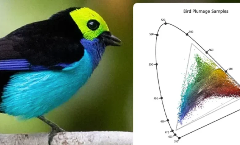
Ryan Moulton’s article, "Where to Find the Colors Your Screen Can’t Show You," embarks on a captivating journey into the realm of color perception and reproduction. While modern displays boast impressive capabilities, supporting wide color gamuts like P3 and advanced color models such as OKLCH and the color() function, there remain real-world colors that screens struggle to accurately represent.
Moulton’s work highlights the limitations of current display technology in reproducing the full spectrum of visible colors. The article points to fascinating examples, such as the vibrant hues found in nature, noting that "There are around 500 species of birds with colors outside the sRGB gamut." This exploration is not merely an academic exercise; it has implications for fields like photography, graphic design, and digital art, where the accurate reproduction of color is paramount. Understanding these limitations and the colors that lie beyond our screens’ capabilities is crucial for artists and designers seeking to capture and convey the true essence of their subjects. It also fuels ongoing research and development in display technology, pushing the boundaries of what is visually possible.
Conclusion: A Dynamic and Evolving Web Development Ecosystem
The developments discussed – from the nuanced control offered by the Goldilocks select height solution and the enhanced privacy of the <usermedia> element to Webflow’s expanded developer toolkit, the practical applications of modern CSS, the streamlined dark mode implementations, the powerful View Transitions API, and the innovative approaches to WebGL rendering – collectively paint a picture of a vibrant and rapidly evolving web development ecosystem. These advancements empower developers with greater control, improve user experiences, enhance privacy, and unlock new creative possibilities, ensuring that the web continues to be a dynamic and exciting platform for innovation. As these technologies mature and gain wider adoption, they will undoubtedly contribute to building more sophisticated, accessible, and engaging digital experiences for users worldwide.