Mastering Data Visualization: Strategic Use of Color and Design in Microsoft Excel for Effective Business Communication

In the modern corporate and analytical landscape, the sheer volume of generated data necessitates tools that can transform complex metrics into comprehensible insights within seconds. Whether utilizing traditional spreadsheet applications like Microsoft Excel, embedded charting modules in productivity suites like Microsoft Word and PowerPoint, or emerging artificial intelligence-driven drafting assistants, professionals are constantly equipped to produce graphical representations of data almost instantaneously. However, while modern software can construct a multi-variable chart in mere fractions of a second and autonomously apply default highlights, these algorithms inherently lack contextual awareness. They cannot discern which specific data points carry the most critical weight for a particular corporate audience. Consequently, the ultimate responsibility of editorial and visual curation remains squarely with the human analyst. Purposeful, restrained application of color stands out as one of the most efficient mechanisms to elevate a rudimentary graph into a compelling explanatory communication.

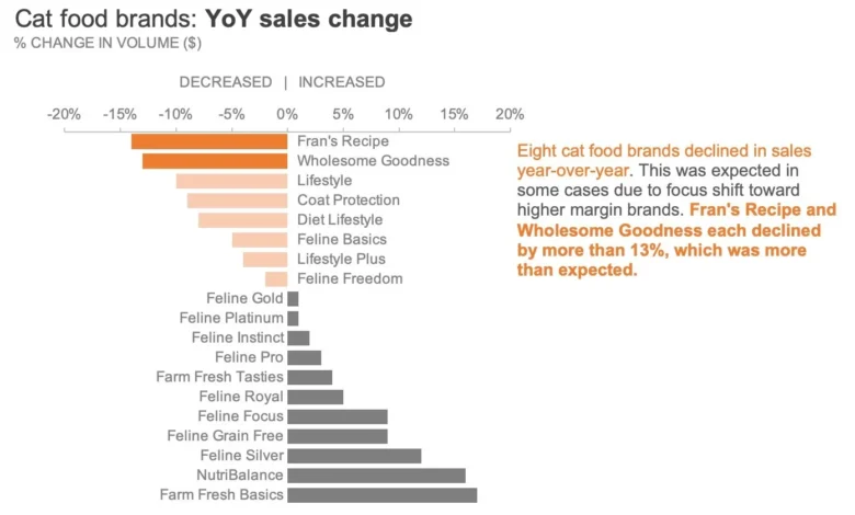
The core challenge facing many data practitioners involves operationalizing design theory within rigid software environments. To bridge this gap, instructional methodologies—such as those detailed in exercise 4.2 of the professional development publication "storytelling with data: Let’s Practice!"—provide empirical frameworks. By examining a practical scenario involving year-over-year (YoY) sales performance data for various cat food brands manufactured by a leading pet food supplier, analysts can learn to strip away default software clutter and reconstruct visualizations for maximum cognitive impact.
The Pitfalls of Automated Design Defaults
Software applications are engineered to provide immediate visual output, yet their default color palettes often prioritize aesthetic variety over communicative clarity. When a graphing tool applies a distinct, vibrant color to every individual bar, slice, or line in a dataset, it creates visual noise. This phenomenon forces the human eye to continuously scan back and forth between a complex legend and the chart itself, dividing attention rather than focusing it.
Data visualization experts consistently advocate for a minimalist approach: color should be deployed sparingly, deliberately, and only to serve an explicit communicative purpose. When every data series clamors for attention through contrasting hues, the underlying message is effectively buried. In contrast, removing arbitrary color and starting from a neutral baseline allows the analyst to dictate precisely where the audience’s gaze should land. This foundational shift transforms a decorative graphic into an active narrative tool.
Phase One: Establishing a Neutral Greyscale Foundation
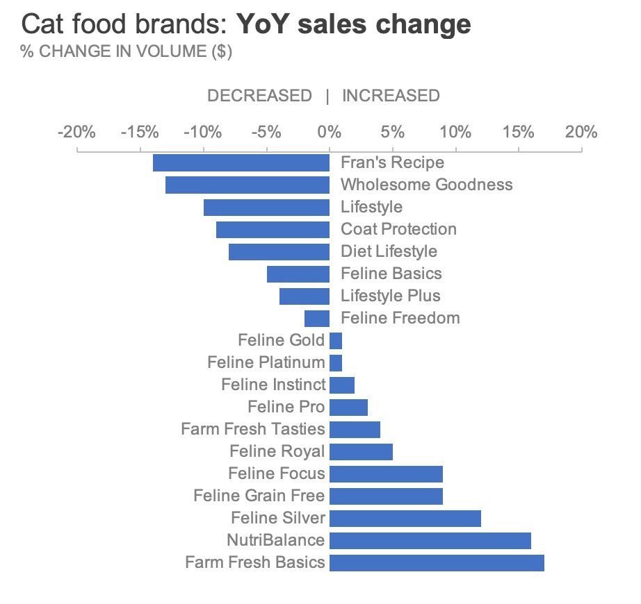
The initial step in refining any corporate chart is the establishment of a neutral visual foundation through the exclusive use of greyscale tones. Constructing a chart entirely in shades of grey serves a dual purpose. First, it immediately eliminates the distraction of arbitrary software-generated palettes. Second, it acts as a procedural safeguard, serving as an explicit visual indicator that the chart remains in a draft state and requires further human refinement before it is deemed presentable for executive leadership or external stakeholders.
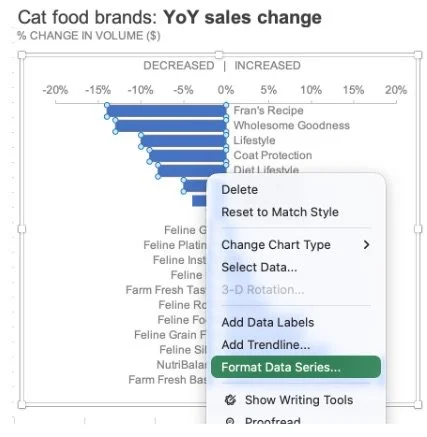
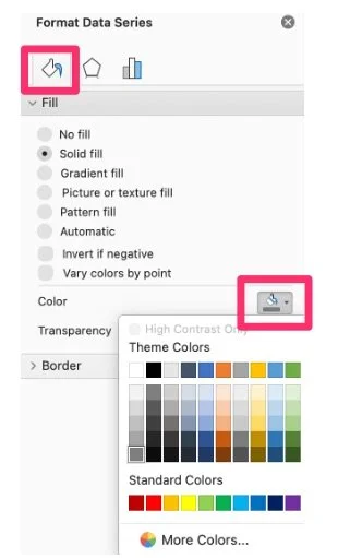
To execute this transition within Microsoft Excel, the analyst begins by interacting directly with the chart elements. By right-clicking on the active data series, the user accesses the contextual menu and selects the "Format Data Series" command. This action opens the comprehensive Format pane along the right side of the workspace. Navigating to the "Fill & Line" tab—distinguished by a paint bucket icon—allows the user to override the default settings by assigning a uniform, neutral grey fill to all data series.
For analysts managing complex multi-series charts, this process must be repeated systematically until every graphical element is unified under a cohesive greyscale scheme. To optimize workflow efficiency, organizations frequently capture this clean, neutral state as a reusable spreadsheet template. Establishing a standardized "clean slate" template ensures that analysts across departments can bypass repetitive formatting steps, thereby standardizing visual reporting standards enterprise-wide.
Phase Two: Strategic Highlighting and Accessibility Considerations
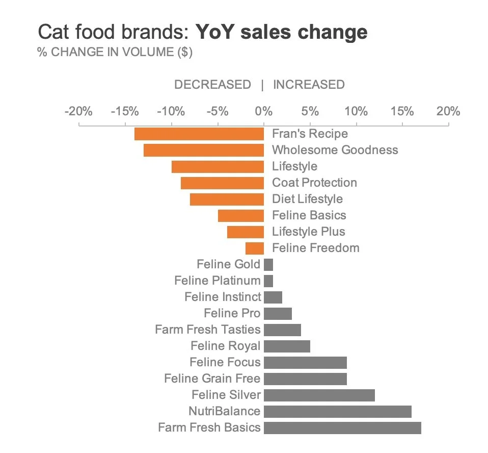
Once a neutral greyscale foundation is firmly established, the analyst can introduce color intentionally to draw the audience’s attention toward specific insights. Continuing with the pet food manufacturer’s year-over-year sales performance, suppose the primary objective is to highlight those specific brands that experienced a negative sales trajectory compared to the previous fiscal year.
Rather than coloring the entire dataset, the analyst isolates only the declining bars. Furthermore, adhering to modern accessibility and universal design standards requires careful consideration of color selection. Historically, red has been universally utilized to denote negative financial performance or decline. However, red-green color blindness affects a significant portion of the global population, making traditional red hues problematic for inclusive corporate communications. To circumvent this accessibility barrier while still reinforcing a negative semantic association, analysts frequently substitute red with a deliberate, muted orange.
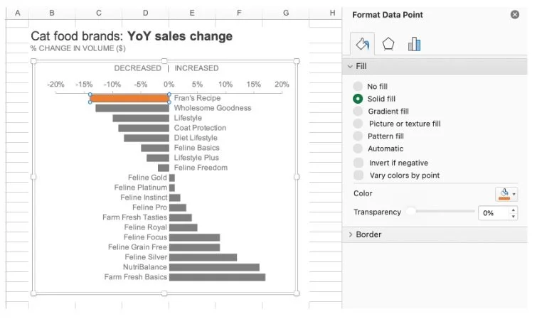
Executing this targeted highlighting in Microsoft Excel requires precise interaction with the user interface. Because clicking a data series typically selects all constituent bars simultaneously, the analyst must execute a two-step selection process: clicking once on the entire series, and then clicking a second time directly on the specific bar requiring isolation. Right-clicking this individual data point yields the "Format Data Point" menu. Navigating back to the "Fill & Line" tab under the paint bucket icon allows the user to select "Solid fill" and apply the chosen orange hue.
To replicate this formatting efficiently across multiple declining data points without repeating the entire menu navigation, analysts can utilize platform-specific shortcut commands. On Macintosh systems, pressing Command-Y repeats the previous formatting action, while Windows users can achieve the same result using Control-Y. This keyboard shortcut significantly accelerates the manual refinement of multi-bar visualizations.
Phase Three: Introducing Hierarchical Depth Through Visual Intensity
Within any corporate dataset, not all negative trends carry equal weight. Expanding upon the pet food sales scenario, suppose an analysis of the declining brands reveals that two specific labels—designated as Fran’s Recipe and Wholesome Goodness—suffered the most catastrophic sales contractions. Coloring every declining bar in the exact same shade of bright orange would successfully separate them from the growing brands, but it would inadvertently obscure the relative severity within the declining cohort itself.
To preserve both signals—showing which brands declined overall while simultaneously emphasizing the two worst performers—analysts must introduce visual hierarchy through varying color intensities. There are three primary methodologies available within standard spreadsheet environments to achieve this effect:
- Manual Palette Tiering: The analyst manually selects a paler, less saturated shade of orange for the moderately declining brands, reserving the vibrant, highly saturated orange exclusively for Fran’s Recipe and Wholesome Goodness.
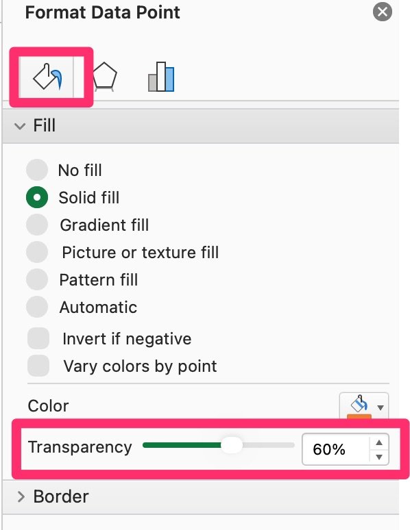
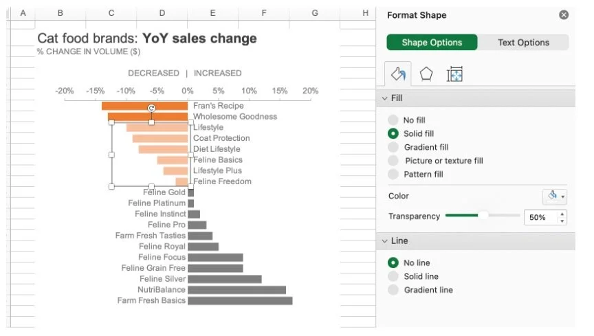
- Transparency Manipulation: The user maintains a uniform color hue across all declining bars but systematically adjusts the transparency parameter within the Fill menu. By applying a higher transparency percentage to the moderate declines, those bars visually recede into the background, allowing the solid, opaque bars of the severe declines to project forward.
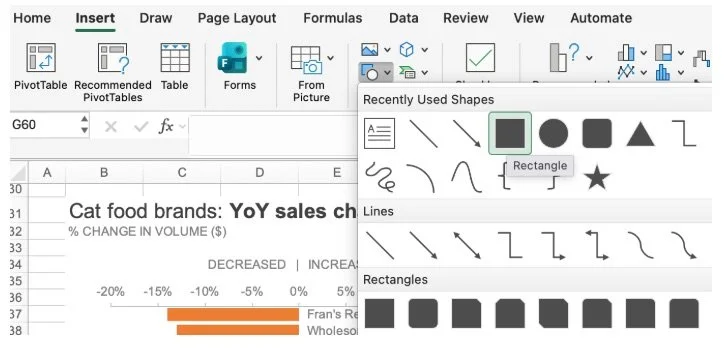
- Overlay Shape Insertion: The analyst inserts a semi-transparent geometric shape—such as a customized rectangle—directly over the region encompassing the moderately declining bars. Formatting this overlay with a solid white fill, zero outline, and a carefully calibrated transparency level effectively mutes the underlying bars without altering the native chart series properties.
Each of these techniques leverages human pre-attentive processing, enabling viewers to intuitively grasp complex gradations of severity within milliseconds of viewing the graphic.
Phase Four: Integrating Textual Annotations for Independent Consumption
Even the most meticulously designed chart can fail if it lacks clear contextual framing, particularly when distributed as a standalone report intended for asynchronous consumption. When an analyst is not physically present to guide an audience through a slide deck or analytical briefing, the visual graphic must be supported by integrated explanatory text.
Modern data storytelling principles emphasize the integration of direct text annotations within the whitespace of the chart canvas, rather than relying solely on traditional peripheral legends or lengthy paragraph descriptions below the graphic. By embedding a concise takeaway directly adjacent to the relevant data points, and strategically bolding and coloring key terminology in the exact same orange hue utilized in the visualization, the analyst creates an immediate, undeniable visual bridge between the narrative text and the numerical evidence.
This deliberate pairing of text and visual cues ensures that the primary takeaway is absorbed instantaneously. Viewers scanning the document do not have to guess the strategic implication of the data; the combination of a restrained color palette, purposeful highlighting, hierarchical intensity, and direct annotation guides their cognitive processing effortlessly to the intended conclusion.
Broader Implications for Corporate Reporting and Analytics
The transition from automated, software-driven data presentation to intentional, human-curated visual design holds profound implications for enterprise communication. In an era where corporate decision-makers are inundated with daily dashboards, reports, and analytical briefs, cognitive fatigue is a pervasive operational hurdle. Visual clutter obscures critical business intelligence, potentially delaying strategic interventions in declining product lines, supply chain bottlenecks, or market shifts.
By adopting standardized workflows—such as starting charts in neutral greyscale, applying accent colors exclusively to drive focus, building visual hierarchies through intensity or transparency, and anchoring insights with direct textual annotations—organizations can fundamentally improve the clarity and velocity of their internal communications. Ultimately, effective data visualization is not merely an exercise in graphic design; it is an essential business discipline that ensures critical insights are communicated accurately, inclusively, and persuasively across all levels of enterprise leadership.