
Henry Holland Studio Translates Japanese Nerikomi Ceramics Into Immersive Maximalist Interiors Through Harlequin Collaboration

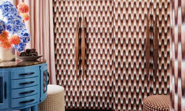
British designer Henry Holland has cemented his transition from the fashion runways to the vanguard of interior design with his latest venture: a comprehensive fabric and wallpaper collection created in partnership with luxury furnishings brand Harlequin. Titled Harlequin x Henry Holland, the line translates the intricate, tactile language of studio ceramics into domestic spaces on a monumental scale. Drawing heavily from the traditional Japanese pottery technique of nerikomi—where patterned clay is layered, compressed, and sliced—and informed by the centuries-old design archives of Harlequin’s parent company, Sanderson Design Group, the collection represents a significant milestone in contemporary surface design.
The collaboration bridges two distinct creative disciplines: the intimate, hand-built nature of studio pottery and the expansive, commercial application of high-end interior textiles. By upscaling microscopic gestures from glazed and unglazed earthenware into bold, room-wrapping patterns, Holland and the Harlequin development team have engineered a maximalist aesthetic that champions organic irregularity over digital perfection.

The Genesis of the Collection: From Tabletop to Tapestry
The foundational spark for Harlequin x Henry Holland originated entirely within Holland’s eponymous London ceramic studio. Best known initially for his eponymous fashion label launched during the height of London’s indie-sleaze era, Holland pivoted to ceramics during the COVID-19 pandemic, quickly establishing a distinct voice in the contemporary craft community.
His transition to clay was defined by an obsession with nerikomi, a meticulous pottery method requiring immense precision. Unlike surface printing, nerikomi patterns are embedded directly into the material structure. Artisans stack, fold, slice, and fuse blocks of colored clay, meaning the internal cross-section dictates the final appearance of the vessel.
When approached by Harlequin, Holland recognized an immediate methodological parallel between building clay bodies and manufacturing woven or printed textiles. Rather than simply applying digital vector graphics to flat surfaces, Holland and Harlequin’s design teams sought to capture the physical dimension and material chance inherent in the ceramic-making process.

"The starting point for the collection was our ceramic work," Holland explained in an interview with design publication Dezeen. "We used the organic patterns and forms created in our handbuilt work as the starting point, and then similarly we built the colour palettes around the clays that we use to create our pieces."
This methodology allowed the design team to isolate minute details—a cross-sectional line, a marbled smudge, or the edge of a clay slab—and enlarge them exponentially. A detail measuring mere millimeters on a hand-held vase was magnified into an immersive, floor-to-ceiling wallcovering.
Chronology and Development: A Collaborative Back-and-Forth
The partnership between Henry Holland Studio and Harlequin followed a rigorous, multi-stage developmental timeline spanning nearly two years of iterative sampling.

The process began with archival research. Before introducing new ceramic-derived motifs, Holland immersed himself in the extensive historical archives held by Sanderson Design Group, evaluating historic prints that could sit harmoniously alongside his contemporary clay designs. This historical grounding provided the collection with a foundational depth, ensuring that the avant-garde patterns resonated with traditional interior sensibilities.
Once the initial archival selections were made, the core developmental phase commenced in the studio. Holland provided physical ceramic samples, cross-sections, and raw clay color swatches to Harlequin’s technical teams. This triggered an iterative feedback loop:
- Translation and Scale Exploration: Harlequin’s textile technicians translated the physical ceramic patterns into repeat prints suitable for roll wallpaper and wide-width fabrics. Scale was intentionally distorted, shifting viewer perspective from micro to macro.
- Colorway Refinement: The color palettes were strictly derived from Holland’s ceramic vocabulary. Unfired, raw clays inspired the subdued, earthy pastel tones of chocolate and moss, while high-fired, glazed earthenware informed the collection’s vibrant, energetic hues.
- Texture and Material Selection: The team developed four core hero fabric and wallpaper lines—named Southborough, Elsworthy, Great Hey, and Blenets Check Mini—each engineered to carry distinct tactile qualities.
- Final Sampling and Integration: The resulting textiles and wallpapers were stress-tested in various interior mock-ups to ensure that the disparate patterns could cross-pollinate within a single space without visual dissonance.
An Autobiographical Narrative: The Four Hero Lines
Personal storytelling forms the emotional core of Harlequin x Henry Holland. Eschewing generic design nomenclature, Holland drew directly from his personal life to name the four primary patterns in the collection: Southborough, Elsworthy, Great Hey, and Blenets Check Mini. Every fabric and wallpaper within these lines is named after a former residence shared by Holland and his husband.
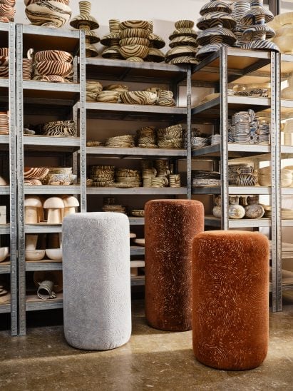
This autobiographical naming convention anchors the maximalist prints in a lived-in reality, counterbalancing the high-energy visual language with domestic intimacy.
- Elsworthy: Featuring a sophisticated, moiré-style watermarked pattern, Elsworthy mimics the fluid movement of liquid clay during the throwing and cutting stages, offering a softer, more atmospheric backdrop for residential spaces.
- Southborough: Characterized by bold, graphic chevrons, this line highlights the structured, mathematical side of Holland’s ceramic practice, introducing sharp linear geometry into the collection.
- Great Hey: Incorporating a distinctive ladder-like design, Great Hey references the structural framing of ceramic building blocks, balancing linear precision with organic softness.
- Blenets Check Mini: A playful, scaled-down interpretation of the traditional checkerboard motif, this pattern showcases the irregularities of hand-drawn ceramic tiles, avoiding the sterile perfection typically associated with digital grid systems.
Technical Analysis and Material Specifications
From a manufacturing perspective, the collaboration required overcoming significant technical hurdles to replicate the tactile quality of pottery onto woven textiles and heavy-duty wallcoverings.
Harlequin utilized advanced printing technologies alongside traditional weaving techniques to maintain the illusion of hand-manipulated material. For instance, the fabrics exhibit slubs, varied yarn weights, and textured weaves that mimic the tooth and grain of raw ceramic clay. The wallpapers, printed on sustainable non-woven grounds, use specialized inks that capture the glossy, light-reflective properties of glazed earthenware versus the matte, chalky finish of bisqueware.
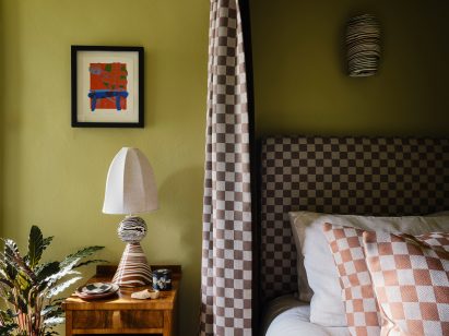
Industry analysts note that the collection arrives at a time of heightened consumer demand for tactile, craft-led interior products. Following years of minimalist, digitally smooth interiors dominated by neutral palettes, the market has seen a decisive pivot toward maximalism, characterized by layered patterns, artisanal imperfections, and deep, grounding earth tones.
Industry Implications and Design Philosophy
The success of Harlequin x Henry Holland underscores a broader movement within the interior design sector: the cross-pollination of fashion, fine craft, and home furnishings. As lifestyle brands increasingly blur the boundaries between sectors, collaborations that leverage the distinct material intelligence of independent designers offer heritage manufacturers fresh cultural relevance.
Holland remains vocal about how designers should approach the collection, advocating for intuitive, rule-breaking application rather than prescriptive, pre-packaged room schemes.
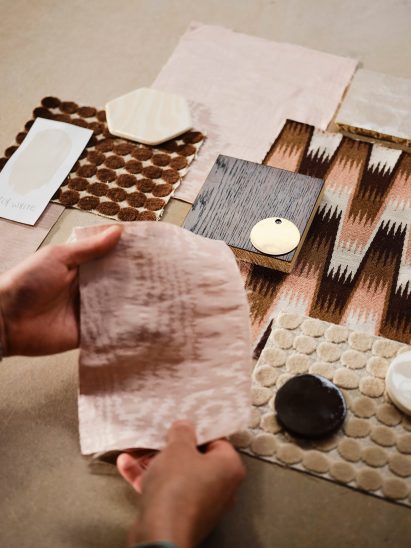
"I don’t think there should be too many rules around how it is used," Holland noted. "One of the things we really wanted was for the collection to have enough cohesion that you could layer different elements together without everything having to match perfectly. The colour stories run throughout the collection, so you can pick up a tone from one of the more expressive wallpapers and echo it through a fabric or a quieter pattern elsewhere in the room."
By maintaining a shared DNA rooted in the unpredictability of clay, the collection achieves a rare balance: it is simultaneously energetic and serene, graphic and organic, modern and archival. As interior designers increasingly seek out materials that tell a genuine human story, Harlequin x Henry Holland offers a masterclass in how multidisciplinary translation can expand the boundaries of contemporary surface design.