Frontend Development and Browser Ecosystem Updates: A Comprehensive Overview of Emerging Standards and Framework Redesigns

The rapid evolution of web technologies continues to reshape how developers build and optimize digital experiences, with recent developments highlighting significant shifts in CSS architecture, framework modernization, media optimization, and multi-screen hardware adaptation. As web browsers introduce advanced native capabilities, frontend engineers are increasingly abandoning heavy JavaScript workarounds in favor of lean, browser-native primitives. This comprehensive overview examines the latest announcements, updates, and community findings across the web development ecosystem, shedding light on the technical implications of upcoming browser releases, CSS enhancements, and major framework milestones.
Multi-Screen Web Development and the Challenges of Emerging Hardware Formats
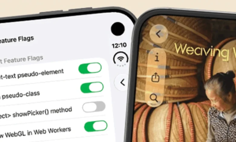
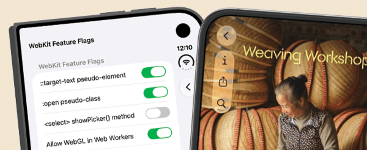
With the imminent market release of the iPhone Duo, frontend developers are once again tasked with adapting web applications to unconventional hardware architectures. Darius Cepulis of Video.js recently explored the implications of this new device category by firing up hardware simulators to test two critical, cutting-edge specifications: the Device Posture API and the Viewport Segments API. Both specifications currently remain hidden behind experimental flags in modern browser environments, signaling their experimental status as the web standards community prepares for foldables and dual-screen form factors.

Cepulis attempted to recreate the sophisticated folded-player user interface popularized by media giants like Netflix, utilizing a combination of Video.js components and advanced CSS layout techniques. While the experimental APIs successfully exposed viewport folding geometry and device posture metrics, developers continue to encounter substantial friction. Apple’s strict fullscreen restrictions introduced notable complications, demonstrating that hardware innovation frequently outpaces platform-level browser integration. As device manufacturers continue to experiment with dual-screen and foldable displays, establishing robust, standardized viewport segmentation primitives remains a high priority for the World Wide Web Consortium (W3C) and browser vendors alike.
Revolutionizing UI Design with Advanced CSS Icon Systems
In the realm of UI styling, Lea Verou has proposed a paradigm shift in how digital designers and developers integrate and manipulate icons within web interfaces. Traditional icon integration methods typically rely on cluttered markup, external SVG sprite sheets, or heavy JavaScript component libraries that bloat the Document Object Model (DOM). Verou’s methodology eliminates the need to touch HTML entirely when inserting or tweaking icons.
By leveraging a combination of --icon custom properties, the @property rule, advanced CSS style queries, and the mask property, developers can construct a pure CSS icon system that offers unprecedented flexibility and maintainability. This technique allows design tokens and icon assets to be dynamically injected and styled directly through stylesheets, drastically reducing HTML payload sizes and separating presentation logic from structural markup. Industry feedback suggests that this approach represents a significant maturation of CSS variable scoping and layout capabilities, reducing reliance on framework-specific icon wrappers.
Deep Dive into Browser Media Fetching and Lazy Loading Mechanics
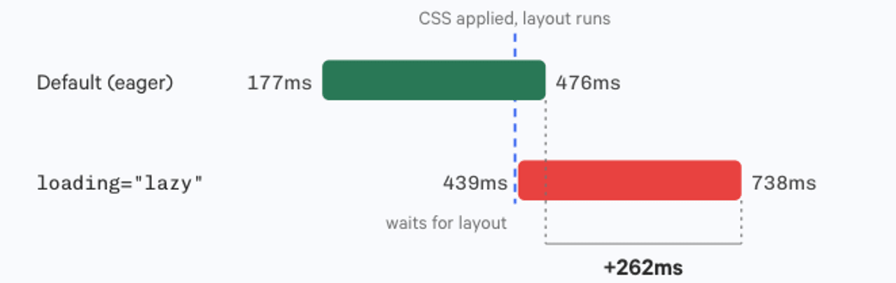
Performance optimization remains a cornerstone of modern web engineering, particularly regarding media delivery and resource prioritization. Ben Schwarz of Calibre recently published an exhaustive investigation into how leading web browsers—specifically Chrome, Firefox, and Safari—handle native lazy-loaded media assets. The research measures precisely how far ahead modern rendering engines fetch lazy-loaded images, audio, and video resources relative to the user’s current scroll position.
Schwarz’s findings reveal nuanced differences in how Chromium-based browsers handle audio and video elements compared to standard image lazy loading. By examining the interplay between the loading="lazy", loading="eager", and fetchpriority attributes, developers can fine-tune resource delivery pipelines to prevent layout shifts while optimizing bandwidth consumption on mobile networks. Understanding these browser-specific fetching thresholds enables engineering teams to construct more resilient performance budgets, ensuring that media-heavy web pages maintain high Core Web Vitals scores without sacrificing user experience.
Mainstream Adoption of the WebP Image Format
The transition toward next-generation image formats has reached a historic milestone. Gavin Anderegg recently reflected on the ubiquity of the WebP image format, noting that sixteen years after its initial introduction by Google, global browser support has officially reached approximately 97 percent.

Despite lingering debates regarding compression artifacts and format fidelity compared to modern iterations of AVIF and JPEG XL, WebP has effectively transitioned from an experimental alternative to an undisputed baseline standard for web image delivery. With near-universal support across legacy and modern user agents, web development teams are increasingly dropping complex multi-format fallback strategies (<picture> elements with multiple source types) in favor of straightforward WebP integration, streamlining build pipelines and reducing asset management overhead.
Browser Engine Releases: Chrome 156 Beta and Safari Technology Preview 254
Browser vendors continue to push the boundaries of what is possible natively within the rendering engine. The release of Chrome 156 Beta introduces native support for the CSS random() function, a long-awaited capability that empowers developers to generate randomized values directly within stylesheets without resorting to JavaScript-based pseudo-random number generators. This addition opens new avenues for generative UI design, particle animations, and organic layout variations.
Simultaneously, the WebKit team rolled out Safari Technology Preview 254, featuring robust support for both calc-size() and interpolate-size. These additions address long-standing frustrations regarding smooth CSS animations on intrinsic sizing properties, such as transitioning elements from height: 0 to height: auto. Historically, animating to keyword values required complex JavaScript measurements; these new CSS features allow browser engines to calculate and interpolate intrinsic sizes natively, significantly boosting animation performance and developer productivity.
Framework Evolution: Bootstrap 6 Alpha Introduces Modernization
In the JavaScript and framework ecosystem, major updates are underway for foundational UI libraries. Mark Otto announced the release of Bootstrap 6 Alpha, marking the first major architectural revision of the immensely popular CSS framework since 2021. The overarching theme of version 6 is aggressive modernization and alignment with contemporary browser capabilities.
A key highlight of the Bootstrap 6 Alpha release is the migration of most Sass variables into native CSS custom properties (variables), enabling runtime theming and dynamic style overrides without requiring a Sass compiler. Additionally, the framework has transitioned its JavaScript plugins to ECMAScript Modules (ESM) exclusively, shedding legacy wrapper patterns. By leaning heavily into browser-native features—such as native dialog elements, container queries, and logical properties—Bootstrap aims to shed unnecessary abstraction layers, resulting in lighter runtime footprints and improved interoperability with modern frontend component architectures.
Streamlining CSS Architecture with Reseter.css 3.0
Addressing the perpetual need for consistent cross-browser baseline styling, Krish Gupta released version 3.0 of reseter.css, a modern CSS reset utility. Weighing in at approximately 1KB compressed, the latest iteration represents a ground-up architectural rework.

Crucially, both the ‘full’ and ‘mini’ variants of Reseter.css 3.0 now ship wrapped inside an explicit @layer reset container. This integration leverages CSS cascade layers to ensure predictable, highly manageable style overrides throughout large application codebases. Furthermore, the library embraces logical properties throughout its ruleset to seamlessly support internationalization and multi-directional text layouts (RTL/LTR), while being compiled and optimized using Lightning CSS. This release exemplifies the broader industry trend toward high-performance, standards-compliant tooling that respects modern CSS cascade mechanics.
Industry Implications and Future Outlook
The convergence of native browser capabilities—ranging from CSS cascade layers and custom properties to advanced media loading heuristics and dual-screen viewport APIs—signals a mature phase in frontend engineering. As frameworks like Bootstrap shed legacy abstractions and developers adopt pure CSS architectural patterns, the web platform is proving increasingly capable of handling complex application logic and sophisticated UI designs natively.
Engineering teams that proactively adapt to these evolving standards are well-positioned to build faster, more maintainable, and resilient digital products. As experimental features like viewport segmentation and CSS randomization transition from beta channels to stable releases over the coming months, the modern web development landscape will continue to demand continuous learning and architectural adaptation.