
Why CSS Height Percentages Often Fail and How Modern Layout Algorithms Solve the Paradox


The fundamental disparity between horizontal and vertical space management remains one of the most common points of friction for web developers transitioning from structural programming to front-end styling. While the CSS box model is designed to handle layout intuitively, the specific behavior of percentage-based height declarations frequently leads to non-responsive elements and layout failures. This phenomenon is rooted in the way browsers calculate geometry, a process that relies heavily on whether a parent element’s dimensions are explicitly defined or dynamically derived.
The Mechanics of the Circular Calculation Paradox
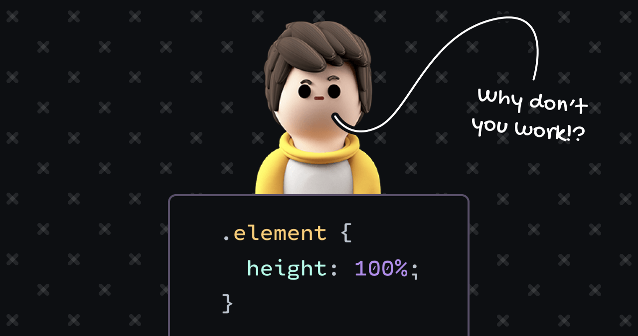
To understand why a declaration such as height: 50% often fails to manifest, one must examine the browser’s rendering pipeline. In the standard CSS Flow layout—the default state for most HTML elements—width and height are calculated using inverse logic. A block-level element, such as a standard div, is programmed to expand horizontally to fill its parent’s available width. Conversely, in the vertical axis, these elements are designed to "shrink-wrap" around their content.
This creates a structural paradox. When a child element attempts to resolve its height as a percentage of its parent, the browser encounters a circular dependency. The parent’s height is determined by the sum of its children’s heights; if a child’s height is set as a percentage of that parent, the browser cannot finalize the calculation because the parent’s dimensions are contingent upon the child’s unresolved height. Consequently, in accordance with the W3C CSS specifications, browsers default to ignoring the percentage declaration, effectively treating it as "auto," which causes the element to collapse to the height of its inner content.
Chronology of Layout Evolution
The history of web layout has evolved from the rigid, table-based structures of the 1990s to the highly dynamic, responsive systems of the modern era. During the early 2000s, developers relied on "clear-fix" hacks and fixed-pixel containers to manage vertical space. However, as mobile browsing increased in prominence, the fragility of these methods became apparent.
By the mid-2010s, the introduction of Flexbox and Grid layout modules marked a significant shift in how browsers handle the "knowable" height problem. Before these modules, achieving a full-viewport height required the rigid application of height: 100% to the html and body elements—a practice that remains common but is increasingly superseded by newer units such as svh (Small Viewport Height). These modern units allow developers to define dimensions relative to the viewport’s actual visible area, bypassing the need for nested percentage inheritance that often broke when mobile browser toolbars expanded or retracted.
Data and Accessibility Considerations
The reliance on fixed units like pixels (px) has long been discouraged by accessibility advocates. According to data from the WebAIM Million, which analyzes the top one million homepages for accessibility compliance, layouts that fail to accommodate browser-level font scaling frequently suffer from significant usability issues. When a developer sets a container to a fixed height of 300px, an increase in the user’s default browser text size can force content to overflow the container, rendering it unreadable or inaccessible to users relying on screen readers or high-contrast settings.
Industry-standard best practices now suggest the use of relative units, such as rem (root em), or the adoption of intrinsic layout models. The transition from Flow layout to Grid or Flexbox represents a shift toward more robust, content-agnostic design. In a Grid formatting context, the child elements no longer behave as they do in Flow layout. Instead of seeking a parent’s height to determine their own, children are treated as grid items that can be instructed to stretch across the entire available cell.
Official Standards and Browser Implementation
Major browser engines—including Blink (Chrome/Edge), WebKit (Safari), and Gecko (Firefox)—follow the CSS Box Model specification to ensure consistency. According to the CSS Working Group documentation, when an element’s height is set to a percentage, the parent must have an explicit height—not a min-height or max-height—for the child to successfully resolve the calculation.
This distinction between height and min-height is a frequent source of technical debt in enterprise-level codebases. While min-height allows for growth beyond a specific point, it does not provide the "knowable" value required for percentage calculations. If an element is defined only by min-height, it remains dynamic, and therefore, any child attempting to use a percentage of that height will fail to scale as expected.
Broader Implications for Web Architecture
The move toward modern layout algorithms such as CSS Grid and Flexbox has profound implications for the stability of web applications. By utilizing these tools, developers can decouple the size of a container from the volume of its content, effectively eliminating the circular paradoxes that once plagued early web design.
Industry analysts observe that as web applications grow in complexity, the ability to maintain predictable layouts becomes a core component of front-end engineering performance. The shift away from legacy Flow-based layouts is not merely an aesthetic choice but a structural necessity. Modern frameworks that prioritize responsive design, such as those used in large-scale React or Angular applications, benefit from the deterministic nature of Grid and Flexbox.
Expert Perspectives on Modern CSS
Engineers specializing in CSS architecture suggest that the "knowable height" concept is essential for any developer looking to move beyond basic styling. By ensuring that the hierarchy of a page has defined boundaries, developers can prevent "layout thrashing"—a performance-heavy process where the browser is forced to re-calculate the position and geometry of elements multiple times during a single render cycle.
The consensus among front-end architects is that the future of web design lies in intrinsic sizing—a methodology where the container adapts to the content rather than forcing content into a pre-defined container. While legacy systems will continue to require workarounds and careful management of percentage-based heights, new projects are increasingly leveraging the capabilities of Grid and Flexbox to ensure that layout remains consistent regardless of viewport size, font settings, or device type.
In summary, while the mystery of the "non-working" CSS height often stems from the browser’s attempt to resolve a circular logic trap, the solution lies in a deeper understanding of the layout algorithm in use. By transitioning from the default Flow layout to modern tools, and by favoring knowable, relative measurements over fixed pixels, developers can build more resilient, accessible, and performant web interfaces. This evolution in practice reflects the ongoing maturation of the web as a platform, moving away from document-based styling toward a sophisticated, application-oriented architecture.