Rebuilding FIFA’s Standings Layout with CSS Subgrid: A Deep Dive into Responsive Design and Accessibility in Web Development

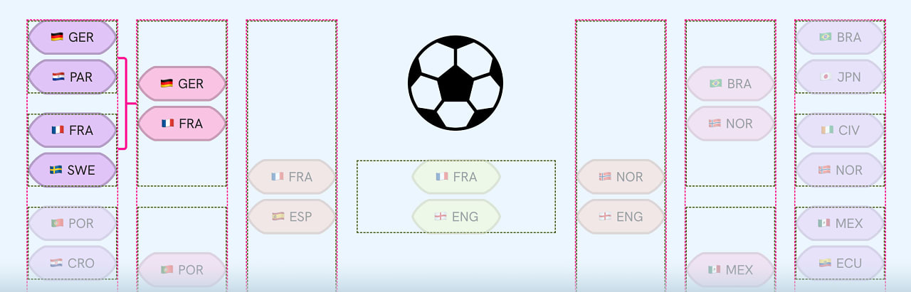
The world of web development is constantly evolving, with new techniques and technologies emerging to address complex design challenges. One such challenge, recently explored by Ahmad Shadeed, involves the intricate layout of sports standings, exemplified by FIFA’s World Cup data. While the global tournament has concluded, the underlying design problem remains a compelling case study for understanding how modern CSS, particularly CSS Grid and Subgrid, can be leveraged to create robust, responsive, and accessible user interfaces. This article delves into Shadeed’s approach, examining the technical solutions, their implications for web design, and the broader context of how developers are tackling increasingly sophisticated layout requirements.
The Challenge of Complex Sports Layouts
Sports standings tables, especially those for major international events like the FIFA World Cup, present a unique set of design hurdles. They are data-heavy, requiring the display of numerous columns with varying content types – team names, scores, rankings, statistics, and often graphical elements. The need for responsiveness is paramount; these tables must adapt seamlessly across a wide spectrum of devices, from large desktop monitors to small mobile screens, without sacrificing readability or usability. Furthermore, accessibility considerations are crucial, ensuring that all users, including those relying on assistive technologies, can effectively interpret the information.
Ahmad Shadeed’s analysis of FIFA’s standings layout highlights the inherent complexity. Traditional approaches, often relying on a combination of tables, floats, and media queries, can quickly become unwieldy and difficult to maintain. The sheer volume of data and the need for precise alignment across different screen sizes can lead to code that is brittle and prone to breaking. Shadeed’s engagement with this problem stems from a desire to explore more modern and efficient solutions, moving beyond legacy techniques.

CSS Grid and Subgrid: A Powerful Combination
Shadeed’s solution centers on the advanced capabilities of CSS Grid and, crucially, CSS Subgrid. CSS Grid Layout provides a powerful two-dimensional layout system for the web, allowing developers to divide a page into regions and control the size, position, and alignment of elements within those regions. It offers a more intuitive and flexible way to create complex layouts compared to older methods.
However, the real game-changer in Shadeed’s approach is CSS Subgrid. Subgrid is an extension of CSS Grid that allows a grid item to adopt the grid of its parent. This means that nested grids can align themselves with the tracks of their parent grid, eliminating the common issue of misalignment that can occur when dealing with complex, nested layouts. In the context of FIFA’s standings, this capability is invaluable. Imagine a primary grid for the overall table structure, and then within a specific cell (e.g., a team row), a nested grid for displaying individual player statistics or performance metrics. Without Subgrid, aligning these nested elements with the main table’s columns would be a painstaking manual process. Subgrid automates this, ensuring a consistent and clean visual hierarchy.
Shadeed’s article, titled "Rebuilding FIFA’s Standings Layout with CSS Subgrid," provides a detailed walkthrough of his methodology. He demonstrates how to structure the HTML and apply CSS Grid properties to achieve the desired layout. Key aspects likely explored include:
- Defining Grid Containers: Establishing the main grid for the entire standings table.
- Column and Row Tracks: Precisely defining the columns and rows needed to accommodate all the data points.
- Grid Item Placement: Positioning individual elements (team names, scores, etc.) within the defined grid.
- Leveraging Subgrid: Applying
grid-template-columnsorgrid-template-rowswith thesubgridvalue to nested elements, allowing them to inherit the parent’s grid alignment. This is particularly useful for aligning complex data within a single cell of the main table. - Responsive Adjustments: Utilizing media queries in conjunction with CSS Grid to modify the layout for different screen sizes. Grid’s inherent flexibility allows for easier rearrangement and resizing of elements compared to older layout methods.
The "no messi" pun in the original description is a playful nod to the sport itself, suggesting a clean and efficient solution that avoids the common pitfalls and complexities often associated with such layouts. The emphasis on visual explanation and ample code examples further underscores the practical and educational value of Shadeed’s work.
The Evolving Landscape of Frontend Development Tools
Shadeed’s exploration of CSS Subgrid is indicative of a broader trend in frontend development: the adoption and mastery of advanced CSS features to build more sophisticated and performant user interfaces. As web applications become more complex, developers are increasingly looking towards tools that offer greater control and flexibility.
Timeline of CSS Grid and Subgrid Adoption:
- CSS Grid Level 1: Officially standardized by the W3C in March 2017, CSS Grid revolutionized web layout, offering a robust two-dimensional system. Its adoption was relatively swift, becoming a cornerstone of modern responsive design.
- CSS Grid Level 2 (including Subgrid): The development of Subgrid began as part of Grid Level 2. Browser support for Subgrid has been a gradual process. Initially, it was implemented in Firefox, with other major browsers like Chrome and Safari progressively adding support. As of late 2023 and early 2024, Subgrid has reached a point of stable support across most modern browsers, making it a viable option for production environments.
The availability of these features directly impacts how developers can approach design challenges. Previously, achieving such precise alignment in nested structures might have required complex JavaScript solutions or intricate CSS hacks. Subgrid offers a native CSS solution, leading to cleaner, more maintainable, and potentially more performant code.
Beyond Layout: Accessibility and Performance
While the primary focus of Shadeed’s article is on layout techniques, the implications extend to crucial aspects of web development: accessibility and performance.

Accessibility:
The article by Morgan Murrah, "Return of CSS Outline," directly addresses an important accessibility concern: focus outlines. For keyboard users navigating websites, focus outlines provide a visual indicator of which element is currently selected. Historically, many websites have removed these outlines using outline: 0 in CSS resets, inadvertently hindering keyboard navigability. Murrah’s piece champions the retention of focus outlines, highlighting the focus-visible pseudo-class as a modern solution that allows developers to style focus states only when necessary (e.g., when a user is navigating via keyboard), thus maintaining both aesthetics and accessibility. This aligns with the principles of building inclusive web experiences, a growing priority in the development community.
The ability to create complex, well-structured layouts using CSS Grid and Subgrid also has direct accessibility benefits. Semantic HTML, combined with a clear visual hierarchy established by the grid, makes it easier for screen readers to interpret and convey content to users. Well-defined grid areas can translate into logical reading orders, improving the overall user experience for individuals with disabilities.
Performance:

The use of native CSS layout techniques like Grid and Subgrid generally leads to better performance compared to JavaScript-driven layouts or overly complex DOM structures. Browsers are highly optimized to render CSS layouts efficiently. By reducing reliance on JavaScript for layout manipulation, developers can potentially decrease page load times and improve rendering performance.
Furthermore, the comparison of frontend frameworks, as highlighted by Alicia Sykes’ "Framework Benchmarks: Compare Frontend Frameworks," underscores the importance of performance considerations. By building the same application in various frameworks and measuring metrics like bundle size, build time, and user experience, developers can make informed decisions about the tools that best suit their project’s needs, balancing development speed with runtime performance.
Tools and Resources for Modern Web Development
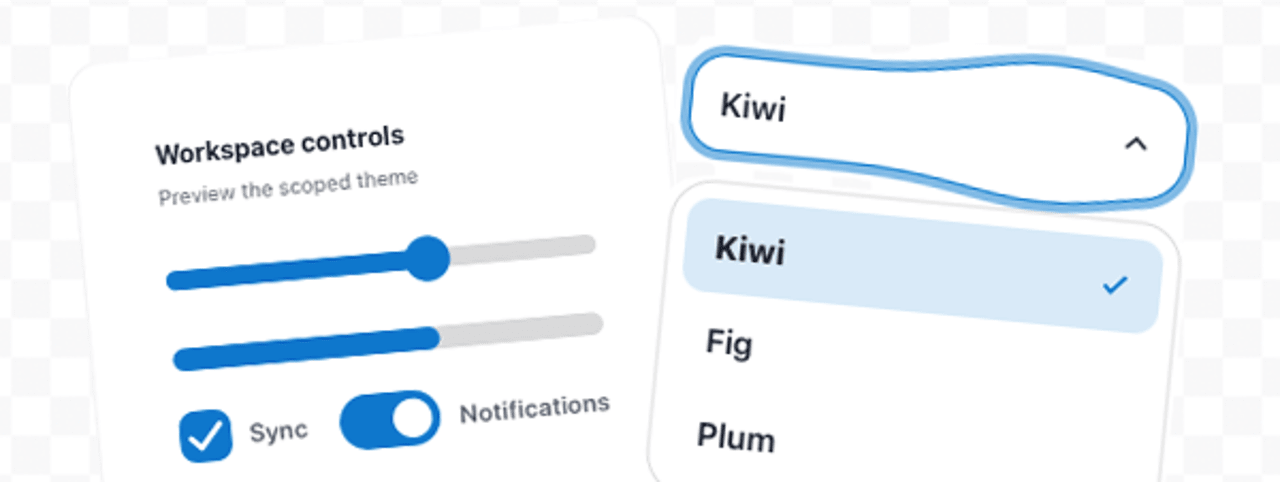
The landscape of web development is also shaped by the availability of robust tools and libraries. The mention of "Jelly UI: Soft Web Components" by bmson introduces a library that leverages web components to provide "soft" physics effects. This demonstrates how developers are exploring new ways to enhance user interaction and visual appeal using native browser technologies. Web components offer encapsulation and reusability, making it easier to build modular and maintainable user interfaces.
The "Decoy Font: A TTF Font That Hides What You Type" by Mixfont is another fascinating example of innovation at the intersection of design and emerging technologies. This experiment with typography, designed to mislead AI by presenting hidden information, sparks curiosity about the future of digital security and the interplay between human perception and artificial intelligence.
Broader Implications and Future Outlook
The technical discussions around CSS Subgrid, focus outlines, and framework performance are not isolated incidents. They represent the ongoing maturation of the web development ecosystem. As the internet becomes more integral to daily life, the demands on web applications – for responsiveness, accessibility, performance, and engaging user experiences – continue to rise.
The FIFA standings example, while specific, serves as a microcosm of the challenges faced by developers across various industries. Whether building e-commerce platforms, educational tools, or complex data dashboards, the principles of clean, efficient, and accessible layout remain paramount.
Analysis of Implications:
- Increased Design Flexibility: Advanced CSS features like Subgrid empower designers and developers to create more complex and aesthetically pleasing layouts without resorting to cumbersome workarounds. This can lead to more innovative and engaging user interfaces.
- Improved Maintainability: Cleaner code, achieved through native CSS solutions, is easier to understand, debug, and update. This reduces development costs and accelerates the pace of feature implementation.
- Enhanced Accessibility: The growing emphasis on accessibility, as seen with the discussion on focus outlines, signifies a shift towards a more inclusive web. Developers are increasingly aware of their responsibility to ensure that all users can access and interact with digital content.
- Performance Optimization: The continuous drive for faster loading times and smoother user experiences necessitates a deep understanding of performance best practices. Choosing the right tools and techniques, from layout engines to framework selections, plays a critical role.
- Emerging Technologies: The exploration of new technologies, such as advanced typography for AI interaction or innovative component libraries, suggests a forward-looking approach within the development community, constantly seeking to push the boundaries of what’s possible on the web.
In conclusion, Ahmad Shadeed’s exploration of rebuilding FIFA’s standings layout with CSS Subgrid is more than just a technical deep dive; it’s a testament to the ongoing evolution of web development. By embracing powerful CSS features and prioritizing accessibility and performance, developers are not only solving immediate design challenges but also shaping the future of the digital landscape, making the web a more robust, inclusive, and engaging space for everyone. The insights gleaned from this analysis, alongside the other articles and resources presented, offer valuable guidance for anyone involved in building for the modern web.