Amazon QuickSight Introduces Mobile Layout for Free Form Dashboards, Revolutionizing On-the-Go Data Access

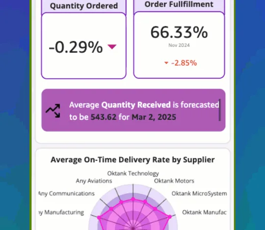
Amazon QuickSight has launched Mobile Layout for its Free Form dashboards, a significant enhancement designed to automatically render complex data visualizations as single-column, touch-optimized views that seamlessly adapt to mobile device screens. This innovation addresses a pervasive challenge for professionals who rely on dashboards for daily decisions but often contend with desktop-centric designs requiring tedious pinching, zooming, and horizontal scrolling on smaller displays. The new capability ensures immediate, frictionless access to critical business intelligence, whether checking revenue during a morning standup, reviewing pipeline metrics between meetings, or monitoring operations while traveling. Mobile Layout for Free Form dashboards is now available in every supported AWS Region, transforming the traditional desktop canvas into a continuous vertical scroll experience perfectly sized for any phone or tablet. Visuals automatically fill the screen width, maintain their aspect ratio, and remain fully interactive, eliminating the need for authors to make any modifications to their existing dashboards.
The Mobile Imperative: Responding to a Shifting Data Landscape
The introduction of Mobile Layout underscores a growing imperative in the business intelligence (BI) sector: the demand for ubiquitous, instant access to data. In an increasingly mobile-first world, decision-makers are no longer tethered to their desks. According to various industry reports, a significant percentage of business professionals now access critical information and applications on mobile devices, with some estimates suggesting that over 70% of employees use smartphones for work-related tasks daily. However, the promise of mobile BI has often been hampered by the technical challenges of porting intricate, multi-layered dashboards, originally designed for large monitors, to smaller screens without compromising usability or data integrity.
Traditional BI tools frequently require developers to create separate mobile-specific versions of dashboards, a time-consuming and resource-intensive process. Alternatively, users are forced to navigate poorly optimized desktop views on their mobile devices, leading to frustration, reduced productivity, and potentially delayed decision-making. Amazon QuickSight’s Mobile Layout directly confronts this problem by automating the adaptation process, thereby democratizing data access and ensuring that insights are available whenever and wherever they are needed. This release reflects AWS’s continuous commitment to enhancing QuickSight’s capabilities, building on its foundation as a scalable, serverless, and AI-powered BI service designed for all users, from data analysts to business leaders.

Unpacking Mobile Layout: Mechanics and Core Capabilities
Mobile Layout functions as an intelligent rendering mode specifically for Free Form dashboards within Amazon QuickSight. When a user opens a Free Form dashboard on a device with a small viewport—such as a smartphone or tablet—QuickSight automatically detects the screen size and initiates the mobile view. The result is a single-column, vertically scrollable feed where each visual is dynamically sized to fill the device’s screen width. This adaptive rendering is based on the device’s viewport dimensions; if the viewport falls within predefined phone or tablet dimensions, Mobile Layout activates. For larger screens, the standard desktop rendering is maintained, ensuring consistency and optimal viewing across all device types.
Key capabilities of Mobile Layout include:
- Continuous Scroll: Visuals are stacked vertically in a single column, each expanding to fill the full viewport width. Crucially, aspect ratios are preserved, meaning portrait-shaped visuals retain their height, and landscape-shaped visuals maintain their width, preventing distortion of critical charts and graphs.
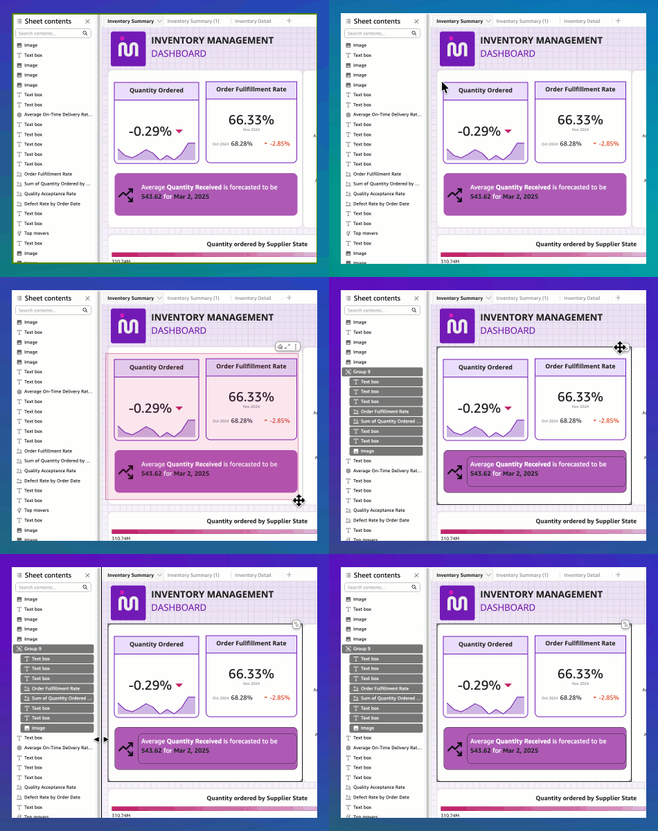
- Group-Aware Rendering: Free Form dashboards often utilize overlapping visuals—for instance, KPI values layered on a colored background or comparison cards stacked over a container. Mobile Layout intelligently respects these group boundaries. Visuals that have been explicitly grouped by the author will render together as a cohesive single unit, preserving the intended layered design and preventing elements from appearing disassociated on mobile.
- Reader Controls and Flexibility: For users of the QuickSight mobile app, a built-in view switcher provides the flexibility to toggle between the optimized Mobile view (continuous scroll) and the original Desktop view. On mobile web browsers, the experience is contextually driven: portrait orientation defaults to the mobile experience, while rotating the device to landscape orientation renders the desktop experience, offering users control over their preferred viewing mode.
- Optimized Performance: Mobile Layout employs a specialized rendering path engineered to reduce resource consumption on mobile devices. This optimization is particularly beneficial for complex dashboards that might have previously struggled to render smoothly on phones, ensuring faster load times and fluid scrolling for an improved user experience.
An illustrative animation demonstrates a Free Form dashboard opening on a phone in Mobile Layout, showcasing a reader effortlessly scrolling through key performance indicators (KPIs) and various charts within a continuous vertical feed. This visual representation highlights the intuitive and immediate access users gain without any manual resizing or horizontal navigation.
Seamless Adoption: No Action Required for Existing Dashboards
One of the most compelling aspects of Mobile Layout is its immediate and automatic implementation. Neither dashboard readers nor authors and administrators are required to take any action for the feature to take effect.
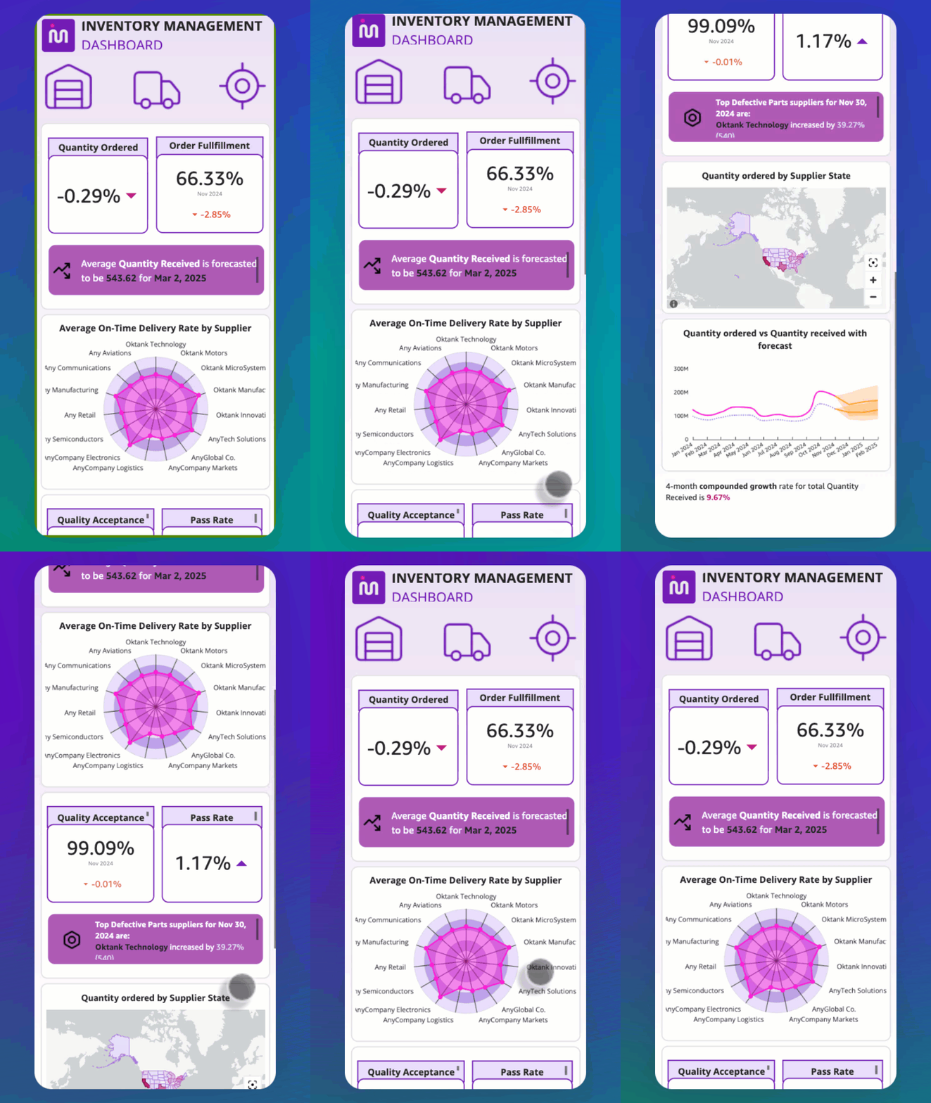
- For Dashboard Readers: The experience is entirely frictionless. There is no setting to enable, no migration process, and no updates to perform. Simply opening an existing Free Form dashboard on a phone or tablet will automatically activate the mobile view, providing instant access to data in the optimized format.
- For Authors and Administrators: The benefit is equally automatic. Authors of Free Form dashboards will find that their published dashboards inherently render in Mobile Layout on smaller screens without any additional development or configuration. This eliminates the need for creating separate mobile-specific versions, significantly reducing the authoring burden. It is important to note that authors using Tiled or Classic layouts are unaffected by this update, as those layout types retain their existing responsive behaviors. Similarly, administrators do not need to configure anything; Mobile Layout is active by default for all Free Form dashboards across the QuickSight account. This ‘zero-config’ approach accelerates adoption and ensures a consistent mobile experience enterprise-wide.
Optimizing for Excellence: The Power of Grouping
While Mobile Layout functions automatically, authors utilizing overlapping visuals in their Free Form dashboards can take an optional step to ensure their designs translate optimally to mobile: organizing these visuals into Groups. In Free Form layouts, it is common practice to layer visuals, such as placing KPI values on top of a colored background or stacking comparison cards within a shared container. On desktop displays, these overlapping elements render precisely as intended, maintaining their intricate relationships.
However, on mobile, the layout engine needs to make decisions about how to present these elements. Without explicit grouping, each visual might be treated as a separate ‘card’ in the mobile scroll. For example, a KPI value that sits on a background image could appear as two distinct elements: the background as one card, and the KPI as a separate card. While the visuals still render correctly, their intended layered relationship and visual unity might be compromised.
By contrast, when visuals are organized into a group, all elements within that group are rendered together as a single, cohesive unit. This ensures that the background and KPIs remain together, preserving the banner or composite visual as the author originally designed it. This simple, optional step empowers authors to maintain the full fidelity of their visual storytelling on mobile devices. QuickSight’s documentation provides comprehensive guidance on working with visual groups in Free Form layouts, detailing how to combine elements like KPI numbers, labels, and background shapes into a single mobile-friendly unit.
The grouping process is straightforward: authors select the overlapping visuals they wish to combine, right-click, and choose the ‘Group’ option from the context menu. This action bundles the selected visuals, treating them as a singular entity for mobile rendering. There is no limit to the number of groups per sheet, allowing for extensive optimization across complex dashboards.
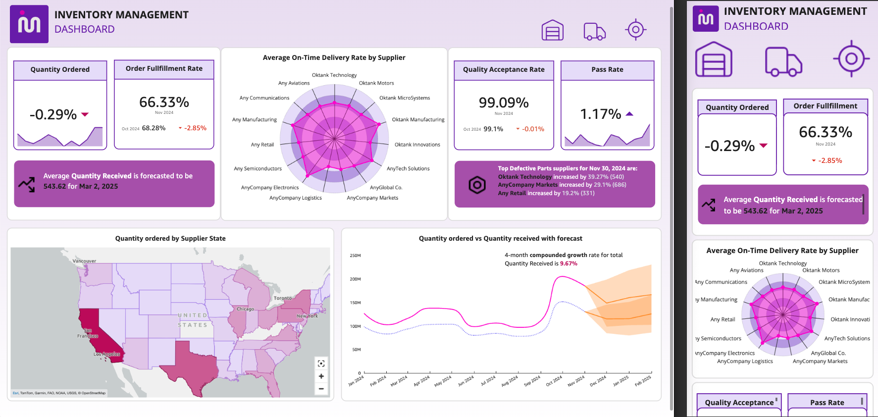
Technical Deep Dive: How Visuals Adapt on Mobile
When Mobile Layout renders visuals in the continuous scroll, it adheres to specific guidelines to ensure readability and interactivity:
- Minimum Height: Each visual maintains a minimum height of 40 pixels. This prevents visuals from becoming too condensed to display any meaningful content.
- Maximum Height: The maximum height for any visual is capped at 10,000 pixels. This safeguard prevents extremely tall visuals from creating an excessively long scrollable area, which could negatively impact performance and user experience.
- Aspect Ratio Preservation: As previously mentioned, the original aspect ratio of each visual is meticulously preserved. This ensures that charts, graphs, and images do not appear stretched or squashed, maintaining their visual integrity and interpretability.
- Minimum Dimensions for Interactive Elements: Interactive elements within visuals, such as scrollbars for tables or selection handles for charts, are guaranteed a minimum size to ensure they remain touch-friendly and fully functional on mobile screens.
Should a visual become too short to effectively render its internal elements due to these constraints, an informational icon will appear, prompting the reader. In such cases, the reader has the option to switch to Desktop mode via the view switcher or rotate their device to landscape orientation to view the full visual. This intelligent handling ensures that users are always able to access the complete data, even in edge cases of extreme visual design.
Broader Implications for Business Agility and Data Democratization
The introduction of Mobile Layout for Amazon QuickSight’s Free Form dashboards carries significant implications for businesses striving for enhanced agility and broader data democratization. By eliminating the technical barriers to mobile data access, organizations can empower a wider range of employees—from field sales teams to executive leadership—with real-time insights directly on their preferred devices.
This capability fosters a culture of continuous data engagement. Instead of waiting to return to a desktop, professionals can make informed decisions on the spot, reacting swiftly to changing market conditions, operational anomalies, or customer feedback. The time saved by not having to redesign dashboards for mobile, coupled with the improved user experience, translates directly into increased productivity and operational efficiency. Furthermore, it levels the playing field for smaller businesses or those with limited IT resources, allowing them to deploy sophisticated mobile BI solutions without significant investment in custom development.
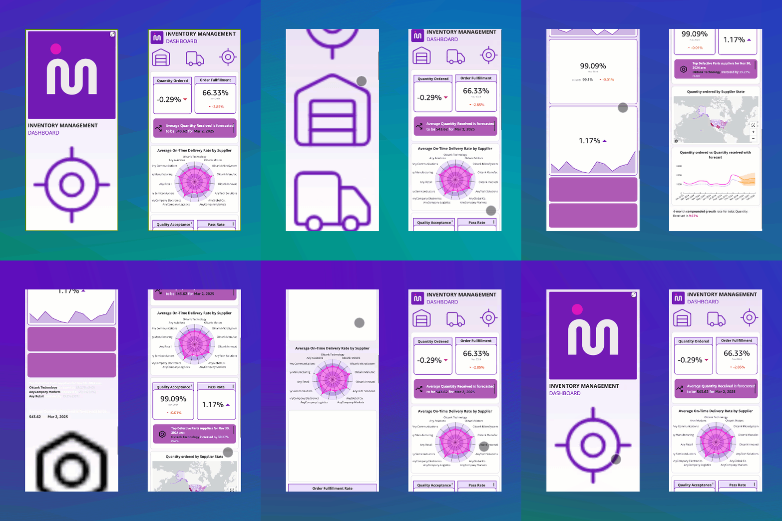
From a competitive standpoint, this feature enhances Amazon QuickSight’s position in the crowded BI market. While many BI platforms offer some form of mobile responsiveness, QuickSight’s automated, "zero-config" approach for Free Form dashboards sets a high bar for ease of deployment and user experience. It aligns with the broader trend of self-service BI, where the focus is on enabling business users to interact directly with data without deep technical expertise.
Amazon QuickSight’s Evolution and Future Outlook
This latest enhancement is part of Amazon QuickSight’s continuous evolution since its launch. AWS has consistently invested in expanding QuickSight’s capabilities, from its initial focus on cloud-native scalability and pay-per-session pricing to the integration of machine learning-powered insights (like ML-powered forecasting and anomaly detection) and natural language query processing (Q). The addition of Mobile Layout for Free Form dashboards addresses a critical user experience gap, solidifying QuickSight’s appeal as a comprehensive BI solution suitable for organizations of all sizes.
Industry analysts have frequently highlighted the importance of robust mobile capabilities in modern BI platforms. This release from QuickSight is likely to be well-received, as it directly addresses a pain point that has historically hindered the widespread adoption of mobile data analytics. It signals AWS’s commitment to building a BI service that is not only powerful and scalable but also exceptionally user-friendly across all access points.
Availability and Getting Started
Mobile Layout for Amazon QuickSight’s Free Form dashboards is now generally available across all supported AWS Regions. To experience this new feature, users can follow a simple process:
- Open an existing Free Form dashboard in Amazon QuickSight.
- Access the dashboard on a mobile device (phone or tablet) using the QuickSight mobile app or a mobile web browser.
- Observe the automatic rendering of the dashboard in the single-column, continuous scroll Mobile Layout.
- Optionally, use the view switcher control within the mobile app to toggle between Mobile, Desktop, and Landscape modes to explore different viewing options.
For authors looking to optimize their dashboards, the key is to strategically group overlapping visuals to maintain their intended layered appearance on mobile. Comprehensive documentation on customizing visuals in a free-form layout and best practices for grouping is available through AWS resources.
Amazon QuickSight actively welcomes feedback through its console feedback mechanism, encouraging users to share their experiences and suggestions to further refine and enhance the platform’s capabilities. This iterative approach, driven by customer input, ensures that QuickSight continues to evolve as a leading-edge BI solution, empowering data-driven decisions for businesses worldwide.