Like many professionals navigating the dynamic landscape of modern work, data storytelling experts are at the forefront of a real-world experiment, integrating artificial intelligence into their daily workflows. The continuous exploration of where AI truly enhances processes and where it potentially impedes progress is shaping a new paradigm in data visualization and communication. A central question emerging from this experimentation is discerning the optimal scenarios for AI utilization, moving beyond mere novelty to strategic application.
The traditional data storytelling process often involves both engaging creative tasks and repetitive, manual labor. Many professionals find satisfaction in the meticulous refinement of visual elements—such as adjusting alignment, selecting color palettes, and sketching initial concepts—steps that frequently spark innovative ideas and lead to superior final products. Conversely, the arduous process of constructing each chart from scratch or laboriously manipulating raw Excel data to produce non-standard visualizations rarely contributes to deeper analytical insights. This mechanical aspect of chart generation is precisely where many data professionals envision AI offering significant value, provided it doesn’t compromise their ultimate control over the design and narrative. Every minute saved on manual chart creation translates into additional time for critical thinking, focusing on the underlying story the data needs to convey, and refining the overarching design strategy. The aspiration is not for AI to autonomously redesign an entire presentation slide, but rather to function as an intelligent assistant, generating a refined starting point that human experts can then meticulously polish and adapt. This collaborative ethos was recently put to the test in a client project, yielding results that are fundamentally altering established working methodologies.

The Evolution of AI in Professional Workflows
The integration of artificial intelligence into professional environments has accelerated dramatically in recent years, transforming industries from healthcare to finance, and increasingly, creative and analytical fields like data storytelling. Generative AI, in particular, has moved beyond niche applications to become a powerful tool for augmenting human capabilities. Market research firm IDC projected that worldwide spending on AI would reach nearly $154 billion in 2023, growing to over $300 billion by 2026, highlighting the rapid enterprise adoption. This widespread integration is driven by AI’s potential to automate repetitive tasks, enhance decision-making through advanced analytics, and unlock new avenues for innovation.
In the realm of data visualization, the journey has been long, from early spreadsheet software like VisiCalc and Lotus 1-2-3 in the 1980s, which offered rudimentary charting, to the advent of powerful business intelligence tools like Tableau, Power BI, and Qlik Sense in the 2000s and 2010s. These tools empowered users with greater control and interactivity, but the creation of bespoke, highly polished, and strategically aligned visualizations still demanded considerable manual effort and expertise. The recent wave of generative AI, exemplified by models like OpenAI’s GPT series, Anthropic’s Claude, and Google’s Gemini, marks a new chapter. These models, initially celebrated for their text generation capabilities, are now increasingly being integrated into productivity suites, offering functionalities that directly impact visual content creation. The emergence of AI add-ins for popular office applications, such as Claude for Microsoft 365 or CoPilot, represents a critical development, enabling AI to operate directly within the tools professionals already use, thereby streamlining workflows and reducing friction.
Deconstructing Complexity: The Challenge of Overloaded Visualizations
The core challenge addressed in the recent experiment involved a common pitfall in data visualization: the creation of a single chart attempting to convey too much information. In a specific client scenario, an original stacked bar chart aimed to illustrate how a company named Alunis was projected to close a revenue gap with a major competitor, Vyrenta, through regional expansion over time. This single visual was tasked with communicating temporal changes, comparing two distinct entities, and breaking down each company’s revenue composition by region. Such multifaceted objectives often lead to cluttered, difficult-to-interpret charts that overwhelm the audience rather than enlighten them.
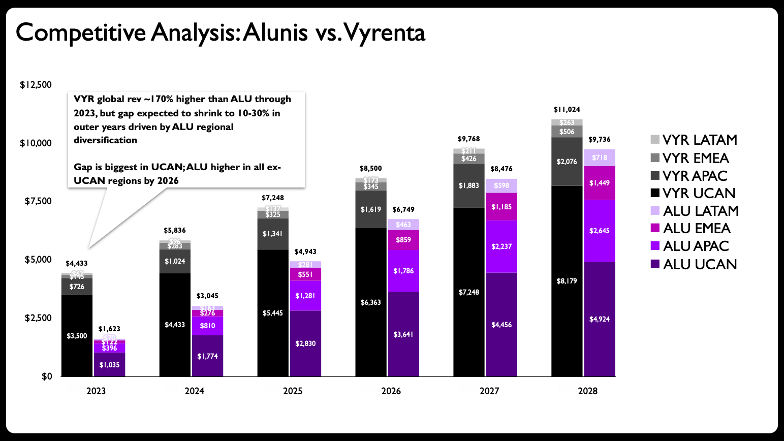
This phenomenon is well-documented in the field of data storytelling. Experts frequently caution against "chart junk" – extraneous visual elements that detract from the data’s message – and emphasize the principle of clarity over complexity. As outlined in seminal works on data visualization, including "before & after: practical makeovers for powerful data stories," one of the most prevalent mistakes is indeed overloading a single graph. The human brain struggles to process multiple layers of information simultaneously within a confined visual space, especially when different types of comparisons (e.g., part-to-whole, trend over time, comparison between entities) are required. The original stacked bar chart, while presenting all the data, failed to provide an immediate, intuitive understanding of the key narrative: Alunis’s strategic closing of the revenue gap through targeted regional growth. It lacked the visual distinction necessary to highlight the core message effectively.
A Strategic Redesign: Partnering with Claude for Enhanced Clarity
Recognizing the inherent limitations of the original stacked bar chart, the initial step in the makeover process was a strategic decision to deconstruct the single, overloaded visual into a series of more focused, digestible charts. This aligns with the "small multiples" principle in data visualization, where multiple small graphs, using the same scale and axes, facilitate easy comparison across different categories or time periods.
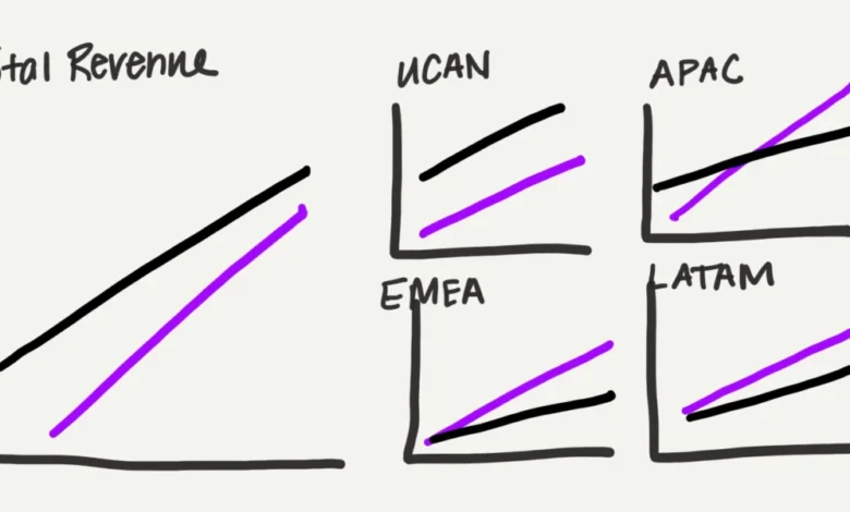
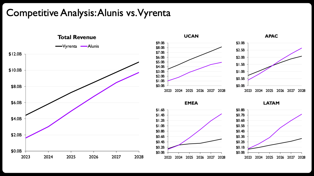
The human expert began by sketching a rough draft of the redesigned layout. This conceptualization phase is critical, leveraging human intuition and design principles to determine the most effective visual representation. The sketch outlined a shift from stacked bars to line charts, which possess a lighter visual footprint, making them advantageous for presenting temporal data across multiple panels without overcrowding the slide. The proposed design divided the data into five distinct graphs: one larger graph depicting total revenue trends for both companies, and four smaller, equally sized graphs, each dedicated to a specific geographical region (UCAN, APAC, EMEA, and LATAM). This arrangement not only separated the information logically but also subtly emphasized the part-to-whole relationship by giving prominence to the total revenue overview while providing detailed regional breakdowns. Historically, creating each of these individual graphs in a software like PowerPoint would consume substantial time, patience, and mental energy, involving repetitive data entry, formatting, and alignment adjustments.
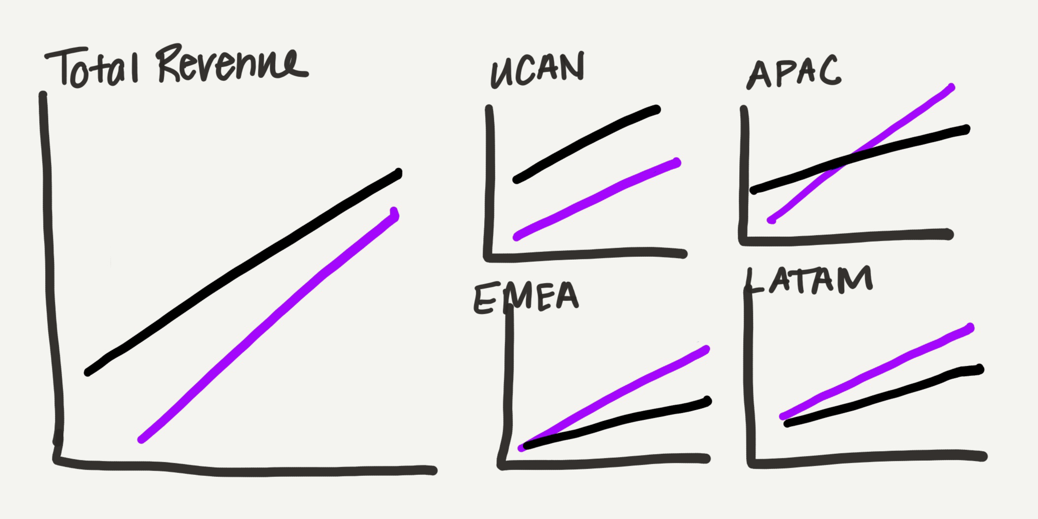
This time, however, the process diverged significantly. The hand-drawn sketch, along with the underlying data, was fed into Claude for PowerPoint, an add-in that has proven particularly effective in streamlining the workflow due to its ability to generate editable charts directly within PowerPoint. The prompt provided to Claude included instructions to rebuild the chart based on the uploaded data and the visual guidance from the sketch. The emphasis on "editable charts" is a critical differentiator for AI tools in professional contexts. Unlike AI outputs that are merely static images, editable charts allow professionals to maintain control, making subsequent refinements, branding adjustments, and minor data corrections seamlessly within their preferred software. While Claude was the tool of choice for this experiment, other AI platforms like CoPilot for Microsoft 365 and ChatGPT (with appropriate plugins) also offer chart generation capabilities, and Gemini is noted for similar functionality within Google Slides, indicating a broader trend towards integrated AI assistance across office productivity suites.
AI as a Production Engine: A Game Changer for Efficiency
The output generated by Claude for PowerPoint was a significant leap forward. It successfully translated the hand-drawn sketch and raw data into a set of native, editable PowerPoint line charts, complete with appropriate axes and labels, arranged in the small-multiples layout envisioned by the human designer. This initial AI-generated output represented a marked improvement over the original stacked bar chart, providing a clearer, more organized presentation of the data. For many users, this result alone would be considered a successful makeover, ready for presentation with perhaps minor textual additions.
Industry analysts observe that this capability of AI to produce high-quality, editable visualizations on demand is a "game changer" for efficiency in data reporting. A study by Accenture suggested that generative AI could automate up to 70% of routine tasks across various functions, freeing up knowledge workers for more strategic activities. In the context of data visualization, this translates into potentially hours saved per project, as the time-consuming, repetitive aspects of chart creation are offloaded to AI. The ability to quickly iterate on design concepts, generate multiple chart types, and integrate complex datasets without manual manipulation significantly accelerates the initial production phase.
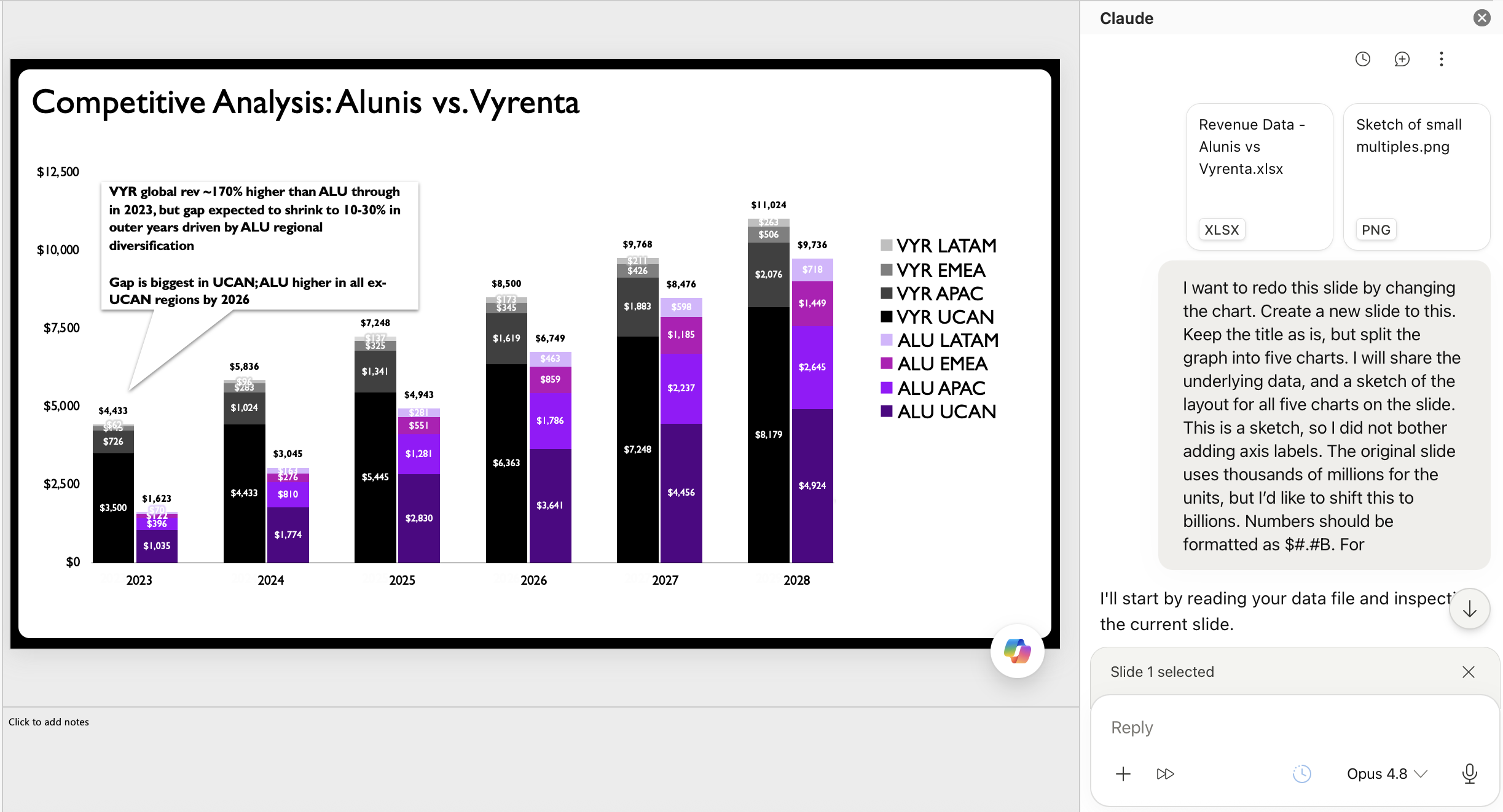
Furthermore, the fact that the output is editable addresses a major hurdle that previously limited the utility of AI-generated visuals. Early AI tools often produced static images, which, if imperfect, required a complete regeneration or manual recreation by the designer. This friction negated much of the potential time savings. With editable charts, AI acts as a powerful drafting engine, providing a robust foundation that can be fine-tuned without starting from scratch. This makes AI an invaluable partner, especially for professionals who are new to data storytelling or struggle with the technicalities of building specific chart types, effectively lowering the barrier to entry for creating professional-grade visualizations.
The Indispensable Human Touch: Refining AI’s Output
Despite the impressive capabilities of AI in generating initial visualizations, the experiment underscored the irreplaceable value of human expertise in elevating data stories from merely "good" to "exceptional." The AI-generated charts, while technically sound and a vast improvement, still required the nuanced judgment and design acumen of a human professional to reach their full potential. The expert identified several key areas for refinement:
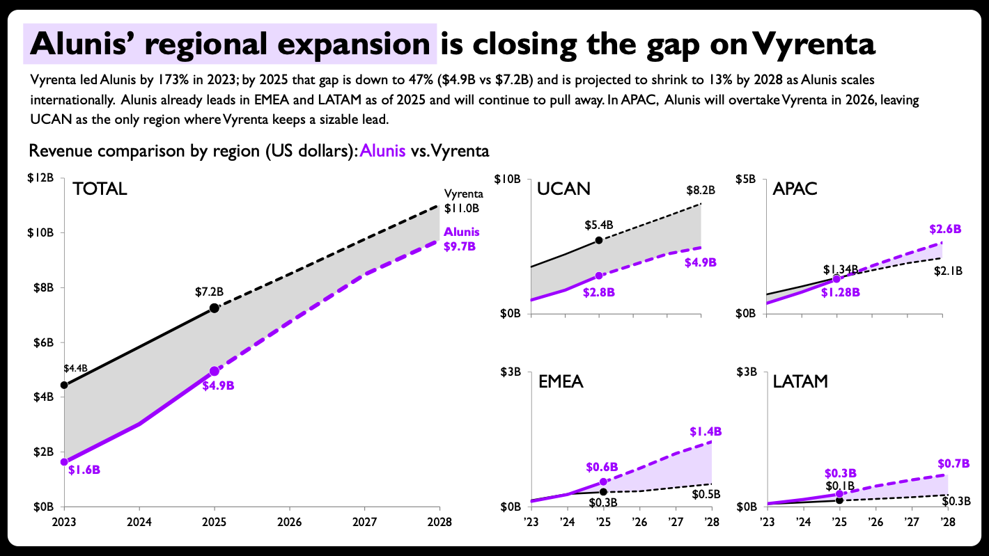
- Visual Emphasis and Narrative Clarity: The human eye immediately recognized opportunities to visually reinforce the core narrative. By adding shaded areas between the two company lines in the charts, the "gap" and its narrowing or widening became instantly apparent, drawing the viewer’s attention to the crucial competitive dynamic. This subtle yet powerful visual cue is something AI, without explicit, highly detailed instructions, might not prioritize as a primary narrative element.
- Direct Labeling for Readability: Replacing traditional legends with direct, end-of-line labels for each company, coupled with their final projected values, drastically improved readability. This eliminates the need for the audience to constantly shift their gaze between the chart and a separate legend, making the data points and trends more accessible and immediate. This focus on cognitive load reduction is a hallmark of effective human-centered design.
- Strategic Axis Scaling: While consistent axis scales are generally a best practice for comparability, the expert deliberately chose to scale the y-axis ranges independently for each regional chart. This allowed for a more granular view of revenue fluctuations within each specific region, preventing smaller regional trends from being obscured by the larger scale of total revenue or other dominant regions. This "breaking the rule" was not a mistake but a conscious, strategic design decision aimed at maximizing regional insight, a level of contextual judgment that currently remains firmly within the human domain.
- Distinguishing Actuals from Projections: The expert further enhanced clarity by using solid lines for historical or "actual" data and dashed lines for "projected" data. This simple visual convention instantly informs the audience about the nature of the data being presented, adding another layer of interpretability.
- Compact Formatting for Aesthetics and Space: In the smaller regional panels, the expert opted for a more compact year formatting, ensuring that the visual remained clean and uncluttered despite the smaller scale. These aesthetic and practical considerations contribute to the overall professional polish of the visualization.
These refinements highlight that while AI can efficiently execute the mechanics of chart creation, human professionals provide the critical layers of judgment, strategic direction, and aesthetic refinement. As one data visualization expert might posit, "AI provides the canvas and the initial brushstrokes, but the human artist is still essential for the masterful composition, the nuanced color choices, and the emotional resonance that truly tells a story." The ability to understand the audience, the context, and the overarching message, then translate that into subtle yet impactful design decisions, remains a uniquely human skill.
Transformative Results and Broader Implications
The final redesigned slide, incorporating both AI-generated foundations and human-applied refinements, was a testament to the power of human-AI collaboration. The complex, single stacked bar chart was transformed into a series of clear, engaging line graphs that effectively communicated Alunis’s strategy and projected success across various regions. The improvements were not merely aesthetic; they enhanced the analytical depth and narrative power of the presentation.
This experiment holds significant implications for the future of data storytelling and professional roles:
- Elevated Role of Data Professionals: Rather than displacing human talent, AI shifts the data professional’s role from a manual laborer to a strategic designer and curator. Professionals can now dedicate more time to understanding data, formulating hypotheses, crafting compelling narratives, and refining the communication strategy, rather than being bogged down by chart construction. This transition is welcomed by many, as it focuses on the "most enjoyable part of data storytelling"—the intellectual and creative challenge.
- Democratization of Data Visualization: AI tools can lower the technical barrier for creating sophisticated visualizations. Individuals without extensive training in advanced charting software can leverage AI to generate complex graphs, allowing a broader range of professionals to communicate data effectively. However, this democratization necessitates a foundational understanding of data visualization principles to ensure the AI’s output is appropriate and accurate.
- Increased Efficiency and Iteration Speed: The ability to rapidly generate and iterate on chart designs significantly accelerates project timelines. This speed allows for more thorough exploration of different visual approaches and faster feedback cycles, ultimately leading to more robust and impactful data stories.
- Focus on Foundational Principles: The success of this human-AI partnership hinges on the human’s ability to provide judgment and direction. Professionals still need to understand why a stacked bar chart might be suboptimal, how to effectively use small multiples, and when to deviate from conventions like consistent axis scales. AI acts as an accelerator, but it doesn’t eliminate the need for critical thinking and expertise in the underlying domain.
- The Future of Work: This collaborative model offers a glimpse into the future of many knowledge-based professions, where AI handles the routine, computationally intensive tasks, while humans focus on creativity, critical thinking, strategic planning, and ethical oversight.
Looking Ahead: The Evolving Symphony of Human and Artificial Intelligence
The journey of integrating AI into data storytelling is still in its early stages, but experiments like this one clearly demonstrate its transformative potential. The critical lesson learned is that the effectiveness of AI in this domain is profoundly tied to its ability to produce editable output. This feature ensures that the human remains firmly in the driver’s seat, able to leverage AI for rapid generation while retaining the essential control for nuanced refinement and strategic adaptation.
As AI models continue to evolve in sophistication, their capacity to understand complex prompts, interpret visual sketches, and generate increasingly refined initial outputs will undoubtedly grow. However, the unique contributions of human judgment—the ability to grasp context, anticipate audience needs, make subtle aesthetic choices, and ultimately weave data into a compelling narrative—will remain indispensable. The future of data storytelling, therefore, is not about AI replacing human creativity, but rather about a powerful, evolving partnership where artificial intelligence accelerates execution and human intelligence provides the vision, wisdom, and final artistic touch. This synergistic relationship promises to unlock unprecedented levels of efficiency and impact in how we understand and communicate with data.