
Web Development and Browser Ecosystem Updates: Bootstrap 6 Alpha, Native Lazy Loading Benchmarks, and Experimental Foldable UI APIs

The landscape of modern web development continues to evolve at a rapid pace, marked by significant framework milestones, emerging browser APIs designed for foldable hardware, and refined techniques for asset optimization and user interface styling. As developers prepare for the upcoming release of new dual-screen mobile devices, browser vendors are concurrently pushing forward experimental features that redefine how CSS handles dynamic layout calculations and pseudo-random values. At the same time, foundational tools are undergoing generational shifts to align with modern web standards, favoring browser-native capabilities over heavy JavaScript abstractions and legacy styling paradigms. This comprehensive overview examines the latest developments across browser engines, styling methodologies, performance benchmarks, and core framework updates shaping the industry.
Navigating Foldable Hardware: The iPhone Duo and Viewport Segments API
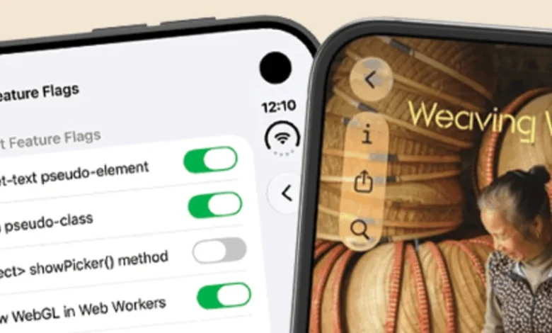
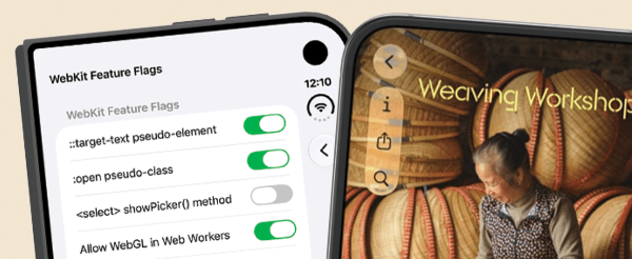
With the anticipated arrival of next-generation dual-screen and foldable devices—colloquially discussed in development circles regarding the iPhone Duo—front-end engineers are increasingly tasked with adapting web applications to discontinuous viewports. Darius Cepulis of the Video.js team recently explored this paradigm shift by testing the Device Posture and Viewport Segments APIs within mobile device simulators. Operating currently behind experimental feature flags, these APIs provide developers with the structural awareness necessary to detect physical hinges, folds, and posture changes in hardware.

Cepulis attempted to recreate a folded-player user interface similar to Netflix’s adaptive layout using core Video.js components and standard CSS techniques. However, the experiment brought to light longstanding integration challenges, particularly surrounding strict platform-level fullscreen restrictions enforced by mobile operating systems. When a video element enters fullscreen mode, it often breaks out of the partitioned viewport segments, rendering posture-aware layout adjustments ineffective.
Industry analysts note that as foldable device adoption grows, browser vendors and operating system developers will need to establish standardized protocols ensuring that split-screen layouts remain intact during media playback and immersive experiences. Until these platform constraints are addressed, developers must rely on fallback mechanisms and progressive enhancement strategies to deliver seamless experiences across both traditional single-screen displays and emerging foldable form factors.
The Evolution of CSS: Advanced Icon Systems and Reseter.css 3.0
Styling methodologies on the web are undergoing a renaissance, driven by advanced CSS features that reduce reliance on complex HTML markup and heavyweight frameworks. Lea Verou recently introduced a novel approach to incorporating vector icons into web user interfaces without modifying the underlying HTML structure. By leveraging modern CSS primitives—including --icon custom properties, @property rule registrations, style queries, and the mask property—developers can construct a pure CSS icon system that is exceptionally flexible and maintainable.
Traditional icon implementations often require repetitive SVG elements, external icon fonts, or JavaScript-heavy component wrappers that can bloat the Document Object Model (DOM). Verou’s approach confines the icon logic entirely to the stylesheet layer. By utilizing CSS custom properties alongside @property type definitions, developers can transition and animate icon states smoothly while keeping markup clean and semantic. Early benchmarks and community feedback suggest that this method significantly improves component reusability and reduces template clutter in large-scale applications.
Complementing advancements in component styling, Krish Gupta has released reseter.css 3.0, a major overhaul of the popular CSS reset utility. Designed for modern rendering engines, version 3.0 wraps its entire rule set—available in both full and mini variants—inside an explicit @layer reset declaration. This architectural choice guarantees predictable cascade layers and eliminates specificity wars when developers override default browser styles. Furthermore, the library has been refactored to utilize CSS logical properties universally, supporting internationalized layouts and writing modes natively, while compiled outputs remain remarkably lightweight at approximately one kilobyte compressed when built with Lightning CSS.
Browser Engine Updates: Chrome 156 Beta and Safari Technology Preview 254
Browser vendors continue to expand native capabilities through recent beta releases and preview builds, offering developers new tools to optimize performance and streamline layout logic. Google has announced the release of the Chrome 156 beta, with a stable rollout scheduled for the following week. A standout addition in Chrome 156 is native support for the CSS random() function, a long-requested feature that allows developers to generate pseudo-random values directly within stylesheets. This capability eliminates the need for inline JavaScript variables when introducing organic variations in design elements, such as particle effects, fluctuating opacities, or randomized offsets in grid layouts.

Simultaneously, the WebKit team has rolled out Safari Technology Preview 254, introducing robust support for calc-size() and interpolate-size. These functions address historical limitations in CSS transition engines, specifically the inability to smoothly animate elements transitioning to or from intrinsic dimensions such as height: auto or width: max-content. By enabling browser-native interpolation for keyword-based sizing properties, Safari is removing the necessity for JavaScript-driven measurement hacks, paving the way for smoother, more performant accordion menus, dropdowns, and collapsible containers.
Media Optimization and Performance: Native Lazy Loading Benchmarks
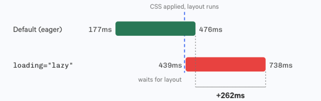
Asset performance remains a critical pillar of front-end engineering, particularly as media-heavy web pages strive to maintain optimal Core Web Vitals scores. Ben Schwarz of Calibre recently published an exhaustive analysis examining how modern web browsers—specifically Chrome, Firefox, and Safari—handle native lazy loading for images and media assets. The research measured the exact fetch distances ahead of the viewport at which different browsers initiate network requests for lazy-loaded content.
The findings indicate subtle discrepancies in loading thresholds across rendering engines, which can impact Largest Contentful Paint (LCP) and bandwidth consumption on mobile networks. Furthermore, Schwarz explored the broader scope of native lazy loading, noting that Chromium-based browsers now support deferred loading for audio and video elements alongside traditional image markup. The analysis also provides practical guidance on orchestrating attribute strategies, detailing when developers should explicitly apply loading="lazy", loading="eager", and fetchpriority="high" attributes to balance initial page load speed with resource availability.
Concurrently, developers are re-evaluating long-standing image formats in light of widespread browser support. Gavin Anderegg recently highlighted the milestone surrounding the WebP image format, noting that sixteen years after its initial introduction by Google, ecosystem support has achieved near-universal saturation at approximately 97 percent globally. With modern compression efficiencies far surpassing legacy formats like JPEG and PNG without sacrificing visual fidelity, industry consensus increasingly favors WebP as a standard baseline for web imagery.
Framework Modernization: Bootstrap 6 Alpha Released
In the realm of UI frameworks, the Bootstrap core team has officially unveiled the Bootstrap 6 Alpha, marking the popular framework’s first major version increment since 2021. Led by Mark Otto, the new alpha release prioritizes aggressive modernization, aligning the framework closely with contemporary browser standards and removing accumulated legacy overhead.
A primary architectural change in Bootstrap 6 is the migration of legacy Sass variables to native CSS custom properties. This shift allows developers to modify component themes dynamically at runtime without requiring a full Sass compilation step. Additionally, the framework’s JavaScript plugins have been refactored into ECMAScript Modules (ESM) exclusively, shedding legacy wrapper patterns in favor of native module imports. By leaning more heavily on browser-native features—such as native CSS nesting, layout grids, and modern pseudo-classes—Bootstrap 6 significantly reduces its overall stylesheet and script payload while improving runtime performance.

Industry Implications and Future Outlook
The convergence of these developments signals a mature phase in web engineering, characterized by a concerted shift toward browser-native solutions and architectural minimalism. As browser engines adopt advanced CSS calculation functions, native sizing animations, and randomized styling capabilities, the reliance on external polyfills and utility JavaScript libraries continues to wane.
Concurrently, the emergence of foldable device APIs underscores the industry’s adaptation to novel hardware landscapes. While standardization and platform-level restrictions—such as mobile fullscreen behavior—still present hurdles, proactive experimentation by developer communities ensures that the ecosystem will be prepared as multi-screen hardware gains mainstream traction. Ultimately, these tools and specifications empower developers to build faster, more adaptable, and highly maintainable digital experiences.