Mastering Data Visualization: How Purposeful Color Transforms Excel Charts for Executive Decision-Making


In the modern corporate landscape, data-driven decision-making has transitioned from a competitive advantage to a baseline operational requirement. Organizations across all sectors—from global fast-moving consumer goods conglomerates to agile tech startups—rely heavily on data dashboards, performance metrics, and analytical presentations to steer their strategic initiatives. However, the proliferation of automated data visualization tools and generative artificial intelligence assistants has introduced a new challenge: the generation of visually cluttered, default-styled charts that obscure rather than illuminate critical business insights. While software can synthesize complex datasets into graphical formats in a matter of seconds, it fundamentally lacks the contextual intelligence required to determine which data points matter most to a specific corporate audience.
Addressing this critical gap in explanatory communications, data visualization experts emphasize that color should never be treated as a default software setting. Instead, it must be deployed as an explicit, highly deliberate choice designed to guide the viewer’s eye toward an intended takeaway. When used with precision, a restrained color palette serves as one of the most effective methods to elevate a standard spreadsheet graphic into an impactful executive communication tool. This comprehensive guide explores the principles of purposeful color design, providing a step-by-step walkthrough for transforming basic Microsoft Excel charts—whether embedded in standalone spreadsheets, Microsoft Word reports, or PowerPoint presentations—into polished, professional visual assets.

The Context of Corporate Data Storytelling: A Case Study Approach
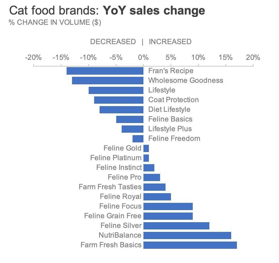
To understand the practical application of intentional color theory, analysts often turn to real-world operational scenarios. Consider a classic business problem derived from exercise 4.2 of the internationally recognized data storytelling curriculum, storytelling with data: Let’s Practice! The dataset in question examines the year-over-year (YoY) percentage change in retail sales across various cat food brands managed by a prominent pet food manufacturer. In standard business reporting, analysts frequently encounter raw Excel outputs that assign a distinct, vibrant rainbow of colors to every individual data series. While these default palettes may appear visually stimulating at first glance, cognitive science research confirms that they impose an unnecessary cognitive load on the audience. When every bar or line in a chart competes for visual attention, the core message is effectively lost in the noise.
To rectify this, visual communication specialists advocate for a foundational shift in how charts are constructed: starting entirely in greyscale. By stripping away default chromatic values and reducing the graphic to neutral shades of grey, the analyst establishes a clean, objective baseline. This preliminary phase acts as a vital psychological reminder that the chart is a work in progress—a draft that requires human intervention before it is deemed ready for executive presentation. Furthermore, working in greyscale forces the creator to deliberately evaluate which elements require emphasis, ensuring that any subsequent introduction of color is fully justified by the underlying narrative.
Step-by-Step Execution: Stripping Back to a Clean Slate in Microsoft Excel
Executing this transformation within Microsoft Excel requires navigating the application’s native formatting architecture. The process begins at the foundational level of data representation:
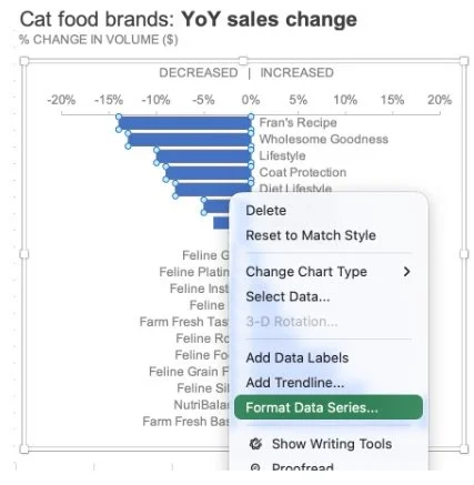
- The analyst selects the generated chart, right-clicks directly on the data series, and opens the formatting menu by choosing the "Format Data Series" option.
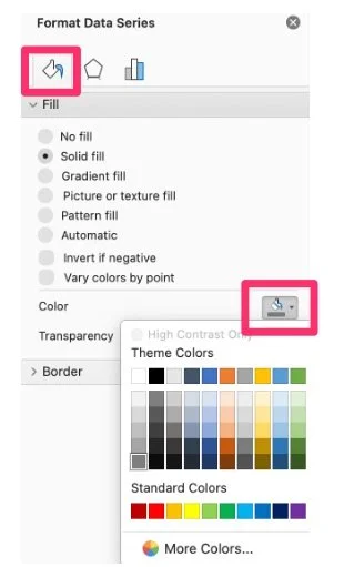
- Within the formatting pane—typically anchored to the right side of the workspace—the user navigates to the "Fill & Line" tab, easily identifiable by its paint bucket icon.
- Under the fill configurations, the standard software palette is discarded in favor of a neutral, professional shade of grey.
For charts containing multiple distinct data series, this procedure must be systematically repeated for each category until the entire graphic is rendered in uniform neutral tones. To maximize workflow efficiency in corporate environments where reporting cycles are frequent, analysts are strongly encouraged to save this finalized, uncolored structure as a reusable template. By establishing a "clean slate" template, reporting teams can bypass repetitive formatting steps, ensuring brand consistency and visual uniformity across all future enterprise deliverables.
Strategic Highlighting: Directing the Executive Gaze
Once a neutral greyscale foundation has been established, the next phase involves selective highlighting. In the context of the pet food manufacturer’s sales performance, suppose the primary objective is to brief executive leadership on product lines experiencing negative momentum—specifically, those brands that recorded a year-over-year decline in sales volume.
Rather than coloring all negative bars in traditional, highly saturated red—which can carry overly aggressive psychological connotations or pose significant accessibility barriers for individuals with color vision deficiencies—designers recommend utilizing a calibrated hue such as orange. Orange effectively reinforces a negative business trend while maintaining visual harmony and adhering to modern accessibility standards.
Applying this selective hue in Excel requires precision to avoid modifying the entire dataset simultaneously:
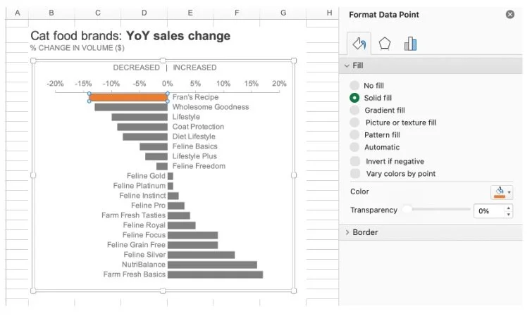
- The user clicks once on the target data bar to select the entire series, then clicks a second time specifically on the individual bar representing the declining brand of interest.
- Right-clicking this isolated data point opens the "Format Data Point" menu.
- Navigating back to the "Fill & Line" tab via the paint bucket icon, the analyst selects "Solid fill" and applies the chosen orange hue.
For reports featuring multiple declining categories, this formatting can be replicated across remaining negative data points. Alternatively, productivity shortcuts can be leveraged: clicking a subsequent bar and utilizing the repeat command—Ctrl+Y on Windows operating systems or Cmd+Y on macOS—instantly applies the most recent formatting action, streamlining the design process significantly.
Advanced Visual Hierarchy: Differentiating Degrees of Decline
While highlighting all declining brands successfully isolates the negative performers from the growth categories, sophisticated business reporting often demands a deeper layer of nuance. Imagine a scenario where, among the portfolio of declining cat food brands, executive leadership needs to pay immediate attention to the two severe underperformers: "Fran’s Recipe" and "Wholesome Goodness."
If all declining brands are colored with the exact same intensity of orange, the distinction between a minor sales contraction and a critical revenue collapse is obscured. To preserve the macro-signal (identifying all negative brands) while communicating the micro-signal (highlighting the worst-performing outliers), the designer must vary the color intensity within the chart.
Professional data designers typically employ one of three methodological approaches to achieve this hierarchy:
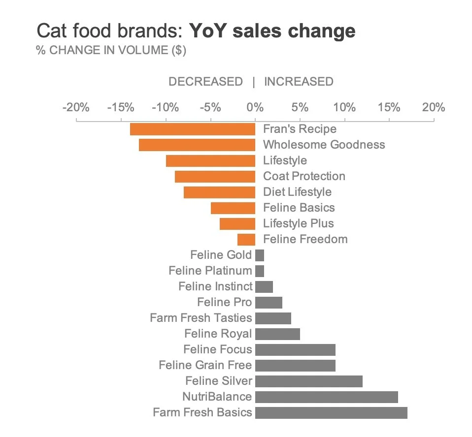
- Manual Color Graduation: Following the established formatting steps, the analyst assigns a paler, less saturated shade of orange to minor decliners, reserving the deep, vibrant orange exclusively for Fran’s Recipe and Wholesome Goodness.
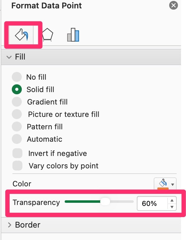
- Transparency Adjustment: Maintaining a uniform base color across all declining bars, the analyst opens the "Fill" menu and selectively increases the transparency percentage for the lesser-declining categories, causing them to recede visually into the background.
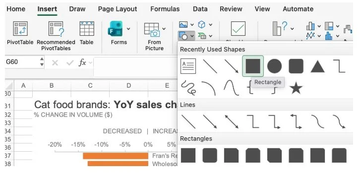
- Overlay Shape Technique: For precise control without altering native series properties, the analyst inserts a simple rectangular geometric shape directly over the bars representing the minor decliners, formats the shape with a solid white fill, removes the border outline, and adjusts its transparency to soften the underlying bars.
Through these advanced techniques, the resulting visualization successfully guides the viewer through a tiered cognitive journey: recognizing the overall trend of negative growth while instantly drawing focus to the most critical operational liabilities.
Integrating Textual Context for Autonomous Consumption
In contemporary corporate environments, data visualizations rarely exist in a vacuum. Stakeholders frequently review reports, slide decks, and analytical memos asynchronously, consuming the information independently without the benefit of a live presenter walking them through the data points. To ensure complete clarity in these autonomous review cycles, visual design must be seamlessly paired with direct textual annotation.
By embedding concise explanatory text directly adjacent to the graphic—and strategically bolding and coloring key terminology in the exact same orange hue used within the chart—the creator establishes a powerful visual bridge between the narrative and the numerical evidence. This technique, known in professional communication as spatial integration, drastically reduces the cognitive effort required for the audience to connect the written takeaway with the visual proof. The viewer’s eyes no longer have to bounce back and forth between a distant legend and the data bars; instead, the insight is absorbed instantaneously.
Broader Implications and Organizational Impact
The meticulous application of color theory in data visualization extends far beyond aesthetic improvements; it directly impacts organizational efficiency and decision-making speed. In executive boardrooms where time is severely constrained, cluttered and poorly designed charts force decision-makers to spend valuable minutes deciphering raw information rather than debating strategic countermeasures. By contrast, a cleanly formatted, purposefully highlighted chart eliminates ambiguity, directing executive consensus immediately to the core business problem.
As organizations continue to automate their data pipelines and integrate advanced analytical software, the human element—specifically, the ability to curate, contextualize, and communicate data ethically and effectively—becomes increasingly invaluable. Mastering tools like Microsoft Excel through the lens of intentional design empowers analysts to transition from mere reporters of historical metrics to trusted strategic advisors. Ultimately, color should never serve as mere decoration; it must act as a disciplined instrument of clarity, supporting the overarching business narrative and driving informed, decisive corporate action.