Rebuilding FIFA’s Standings Layout with CSS Subgrid and Exploring the Evolving Landscape of Web Development

The intricate challenges of modern web design are continuously being addressed by developers pushing the boundaries of existing technologies. A recent deep dive into rebuilding FIFA’s complex standings layout using CSS Grid and Subgrid highlights the power of these layout modules in creating responsive and sophisticated user interfaces. This exploration, spearheaded by Ahmad Shadeed, delves into the practical application of advanced CSS features to solve real-world design problems, offering valuable insights for frontend developers navigating increasingly demanding project requirements. The analysis comes at a time when the global interest in football, particularly during major tournaments like the World Cup, continues to drive engagement with sports-related digital platforms.
Deconstructing Complex Layouts with CSS Subgrid
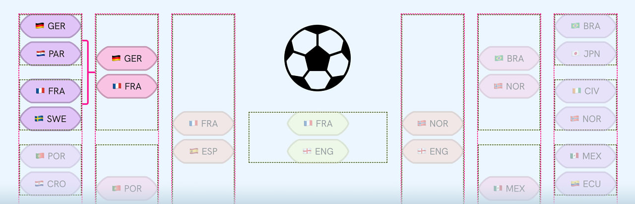
The article, "Rebuilding FIFA’s Standings Layout with CSS Subgrid," published on isha.dev, tackles a design problem that is both visually complex and functionally critical for sports websites. FIFA’s tournament standings pages typically feature a dense grid of information, including team names, player statistics, rankings, and match results. Traditionally, achieving such a layout that remains responsive across various devices has been a significant undertaking, often relying on intricate JavaScript solutions or brittle CSS hacks.
Shadeed’s approach leverages the capabilities of CSS Grid and, more specifically, CSS Subgrid. CSS Grid provides a two-dimensional layout system, allowing developers to define rows and columns for precise control over element placement. CSS Subgrid, an extension of Grid, enables an item placed within a Grid container to inherit the grid tracks of its parent Grid container. This is a crucial distinction, as it allows for the alignment of elements across nested grids, a common challenge in complex UIs like the FIFA standings.
The author demonstrates how Subgrid can be used to align items in different grid containers that share a common parent grid. This means that elements within the standings table, even if they are in separate sub-components or modules, can be perfectly aligned with each other based on the overarching grid structure of the entire standings page. This eliminates the need for manual alignment adjustments or complex calculations, leading to cleaner code and more robust layouts.
The article is rich with visual explanations and code examples, making the concepts accessible. It illustrates how to define a primary grid for the overall standings layout and then use Subgrid to ensure that individual team rows, player statistics columns, and other data points align seamlessly. This approach not only simplifies the development process but also significantly enhances the maintainability of the codebase.

The implications of this technique extend beyond sports websites. Any application requiring a highly structured and data-dense interface, such as dashboards, financial reports, or e-commerce product grids, can benefit from the precise alignment and responsiveness offered by CSS Subgrid. As web applications grow in complexity, tools that simplify the creation of consistent and visually appealing layouts become increasingly indispensable.
Optimizing Logging for Application Debugging: A Sentry Workshop
In parallel with advancements in frontend layout technologies, the backend and operational aspects of web development are also seeing continuous innovation. Sentry, a leading application monitoring platform, is offering a live workshop titled "How to Write Logs That Actually Help." This initiative addresses a critical pain point for developers: effective debugging.
The workshop aims to equip participants with the knowledge to craft logs that provide actionable insights when applications encounter issues, particularly during critical periods like late-night outages. The premise is that poorly written logs often obscure rather than illuminate the root cause of a problem, transforming a potentially straightforward fix into a time-consuming investigation.
The core of the workshop’s message revolves around what information to capture and how to structure it. This involves moving beyond generic error messages to detailed, context-rich logs that can pinpoint the exact sequence of events leading to a failure. Key considerations likely include logging relevant user actions, application states, API requests and responses, and system metrics.
The emphasis on "structured logging" is paramount. By formatting logs in a consistent, machine-readable way (e.g., JSON), developers can more easily parse, filter, and analyze them using specialized logging tools. This contrasts with unstructured text logs, which are notoriously difficult to query and correlate.
The timing of this workshop is significant, as the complexity of modern web applications, often built with microservices and distributed architectures, makes debugging a more challenging endeavor than ever before. Effective logging is not merely a convenience; it is a fundamental necessity for maintaining application stability and ensuring a positive user experience. The workshop’s promise to transform "something broke" into "here’s exactly what happened" underscores the direct impact of improved logging practices on development efficiency and operational reliability.
Adapting to the Real World: Low and Mid-Tier Mobile Testing
Harry Roberts, a well-respected figure in the web development community, has updated his guide on selecting representative mobile devices for testing, titled "Low and Mid-Tier Mobile for the Real World." This piece is particularly relevant as it acknowledges the diverse spectrum of devices used by global internet users, moving beyond the common practice of exclusively testing on high-end flagship models.
Roberts’ argument is grounded in the reality that a significant portion of the world’s mobile users rely on more affordable, mid-range, or even lower-tier devices. Neglecting these devices in testing can lead to suboptimal user experiences for a large segment of the audience. The updated guide provides concrete examples of devices that represent these categories in 2026, including the Samsung Galaxy A17 5G and the Samsung Galaxy A56 5G. These specific models are chosen based on their market prevalence, with the A17 5G noted as the fifth best-seller globally in the first quarter of the year, and the A56 5G being a top seller in Europe.
The implications of this perspective are substantial for frontend developers and quality assurance teams. It suggests a shift in testing strategies, advocating for a more inclusive approach that considers device performance, screen sizes, and network conditions typical of lower-specification hardware. This might involve performance testing under simulated network constraints, optimizing image loading for devices with less RAM, and ensuring that touch targets are easily accessible on a variety of screen sizes.
The ongoing evolution of mobile technology means that what constitutes "low-tier" or "mid-tier" is constantly shifting. Roberts’ update provides a timely reminder that a static approach to device selection is insufficient. Developers must remain aware of market trends and device adoption rates to ensure their websites and applications are accessible and performant for the broadest possible audience. This pragmatic approach to testing ultimately contributes to a more equitable and inclusive digital landscape.
Advancements in CSS for Layout and Aesthetics
The continued evolution of CSS is a constant source of innovation in web development. Several recent articles highlight new and returning CSS features that offer powerful capabilities for both layout and visual design.
The Return of CSS Outline for Accessibility
Morgan Murrah’s article, "Return of CSS Outline," makes a compelling case for the continued importance of focus outlines, particularly for accessibility. Despite the advent of :focus-visible, which aims to provide more context-aware focus indicators, many websites still implement outline: 0 in their CSS resets. This practice, often inherited from older codebases, inadvertently removes visual cues for keyboard users, making it difficult for them to discern which element currently has focus.

The article emphasizes that while :focus-visible is a powerful tool, it is not a universal replacement for robust outline styles. A well-designed focus outline provides clear visual feedback, guiding keyboard navigators through interactive elements. Murrah’s piece serves as a vital reminder that accessibility is not an optional add-on but an integral part of good web design. The implications of neglecting focus outlines are significant, potentially excluding users who rely on keyboard navigation from fully interacting with web content.
Masonry Layouts with CSS Grid and Animation
Chris Coyier’s exploration of "Masonry (with Animation) in CSS" showcases the exciting possibilities of creating dynamic, masonry-style layouts using modern CSS. Masonry layouts, characterized by their staggered arrangement of items that fill available space efficiently, have traditionally been implemented with JavaScript. However, Coyier’s article highlights how CSS Grid, combined with emerging features like Anchor Positioning and the forthcoming grid-lanes, can facilitate fluid animations within these complex arrangements.
This development is significant because it allows for more performant and semantically cleaner implementations of masonry layouts. By leveraging native CSS capabilities, developers can achieve sophisticated visual effects without relying on client-side scripting, which can improve loading times and overall performance. The ability to animate these layouts further enhances user engagement, making content more dynamic and visually appealing. This advancement is particularly relevant for image-heavy websites, portfolios, and content-discovery platforms.
Time-Based Color Transitions with CSS Color Mix
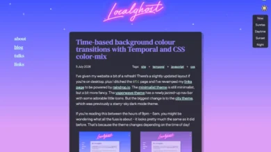
In a more experimental vein, an article on localghost.dev explores "Time-Based Background Colour Transitions with Temporal and CSS Color Mix." This tutorial delves into using the temporal module (likely referring to CSS animation-timeline or related concepts) in conjunction with color-mix() to create dynamic background color transitions that are driven by time.
color-mix() is a powerful CSS function that allows for the interpolation of colors, creating smooth transitions between different hues. When combined with timeline-based animations, this can lead to sophisticated visual effects where backgrounds change color based on the passage of time, scroll position, or other temporal events. While this might be considered a more advanced or experimental technique, it demonstrates the growing potential for CSS to handle complex visual effects that were previously the domain of JavaScript or graphic design software. Such techniques can be employed to create immersive user experiences, dynamic data visualizations, or simply to add a unique aesthetic flair to a website.
Emerging Tools and Resources for Web Developers
Beyond core language features, the web development ecosystem is continuously enriched by new tools and libraries that aim to streamline development workflows and expand creative possibilities.

Jelly UI: Soft Web Components for Interactive Elements
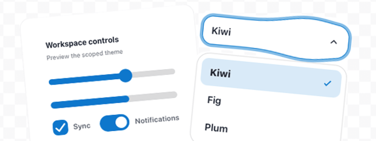
Jelly UI is presented as a "Soft Web Components" library, offering a dependency-free collection of 40 pre-built UI elements. What sets Jelly UI apart is its integration of "soft" physics effects into native HTML controls. This means that standard form elements like buttons, inputs, and sliders are enhanced with subtle, natural-feeling animations and responsiveness, mimicking real-world physical interactions.
The library’s dependency-free nature is a significant advantage, as it minimizes the impact on project bundle sizes and avoids potential conflicts with other libraries. The inclusion of a showcase allows developers to easily explore the various components and understand their behavior. For projects aiming for a more polished and engaging user experience, Jelly UI provides a valuable set of tools to implement sophisticated interactive elements without extensive custom coding. This aligns with a broader trend in UI design that prioritizes fluid interactions and intuitive feedback.
Framework Benchmarks: A Comparative Analysis of Frontend Technologies
Alicia Sykes’s "Framework Benchmarks: Compare Frontend Frameworks" offers a crucial resource for developers choosing the right tools for their projects. This initiative involves an experienced developer building the same weather application across a wide array of frontend frameworks, including Angular, React, Vue.js, Svelte, and many others.
The benchmark system is automated, allowing for consistent and repeatable testing. The results cover a comprehensive set of metrics, including:
- Bundle Size: The amount of JavaScript code required to load the application. Smaller bundle sizes lead to faster initial load times.
- Build Time: The time it takes for the framework to compile or bundle the project during development. Faster build times improve developer productivity.
- UX Metrics: Performance indicators related to user experience, such as responsiveness, frame rates during animations, and interaction latency.
- Memory Usage: The amount of memory the application consumes, which can impact performance on lower-spec devices.
- Startup Time: The time it takes for the application to become interactive after the initial load.
The implications of such benchmarks are far-reaching. For developers, they provide empirical data to inform technology choices, balancing factors like performance, developer experience, and ecosystem support. For businesses, understanding these metrics can lead to more cost-effective and performant application development, ultimately impacting user satisfaction and operational efficiency. The continued evolution of frontend frameworks means that regular benchmarking is essential to stay abreast of the competitive landscape.
Decoy Font: A Novel Approach to AI Obfuscation
An intriguing experiment from Mixfont, "Decoy Font: A TTF Font That Hides What You Type," explores a novel approach to privacy in the age of AI. This specially designed TrueType Font (TTF) aims to obscure typed text from artificial intelligence by embedding a "decoy" layer of information.
The font works by using "separate spatial frequencies to communicate two different letters in the same space." This means that to the human eye, the text appears normal (or perhaps with a slight visual artifact that can be overcome with mild visual adjustment, as the author notes), but to an AI processing the text, it presents conflicting or misleading information. The underlying principle is to create a visual ambiguity that an AI might misinterpret, thereby protecting the actual content being typed.
While the practical applications of such a font are still being explored, it represents a fascinating intersection of typography, computer vision, and privacy concerns. As AI-powered text analysis and content moderation become more prevalent, tools that offer a degree of obfuscation could become increasingly relevant. This experiment highlights the innovative ways developers are thinking about user privacy and security in an era of pervasive digital surveillance and AI integration.
The collective insights from these articles and resources paint a picture of a dynamic and rapidly evolving web development landscape. From the foundational advancements in CSS for layout and accessibility to the practical considerations of logging, testing, and the creation of novel tools, developers are continuously equipped with new methods to build more robust, performant, and user-centric web experiences. The ongoing discourse and experimentation within the community are vital for navigating the complexities of modern software development and shaping the future of the internet.
Related posts: