
What’s !important: Clip-Path Jigsaws, View Transitions Toolkit, Name-Only Containers, and Evolving Web Platform Features
The latest edition of "What’s !important" delves into a series of significant advancements and discussions shaping the modern web development landscape. This comprehensive overview highlights innovative techniques in CSS, sophisticated tools for enhancing user experience, and ongoing dialogues about efficient code organization. From intricate visual effects achievable with clip-path to the streamlined implementation of dynamic page transitions, the web platform continues to evolve at a rapid pace, offering developers new avenues for creativity and performance optimization.
Mastering Visual Complexity with clip-path
A particularly engaging development showcased in this issue is the creative application of the CSS clip-path property. Amit Sheen’s detailed walkthrough on Frontend Masters demonstrates how to construct a full jigsaw puzzle effect using clip-path. While the immediate need for such a precise visual effect might be niche, the underlying methodology provides an invaluable educational tool for developers to grasp the expanding capabilities of clip-path. This property, which allows for the clipping of an element to a specific shape, is rapidly gaining traction due to its flexibility and performance benefits.
Recent developments in browser implementations further underscore the growing importance of clip-path. Notably, Chrome Canary has begun supporting rounded clip-path polygons. This feature, announced on Bluesky by developer Yisibl, represents a significant step forward in making more complex and organic shapes achievable with native CSS. The polygon() round keyword, as described in the Bluesky post, allows for the creation of polygons with smoothly rounded corners, moving beyond the sharp, geometric forms traditionally associated with clipping paths. This enhancement, thanks to contributions from individuals like Jason and the foundational work by Lea Verou, promises to unlock new design possibilities. The implementation of such experimental features in developer channels like Chrome Canary provides early access and allows for testing and feedback before wider public release.
Furthermore, discussions within the W3C CSS Working Group indicate a push to incorporate additional corner-shape keywords, such as bevel. This suggests a future where clip-path will offer even more granular control over the shape and appearance of clipped elements, potentially reducing the reliance on complex SVG workarounds or JavaScript for intricate masking.
Complementing these advancements, Karl Koch’s demonstration of clip-path animations, previously featured in an earlier "What’s !important" edition, highlights the dynamic potential of this property. These animations, which involve animating the clipping path itself, can create visually stunning effects, from elements morphing into new shapes to intricate reveals and transitions. The integration of clip-path into animation workflows opens up a realm of possibilities for creating engaging and memorable user interfaces without the overhead of extensive JavaScript libraries.
Streamlining User Experience with View Transitions
The Chrome DevRel team has introduced a valuable "View Transitions Toolkit," a collection of utilities designed to simplify the implementation of view transitions. This toolkit arrives at a crucial time, following Chrome’s recent shipment of element-scoped view transitions. This new capability allows developers to animate the transition of specific DOM elements between different states or pages, rather than just the entire page.
View transitions are a powerful tool for improving the perceived performance and polish of a website. By creating smooth visual continuity between different views, they guide the user’s attention and make navigation feel more fluid and intuitive. Instead of abrupt page reloads, users experience seamless animations, enhancing engagement and reducing the cognitive load associated with switching content. The ability to scope these transitions to individual elements further refines this experience, allowing for more targeted and sophisticated animations. For example, a shopping cart icon could animate its movement from a product page to a header, or a profile picture could smoothly transition from a list view to a detail view.
The View Transitions Toolkit aims to abstract away much of the complexity involved in orchestrating these animations. It likely provides pre-built components, helper functions, and clear patterns for defining transition effects, making it accessible to a broader range of developers. This move towards providing robust toolkits for cutting-edge web features is a testament to the industry’s focus on developer productivity and the creation of exceptional user experiences. The early adoption and experimentation with element-scoped view transitions, supported by this new toolkit, signal a shift towards more dynamic and interactive web applications.
Rethinking Scoping with Name-Only Containers
The discussion around efficient code organization and scoping continues with an exploration of "name-only containers." Chris Coyier, in a piece on Frontend Masters, examines how these containers can be utilized for scoping, drawing comparisons to traditional class names and the more recent @scope CSS at-rule.

Scoping in CSS is crucial for preventing style collisions and maintaining predictable styling across large and complex projects. Historically, developers have relied heavily on naming conventions like BEM (Block, Element, Modifier) to achieve a semblance of scoping with class names. However, these methods can lead to verbose HTML and require strict adherence to conventions.
The @scope at-rule, introduced as a more direct CSS solution, allows developers to define style boundaries directly within their stylesheets. This approach can lead to cleaner HTML and more maintainable CSS by encapsulating styles to specific parts of the DOM tree. Coyier’s analysis suggests that while name-only containers offer an alternative approach to scoping, his preference, and potentially an evolving industry trend, leans towards @scope for its inherent cleanliness and directness. The debate between these methods highlights the ongoing search for the most effective and maintainable ways to manage CSS in modern web development. The choice often comes down to project requirements, team preferences, and the specific challenges of the codebase.
The Enduring Potential of Subgrid
Despite its widespread availability for over two and a half years, CSS subgrid continues to be an underutilized feature, prompting a renewed call for its adoption. Once heralded as a highly anticipated breakthrough in CSS Grid Layout, subgrid allows grid items to inherit their parent grid’s track sizing and placement. This capability is essential for creating complex, aligned layouts where elements across different grid containers need to share the same grid structure.
The absence of widespread subgrid adoption is a missed opportunity, as it can effectively solve common layout challenges that often lead to cumbersome workarounds. Developers frequently resort to techniques like nested wrappers, negative margins, or the "Michael Scofield" approach (referencing the intricate planning seen in the show Prison Break) to achieve proper alignment across nested grids. Subgrid offers a far more elegant and maintainable solution by enabling direct alignment without these complex hacks.
David Bushell’s straightforward explanation of subgrid serves as a timely reminder of its power and simplicity. The visual examples accompanying his explanation clearly illustrate how subgrid can effortlessly align content across disparate grid items, fostering cleaner code and more robust designs. The implication of subgrid‘s underutilization is that many web projects may be unnecessarily complex and harder to maintain than they need to be. Encouraging its adoption could lead to significant improvements in layout consistency and developer efficiency.

Embracing CSS for JavaScript Functionality
In a move reminiscent of the "You Might Not Need jQuery" movement, Pavel Laptev’s article, "The Great CSS Expansion," highlights the growing trend of replacing JavaScript functionalities with native CSS solutions. This expansion of CSS capabilities means that many tasks previously requiring JavaScript libraries can now be accomplished with more performant and lightweight CSS, leading to faster load times and a more efficient user experience.
The article points to examples where CSS can now handle tasks such as anchor positioning, complex animations, and interactive components that were once the exclusive domain of JavaScript. This shift is driven by the continuous development of new CSS features and properties, such as CSS Anchor Positioning, which allows elements to be positioned relative to other elements without explicit JavaScript manipulation. By leveraging these CSS advancements, developers can reduce their project’s JavaScript footprint, leading to improved performance, especially on lower-powered devices or slower network connections. The "You Might Not Need JavaScript" ethos is becoming increasingly relevant as CSS matures, offering a more integrated and efficient approach to building modern web interfaces.
The Ever-Expanding Frontier of CSS
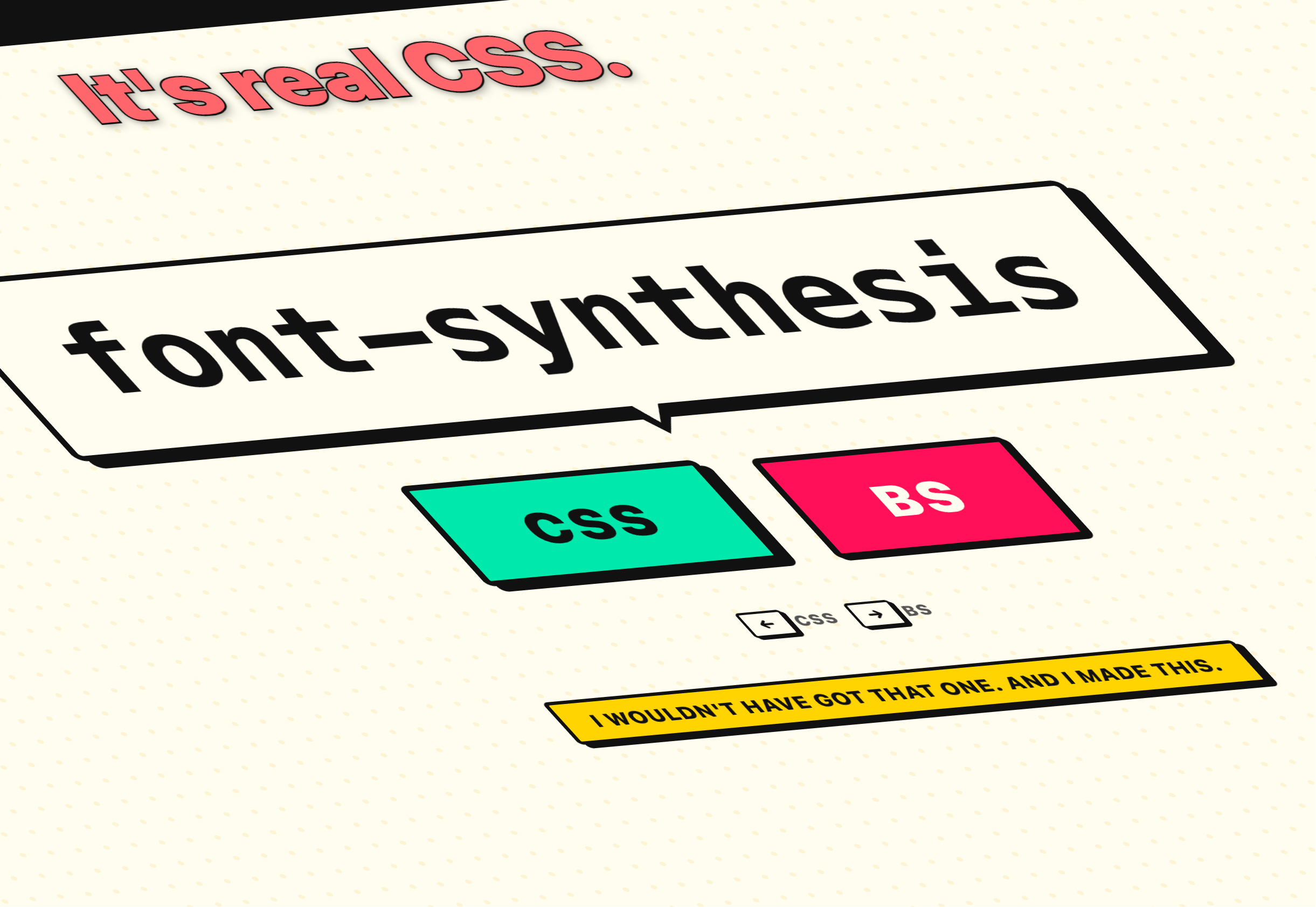
The rapid pace of innovation in CSS presents a challenge for developers aiming to stay current. The sheer volume of new features, properties, and techniques emerging regularly can be overwhelming. A testament to this is Keith Cirkel’s "CSS or BS?" quiz, which playfully tests a developer’s knowledge of real versus fabricated CSS properties. The difficulty of achieving a perfect score, as noted in the original content, underscores the dynamic and evolving nature of the web platform. This constant influx of new capabilities, while exciting, necessitates continuous learning and adaptation for web developers to remain proficient and leverage the latest advancements effectively. The ongoing evolution of CSS, from advanced visual effects to sophisticated layout control and functional replacements for JavaScript, signifies a maturing and increasingly powerful toolkit for building the web of tomorrow.


