Dash Creative Unveils New Website Embodying "Magnetic Commerce" Through Innovative Design and Interactivity

Dash Creative, a prominent digital agency, has officially launched its newly revamped website, a project that not only showcases their design prowess but also embodies their core philosophy of "magnetic commerce." This strategic rebrand, the culmination of several months of dedicated development, aims to elevate their online presence and better articulate their approach to creating engaging digital experiences. The new site is a testament to the agency’s commitment to innovative design, interactive elements, and a user-centric approach, all meticulously crafted to draw users in and foster deeper engagement.
The genesis of this ambitious project stemmed from a desire within Dash Creative to distinguish themselves in a crowded digital landscape. The agency recognized the need for a website that transcended mere aesthetics, one that could actively communicate their unique value proposition. This introspection led to the crystallisation of the "magnetic commerce" concept, a guiding principle that informed every subsequent design decision. This concept posits that effective digital experiences should possess an inherent ability to attract and retain user attention, moving beyond passive information delivery to actively engage and captivate.
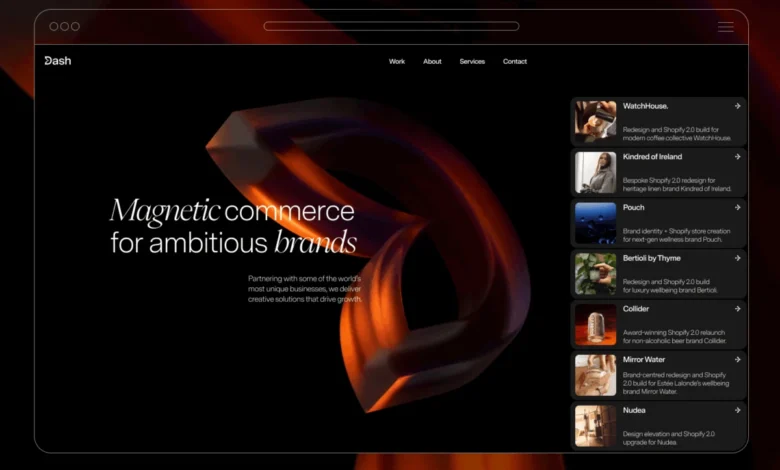
The "magnetic commerce" idea found its most tangible expression in the redesigned logo. A key element of the new emblem features a portion of the "D" being drawn inward, as if influenced by an unseen magnetic force. This visual metaphor, representing attraction and engagement, served as the foundational element for the entire website’s design language. This emblem, rendered as a dynamic 3D object, became the focal point of interactive elements, most notably a cursor-driven animation. As users move their cursor across the logo, it responds by subtly "pulling" in the direction of the cursor, a direct manifestation of the magnetic concept. This innovative interaction set the precedent for how motion and animation would be integrated throughout the site, creating a cohesive and immersive user journey.
Further enhancing the user experience, Dash Creative drew inspiration from iOS design principles for their treatment of cards and calls-to-action (CTAs). Project cards on the site are designed to evoke the familiar and tactile feel of iOS notifications, a deliberate choice to create a sense of comfort and intuitiveness for users. This familiarity, juxtaposed with the innovative context of a digital agency’s portfolio, adds a layer of unexpected delight. The implementation of strict brand guidelines throughout the design process proved to be a valuable constraint, preventing design drift and ensuring a cohesive and considered final product.
The development timeline for this comprehensive rebrand spanned several months. While the core concept of "magnetic commerce" was established relatively early in the process, significant effort was dedicated to refining the website’s content and meticulously polishing the animations during the development phase. This meticulous attention to detail underscores Dash Creative’s commitment to delivering a high-quality, polished final product.

Technological Backbone: A Symphony of Tools
The successful execution of the Dash Creative website relied on a carefully selected suite of cutting-edge technologies. For the design phase, Figma proved to be an indispensable tool. Its robust features for managing design systems, including typography, spacing, and component libraries, ensured a systematic approach without hindering creative iteration. The platform facilitated seamless collaboration and version control, crucial for a project of this scale.
The build phase was primarily powered by Webflow, a platform that Dash Creative itself champions. Utilizing Webflow for their own website served as a powerful demonstration of its capabilities for prospective clients. A significant portion of the site’s intricate animations and interactive elements were realized using Webflow’s native animation system, highlighting the platform’s growing potential for sophisticated web development.
For functionalities that extended beyond Webflow’s native capabilities, particularly the highly precise cursor-driven behaviors and complex sequencing of animations, GSAP (GreenSock Animation Platform) was employed. GSAP’s powerful animation engine allowed for granular control and the creation of highly performant and fluid motion graphics.
The most visually striking element, the hero background, was brought to life using Custom WebGL. This advanced graphics technology was essential for achieving the unique visual effects required for the dynamic hero section, a feat that could not have been accomplished with standard web technologies.
The Hero Background: A Dynamic, Distorting Surface

The website’s hero section immediately captivates visitors with a fullscreen video background that dynamically distorts in response to cursor movement. The underlying concept was to create a background that felt alive and responsive, subtly reacting to user interaction without becoming a distraction from the core content. A key design principle was to avoid a simple ripple effect centered on the cursor. Instead, the distortion was engineered to propagate in the direction of cursor movement, creating a sense of the surface being actively pulled or stretched, a more organic and engaging visual metaphor.
The technical implementation of this effect is a testament to sophisticated shader programming. Rather than layering visual effects on top of the video, the WebGL fragment shader directly manipulates the video’s texture coordinates. The cursor’s position dictates the area of influence for the distortion, while the direction and speed of its movement determine the propagation and intensity of the effect. A damped sine function is employed to generate the wave that drives the displacement, resulting in a fluid and naturalistic distortion.
Key configurable values, meticulously tuned for optimal visual impact, are defined within the renderer. These include parameters such as radius, amplitude, frequency, speed, carry, and stagger, which collectively govern the visual characteristics of the distortion. The geometry is a simple fullscreen quad, providing the canvas for the shader to work its magic.
Within the fragment shader, a maskFn calculates the influence of the cursor based on its proximity and movement. A wave function, derived from a damped sine wave, generates the displacement. The direction of movement (dir) and the calculated mask are then used to offset the texture coordinates, creating the illusion of a dynamic surface.
The visual continuity and momentum of the distortion are maintained through JavaScript smoothing and decay mechanisms before values are passed to the shader. This ensures that the effect doesn’t abruptly stop when the cursor ceases movement. Instead, the distortion gradually loses momentum, returning to its resting state, which contributes to a more continuous and less "mechanical" feel.
Visual Restraint and Impact

Despite the advanced technology employed, the design team exercised considerable restraint to ensure the hero background enhanced, rather than detracted from, the overall user experience. The distortion effect is strategically placed behind the website’s typography, adding depth and visual interest without compromising the legibility of the content. The use of a soft falloff for the cursor’s influence field avoids the harsh spotlight effect often seen in similar implementations. Furthermore, vertical damping limits the spread of the wave, ensuring a more directional and less uniformly expanding distortion.
The minimalism of the surrounding hero elements – a simple black background and a full-bleed video – further emphasizes the interactive background. This deliberate simplicity allows the dynamic visuals to take center stage, drawing users into the site’s immersive experience.
Architectural Foundation
The architectural structure of the hero section is intentionally straightforward, facilitating integration and scalability. It comprises a primary hero container, a hidden video element serving as the texture source, and a WebGL canvas layered above it.
The renderer is responsible for a sequence of tasks: initializing the WebGL context and canvas, loading and preparing the video texture, setting up the fullscreen quad geometry, compiling and linking the vertex and fragment shaders, and initiating the render loop. Crucially, the renderer operates without a scene graph or post-processing pipeline, simplifying its integration into existing web development workflows. It relies on a single texture, a fullscreen quad, and a pair of shaders for its core functionality.
Frame uploads to the texture are optimized, occurring only once the video has reached a sufficient ready state. The render loop is designed for efficiency, employing smoothed interaction values, UV coordinate remapping within the shader, and limiting rendering to the hero section. Rendering is initiated only after the video is prepared, ensuring a smooth and uninterrupted experience for the user. This architectural approach allows for the reuse of the core technology with different video sources, distortion profiles, or across various sections of a website, demonstrating its adaptability and modularity.

Reflections and Future Considerations
The final iteration of the Dash Creative website is a significant step forward, effectively communicating the agency’s core philosophy of "magnetic commerce." While the technical implementation was relatively swift, the majority of the project’s duration was dedicated to the nuanced refinement of motion, content curation, and the harmonious integration of both.
A key learning from this project was the importance of knowing when to cease adding elements. Subtle adjustments to timing, easing, and copywriting often yielded more impactful results than introducing entirely new effects. This iterative approach underscores a mature understanding of user experience design, where less can often be more.
Reflecting on the process, Dash Creative identifies a key area for future consideration: the reliance on cursor interaction. While highly effective on desktop devices, the experience on touch-enabled devices presents a significant divergence. The agency acknowledges that a more integrated approach to touch interactions earlier in the design process would have further enhanced the site’s universal appeal and accessibility.
Ultimately, the project reinforced a fundamental principle that guided the rebrand from its inception: interaction is most effective when it serves to support the core concept rather than becoming the sole focus. The Dash Creative website stands as a compelling example of how innovative design and thoughtful implementation can create digital experiences that are not only visually stunning but also deeply engaging and conceptually resonant. The success of this rebrand positions Dash Creative to continue attracting clients seeking cutting-edge digital solutions that drive meaningful engagement and foster genuine "magnetic commerce."